Using Check Boxes

In this section:

How to:

Reference:

Use check boxes in your forms to enable your end users to turn options on and off.

There are several ways you can use a check box in your form:


Top of page

x
Procedure: How to Place a Check Box on Your Form
  1. Select the Check box control Check box control in the Controls palette.
  2. Draw a rectangle on your form approximately where you want your check box to be at approximately the size you want.
  3. Select the text next to the actual box, type the label you want your check box to have, and press the Enter key.
  4. Giving your check box a more meaningful name than CheckBoxn is optional, but recommended.
  5. If necessary, readjust the size and placement of your check box.
  6. Double-click the check box or select the Checked property to open the Set Check Box State dialog box.
  7. To directly set the initial state for the check box, select As selected below, and then select either 0 - No (cleared) or 1 - Yes (selected).

    To assign the state of the check box to a variable, select From a variable. Then select a variable or data source stack column.

    Note: You can create a new variable or data source stack by clicking New variable or New data source stack. For more information, see How to Create a Variable in a Procedure or How to Create a Data Source Stack Explicitly Using the Stack Editor.

    The variable or stack column should have a value of 1 or 0, if numeric.

  8. Click OK.

Top of page

x
Syntax: How to Set the Value of a Check Box Dynamically

If you want to reset the value of a check box to its initial value, issue the following command

COMPUTE Formname.CheckBoxName.Checked = {0|1};

where:

Formname

Is the name of the form the check box is placed on.

CheckBoxName

Is the name of the check box.

0

Clears the check box.

1

Selects the check box.


Top of page

x
Procedure: How to Trigger an Action When an End User Selects a Check Box
  1. Open the Event Handler editor.
  2. Select the check box in the list of controls.
  3. Select the Check event from the list of events.
  4. Specify an event handler.

Top of page

x
Reference: Set Check Box State Dialog Box

Use the Set Check Box State dialog box, shown in the image below, to determine whether the check box will be selected or cleared initially, or whether its value will be assigned to a variable or data source stack column.

Set CheckBox State dialog box

This dialog box contains the following options:

Set the checked state of the control

Select As selected below to set the initial value directly.

Select From a variable to set the value from a variable.

Checked

This is available only if you selected As selected below.

Select 0 - No to clear the check box initially (the default).

Select 1 - Yes to select the check box initially.

New variable

This is available only if you select From a variable. This option opens the New Variable dialog box, where you can create a variable.

New data source stack

This is available only if you select From a variable. This option opens the Stack Editor, where you can create a stack.

List of data source stacks and variables in your procedure

This is available only if you select From a variable. This option contains a list of the existing stacks and variables in your procedure, as shown in the image below.

Either select a variable, or expand a data source stack and select a column.

Set CheckBox State dialog box

Data Sources - Current Area

This is available only if you select From a variable. This option lists the fields from the data sources used in this procedure.


Top of page

x
Changing Check Box Properties

When you select your check box, you will see a list of check box properties in the property sheet. Changing these properties will change what your check box looks like and what it does at run time.

Many of the styling properties can also be changed using a Cascading Style Sheet. For more information on Cascading Style Sheets, see Using Cascading Style Sheets.

Choose your check box property based on the task you wish to perform:

If you want to change the label that identifies the check box to the end user, use the Text Property. For more information, see the Text Property.

If you want to change the name of the check box that identifies it to the procedure, use the (Name) Property. For more information, see the (Name) Property.

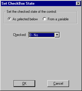
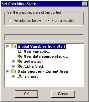
If you want to change the initial setting for the check box or assign the check box state to a variable, use the Check Box State dialog box. For more information, see Set Check Box State Dialog Box.

If you want to change the size or location of the check box, use the Bottom Property, Left Property, Right Property, Top Property, or use a style sheet. For more information, see the Bottom Property, Left Property, Right Property, and Top Property. You can also move or resize the check box directly in the form.

If you want to change the color of the check box, use the BackColor Property to determine the background color, the ForeColor Property to determine the color of the text in the label, or use a style sheet. For more information, see the BackColorOver Property and the ForeColor Property.

If you want to change the label font, use a style sheet or use the Font Property. For more information, see the Font Property.

If you want to move the label to the other side of the check box, use the TextOnLeft Property. For more information, see the TextOnLeft Property.

If you want to make the check box inactive or make it invisible, use the Enabled Property to determine whether the check box is active or not. If the check box is inactive, it will be dimmed out and nothing will happen when the end user clicks it. You can also use the Visible Property to determine whether the check box is visible to the end user or use a style sheet. For more information, see the Enabled Property and the Visible Property.

If you want to change what the cursor looks like when it is on top of the check box, use the CursorPointer Property or use a style sheet. For more information, see the CursorPointer Property.

If you want to display a tooltip when the cursor is on the top of the check box, use the ToolTipText Property. For more information, see the ToolTipText Property.

If you want to assign a Help topic to the check box, use the Help Property. For more information, see Assigning Help to Your Forms and Controls.

If you want the end user to be able to tab to the check box, use the Tabstop Property. For more information, see the Tabstop Property.

If you want to move the check box to another layer, use the Layer Property. For more information, see Layering Controls.

If you want to control the display order of the check box when more than one control is overlaid, use the ZIndex Property. For more information, see the ZIndex Property.


WebFOCUS