Pie Chart Properties (pieProperties)

In this section:

These properties control the basic layout of pie charts.

The following code segment shows the default values for pie chart properties:

pieProperties: {
 
   holeSize: 0,
   rotation: 0,
   skew: 0,
   label: {
      visible: false,
      font: '10pt Sans-Serif',
      color: 'black'
   },
   totalLabel: {
      visible: false,
      font: '10pt Sans-Serif',
      color: 'black'
      numberFormat: 'auto'
   },
   feelerLine:  (deprecated, use dataLabels:feelerLine)
   otherSlice: {
      threshold: undefined, 
      legendLabel: 'Other',
      color: 'grey',
      border: {
         width: 1,
         color: 'transparent',
         dash: ''
      },
      showDataValues: true,
      marker: {  
         shape: 'square', 
         border: {
            width: 0,
            color: 'transparent',
            dash: ''
         }
      }
   },
   explodeClick: {
      enabled: false,
      duration: 700,
      distance: 25,
      limitExplodeCount: false
   }
}

Note: For additional properties that affect pie charts, see the following series-specific properties:


Top of page

x
Controlling Animation When a Pie Slice Is Clicked

How to:

The explodeClick properties enable or disable and define animation when a chart user clicks on a pie slice.


x
Syntax: How to Control Animation When a Pie Slice Is Clicked
pieProperties: {
   explodeClick: {
      enabled: boolean,
      duration: number,
      distance: number,
      limitExplodeCount: boolean   }
}

where;

enabled: boolean

Valid values are:

  • true, which enables the explode slice animation on mouse click.
  • false, which disables explode slice animation on mouse click. This is the default value.
duration: number

Specifies the duration of the animation in milliseconds (a value of 1000 equals one second). Smaller values mean quicker animation. Larger values mean slower animation. The default value is 700.

distance: number

Is the distance in pixels to explode the clicked slice from the pie. The default value is 25.

limitExplodeCount: boolean

Valid values are:

  • true, to limit the explode slice to a single exploded slice.
  • false, to allow multiple exploded slices. This is the default value.


Example: Controlling Animation When Clicking a Pie Slice

The following request enables the explodeClick property:

GRAPH FILE WF_RETAIL_LITE
SUM COGS_US 
ACROSS PRODUCT_CATEGORY
ON GRAPH PCHOLD FORMAT JSCHART
ON GRAPH SET LOOKGRAPH PIE
ON GRAPH SET STYLE *
*GRAPH_JS
   pieProperties: {
      explodeClick: {enabled: true}     
   }  
*END
INCLUDE=IBFS:/FILE/IBI_HTML_DIR/javaassist/intl/EN/ENIADefault_combine.sty,$
ENDSTYLE
END

On the output, two slices have been exploded by clicking them:

To return an exploded slice to its original position, click it again.


Top of page

x
Drawing a Ring Pie (Pie Chart With a Hole in the Middle)

How to:

The holeSize property defines the size of a transparent circle to draw in the center of a pie chart.

Note: You can also use the LOOKGRAPH parameter value PIERING to draw a pie chart with a hole in the center. For more information about LOOKGRAPH parameter settings, see Controlling the Chart Type.


x
Syntax: How to Control the Size of the Pie Hole
pieProperties: {
   holeSize: size   }

where:

holeSize: size

Valid values are:

  • A number that defines the size in pixels.
  • A string that includes a percent symbol (%), enclosed in single quotation marks ('), that defines the size as a percent of the pie radius (for example, '10%'). The default value is zero (0).


Example: Setting the Pie Chart Hole Size

The following request generates a pie chart with a 10-pixel hole in the center:

GRAPH FILE WF_RETAIL_LITE
SUM COGS_US 
ACROSS PRODUCT_CATEGORY
ON GRAPH PCHOLD FORMAT JSCHART
ON GRAPH SET LOOKGRAPH PIE
ON GRAPH SET STYLE *
*GRAPH_JS
pieProperties: {holeSize: 10}
*END
INCLUDE=IBFS:/FILE/IBI_HTML_DIR/javaassist/intl/EN/ENIADefault_combine.sty,$
ENDSTYLE
END

The output is:

Changing the hole size to ‘50%’ generates the following chart:


Top of page

x
Formatting the Pie Chart Label

How to:

The label property controls the visibility and format of the pie chart label.


x
Syntax: How to Format the Pie Chart Label
pieProperties: {
   label: {
      visible: boolean,
      font: 'string',
      color: 'string'
   }
}

where:

visible: boolean

Valid values are:

  • true, which makes the label visible. This is the default value.
  • false, which makes the label not visible.
font: 'string'

Is a string that defines the size, style, and typeface of the pie chart label. The default value is '10pt Sans-Serif'.

color: 'string'

Is a string that defines the color of the pie chart label, using a color name or numeric specification string. The default value is 'black'.

For information about specifying colors, see Colors and Gradients.


Example: Formatting the Pie Chart Label

The following request makes the pie label dark slate blue with a font that is 14 pt Sans-Serif and bold:

GRAPH FILE WF_RETAIL_LITE
SUM COGS_US 
ACROSS PRODUCT_CATEGORY
ON GRAPH PCHOLD FORMAT JSCHART
ON GRAPH SET LOOKGRAPH PIE
ON GRAPH SET STYLE *
INCLUDE=IBFS:/FILE/IBI_HTML_DIR/javaassist/intl/EN/ENIADefault_combine.sty,$
*GRAPH_JS
legend: {visible: false},
pieProperties: {
   label: {
      visible: true,
      font: 'Bold 14pt Sans-Serif',
      color: 'DarkSlateBlue'}    
   }
*END
ENDSTYLE
END

The output is:


Top of page

x
Generating a Multi-Ring Pie Chart

How to:

The multiRing property enables or disables a multi-ring pie chart. A multi-ring pie chart is analogous to a stacked bar chart. Each slice in the pie is divided into different colored concentric rings. This sub-chart type uses the same data as a normal pie chart.


x
Syntax: How to Generate a Multi-Ring Pie Chart
pieProperties: {
   multiRing: boolean   }

where:

multiRing: boolean

Valid values are:

  • true, which always draws one pie chart with multiple rings in each slice.
  • false, which draws a traditional pie chart. False is the default value.


Example: Generating a Multi-Ring Pie Chart

The following request generates a multi-ring pie chart:

GRAPH FILE WF_RETAIL_LITE
SUM COGS_US 
ACROSS PRODUCT_CATEGORY
ON GRAPH PCHOLD FORMAT JSCHART
ON GRAPH SET LOOKGRAPH PIE
ON GRAPH SET STYLE *
INCLUDE=IBFS:/FILE/IBI_HTML_DIR/javaassist/intl/EN/ENIADefault_combine.sty,$
*GRAPH_JS
pieProperties: {multiRing: true},
series: [
   {series: 'all', border: {width: 1, color: 'grey'}},
   {series: 0,color: 'red'},
   {series: 1,color: 'lightgreen'},
   {series: 2,color: 'beige'},
   {series: 3,color: 'blue'},
   {series: 4,color: 'orange'},
   {series: 5,color: 'yellow'},
   {series: 6,color: 'purple'}
]
*END
ENDSTYLE
END

The output is:


Top of page

x
Merging Pie Slices Below a Specified Value

How to:

The otherSlice property controls the visibility and format of pie slices that are below a specified value. Once you define an otherSlice value, any slices that fall into that category are merged into one slice.

In addition, you can define an interaction property that drills down into the other slice when clicked. For more information, see Special Topics.


x
Syntax: How to Format Pie Slices Below a Specified Value
pieProperties: {
   otherSlice: {
      threshold: value, 
      legendLabel: 'string',
      color: color,
      border: {width: number, color: 'string',dash: 'string'}
      showDataValues: boolean,
      marker: {  
         shape: 'string', 
         border: {width: number, color: 'string',dash: 'string'}
      }
   }
}

where:

threshold: value

Defines the value below which the data is merged into the other slice category. Valid values are:

  • A number (absolute data value). If threshold is a number, any values below this threshold number are combined into the other slice.
  • A percent string, enclosed in single quotation marks (') that includes a percent symbol. If threshold is a percent string (for example, '2%'), any slice whose overall contribution to the pie is less than this value is merged into the other slice.
  • A 'top n' string (for example 'top 2'), where n defines the number of values that will not be merged into the other slice category.
  • undefined, which means the other slice is disabled. This is the default value.
legendLabel: 'string'

Is a string identifying the label to show in the legend for the other slice. The default value is 'Other'.

color: color

Defines a color for the other slice. Valid values are:

  • A JSON object that defines a color gradient.
  • A color string that specifies a gradient string or a color name or numeric specification. The default value is 'grey'.

For information about specifying colors and gradients, see Colors and Gradients.

border:

Defines the properties of the other slice border.

width: number

Is the width of the other slice border in pixels. The default value is 1.

color: 'string'

Is a color defined by a name or numeric specification string that controls the color of the other slice border. The default value is 'transparent'.

dash: 'string'

Is a string that defines the other slice border dash style. The default value is '', which produces a solid line. Use a string of numbers that defines the width of a dash followed by the width of the gap between dashes (for example, dash: '1 1' draws a dotted line).

showDataValues: boolean

Valid values are:

  • true, which shows the data text label for the other slice.
  • false, which does not show the data text label for the other slice. This is the default value.
marker:

Defines the properties of the marker to show in the legend are for the other slice.

shape: ‘string

Is a string that defines the shape of the marker to show in the legend area for the other slice. Supported shapes are arrow, bar, circle, cross, diamond, fiveStar, hexagon, hourglass, house, pin, pirateCross, plus, rectangle, sixStar, square, thinPlus, tick, circlePlus, circleMinus, or triangle. The default value is 'square'. Note that bar, cross, circlePlus, circleMinus, and tick markers require a border width and color.

border:

Defines the properties of the marker border.

width: number

Is the width of the marker border in pixels. The default value is 1.

color: 'string'

Is a color defined by a name or numeric specification string that controls the color of the marker border. The default value is 'transparent'.

dash: 'string'

Is a string that defines the marker border dash style. The default value is '', which produces a solid line. Use a string of numbers that defines the width of a dash followed by the width of the gap between dashes (for example, dash: '1 1' draws a dotted line).


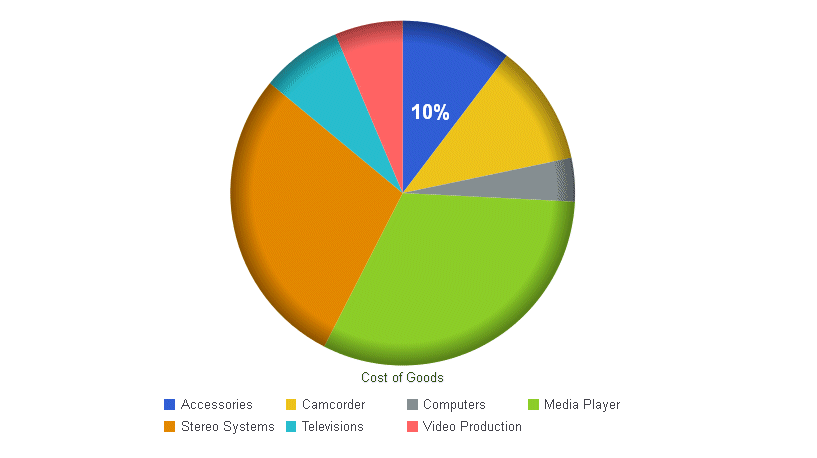
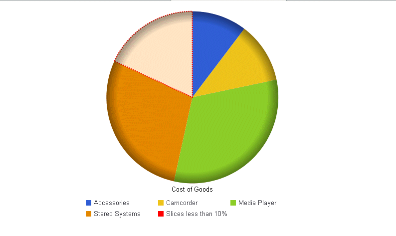
Example: Generating a Pie Chart Other Slice

The following request merges all slices with a value less than 10% into the other slice. The other slice has the label Slices less than 10% in the legend. Its color is bisque and its border is a red dash. Its marker shape in the legend is a red square:

GRAPH FILE WF_RETAIL_LITE
SUM COGS_US 
ACROSS PRODUCT_CATEGORY
ON GRAPH PCHOLD FORMAT JSCHART
ON GRAPH SET LOOKGRAPH PIE
ON GRAPH SET STYLE *
INCLUDE=IBFS:/FILE/IBI_HTML_DIR/javaassist/intl/EN/ENIADefault_combine.sty,$
*GRAPH_JS
pieProperties: {totalLabel: {visible: false},
   otherSlice: {threshold: '10%', legendLabel: 'Slices less than 10%',
      color: 'bisque',
      border: {width: 2,color: 'red',dash: '2 2'},
      marker: {shape: 'square', 
      width: 1,color: 'red'}          
      }
   },
*END
ENDSTYLE
END

The output is:

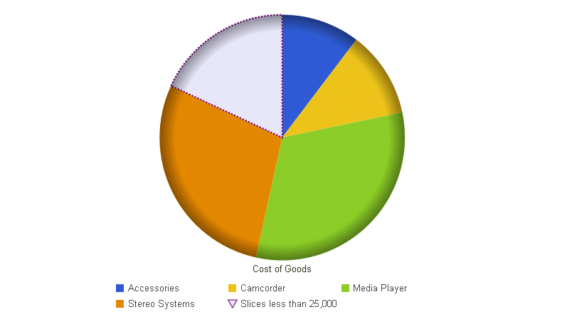
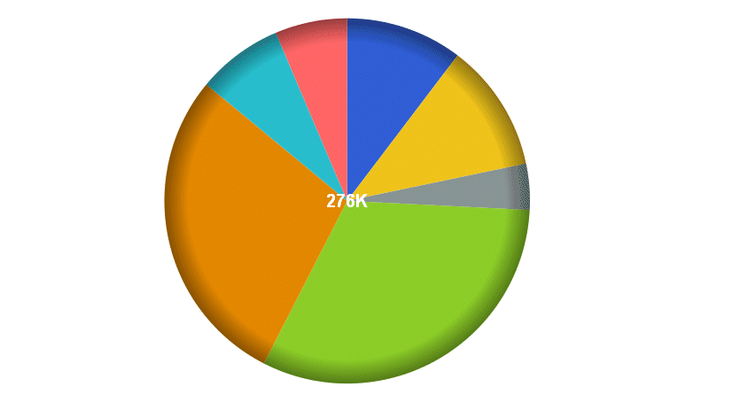
In the following request, the other slice contains all values less than 25,000. It is lavender with a purple dashed border, and the marker for the other slice in the legend is a lavender triangle with a purple border. The legend text is Slices less than 25,000.

GRAPH FILE WF_RETAIL_LITE
SUM COGS_US 
ACROSS PRODUCT_CATEGORY
ON GRAPH PCHOLD FORMAT JSCHART
ON GRAPH SET LOOKGRAPH PIE
ON GRAPH SET STYLE *
INCLUDE=IBFS:/FILE/IBI_HTML_DIR/javaassist/intl/EN/ENIADefault_combine.sty,$
*GRAPH_JS
pieProperties: {totalLabel: {visible: false},
  otherSlice: {threshold: 25000, legendLabel: 'Slices less than 25,000',
     color: 'lavender',
      border: {width: 2,color: 'purple',dash: '2 2'},
      marker: {shape: 'triangle', 
      border: {width: 1,color: 'purple'}}    
      }
   },
*END
ENDSTYLE
END

The output is:


Top of page

x
Rotating a Pie Chart

How to:

The rotation property rotates a pie chart a specified number of degrees.


x
Syntax: How to Rotate a Pie Chart
pieProperties: {
   rotation: number   }

where:

rotation: number

is the number of degrees, from 0 to 359, to rotate the pie chart. The default value is zero (0).


Example: Rotating A Pie Chart

The following request generates an unrotated pie chart ({rotation:0}) in which series 0 has a data label:

GRAPH FILE WF_RETAIL_LITE
SUM COGS_US 
ACROSS PRODUCT_CATEGORY
ON GRAPH PCHOLD FORMAT JSCHART
ON GRAPH SET LOOKGRAPH PIE
ON GRAPH SET STYLE *
INCLUDE=IBFS:/FILE/IBI_HTML_DIR/javaassist/intl/EN/ENIADefault_combine.sty,$
*GRAPH_JS
pieProperties: {rotation:0},
series: [
  {series:0, showDataValues: true}
], 
dataLabels: {visible: true, color:'white', font: 'Bold 14pt Sans-Serif'}
*END
ENDSTYLE
END

On the output, series 0 starts at the zero degrees point in the pie (12 o’clock position):

Changing the rotation value to 90 generates the following chart, in which series 0 starts at the 90 degree point on the pie (3 o’clock position):


Top of page

x
Skewing a Pie Chart

How to:

When depth is applied to a pie chart, the skew property controls the tile of the pie chart. For information about applying depth, see Applying Depth to Charts.


x
Syntax: How to Skew a Pie Chart
pieProperties: {
   skew: number   }

where:

skew: number

Is a number between 0 and 100. The default value is zero (0).


Example: Skewing a Pie Chart

The following request generates an unskewed pie chart ({skew:0}) with a depth of 25:

GRAPH FILE WF_RETAIL_LITE
SUM COGS_US 
ACROSS PRODUCT_CATEGORY
ON GRAPH PCHOLD FORMAT JSCHART
ON GRAPH SET LOOKGRAPH PIE
ON GRAPH SET STYLE *
INCLUDE=IBFS:/FILE/IBI_HTML_DIR/javaassist/intl/EN/ENIADefault_combine.sty,$
*GRAPH_JS
depth: 25,
pieProperties: {holeSize: 20, skew: 0}
*END
ENDSTYLE
END

The output is:

Changing the skew value to 25 generates the following chart:


Top of page

x
Formatting the Total Label in a Pie Chart

How to:

The totalLabel property controls the visibility and format of the total label in a pie chart (the total value displayed in the center of the chart).


x
Syntax: How to Format the Total Label in a Pie Chart
pieProperties: {
   totalLabel: {
      visible: boolean,
      font: 'string',
      color: 'string',
      numberFormat: numformat   }
}

where:

visible: boolean

Valid values are:

  • true, which makes the label visible.
  • false, which makes the label not visible. This is the default value.
  • 'auto', which makes the total label visible if there is a hole in the pie chart and it can fit the total label (the font size will be scaled, if possible).
font: 'string'

Is a string that defines the size, style, and, typeface of the label. The default value is '10pt Sans-Serif'.

color: 'string'

Is a string that defines the color of the label, using a color name or numeric specification string. The default value is 'black'.

For information about specifying colors, see Colors and Gradients.

numberFormat: format

Can be specified as a JSON object, a format string, or a user-defined function. The default value is 'auto'. You can also use autoNumberFormats to apply a number format to all pie total labels. For information about number formats, see Formatting Numbers.


Example: Formatting a Pie Chart Total Label

The following request generates a pie chart with a total label that is white, in a font that is bold 14pt Sans-Serif:

GRAPH FILE WF_RETAIL_LITE
SUM COGS_US 
ACROSS PRODUCT_CATEGORY
ON GRAPH PCHOLD FORMAT JSCHART
ON GRAPH SET LOOKGRAPH PIE
ON GRAPH SET STYLE *
INCLUDE=IBFS:/FILE/IBI_HTML_DIR/javaassist/intl/EN/ENIADefault_combine.sty,$
*GRAPH_JS
legend: {visible:false},
pieProperties: {
 label: {visible: false},  
 totalLabel: {visible: true,font: 'Bold 14pt Sans-Serif',color: 'white'} 
   }     
*END
ENDSTYLE
END

The output is:


WebFOCUS