How to: |
The dataLabels properties control the visibility and format of data text labels for all series. First they have to be enabled for all series.
You can also use series-specific properties to enable or disable data text labels for individual series.
When dataLabels: position is set to 'outside', the feelerLine property controls the appearance of feeler lines between a pie chart and its data text labels. The data labels must also be enabled for each individual series by setting the property showDataValues: true for each series.
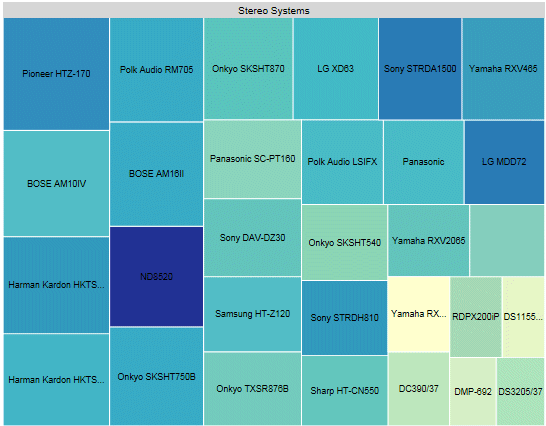
If a data label in a treemap does not fit into its rectangle, it will be truncated and appended with an ellipsis (...), as in the following image.
dataLabels: {
       visible: boolean,
       displayMode: 'string',
       position: 'string',
       font: 'string',
       color: 'string',
       useNegativeColor:boolean,
       negativeColor: 'string'
       numberFormat: numformat,
       formatCallback: function(),
 feelerLine: {
      visible: boolean,
      width: number,
      color: 'string',
      dash: 'string'
   }
}
where:
Can be:
Before data labels can be made visible, the ShowDataValues property has to be set to true. For most types of charts, showDataValues can be set for all series by specifying the following:
series: [{series:'all', ShowDataValues:true}]However, for pie charts, you must set showDataValues to true for each individual series.
Controls the data text to show. Valid values are 'x', 'y', 'z', '%', '%+', 'cumulative', 'groupLabel', or 'seriesLabel'. The default value is 'x'.
For % mode in pie charts, you must set the numberFormat property to display the value as a percentage (for example, numberFormat: '[>9]#,#%;[<0]-#.#%;[<=9]#.##%;[=0]0'). For information on formatting numbers, see Formatting Numbers.
Is a string that defines the position of data labels relative to the risers. Valid values are 'bottom', 'center', 'insideBottom', 'insideTop', 'left', 'outside', 'right', 'top', 'auto'. The default value is 'top'.
Note: Position On top edge is not supported in JSCHART format.
Is a string that defines the size, style, and typeface of the data text labels. The default value is font: '7.5pt Sans-Serif'.
Is a string that defines the color by name, numeric specification string, or gradient definition string, of the data text labels. The default value is 'black'.
Controls whether to use a different color for data text labels for negative risers. Can be:
Is a string that defines the color for data text labels for negative risers by name, numeric specification string, or gradient definition string, of the data text labels. The default value is 'red'.
Is the number format for the data labels. The number format can be specified as a JSON object, a format string, or a user-defined function. The default value is 'auto'. You can also use autoNumberFormats to apply a number format to all data text labels. For information on number formats, see Formatting Numbers.
Identifies a function to call for each data label. The default value is undefined. This function can use up to four arguments (data value, series ID, group ID, and data object) and should return a string to be displayed.
Defines the properties of the feeler lines.
Valid values are:
Is a number of pixels that defines the width of the feeler lines. The default value is 1.
Is a string that defines the color of the feeler lines, using a color name or numeric specification string. The default value is 'black'.
For information about specifying colors, see Colors and Gradients.
Is a string that defines the dash style. The default value is '', which produces a solid line. Use a string of numbers that defines the width of a dash followed by the width of the gap between dashes (for example, dash: '1 1' draws a dotted line).
function myCallback(dataValue, seriesID, groupID, data);
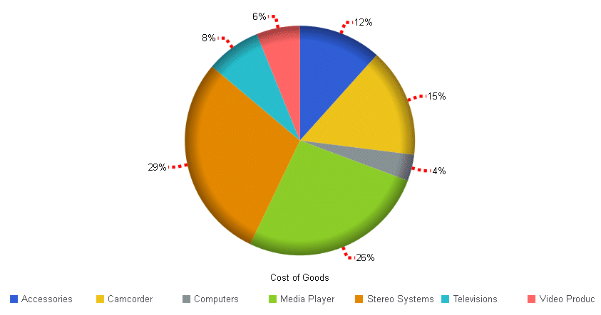
The following request makes the feeler lines red and dashed, with a width of 4. In order to generate feeler lines, the data labels are placed outside the pie chart. In order to make data labels visible, they first must be enabled for each individual series:
GRAPH FILE WF_RETAIL_LITE
SUM COGS_US
ACROSS PRODUCT_CATEGORY
ON GRAPH PCHOLD FORMAT JSCHART
ON GRAPH SET LOOKGRAPH PIE
ON GRAPH SET STYLE *
INCLUDE=IBFS:/FILE/IBI_HTML_DIR/javaassist/intl/EN/ENIADefault_combine.sty,$
*GRAPH_JS
series: [
    {series: 0, showDataValues: true},
    {series: 1, showDataValues: true},
    {series: 2, showDataValues: true},
    {series: 3, showDataValues: true},
    {series: 4, showDataValues: true},
    {series: 5, showDataValues: true},
    {series: 6, showDataValues: true}
],
dataLabels: {position: 'outside', visible: true,
  feelerLine: {visible: true, width: 4, color: 'red',dash: '4 4'}},
*END
ENDSTYLE
END
The output is:
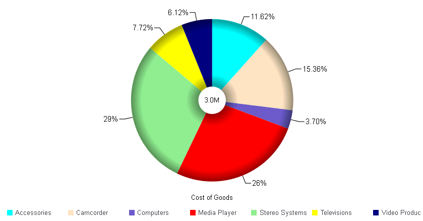
The following request generates a pie chart. The data labels are made visible, are displayed in percent mode in 10pt Sans-Serif font, are positioned outside of the slices, and are formatted differently depending on the data value. In addition, each series has the showDataValues property set to true:
GRAPH FILE WF_RETAIL_LITE
SUM COGS_US
ACROSS PRODUCT_CATEGORY
ON GRAPH PCHOLD FORMAT JSCHART
ON GRAPH SET LOOKGRAPH PIE
ON GRAPH SET STYLE *
INCLUDE=IBFS:/FILE/IBI_HTML_DIR/javaassist/intl/EN/ENIADefault_combine.sty,$
*GRAPH_JS
 pieProperties: {totalLabel: {visible: true},holeSize:25},
dataLabels: {visible:true,
     displayMode: '%',
     position: 'outside',
     font: '10pt Sans-Serif',
     numberFormat: '[>.2]#,#%;[<0]-#.#%;[<=.2]#.##%;[=0]0'
     },
series: [
   {series: 0, color: 'cyan', showDataValues:true},
   {series: 1, color: 'bisque', showDataValues:true},
   {series: 2, color: 'slateblue', showDataValues:true},
   {series: 3, color: 'red', showDataValues:true},
   {series: 4, color: 'lightgreen', showDataValues:true},
   {series: 5, color: 'yellow', showDataValues:true},
   {series: 6, color: 'navy', showDataValues:true},
   {series: 7, color: 'lavender', showDataValues:true},
   {series: 8, color: 'limegreen', showDataValues:true}
]
*END
ENDSTYLE
END
On the chart output, the data labels are outside of the pie with feeler lines:
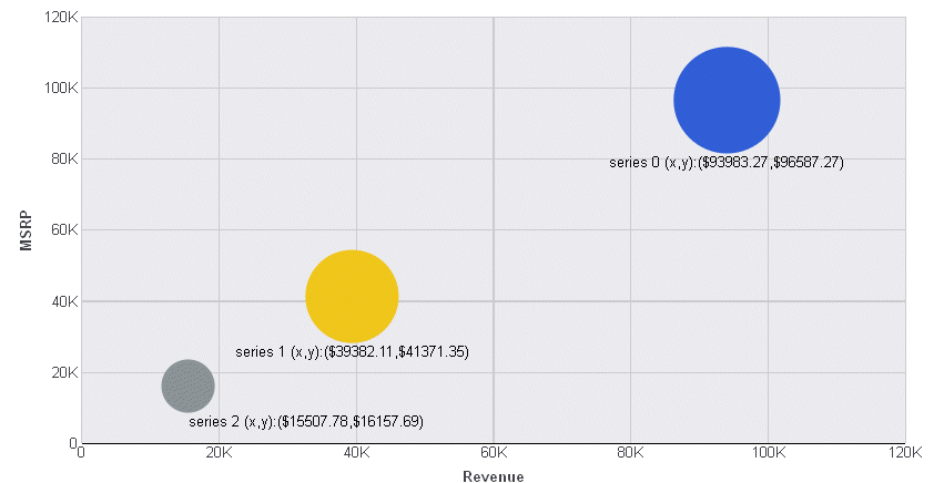
The following request enables data labels for all series, makes the data labels visible, places them below the bubbles, and uses a function to return the label. The function takes the data values and series number as arguments and returns a label that has the series number and x,y values of the data, each prefixed with appropriate text:
GRAPH FILE WF_RETAIL_LITE
SUM  REVENUE_US MSRP_US DISCOUNT_US
BY PRODUCT_SUBCATEG
WHERE PRODUCT_SUBCATEG EQ 'iPod Docking Station' OR 'Blu Ray' OR 'Speaker Kits'
ON GRAPH PCHOLD FORMAT JSCHART
ON GRAPH SET LOOKGRAPH BUBBLE
ON GRAPH SET STYLE *
INCLUDE=IBFS:/FILE/IBI_HTML_DIR/javaassist/intl/EN/ENIADefault_combine.sty,$
*GRAPH_JS
legend: {visible:false},
series: [{series:'all', showDataValues:true}],
dataLabels: {
  visible: true,
 position: 'bottom',
  formatCallback: function(d, s)
  {return 'series ' + s+' (x,y):' +'('+'$'+d.x+','+'$'+d.y+')';}
    }
*END
ENDSTYLE
END
The output is:
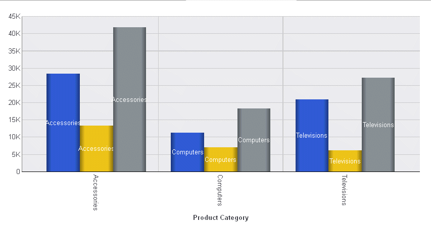
The following request uses the group labels as the data text and places them inside the risers:
GRAPH FILE WF_RETAIL_LITE
SUM COGS_US GROSS_PROFIT_US REVENUE_US
ACROSS PRODUCT_CATEGORY
WHERE PRODUCT_CATEGORY EQ 'Accessories' OR 'Computers' OR 'Televisions'
ON GRAPH PCHOLD FORMAT JSCHART
ON GRAPH SET LOOKGRAPH VBAR
ON GRAPH SET STYLE *
INCLUDE=IBFS:/FILE/IBI_HTML_DIR/javaassist/intl/EN/ENIADefault_combine.sty,$
*GRAPH_JS
legend: {visible:false},
series: [{series:'all', showDataValues:true}],
dataLabels: {
  visible: true,
  color:'white',
  position: 'inside',
  displayMode: 'groupLabel'
}
*END
ENDSTYLE
END
On the output, the group (sort field) label (product category) is used as the data label:
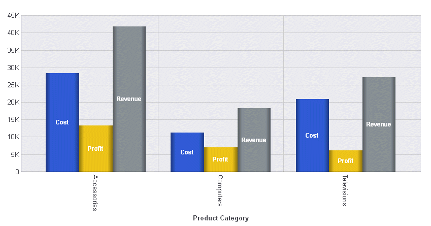
The following request uses the series labels as the data text. The series are generated from the display fields in the request. In this request, the default column headings are replaced with AS names:
GRAPH FILE WF_RETAIL_LITE
SUM COGS_US AS Cost
GROSS_PROFIT_US AS Profit
REVENUE_US AS Revenue
ACROSS PRODUCT_CATEGORY
WHERE PRODUCT_CATEGORY EQ 'Accessories' OR 'Computers' OR 'Televisions'
ON GRAPH PCHOLD FORMAT JSCHART
ON GRAPH SET LOOKGRAPH VBAR
ON GRAPH SET STYLE *
INCLUDE=IBFS:/FILE/IBI_HTML_DIR/javaassist/intl/EN/ENIADefault_combine.sty,$
*GRAPH_JS
legend: {visible:false},
series: [{series:'all', showDataValues:true}],
dataLabels: {
  visible: true,
  color:'white',
  font: 'Bold 8pt Sans-Serif',
  position: 'inside',
  displayMode: 'seriesLabel'
}
*END
ENDSTYLE
END
On the output, the series (display field) AS name is used as the data label:
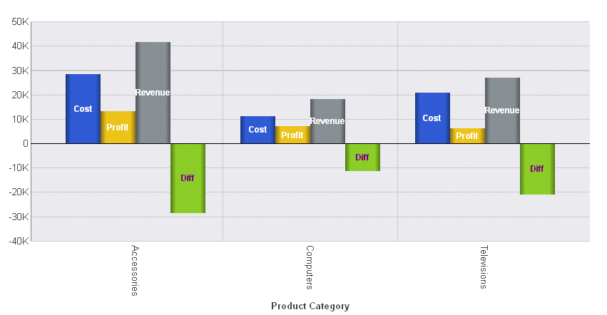
The following request uses the series labels as the data text and makes the data text for negative risers purple. The series are generated from the display fields in the request. In this request, the default column headings are replaced with AS names:
DEFINE FILE WF_RETAIL_LITE
DIFF =GROSS_PROFIT_US-REVENUE_US;
END
GRAPH FILE WF_RETAIL_LITE
SUM COGS_US AS Cost
GROSS_PROFIT_US AS Profit
REVENUE_US AS Revenue
DIFF AS Diff
ACROSS PRODUCT_CATEGORY
WHERE PRODUCT_CATEGORY EQ 'Accessories' OR 'Computers' OR 'Televisions'
ON GRAPH PCHOLD FORMAT JSCHART
ON GRAPH SET LOOKGRAPH VBAR
ON GRAPH SET STYLE *
INCLUDE=IBFS:/FILE/IBI_HTML_DIR/javaassist/intl/EN/ENIADefault_combine.sty,$
*GRAPH_JS
legend: {visible:false},
series: [{series:'all', showDataValues:true}],
dataLabels: {
  visible: true,
  color:'white',
  useNegativeColor:true,
 negativeColor: 'purple',
  font: 'Bold 8pt Sans-Serif',
  position: 'inside',
  displayMode: 'seriesLabel'
}
*END
ENDSTYLE
END
The output is:
| WebFOCUS |