In this section: |
You can add a variety of components to an HTML page using the command groups in the Components tab.
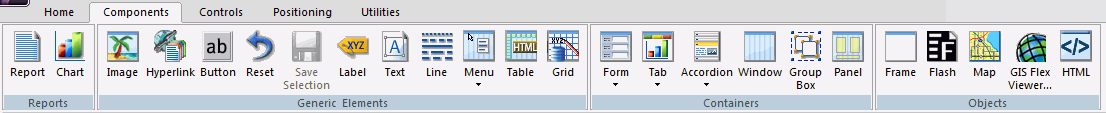
The Components tab contains the Reports, Generic Elements, Containers, and Objects groups, as shown in the following image.
When you click a command from a ribbon, the mouse pointer turns into a crosshair in order to let you draw the object in the HTML canvas. If you click a command in error, press the Esc key to return your mouse to a pointer.
How to: |
From the Reports group, you can add a Report or Chart to your HTML page. The Reports group is shown in the following image.

The commands in the Reports group are:
Inserts a report object. You can add reports to the HTML canvas that will display when you run the layout. You can either embed or reference reports. Double-clicking a blank report object opens the Report canvas where you can create and style a report to be used in the HTML page.
You can also include parameters in a report whose values can be assigned with controls that are added with the HTML canvas.
Inserts a chart object. You can add charts to the HTML canvas that will display when you run the layout. You can either embed or reference charts. Double-clicking on a blank chart object will open the Chart canvas where you can create and style a chart to be used in the HTML canvas.
Related Information:
The pointer changes into a crosshair.
A report or chart object is created in the layout and assigned the name report(n) or chart(n), where n is a number. The object will appear in gray and white to indicate that the placeholder does not have a report or chart associated with it. Once a report or chart is associated with the object, the object displays the contents of the report or chart if live or simulated data is active (live data is the default) or a colored placeholder if preview is off in the HTML Page tab, located in the App Studio Options dialog box.
or
The Open dialog box opens.
The Report canvas opens for reports and the Chart canvas opens for charts.
The pointer changes into a crosshair. Drag the crosshair to create a report or chart object and adjust it to the size you want.
A report or chart object is created in the layout and assigned the name report(n) or chart(n), where n is a number. The object will appear in gray and white to indicate that the placeholder does not have a report or chart associated with it. Once a report or chart is associated with the object, the object displays the contents of the report or chart if live or simulated data is active (live data is the default) or a colored placeholder if preview is off in the HTML Page tab, located in the App Studio Options dialog box.
The Open dialog box opens.
The report or chart object appears in the Design view of the HTML canvas.
In this section: How to: |
You can add a variety of basic elements. The Generic Elements group is shown in the following image.
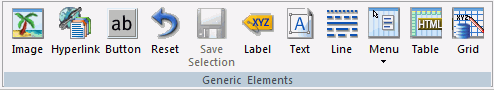
The commands in the Generic Elements group are:
Inserts an image. You can add an image to the layout. This is useful for including graphics, such as a company logo.
You can insert an image into your report layout and add a hyperlink. After you run your report and click the image, you can launch a URL or run a report the same way by clicking a hyperlink or push button.
Note: When inserting images, images must be referenced from a specific directory location.
Inserts a hyperlink.
Inserts a button. A push button enables you to execute a report or link to a URL or HTML file. This behavior is similar to a hyperlink.
Inserts a reset button. A reset button enables you to revert the entire page back to its initial settings.
Inserts a save selection button. This component is available only when you are using Managed Reporting.
Inserts a label. A label is simply a piece of text. The label component enables you to create and name a label, and link it to a control by assigning the label HTML for property the same value as the Unique Identifier property for the control.
Inserts a text box. You can add text to the layout. This is useful for including headings for your webpage, or adding directions or explanation for your report or chart.
Inserts a line. You can add a horizontal or vertical line to the layout. This is useful for distinguishing between sections of your launch or display page.
Inserts a menu. You can add a horizontal or vertical menu to the layout. This component can be used with Maintain code.
Inserts a table. You can add a horizontal or vertical line to the layout. This component can be used with Maintain code.
Inserts a grid.
Related Information:
You can use the Font dialog box to style your text. The options are:
Determines the type of font used. For example, Ariel, Garamond, Times New Roman. The fonts available for you to use are determined by what fonts are installed on the current machine.
Determines whether the text is normal, bold, italic, or bold and italic.
Determines how large the text is.
Determines the color of the text.
Determines what effects, if any, are used for the text. You can select None, Underline, Strikethrough, Overline.
You may apply various formatting and style options to words and individual text characters within the text object.
Note: Any formatting and styling that you may have applied to individual text strings within the text object will remain unchanged. Changes made to the entire text object are only applied to part of the text string that has not been formatted.
The pointer changes to a crosshair.
A text object with the default text, Enter text, is created.
The Font dialog box opens.
Note: You can also access font formatting options in the Properties panel.
Note: The Bold, Italic, Underline, Superscript, and Font Style options are available when formatting individual words or text characters. The Style option and Alignment option are available when the entire text object is selected.
The formatting options that you selected applied to the text.
To insert a bulleted list or numbered list into a text object:
The pointer changes to a crosshair.
A text object with the default text, Enter text, is created.
Note:
To insert a nested list into the text object:
The pointer changes to a crosshair.
A text object with the default text, Enter text, is created.
A list is started within the current list, allowing you to enter text on that list level.
Note: Pressing Tab while your pointer is on the same line as a list item will move that item one level down, resulting in a nested list. The bullet or number type selected is the next list type in the right-click shortcut menu. For example, if you have a bulleted list that uses the disc bullet type, pressing Tab to move an item down one level will cause that nested list to have the circle bullet type.
You can continue to nest lists within other lists by using the same steps shown above.
Note: You cannot skip a list level. For example, in order to insert a nested bulleted list or nested numbered list on a lower level, there must be a list one level up from it.
In this section: How to: |
You can add specific containers that group objects together on an HTML page. The Containers group is shown in the following image.
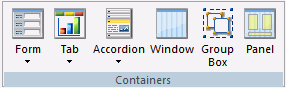
The commands in the Containers group are:
Inserts either a multi-layer or single-layer form.
Inserts a tab control. Tab controls enable you to create multiple pages in one HTML form and present a better display for viewing secondary information. You can select Top, Bottom, Left, or Right. This means you can choose to add a tab control that displays tabs at the top, bottom, left, or right on the control.
You can drag and resize this object, at run-time, if the Enable dragging and Enable resizing properties, in the Properties panel, are set to Yes.
When a tab control object is added to the layout, each tab control consists of:
A tab item is the tab label. You may edit the name of the tab item, style the tab item, and add multiple tab items. Each tab item is associated with a tab body.
A tab body is the tab page where you associate your components, such as report and graph objects, images, and lines.
The Tab control can be displayed as a full screen or part of an HTML page.
Inserts an Accordion styled box. You can drag and resize this object, at run-time, if the Enable dragging and Enable resizing properties, in the Properties panel, are set to Yes.
Inserts a window. You can drag and resize this object, at run-time, if the Enable dragging and Enable resizing properties, in the Properties panel, are set to Yes.
Inserts a group box. A group box can be used to create a border around a group of objects, for example, forms or reports and charts.
Inserts a panel to group objects together. The panel is invisible at runtime.
Related Information:
A tab is added to the tab control object.
The tab items are resized to the size of the widest tab item and they are evenly spaced.
You may resize the tab control to fit the full screen of your layout, making the tab control the full background of your window at run time. When set to full screen mode, scroll bars will not be applied to the output window. Therefore, you may have to adjust the tab control (and any items on the tab) in the layout to ensure that they appear appropriately for display at run time.
Note: It is recommended to set the tab control to full screen mode at the beginning of the development process. If there are existing components on the layout that are not part of the tab control, these components will become inaccessible if the tab control is changed to full screen mode.
The pointer changes into a crosshair.
The tab control displays as a full screen in the layout.
For more information on Autosize Children, see Using Autosize.
You can use a form object to create a pop-up dialog box.
As popup dialog causes the form to display as a pop-up dialog box. When the dialog box is displayed, you must click Close to return to your HTML page.
As popup window causes the form to display as a pop-up window. When the window is displayed, you can resize and move the window around your screen.
You can reorder tabs, accordions, and windows by dragging the page that you want to appear first onto the page that you want it to display before. For example, if you have 3 tabs, Tab1, Tab2, and Tab3, and you drag Tab3 onto Tab1, Tab3 will now display ahead of Tab1. The order of the tabs will then be Tab3, Tab1, Tab2. You can reorder windows when they are in tile view.
You can add objects other than reports, charts, elements, or containers to customize your HTML page. The Objects group is shown in the following image.
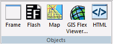
The commands in the Objects group are:
Inserts a frame. You can use a frame to embed additional web sources or run reports. You can also use a frame as the output location or target for a drill-down report. You can also use a frame to run a table of contents report, an OLAP report, a PDF report, an Excel® or a report.
Inserts a Flash component. You can add SWF files that are Adobe® Flash Player compatible to accompany reports or graphs on an HTML page.
Note:
Inserts a map. You can add a Google™, Bing®, or ESRI map to your HTML page. Maps are services offering powerful, user-friendly mapping technology that can be customized to show points on a map with drill-down capabilities. You can customize the map properties and bind them to a report or chart.
Inserts a GIS Flex Viewer. The GIS Flex Viewer contains numerous controls, a report, and a map object.
Inserts an HTML object. Developers can use the Settings panel to type a valid snippet of HTML code for the HTML object, such as HTML code to browse for a file.
| WebFOCUS |