In this section: |
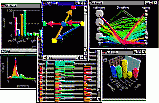
Charts provide common and novel graphical displays of data and ways of interacting with your data that provide even more insight. We call interacting with your active charts Visual Discovery AE.
In this section: |
|
Chart Overview
Charts are a collection of both familiar and novel ways of visualizing data that allow you to better understand your data and what it is trying to tell you.
1 field displays:
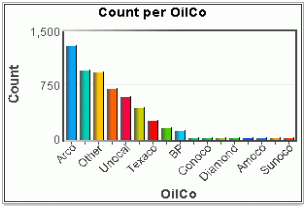
Bar Charts show the categories in a field and how other data is distributed across these categories. Use this to understand the common categories in a field.
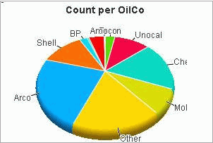
Each category in a field is a slice of the pie. It is harder to make exact comparisons of pie slices than bars in a bar chart. However, selected subsets of pies can be compared directly as percents of the whole (this capability is brought to bar charts by the spine mode).
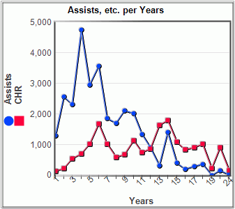
A sequence of categories, connected by a line. The line emphasizes the progression of data, so Line Charts are appropriate for data where adjacent items have a relationship (for example, time, location, etc.).
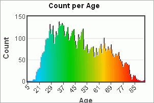
The number of occurrences of values of a numeric (continuous) field. This shows the distribution of the field, with smoothing to emphasize the overall shape of the curve.
2 field displays:
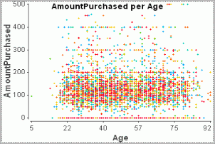
Show the occurrences of observations for 2 continuous fields. Look for patterns of relationship between the fields.
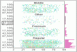
Plot the interaction of combinations of 2 categories. This can be viewed as a graphical 2D table. It may also be viewed as a categorical scatter plot.
A specialized view that shows events over time. It is a Scatter Plot with time on the x-axis, with additional capabilities for categorizing data points based on other fields and for distinguishing multiple overlapping events.
Show the nesting of one field within another. Lower level items can be sized or colored by data, forming a space filling display, a map.
Multiple field displays:
Display data fields in a grid. The grid may be collapsed into an array of bar charts to allow patterns between fields to be studied. The grid may be searched. A Data Sheet is often used to show details of data selected in other views. The Data Sheet shows unaggregated data.
The Parabox shows an array of field summaries. For continuous data, the field is summarized as a box plot. For categorical data, the data is summarized as a bubble plot. Lines may also be plotted over the display connecting the points for a single data row (observation). A Parabox also shows how a subset differs from the overall population, or how particular observations take values from multiple fields in the context of the overall population. It is also useful for studying outliers.
A Data Constellations shows related objects represented as a graph of nodes and links. It provides a graph viewer plus placement algorithms for layout of the graph. Data is provided in two tables: a table of nodes and a table of links between nodes.
Maps show data positioned over geography. The map may be an image or a set of polygons. A map provides all of the capabilities of the Data Constellations chart as well.
Summarize fields using common statistics: mean, standard deviation, mode, etc.

Summarize measures for categories in a field: sum, or average.
Controls:
Filter the data that is being analyzed by excluding rows containing a category in a field
|
Chart |
Common Use of Chart |
|---|---|
|
Bar Chart |
Examine one or more measures (such as sales and costs) over a grouping (such as region or quarter). |
|
Pie Chart |
View a grouping's proportions (such as the percentage of sales that each region a company contributes to the company total). |
|
Line Chart |
See trends of one or more measures, such as quarterly revenues and expenses. Successive observations should be related, since the line visually relates the points. If they are not related, use a bar chart instead. |
|
Histogram |
Examine the distribution of a metric (for example, the quantity of highly discounted transactions compared to low discounted transactions). |
|
Scatterplot |
How two measures relate (for example, which investments provide a favorable date of return at a low risk). |
|
Multiscape |
How two measures relate (for example, which investments provide a favorable date of return at a low risk). |
|
Heat Map |
See items in groups, with the space and coloring based on data metrics. This may help understand how groups perform versus each other, for example progress on fault reports grouped by type of fault. |
|
Data Sheet |
See the underlying raw data and for visually correlating across multiple measures (for example, does a discount increase as the transaction amount increases). |
|
Parabox |
See multiple metrics and/or multiple groupings relate (for example, how do the offensive statistics of the highest-paid player of a sports league compare to the lowest-paid players, and where within the league are these players). |
|
Data Constellations |
See relationships between items. A variety of relationships may be viewed:
|
|
Time Table |
See events over time at a granular level (for example, server alarms for network intrusion detection). Events may be grouped. |
|
Map |
See data displayed geographically (like airline flight numbers by city) and look for possible relationships between the geographical entities (like flight delays between cities). |
|
Counts |
Statistics on fields (like total sales for a selected area of interest) and the meta data (type and cardinality of a field, for example). |
A Bar Chart shows the relative number or weights of categorical values in a data field. It helps you understand how values of the field are distributed.
The following are the different bar chart features:
The aggregation option determines what the bar height represents. Bar height may be proportional to the number of items (rows) with that category value; this is the default. It may be proportional to the sum of another field (a weight field); it may be the average value of a weight field, or the ratio or 2 fields.
If the aggregation is the average of the weight for a category, error bars are drawn showing a standard deviation; this helps you understand the variability in the field. Color stacking (see Stacked below) is turned off in Average or Ratio mode.
Multiple weighting fields may be selected for the same category; these are shown as a group of bars for the category. All bars share the same Y scale
If clustered, the chart may be colored by the Y field names or by the table, and the color scale used to color may be chosen.
From the Property Cluster Color Scale.
If a bar chart shows a field from a data table colored by a different field, the colors for that field are shown stacked. This lets you see how values of another field map to values of the bar chart's field.
Color stacking can be disabled with the Stack Color property in the Property Explorer; bars with multiple colors are shown in the selected color. This can be useful for very large datasets, since color stacking can be a considerable expense.
From the Color By, Property Explorer (Stack Colors).
A Bar Chart may have its axis aligned vertically (the default) or horizontally. Vertical alignment is most common, but horizontal alignment provides a bit more space for labels. For example:

From the Toolbar Property Orient Horizontal.
A Bar Chart will scale so that all category bars are visible initially. If there is enough space, each bar is labeled. As the number of bars increases, the bars are packed together and the zoom bar at the bottom of the display may be used to zoom (magnify/de-magnify) or scroll the display.
If there are too many bars to even show every bar as a single pixel line, then a bar at the top of the window will indicate overplotting. You can also suppress the zoom bar.
From the Property Allow Magnify.
A goal line is a line in the display that shows a target level. There may be multiple goal lines in a display. Goal lines are set at a particular y-axis value. The goal line may be used to select all categories above or below the goal.
From the Toolbar Add GoalLine button.
In this mode the width of the bar is proportional to the weight of the category rather than the height. You can think of this mode as being a flattened pie chart. The value of this mode is when comparing selected subsets: the height of the selection can be compared as a percentage across categories. A pie chart can be used in the same way, but it may be easier to directly compare the selected region in a spine plot since the bar heights can be visually lined up (in a pie chart, they are around a circle):
From the Toolbar Property Spine Plot.
Bars may be shown full size (so that they are totally visible at a default size, but scrolling may be required), the may be fit to the window (so that all are visible and scrolling is not required, but overplotting may be necessary if space is inadequate to show all bars uniquely), or a one pixel line per bar (guaranteeing that all bars are visible, but scrolling may be required):
From the Property Line Mode.
You can choose how the bars for categories are ordered: in original order (the order they were encountered in the input file), by label, by size, or by percent selected. If bars are ordered by percent selected, doing a selection can change the bar order to change.
Typically order bar charts by size. Order by label if the categories have an intrinsic ordering that is important (for example, month of year. Original order is only useful if the input data is in an interesting order, which is rare.
Ordering may also be reversed by any of these criteria (for example, reverse by size, reverse by label, ...).
From the Toolbar Property Grid (Bar Order).
You can control which bars are labeled. If there is room to label all bars legibly, all will be labeled. If there is not sufficient room, then a variety of strategies may be used. A best fit may be done, where as many bar labels as will be visible are used. All bars may be labeled, no bars, or selected bars, or chosen bars (use context menu while over item; NOT SUPPORTED IN WORKBENCH):
From the Property Grid (Label Mode)
Bars may be labeled with their y-axis measure weight. Labels are never overplotted, so a set of labels that do not overlap will be chosen. In the Property Explorer, you can choose the measure to use for the label (“Bar Label Measure”), the font for the label (“Bar Label Font”), and specify whether large numeric values should be shortened (Bar Label Abbreviated?”). Options for the “Bar Label Measure” are “Percent of Total”, “Selected Weight”, “Total Weight”, and “No Label”. In the toolbar tray for the chart, you can also turn labeling on or off with a button. This turns the weight set by “Bar Label Measure”. If none is set, then the Selected Weight is used.
You can control how much of your category labels are visible. By default, the chart tries to balance the amount of screen space devoted to the data graphics and to labels. This may cause long labels to be cut off. You can adjust this size by moving the mouse of the x-axis until it changes to a double bar. Then left-click drag the axis to the location you want.
Changing to vertical orientation may also provide more label space.
You may also request that labels be shown fully; this is only available from scripting (NOT CURRENTLY AVAILABLE).
The coordinates of the mouse are constantly shown on the x and y-axis. Move the mouse over the chart to see this.
You focus on an item by pointing at it for a moment; the current item is labeled. (Depressing the Shift key causes immediate focus without the delay.) Since a Bar Chart is aggregated, focus from the Bar Chart has no effect on other views; focus on a primitive item in another view (for example, a Data Sheet) will label that item in the Bar Chart.
You can customize the focus information by changing a format string with the FocusFormat property. Clearing this string suppresses focus labeling.
From the Property Grid (Focus Format String)
This option automatically selects each category sequentially. If you have multiple views, this will show you how each category appears in other views.
From the Animate Toolbar.
Data may contain missing values: a special value indicating that there is no data. This can be important for some types of data: for example in a survey, you want to treat questions that weren't answered differently from questions that were answered. Missing values are recognized and ignored, by default. You may ask for missing values to be included, however; this will add another category to the bar chart for all table rows with a missing value.
You may also change the string that is used to label missing values; this string is used by all views, not just the current view:
From the Property Grid (Show Missing Values), Tables view in the in Project Explorer.
When a Bar Chart is showing the categories in a field from a table that is selection-linked to another table, the name of the other table can be entered in the Unmatched from Linked Table property. This can cause an additional bar to be displayed, with a label as specified in the Unmatched Bar Label property, whose length represents the number of rows in the other table that are not linked to any rows in this table.
From the Property Explorer (Unmatched from Linked Table, Unmatched Bar Label).
From the Toolbar Property Explorer (Axis Font, Display Title, Label Font, Title, Title Font, x-xis Font, y-axis Font)
Unselected bars may be omitted. This is especially useful for focusing on selected data if there are a large number of bars.
From the Toolbar Property Explorer (Show Unselected)
Positive aggregated values are shown by positive bars (above the axis), and negative values by negative bars (below the axis). Categories that have weights that are combinations of negative and positive values can be shown in two ways: net or pooled. In net display, the positive and negative amounts are summed and a single bar displayed. In pooled mode, negative and positive values are separately aggregated and shown as two opposing bars. Pooled mode can reveal the negative and positive components of a total that are otherwise hidden by the net. In pooled mode, a line on the bar indicates the net value.
From the Property Explorer (Display Net Values).
The Bar Chart can be used to examine categories in a field (such as region or quarter), showing the distribution of count or one or more measures (such as sales and costs). As part of a collection of charts on a page, this can be used for filtering, correlation, and trending across subpopulations.
Inserting a New Bar Chart
 or in the Page menu, select
Insert Chart, New Bar Chart.
or in the Page menu, select
Insert Chart, New Bar Chart. to display the Data Configuration
window. If more than one table was loaded using the WebFOCUS Visual
Discovery AE Data Wizard, use the drop-down list to select the applicable
table. If a single table was loaded, it is the default.
to display the Data Configuration
window. If more than one table was loaded using the WebFOCUS Visual
Discovery AE Data Wizard, use the drop-down list to select the applicable
table. If a single table was loaded, it is the default.Optionally, to display the line chart horizontally, place a checkmark in the Display Horizontally check box.
The Bar Chart toolbar is located at the bottom of the chart. If it is not displayed, click the in the chart. The toolbar contains the following functions:
|
Toolbar button |
Description |
|---|---|
|
|
Data Configuration. Displays the Data Configuration window.
|
|
|
Rotate Chart. The Rotate Chart function switches the data displayed along the x-axis and y-axis so that data currently displayed on the x-axis will appear on the y-axis and data currently displayed on the y-axis will display on the x-axis. This function is available for bar charts, histograms, and line charts. |
|
|
Set Display Order. Click this button to display the following display options:
|
|
|
Insert as a Spine Plot. A spine plot more easily compares selected subsets of data. In a spine plot, the width of the bar is proportional to the weight of category rather than the height. You can think of this mode as a flattened pie chart. |
|
|
Display Unselected Values. You can choose whether or not to display unselected data during analysis. By default, unselected data is displayed. By selecting this button, unselected data is excluded automatically for each selection. |
|
|
Edit Chart Values. Use this function to change the content and font style of labels displayed in an active view. In this dialog box, you can:
Click OK to save your changes and close the dialog box. |
|
|
Drill Down. Moving from summary to more detailed-level data is known as drilling down. Drilling down into the data, is essential to accessing valuable information from the data that you are analyzing. Conversely, moving from detailed-level to summary-level data is referred to as drilling up. It is useful when you want an overall, big picture understanding of the information. By drilling up or down, you can use data at the appropriate level of detail in order to make correlations and draw conclusions. By configuring data hierarchies you can set up drill up / drill down in a Bar Chart, Line Chart or Pie Chart . By setting up a data hierarchy, configuring bar chart(s), line chart(s) and pie chart(s), and pointing to a hierarchy by name, data in certain charts can be drilled up or drilled down. To Drill Down Into Data
Note: If you drill to the lowest level of your data, the Drill down button is dimmed, indicating that you cannot drill down any further. |
|
|
Drill Up. Moving from detailed-level to summary-level data is referred to as drilling up. It is useful when you want an overall, big picture understanding of the information. Conversely, moving from summary to more detailed-level data is known as drilling down. Drilling down into the data, is essential to accessing valuable information from the data that you are analyzing. By drilling up or down, you can use data at the appropriate level of detail in order to make correlations and draw conclusions. By configuring data hierarchies you can set up drill up / drill down in a Bar Chart, Line Chart, or Pie Chart. By setting up a data hierarchy, configuring bar chart(s), line chart(s) and pie chart(s), and pointing to a hierarchy by name, data in certain charts can be drilled up or drilled down. To Drill Up Into Data
Note: If you drill to the highest level of your data, the Drill Up button is dimmed, indicating that you cannot drill up any further. |
|
|
View Chart Help. Displays the Help View for the chart. |
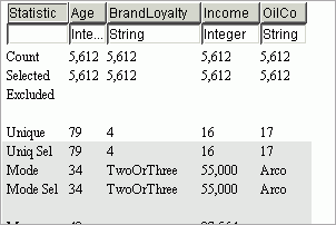
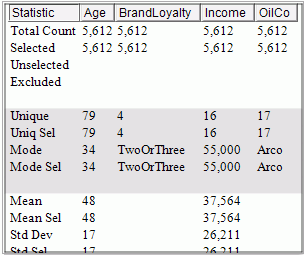
A Counts shows the details of data in a table as a data grid. It gives you numeric summaries of your data, both overall and selected. Click on a feature below to learn more about it:
A Counts view is built from a Data Sheet, so it has all of the behaviors defined for Data Sheets.
The top rows give the total number of rows in the data table, and the number of selected and excluded rows. Since all fields are in the same table, these numbers will be the same for each field.
Categorical fields are described by the number of unique values (total and selected) and the mode (most common value), total and selected.
Standard descriptive statistics are available: mean, standard deviation, min, max, and sum, for both the complete population and the currently selected subset.
You can filter the display to exclude (or include) types of information: simple statistics only, selected subset only.
From: Basic View, Selected Only properties in the Property Explorer.
By default, no Zoombar is displayed, but it can be useful when Basic View and Selected Only are false, so it is available on request.
From: Show Zoombar property in the Property Explorer.
Grid Specification
The layout, labels, and statistics included in a Counts chart can be customized. This is done through the Grid Specification property in the Properties pane for the chart (accessed using the Property Explorer button in the chart toolbar).
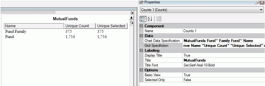
The Grid Specification property gives a definition of the chart layout. Here is a possible example:
row Name Unique Count Unique Selected row Fund~ Family 1.Unique 1.UniqueSelected row Fund 2.Rows 2.Selected
In this example there are 3 rows, including a header row of 3 column labels, and in subsequent rows the first column is a descriptive string, followed by 2 statistic specifications. The string row in the specification identifies the beginning of a new row in the displayed chart; items after that define the contents of successive columns in the chart. The first row is always displayed as a heading. Items are separated by spaces, but to include spaces in a label string, quote the string (for example, a name with spaces) or prefix each space with a ~ (for example, a~ name~ with~ spaces).
Statistics are specified like this:
[1-9].[StatisticName]
The initial number is the index of a field in the Chart Data Specification property, shown directly above the Grid Specification value. The StatisticName tells which of the statistics should be calculated. Valid choices are:
StatisticsName | Meaning | Applies to Type |
|---|---|---|
Rows | Total count of rows in the table, regardless of selection state | Any |
Selected | Count of selected rows | Any |
Unselected | Count of unselected rows | Any |
Excluded | Count of excluded (or filtered) rows | Any |
Unique | Count of distinct non-null values in non-excluded rows of the specified field | Any |
UniqueSelected | Count of distinct non-null values in selected rows of the specified field | Any |
Mode | Most common value in selected rows of the specified field | String |
ModeSelected | Most common value in selected rows of the specified field | String |
Mean | Average value of non-excluded rows of the specified field | Numeric |
MeanSelected | Average value of selected rows of the specified field | Numeric |
StdDev | Standard deviation of non-excluded rows of the specified field | Numeric |
StdDevSelected | Standard deviation of selected rows of the specified field | Numeric |
Min | Minimum value of non-excluded rows of the specified field | Numeric |
MinSelected | Minimum value of selected rows of the specified field | Numeric |
Max | Maximum value of non-excluded rows of the specified field | Numeric |
MaxSelected | Maximum value of selected rows of the specified field | Numeric |
Sum | Sum of values of non-excluded rows of the specified field | Numeric |
SumSelected | Sum of values of selected rows of the specified field | Numeric |
Statistic names must be Capitalized as shown above.
Notice that data can come from up to 9 fields in a single table, and may be laid out in any way you wish: you do not need to put multiple statistics from the same field in a single row or column, and you do not need to lay out the table in the column per field layout that is used by the Counts view by default.
If no Grid Specification is given, then each field is displayed in a column and the statistics displayed are governed by the Basic View and Selected Only property settings.
The Counts chart displays statistics (meta data) for fields that you designate. Use this chart to see sums, averages, minimums, maximums, or deviations for any metric.
Features
Inserting New Counts
|
Toolbar button |
Description |
|---|---|
|
|
Data Configuration. Displays the Data Configuration window.
|
|
|
Summarize Selected Data Only. By clicking this button, only selected data is displayed; excluded data is not displayed. |
|
|
View Chart Help. Displays the Help View for the chart. |
A Data Constellation is a graph, a collection of things (nodes) that are connected (using links). It can be used to show connections and relationships. This combines a graph viewer with layout tools that allow you to position your graph. However, it does require two input tables, defining nodes and links.
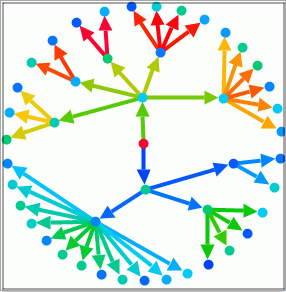
The Data Constellations graph is defined by two Data Pool tables: one representing nodes, and the other (optional) representing links. A field in the nodes table names the nodes; two fields in the links table give the two sides of the link in terms of the node names. It is possible to have a Data Constellations with no links. Use the Context Menu for this Data Constellations example to go to the Property Pages to see how this example is specified.
From: Data Configuration toolbar button.
Draw in 2D or 3D. 3D requires that a field giving the node height be provided; specifying a height field automatically converts to 3D.
From: Node Height in Data Configuration Wizard. Parallel projection is not currently accessible from the Workbench.
Pan, zoom, and rotate the view to get the viewpoint that you want. This can be done with the zoom bars or with buttons in the toolbar. It can also be done using the viewpoint standards using the mouse, the keyboard, or the zoom bars.
In 2D only, the graph may also be rotated by dragging with the Middle Mouse Button (scroll wheel) depressed starting in a corner of the display.
From: Toolbar, Zoom Bars, Keyboard, Mouse.
The node table may contain multiple rows with the same key value. These rows are automatically combined together. If you specify a node height (causing 3D) or a node size, the values in that field for the same node are summed before they are used. Link table rows are not combined, however: each link table row forms a separate link.
The nodes in the Data Constellations are colored by the node table color; the links are colored by the link table color. Since these are separate tables, the colors on nodes and links can be different.
If the Data Constellations nodes are aggregated (multiple rows with the same key) and the nodes table is colored by a field other than the node name, than the colors will be stacked; there is no way to turn off color stacking in a Data Constellations.
In both 2D and 3D, you can map a field from the node table to determine the node shape. The style field is ordered and assigned to shapes in order; you cannot control this assignment:
You can scale all nodes (or links) using the + and - keys, or with the Link Scale and Node Scale fields in the Property Explorer.
Node scale should be manually set if the size chosen for nodes is too small to be comfortably seen.
For 3D, nodes may be positioned at their height, or the graph may be drawn on the floor. This is set by the Extruded Glyphs property.
For 3D, you can choose the default node shape: cube, disk, tetrahedron, octahedron, icosahedron, dodecahedron, cone, cylinder, sphere, torus. You may need to scale the nodes for them to be at a good size. This is set by a toolbar button or by the Glyph Shape property.
All node shapes can be extruded in 3D, not just the default box shape, but box, cube, cylinder, and cone work best.
The size, shape, and height of a node may be controlled by data from fields in the node table.
Note: In 3D, if extruded and both the Height and Size are set, the fields must be the same.
You can also select the field(s) used to label nodes. Labels are distinct from focus labels; they can be separately specified (see below). If nodes are aggregated, the label is taken from the first row with the key for numeric values; for string values, a label is only used if all rows for the key have the same value. Not provided by Workbench.
From: Described above.
The size and line style of links can be controlled by data from fields in the link table. Link style only works for the 2D version, however. Use toolbar button Select the fields for node and link sizing. Link styles are not provided by the Workbench.
From: Described above.
In 3D only, back walls and a grid may be separately included.
From: Back Walls not provided by Workbench. Grid controlled by property Show Grid.
Draw glyphs that are totally unselected.
Items may only be selected graphically when they are visible.
From: Toolbar, property Display Unselected.
The layout of nodes in your graph is key to making it comprehensible. Data Constellations includes a set of placement algorithms that may be used to generate a placement. Alternatively, you can calculate a placement externally and store this with your data, and have Data Constellations use that placement. This is not provided by the Workbench.
A numeric field from the link table may be used to give the link weight; the higher the magnitude of this number, the closer nodes will be placed to each other. Choose this field from the toolbar button Select the fields for node and link sizing.
Layout algorithms:
When the Hex Grid placement is used, it may be further improved by having nodes swapped to see if that improves the placement (based on moving strongly attracted nodes close together). Strength of attraction is based on assigning a numeric field to links as the Link Weight. This graph improvement can be time consuming, so you can choose a particular amount of time for swapping to occur. This is not provided by the Workbench.
After swapping, you can use another improvement which physically moves nodes closer together off of the initial Hex grid based on the strength of attraction.
Manual positioning is also possible for 2D charts; when the mouse is over a node it turns to a hand; dragging the node (LMB down) moves its position.
From: As described above.
Links may be drawn as arrows, in 2D only. The direction of the link is taken from the order the fields were specified in the link table.
From: Property Directional Links.
When you make a selection, you can control how that selection affects attached links (when selecting nodes) or nodes (when selecting links). You can control which can be selected: nodes only, links only, or both nodes and links. For each of these, you can control how selection is propagated: No linking, Links to Nodes, Nodes to Links, or both ways.
You can also control whether selections made outside of the Data Constellations are propagated between nodes and links. This affects only selections made in other views.
In this example, both nodes and links can be selected and link selection is propagated to nodes. Unselect the display (for example, RMB Context Menu, Unselect All). Sweep just a link; notice that it and any nodes attached to it are selected. Click on just a node to select just that node; notice that the attached links are unaffected.
Directional links affect selection propagation over links; selection is propagated across a link only in the direction of the link when directional, and to both sides of the link when not directional.
From: Properties Enable Linking, External Linking, Selection Linking, Selection Type.
You may extend the set of selected nodes by walking the graph. Not available from the Workbench.
Both nodes and links can have labels. By default, link labels are not shown.
You focus on a node in the graph by pointing at it for a moment (or force immediate focus by holding down Shift). By default, the node name is displayed. Multiple focus fields can be shown. If there are additional weighting fields (for example, node height), that weight is automatically shown as well.
As always, focus is propagated to other views as well if the node represents a single row; if it represents multiple rows, focus cannot be broadcast.
Nodes can always be focused on; links can only be focused on if a field is assigned as the link label (using scripting or the Node/Link Property Page).
You can customize the focus information for Nodes only by changing a format string with the FocusFormat property in the Property Explorer. Clearing this string suppresses focus labeling.
The font used for labels can be set from the Chart Titles dialog (from in the toolbar) or from the Label Font property in the Property Explorer.
The chart may have a title; by default no title is shown. This title may be changed using the Chart Titles dialog or the Title property, the font may be changed, or the title may be hidden (from the Chart Titles dialog or the Display Title property).
From: Toolbar, Property Explorer properties Display Title, Label Font, Title, Title Font.
Unselected items can be drawn as transparent rather than opaque (there must be unselected items to see this effect).
The range of the X, Y, or Z axis may be set; this controls the aspect ratio of the display. The default aspect ratio has equal X, Y, and Z axis sizes. Available from toolbar button.
The drawing projection may be selected: A perspective projection is more realistic; things farther away are smaller. A parallel perspective maintains right angles, so things look odd but are more comparable. A top view (End key) in a parallel projection looks basically the same as a 2D view (except for the glyphs). Not available from Workbench.
The binding of mouse buttons to view transformations may be changed, so, for example, the Left Mouse Button may be used to pan. This is provided from the chart toolbar.
From: As described above.
The Data Constellation chart displays an interconnection of nodes and links to show relationships (links) between items (nodes). For example, what were actual sales as a percent of forecast at the company, subsidiary, division and department levels. This chart illustrates an interconnection of nodes and links to show relationships (links) between items (nodes).
Inserting a New Data Constellation
 or in the Page menu, select
Insert Chart | New Data Constellation. to display the Data Constellation
Wizard.
or in the Page menu, select
Insert Chart | New Data Constellation. to display the Data Constellation
Wizard. If you select this option, select the applicable table from the drop-down list and indicate From and To fields (if you selected Affinity Between Two Fields or Parent and Child fields (if you selected Parent/Child (hierarchy)). Click Next.
You can delete any aggregate fields from the list by highlighting the entire row and clicking on the box to the left of the first column. Shift and Control keys can be used to highlight multiple rows as once. Use the right mouse button to select the Delete Selected Rows context menu option.
To add a new aggregate field, click on the Add Field button. A new empty row will be added to the bottom of the list. Click on the Origin Field cell in the new row and select the field you want to aggregate. Click on the Operation Type cell in the new row and select the operation type you wish to apply to the field. A default destination field name is placed in the last cell of the new row. If you wish to change this name, click in the Destination Name cell and type in the new name.
You can edit any of the existing aggregate fields by clicking on the cell and either selecting a different value from the dropdown list for Origin Field and Operation Type columns, or by typing in a new name for the Destination Name column.
Click Next.
The Data Constellation toolbar is located at the bottom of the chart. If it is not displayed, click the downward arrow in the chart.
The toolbar contains the following functions:
|
Toolbar button |
Description |
|---|---|
|
|
Data Configuration. Displays the Data Constellation Wizard. This wizard guides you through the process of creating a map. See Using Charts | Data Constellation for step-by-step instructions. |
|
|
Display Unselected Values. You can choose whether or not to display unselected data during analysis. By default, unselected data is displayed. By selecting this button, unselected data is excluded automatically for each selection. |
|
|
Edit Chart Values. Use this function to change the content and font style of labels displayed in an active view. In this dialog box, you can:
Click OK to save your changes and close the dialog box. |
|
|
Displayed Glyph Shape. Click this button to select the glyph shape displayed. Values include: Cone, Cube, Disk and Sphere. |
|
|
Select Color Field for Links. Click this button to choose the color for the links (lines between nodes) in a data constellation or map. |
|
|
Select Fields for Node and Link Sizing. For Data Constellation and Map charts, this function allows you to configure the node size (cylinders on a Map or points on a Data Constellation) and width of the lines between the nodes (links).
|
|
|
Glyph Placement. Use this button to define the placement of nodes in the Data Constellation chart. Values include:
|
|
|
Mouse Selects Data. Click this button to select data in a visual. |
|
|
Mouse Pans Data. Click this button to move the data displayed to the left, right, up, or down in a chart. |
|
|
Mouse Rotates Chart. Click this button to rotate data displayed on the X/Y axes. |
|
|
Mouse Turns Chart. Click this button to rotate displayed data on the Z axis. |
|
|
Mouse Zooms Chart. Click this button to zoom in (enlarge) or zoom out (reduce) the contents displayed in a chart. To zoom in, move the mouse upward (away from you). To zoom out, move the mouse downward (towards you). |
|
|
Adjust Range. You can stretch one or more axes in the chart so that the displayed data and axes labels are easier to read. When you click this button, X, Y and Z axis slider bars display. Select any axis and drag the slider bar. To view data as it was originally displayed, drag all sliders in the slider bars back to their original positions. |
|
|
Return to Home Position. Click this button to return data displayed in this chart to its default location. |
|
|
Go To Side for Positive/Negative Selection. Click this button to make it easier to select positive/negative data. |
|
|
Go To Top for Row/Column Selection. Click this button to make it easier to view row/column data. |
|
|
View Chart Help. Displays the Help View for the chart. |
A Data Sheet shows the details of data in a table as a data grid. It gives you the exact values of fields in your data, lets you sort or search it, and shows relationships between fields. Details of the focus item (perhaps from another view) are available.
The current focus item is shown in the top line of the Data Sheet grid. Focus is shared by all charts, so this focus item may be coming from another view. This provides a way to see the details of a number of fields for the focus item.
The focus line may also be inhibited.
From: Property Display Focus from Property Explorer.
The Zoom Bar to the right can be used to zoom the grid to a reduced representation, where lines are shown as pixel high (or smaller) lines. This provides an overview of many lines. Numeric fields are shown with bar proportional to the magnitude of the value, in effect forming a bar chart. The line size may also be set with the toolbar.

Scrolling may be done with the zoom bar, by dragging the mouse (MMB down), or using the Page Up/Down keys. Return to the default with the Home key, or by adjust the zoom bar.
The ability to scale text to bars may be inhibited via the Allow Scaling property.
From: Toolbar button One pixel per line, property Display Mode.
Clicking a column heading sorts the table by that column. Click several fields to sort by major and minor keys.
Sorting may be forward or in reverse. You may return to the original order using the popup menu.
Zooming a sorted table may reveal relationships between fields: numeric fields that grow together, for example.
From: Mouse
Search a table field for values matching a pattern, and select just those table rows.
From: Text Search from the toolbar.
Unselected rows may be optionally hidden. This allows you to see just the selected items easily, no matter where in the table of data they occur.
From: Toolbar, Show Unselected property.
Drag a column (with Left Mouse Button depressed) to a new position to re-order columns interactively.
From: via mouse.
Data may contain missing values: a special value indicating that there is no data. This can be important for some types of data: for example in a survey, you want to treat questions that weren't answered differently from questions that were answered. Missing values are recognized and displayed with a string that you may change.
From: Property Show Missing Values.
Write the currently selected rows to a table. Only the fields shown by the chart are exported. This gives you a way to choose which fields in a large table to export.
From: Tool Bar button Export
Textual data displayed in a Data Sheet may be colored like in other charts, according to the data values in some field (the default); or all rows may be displayed in the Selected color (normally a dull purple), or all rows may use the Foreground color (normally black).
From: Property Coloring Mode.
The Data Sheet provides a tabular view of selected fields in a table. It is typically used to examine the underlying raw data and for visually correlating across multiple measures (for example, does a discount increase as the transaction amount increases).
Features
Inserting a New Data Sheet
 or in the Page menu, select
Insert Chart | New DataSheet.
or in the Page menu, select
Insert Chart | New DataSheet. See Data Sheet Toolbar for a description of toolbar functions.
The Data Sheet toolbar is located at the bottom of the chart. If it is not displayed, click the downward arrow in the chart.
The toolbar contains the following functions:
|
Toolbar button |
Description |
|---|---|
|
|
Data Configuration. Displays the Data Configuration window.
|
|
|
Display Property Explorer. Click this button to display the property explorer. |
|
|
Display Unselected Values. You can choose whether or not to display unselected data during analysis. By default, unselected data is displayed. By selecting this button, unselected data is excluded automatically for each selection. |
|
|
Text Search. Displays the Data Sheet Text Search window. Enter the field to be searched as well as the text that you wish to locate and click Select Matching. |
|
|
Edit Chart Titles. Use this function to change the content and font style of labels displayed in an active view. |
|
|
Default Line Size. Click this button to display text so that it can be read legibly in the chart. |
|
|
One Pixel Per Line. Clicking this button displays one pixel per line to illustrate trending. |
|
|
Mouse Selects Data. Click this button to select data in a visual. |
|
|
View Chart Help. Displays the Help View for the chart. |
|
|
Export. Export the fields shown by the chart for the currently selected rows to a file. Exports may be formatted as text (tab delimited) or CSV (comma delimited) files. A header line is included giving the names of the fields shown. |
A Heat Map is a space-filling display that shows two levels of data. Categories in a field are aggregated, then optionally grouped by a second categorical field. So a Heat Map visualizes up to 4-way interactions (item, group, size, color). The size and color of fields may be set based on data. This space-filling display lets you visually identify patterns and outliers based on size and color.
Select a categorical field to aggregate; this is the Field in the Data Configuration dialog. This can be further broken down into categories from a second field, the Detail Field in the Data Configuration dialog. The lowest level field can be sized based on a numeric field, and colored based on another field. Coloring will be shared as well, so the current coloring scheme will be used if a color field is not chosen
From: Data Configuration dialog from toolbar.
From: Toolbar Property Explorer (Automatic Title, Display Title, Label Color, Label Font, Title, Title Color, Title Font)
Unselected bars may be omitted. This is especially useful for focusing on selected data if there are a large number of bars.
From: Toolbar Property Explorer (Show Unselected)
Glyphs in the Heat Map may be colored based on values in a numeric table field, specified in the configuration dialog. By default a red-to-green scale is used. (If no coloring field is given, colors for the table are used if they are unique for each lowest level item.) You can change the colors used in the Property Explorer for the chart, using the properties High Value Color, Low Value Color, and Middle Value Color in the Options section. Colors are formed as a range between the high value and middle value colors, and the middle value and low value colors.
From: Property Explorer (High Value Color, Low Value Color, Middle Value Color)
The Heat Map displays categorical dimensions by a combination of size (for example, volume of stock trading) and perceived value (whether the stock gained or lost value).
Inserting a New Heat Map
 or in the Page menu, select
Insert Chart | New Heat Map.
or in the Page menu, select
Insert Chart | New Heat Map. The Heat Map toolbar is located at the bottom of the chart. If it is not displayed, click the downward arrow in the chart.
The toolbar contains the following functions:
|
Toolbar button |
Description |
|---|---|
|
|
Data Configuration. Displays the Data Configuration window.
|
|
|
Display Unselected Values. You can choose whether or not to display unselected data during analysis. By default, unselected data is displayed. By selecting this button, unselected data is excluded automatically for each selection. |
|
|
Edit Chart Titles. Use this function to change the content and font style of labels displayed in an active view. In this dialog box, you can:
Click OK to save your changes and close the dialog box. |
|
|
View Chart Help. Displays the Help View for the chart. |
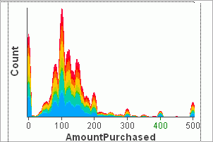
A Histogram shows the distribution of values for a continuous field. It can only be used with numeric fields: integer or double storage types.
A Histogram may have its axis aligned vertically (the default) or horizontally. Vertical alignment is most common, but horizontal alignment provides a bit more space for labels.
From: Rotate Chart toolbar button, Orient Horizontal property.
The aggregation determines how the height of the histogram at an x-axis point is computed. Height may be proportional to the number of items (rows) with that value; this is the default. It may be proportional to the sum of another field (a weight field) in the same table.
From: Optional Properties box in Data Configuration dialog (from toolbar).
If the table the Histogram is showing data for is colored by a different field than the one being shown by the bar chart, the colors for that field are shown stacked. This lets you see how values of another field map to values of the current field.
From: Color By drop down, Color Workshop, Stack Colors property.
By default the x-axis is shown with a linear scale: distance increases at the same rate as values increase. You can instead use a different transform for the axis, a log or root scale. With these, distance increases at a faster rate than value. These can be useful if you have data which is highly skewed, for example with a few large values but many smaller values. Applying a transform can better distribute your values in the space available in the chart, making it easier to see the data.
Use this if your data appears to be squished to the left, to allow you to see more detail.
From: Distribution Scale toolbar button, Distribution Transformation property.
The histogram is smoothed: the curve drawn approximates the values rather than follow them exactly. You can control the degree of smoothing.
From: Keyboard (+ and - keys), Smoothing property.
Data may contain missing values: a special value indicating that there is no data. This can be important for some types of data: for example in a survey, you want to treat questions that weren't answered differently from questions that were answered. Missing values are recognized and ignored, by default. You may ask for missing values to be included, however; this will add another category to the chart for all table rows with a missing value.
You may also change the string that is used to label missing values; this string is used by all views, not just the current view.
From: Show Missing Values property.
The font used for labels can be set from the Chart Titles dialog (from in the toolbar) or from the Axis Font property in the Property Explorer. You may also set the axis titles
The chart may have a title; by default a generated title is shown. This title may be changed via the Chart Titles dialog or the Title property, the font may be changed, or the title may be hidden (from the Chart Titles dialog or the Display Title property).
From: Chart Titles toolbar button, properties Axis Font, Display Title, Label Font, Title, Title Font, x-axis Text, y-axis Text.
The Histogram can be used to examine the distribution of a metric (for example, the quantity of high volume transactions compared to low-volume transactions).
Inserting a New Histogram
 or in the Page menu, select
Insert Chart | New Histogram.
or in the Page menu, select
Insert Chart | New Histogram. |
Toolbar button |
Description |
|---|---|
|
|
Data Configuration. Displays the Data Configuration window.
|
|
|
Rotate Chart. The Rotate Chart function switches the data displayed along the x-axis and y-axis so that data currently displayed on the x-axis will appear on the y-axis and data currently displayed on the y-axis will display on the x-axis. This function is available for bar charts, histograms, and line charts. |
|
|
Distribution Scale. Selections include Linear Transformation, Log Transformation, and Root Transformation. |
|
|
Edit Chart Titles. Use this function to change the content and font style of labels displayed in an active view. In this dialog box, you can:
Click OK to save your changes and close the dialog box. |
|
|
View Chart Help. Displays the Help View for the chart. |
A Line Chart shows a sequence of (possibly weighted) categorical items, connected by a line. Line charts are good for a series of values that are connected in some sense. Note that the Line Chart is an aggregated chart: all of the rows in the source table on the x-axis with the same value are combined. Consider using a Scatter Plot if you don't want your data aggregated; use a trend line in the Scatter Plot to form the line between points. Click on line chart features below to learn more about them:
A Line Chart shows aggregated x-axis field categories. The y-axis height depends on the type of aggregation. Height may be proportional to the number of items (rows) with that category value; this is the default. It may be proportional to the sum of another field (a weight field); it may be the average value of a weight field, or the ratio or 2 fields.
From: Toolbar button Data Configuration.
Multiple weighting fields (y-axis) may be selected for the same category (x-axis field); this creates multiple lines in the chart. The color used for each y-axis line may be chosen.
From: Data Configuration dialog from toolbar, Cluster Color Scale property.
Weights for x-axis categories are accumulated (added to the previous weight) as the chart progresses (to the left of bottom). Use this to see a current value as the sum of previous values.
From: Property Explorer (“Cumulative measure?”).
If the table the chart is showing data for is colored by a different field, the colors for that field are shown stacked. This lets you see how values of another field contribute to the current field.
The area between the stacks can be filled by that color by turning on property Fill Colors; however, Pool Weights must be set of False; see Negative Handling below.
Note that lines from the other field are stacked, so they aren't directly comparable as over plotted lines.
From: Color By pull down in Page toolbar, Color Workshop, property Fill Colors, property Pool Weights.
A Line Chart may have its axis aligned vertically (the default) or horizontally. Vertical alignment is most common, but horizontal alignment provides a bit more space for labels.
From: Toolbar Rotate chart button, Data Configuration dialog from toolbar.
A Line Chart will scale so that all categories are visible initially. If there is enough space, each data point is labeled. As the number of items increases, the items are packed together and the zoom bar at the bottom of the display may be used to zoom (magnify or de-magnify) or scroll the display.
If there are too many items to even show as a single pixel line, then a bar at the top of the window will indicate over plotting.
You can also suppress the zoom bar.
From: Property Allow Magnify, Mouse, Keyboard
x-axis category values may be shown full size (so that they are totally visible at a default size, but scrolling may be required), the may be fit to the window (so that all are visible and scrolling is not required, but over plotting may be necessary if space is inadequate to show all bars uniquely), or one line per pixel (guaranteeing that all bars are visible, but scrolling may be required).
From: Property LineMode.
You can choose how the points for categories are ordered: in original order (the order they were encountered in the input file), by label, by size, or by percent selected. If bars are ordered by percent selected, doing a selection can change the bar order to change. Original order is typically only useful if the input data is in an interesting order. Line charts should rarely be in other than label order.
Ordering may also be reversed by any of these criteria (for example, reverse by size, reverse by label, ...).
From: Toolbar button Set Display Order, property Bar Order.
You can control which points are labeled. If there is room to label all points legibly, all will be labeled. If there is not sufficient room, then a variety of strategies may be used. A best fit may be done, where as many labels as will be visible are used. All points may be labeled, no points, selected points, or chosen points.
From: Property Label Mode.
You can control how much of your category labels are visible. By default, the chart tries to balance the amount of screen space devoted to the data graphics and to labels. This may cause long labels to be cut off. You an adjust this size by moving the mouse of the x-axis until it changes to a double bar. Then left-click to drag the axis to the location you want. Try this now!
Changing orientation may also provide more space for labels.
From: Mouse interaction.
A goal line is a line in the display that shows a target level. There may be multiple goal lines in a display. Goal lines are set at a particular y-axis value. The goal line may be used to selected all categories above or below the goal.
From: Toolbar button
The coordinates of the mouse are constantly shown on the x and y-axis. Move the mouse over the chart to see this.
You focus on an item by pointing at it for a moment; the current item is labeled. (Depressing the Shift key causes immediate focus without the delay; property Label By Hover controls whether focus is immediate) Since a Line Chart is aggregated, focus from the Line Chart has no effect on other views; focus on a primitive item in another view (for example, a Data Sheet) will label that item in the Line Chart.
You can customize the focus information by changing a format string with the Focus Format String property. Clearing this string suppresses focus labeling.
From: Focus Format String property.
This option automatically selects each category sequentially. If you have multiple views, this will show you how each category appears in other views.
From: Animation toolbar.
Text for the chart title and axis titles may be changed, along with the text font. Display of the title is optional.
From: Toolbar ( ), Property Explorer (Axis Font, Display Title, Label Font, Title, Title Font, x-axis Font, y-axis Font)
Unselected bars may be omitted. This is especially useful for focusing on selected data if there are a large number of bars.
From: Toolbar (), Property Show Unselected.
Positive aggregated values are shown by positive bars (above the axis), and negative values by negative bars (below the axis). Categories that have weights that are combinations of negative and positive values can be shown in two ways: net or pooled. In net display, the positive and negative amounts are summed and a single bar displayed. In pooled mode, negative and positive values are separately aggregated and shown as two opposing bars. Pooled mode can reveal the negative and positive components of a total that are otherwise hidden by the net. Pooled weights is the default.
From: Property Pool Weights.
Data points may be labeled with their y-axis measure weight. Labels are never overplotted, so a set of labels that do not overlap will be chosen. In the Property Explorer, you can choose the measure to use for the label (“Bar Label Measure”), the font for the label (“Bar Label Font”), and specify whether large numeric values should be shortened (“Bar Label Abbreviated?”). Options for the “Bar Label Measure” are “Percent of Total”, “Selected Weight”, “Total Weight”, and “No Label”. In the toolbar tray for the chart, you can also turn labeling on or off with a button. This turns the weight set by “Bar Label Measure”. If none is set, then the Selected Weight is used.
From: Toolbar ( ), Property Explorer (“Bar
Label Measure”, “Bar Label Font”, “Bar Label Abbreviated?”)
), Property Explorer (“Bar
Label Measure”, “Bar Label Font”, “Bar Label Abbreviated?”)
The Line Chart can be used to examine trends of one or more measures, such as quarterly revenues and expenses. This chart aggregates one or more metrics across the discrete values of a field and displays entities as connected points.
Inserting a New Line Chart
 or in the Page menu, select
Insert Chart | New Line Chart. to display the Data Configuration
window. If more than one table was loaded using the WebFOCUS Visual
Discovery AE Data Wizard, use the drop-down list to select the applicable
table. If a single table was loaded, it is the default.
or in the Page menu, select
Insert Chart | New Line Chart. to display the Data Configuration
window. If more than one table was loaded using the WebFOCUS Visual
Discovery AE Data Wizard, use the drop-down list to select the applicable
table. If a single table was loaded, it is the default.Optionally, to display the line chart horizontally, place a checkmark in the Display Horizontally check box.
|
Toolbar button |
Description |
|---|---|
|
|
Data Configuration. Displays the Data Configuration window.
|
|
|
Rotate Chart. The Rotate Chart function switches the data displayed along the x-axis and y-axis so that data currently displayed on the x-axis will appear on the y-axis and data currently displayed on the y-axis will display on the x-axis. This function is available for bar charts, histograms, and line charts |
|
|
Set Display Order. Click this button to display the following display options:
|
|
|
Display Unselected Values. You can choose whether or not to display unselected data during analysis. By default, unselected data is displayed. By selecting this button, unselected data is excluded automatically for each selection. |
|
|
Edit Chart Titles. Use this function to change the content and font style of labels displayed in an active view. In this dialog box, you can:
Click OK to save your changes and close the dialog box. |
|
|
Drill Down. Moving from summary to more detailed-level data is known as drilling down. Drilling down into the data, is essential to accessing valuable information from the data that you are analyzing. Conversely, moving from detailed-level to summary-level data is referred to as drilling up. It is useful when you want an overall, big picture understanding of the information. By drilling up or down, you can use data at the appropriate level of detail in order to make correlations and draw conclusions. By configuring data hierarchies you can set up drill up / drill down in a Bar Chart, Line Chart or Pie Chart . By setting up a data hierarchy, configuring bar chart(s), line chart(s) and pie chart(s), and pointing to a hierarchy by name, data in certain charts can be drilled up or drilled down. To Drill Down Into Data
Note: If you drill to the lowest level of your data, the Drill down button is dimmed, indicating that you cannot drill down any further. |
|
|
Drill Up. Moving from detailed-level to summary-level data is referred to as drilling up. It is useful when you want an overall, big picture understanding of the information. Conversely, moving from summary to more detailed-level data is known as drilling down. Drilling down into the data, is essential to accessing valuable information from the data that you are analyzing. By drilling up or down, you can use data at the appropriate level of detail in order to make correlations and draw conclusions. By configuring data hierarchies you can set up drill up / drill down in a Bar Chart, Line Chart, or Pie Chart. By setting up a data hierarchy, configuring bar chart(s), line chart(s) and pie chart(s), and pointing to a hierarchy by name, data in certain charts can be drilled up or drilled down. To Drill Up Into Data
Note: If you drill to the highest level of your data, the Drill Up button is dimmed, indicating that you cannot drill up any further. |
|
|
View Chart Help. Displays the Help View for the chart. |
A Map is a Data Constellation graph placed over a map. The map may be an image or a set of polygons. It may also be a globe. The Map has all of the behaviors already described for a Data Constellations, so this will only describe the differences. Click on a Data Constellation feature below to learn more about it:
The Map chart is a specialization of the Data Constellations component. So, it has all of the same capabilities and behaviors as a Data Constellations. We won't repeat them here, you can read them there.
Since a map is a Data Constellations, you can use all of its options in your map. For example, glyphs can be located at a position on the map, floating above it, or extruded above it. You can use links to chose connections on top of the map, or omit links so that only node data is present.
Unfortunately 3D maps do not currently support direction links, so you cannot have directional links over your map.
A map
is a graph placed on top of a representation of geography. This representation
may be an image, or it may be a set of polygons that are the outlines
of the geographical regions: 
With polygon backgrounds, a table in the Data Pool specifies the polygons. The polygons are colored based on the coloring of that table. See the Reference for more details.
The map image or polygons may actually be anything, as long as your node coordinates map correctly on top of the image/polygons.
Data from around the world can be shown on the world displayed as a map on a sphere (just like the real thing!). Coordinates must be latitudes and longitudes, and the range of coordinates is the entire world: Flat Globe
Links can be displayed on a globe; by setting the LinkSize property, the height of the link reflects the value of the statistic (the line weight is always the same). The relative height of bars is given by NodeSize rather than NodeHeight.
Links can be omitted by not specifying links, or by unselecting the links table with Show Unselected turned off.
Unlike a Data Constellations, the location of nodes must be based on geographical coordinates (sometimes termed geocodes). You must provide the geocodes (typically as longitudes and latitudes) in your data table.
You may not be happy with the default positioning of your map. Manually adjust your viewpoint until you are happy using the mouse to pan, rotate, and zoom. Then, type an x into the window, which will display the current viewpoint property values. Use these to set up your component so that you will start at this viewpoint (for example, via <object> properties in the HTML if in a rich web client, in the XML manifest for WebFOCUS Visual Discovery Server AE, or as properties for a client implementation).
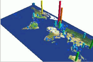
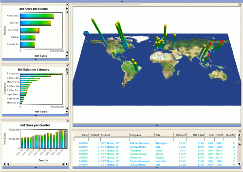
The Map chart displays data plotted on a map to show data against geographical location. Examples of Maps include airline flight numbers by city and flight delays between cities. The Map chart shows bars at locations, and optionally provides links/arcs between locations.
A map requires a data table with a field that corresponds to locations. The data is aggregated on location and displayed over a map with bars positioned based on the locations. The height of the bar is based on a count of the items aggregated to the location, or the sum of another numeric field in the same table.
The location must be mapped to a position on the map; this is typically done by a geocode, a pair of latitude and longitude. The mapping of location to geocode may be done using a separate mapping table. WebFOCUS Visual Discovery Workbench AE comes with a number of mappings and others may be added. Alternatively, the data table may already include latitude and longitude fields.
 or in the Page menu, select
Insert Chart | New Map. to display the WebFOCUS
Visual Discovery AE Map Wizard. This wizard guides you through the
process of creating a map. The Welcome wizard page displays. Click Next.
or in the Page menu, select
Insert Chart | New Map. to display the WebFOCUS
Visual Discovery AE Map Wizard. This wizard guides you through the
process of creating a map. The Welcome wizard page displays. Click Next. Remember that locations often require multiple names to uniquely determine them. For example, city names may not be unique, but may require an additional name such as state. If you do not have such a combination in your data, create it with the Expression Builder.
If you do not know the geocode range of the entire map image, you can drag a rectangle on the image from any two points, and enter the coordinates of these points using the input dials on this page. These ranges will be used to calculate the range of the entire map. Because of rounding inaccuracies, you may need to adjust the range manually to have locations fall correctly.
The Completing WebFOCUS Visual Discovery AE Map Wizard page is displayed. Click Finish to close the wizard and create the chart.Geocode Translations
Location names in your data must be translated to geocodes (latitudes/longitudes) to give placement on a map. A collection of mappings from common location names is provided with WebFOCUS Visual Discovery Workbench AE, or you can add your own mappings (below). The location name in your data must exactly match the key in the mapping, including case.
Each mapping is provided by a single file, stored in the Maps subdirectory of the WebFOCUS Visual Discovery Workbench AE installation directory; the file name appears in the menu of mapping files. You can also modify the mapping files provided with WebFOCUS Visual Discovery Workbench AE by changing these files yourself.
The mappings provided are:
Extending Maps
Plotting data on a map requires two things: a background image or outline (the map) and translation of locations in your data to geocodes (latitudes and longitudes). WebFOCUS Visual Discovery Workbench AE comes with a set of map images, map outlines, and location-to-geocode translation (or mapping) files. These standard map images and translation files stored in the Maps subdirectory of the directory where WebFOCUS Visual Discovery Workbench AE is installed (typically c:\Program Files\WebFOCUS Visual Discovery AE\Maps).
You can add your own map images, location-to-geocode translation files, or shape files here and they will be provided as options by the Map Wizard.
You can also add additional locations to any of the location-to-geocode translation files provided with WebFOCUS Visual Discovery Workbench AE by adding additional lines to these files; the format is described below.
To provide your own map image, copy the image file to the Maps directory. Map images are image files in JPEG (.jpg) or Bitmap (.bmp) format. Map images should have latitudes and longitudes of equal size; this is a Mercator projection. (Note that Mercator projections distort the size and shapes of large objects.)
When you reference your own image file in the Map Wizard, it will prompt you for the range of geocodes covered by the image; you provide these as the latitudes or longitudes for the left, top, right, and bottom of the geographical area covered by the image. As described above, you can also sweep a smaller area and enter coordinates of that range, which will be adjusted to cover the entire image for you.
Location-to-Geocode translation (mapping) files should have a .txt suffix and should include Latitude and Longitude fields; these should be real numbers. The first field in the file should be named Key and should be the location name.
Shape files should have a .csv suffix and should follow the format of the existing files.
|
Toolbar button |
Description |
|---|---|
|
|
Data Configuration. Displays the Data Constellation Wizard. This wizard guides you through the process of creating a map. See Using Charts | Data Constellation for step-by-step instructions. |
|
|
Display Unselected Values. You can choose whether or not to display unselected data during analysis. By default, unselected data is displayed. By selecting this button, unselected data is excluded automatically for each selection. |
|
|
Edit Chart Values. Use this function to change the content and font style of labels displayed in an active view. In this dialog box, you can:
Click OK to save your changes and close the dialog box. |
|
|
Displayed Glyph Shape. Click this button to select the glyph shape displayed. Values include: Cone, Cube, Disk and Sphere. |
|
|
Display as Globe. In the Map chart, click the button to display the map in a globe format. To use this function, it is recommended that you specify global coordinate ranges in the Map Wizard. If you do not, a globe is created using the map image that you specified (for example, if you selected a U.S. map, it would be displayed as a globe). |
|
|
Select Color Field for Links. Click this button to choose the color for the links (lines between nodes) in a data constellation or map. |
|
|
Select Fields for Node and Link Sizing. For Data Constellation and Map charts, this function allows you to configure the node size (cylinders on a Map or points on a Data Constellation) and width of the lines between the nodes (links).
|
|
|
Mouse Selects Data. Click this button to select data in a visual. |
|
|
Mouse Pans Data. Click this button to move the data displayed to the left, right, up, or down in a chart. |
|
|
Mouse Rotates Chart. Click this button to rotate data displayed on the X/Y axes. |
|
|
Mouse Turns Chart. Click this button to rotate displayed data on the Z axis. |
|
|
Mouse Zooms Chart. Click this button to zoom in (enlarge) or zoom out (reduce) the contents displayed in a chart. To zoom in, move the mouse upward (away from you). To zoom out, move the mouse downward (towards you). |
|
|
Adjust Range. You can stretch one or more axes in the chart so that the displayed data and axes labels are easier to read. When you click this button, X, Y and Z axis slider bars display. Select any axis and drag the slider bar. To view data as it was originally displayed, drag all sliders in the slider bars back to their original positions. |
|
|
Return to Home Position. Click this button to return data displayed in this chart to its default location. |
|
|
Go To Side for Positive/Negative Selection. Click this button to make it easier to select positive/negative data. |
|
|
Go To Top for Row/Column Selection. Click this button to make it easier to view row/column data. |
|
|
View Chart Help. Displays the Help View for the chart. |
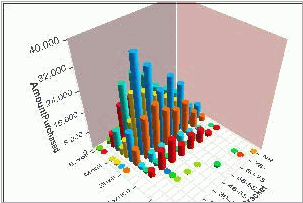
A Multiscape is a graphical 2 dimensional table. It shows the interactions between 2 categorical (nominal) fields. It helps you understand how values of the field are jointly distributed. Click on a Multiscape feature below to learn more about it:
Pan, zoom, and rotate the view to get the viewpoint that you want in 3D mode.
Mouse: Drag with Left Mouse Button on blue rotate handles to rotate; drag with Middle
Mouse Button to pan; drag up/down with Right Mouse Button or Middle Mouse Button + CTRL-Shift to zoom; shift key changes this action between zoom, twist, and rotate. The binding of viewpoint operations to mouse buttons can be changed via scripting or via the 3D Property Page tab.
Keyboard: Home returns to default position; End from top; arrow keys from sides.
The aggregation determines how the height of a bar is computed. Bar height may be proportional to the number of items (rows) with that category value; this is the default. It may be proportional to the sum of another field (a weight field); it may be the average value of a weight field, or the ratio or 2 fields.
In Average mode, error bars are drawn at one standard deviation to give an indication of the amount of variation in the values for that combination of categories.
From: Data Configuration Toolbar button.
If the table the Multiscape is showing is colored by a different field, the colors for that field are shown stacked. This lets you see how values of another field map to values of the current field.
You can turn color stacking on or off: if off and there are multiple colors mapped to a single category pair, than the item is shown in the default selected color.
From: Color By pull down in Page toolbar.
You can choose how the bars for categories are ordered: in original order (the order they were encountered in the input file), by label, by size, or by percent selected. If bars are ordered by percent selected, doing a selection can cause the bar order to change. Original order is typically only useful if the input data is in an interesting order.
Shorter bars in a Multiscape may be hidden by taller bars in front of them; order both rows and columns by Count to insure that all bars are visible.
Note that rows and columns in 3D refer to the grid on the floor of the scene; the data glyphs that extend in the Z direction may look like columns, but that's not what we're referring to.
From: Toolbar button Row/Column Order, property Column Order and Row Order
Different styles of drawing the glyph in a cell are available.
|
Style |
2D |
3D |
|---|---|---|
|
Bubble |
circle |
cylinder |
|
Block |
rectangle |
prism |
|
Side block |
Full population in unselected color; selected in selected color as separate bar. |
Full population as prism in unselected color; selected as separate bar in selected color. |
|
Spine |
Constant height; width proportional to weight. May be used to compare selected subset, as in Pie Chart or spine plot mode in Bar Chart. |
Not available |
|
Surface |
Not available |
Surface connecting height points. The surface may not be selected. |
From Property Display Mode.
Display a more detailed grid.
In 2D this displays on grid on the data surface; in 3D it toggles a grid on the back height wall.
From Property Show Grid.
Draw glyphs that are totally unselected.
From Toolbar, property Show Unselected.
Negative weights (in 3D) cause glyphs to be drawn below the base plane.
Negatives can be treated in 2 ways: separately aggregated or pooled.
From property Pool Weights.
Instead of showing a table of X vs. Y in the Multiscape, you can also use it to show multiple weights (statistics) for a categorical field. In this case, the columns are categories in a field, and each row is a separate statistic/measure. This can be used to compare multiple weights for the same categories. Since the weights can have different scales, they are all normalized to the same range.
From: Not available in WebFOCUS Visual Discovery Workbench AE.
You focus on an item by pointing at it for a moment; the current item is labeled. (Depressing the Shift key causes immediate focus without the delay.) Since a Multiscape is aggregated, focus from the chart has no effect on other charts; focus on a primitive item in another (for example, a Data Sheet) will label that item in the Bar Chart.
You can customize the focus information by changing a format string with the FocusFormat property. Clearing this string suppresses focus labeling.
From: property Focus Format String.
Unselected items can be drawn as transparent rather than opaque.
Back walls may be included or not.
The range of the X, Y, or Z axis may be set; see the toolbar for this capability.
The drawing projection may be selected.
The binding of mouse buttons to view transformations may be changed: see the toolbar for this capability.
From: properties Transparent Unselected, Display Backwalls, Toolbar, and Projection.
You can select the font to use for axis text and titles, set the labels for each axis, and set a title and control whether the title is visible.
From: Toolbar Edit the Chart titles button, properties Axis Font, Display Title, Label Font, Title, x-axis Text, y-axis Text.
The Multiscape aggregates a metric across the intersections of two categorical fields and displays in a row/column format. This chart is typically used to examine the relationship between two or more categorical fields.
Inserting a New Multiscape
 or in the Page menu, select
Insert Chart | New Multiscape. to display the Data Configuration
window. If more than one table was loaded using the Data Wizard,
use the drop-down list to select the applicable table. If a single
table was loaded, it is the default.
or in the Page menu, select
Insert Chart | New Multiscape. to display the Data Configuration
window. If more than one table was loaded using the Data Wizard,
use the drop-down list to select the applicable table. If a single
table was loaded, it is the default. Note: The Sum measure appears as the Z axis in the Multiscape chart.
|
Toolbar button |
Description |
|---|---|
|
|
Data Configuration. Displays the Data Configuration window.
|
|
|
Row/Column Order. Click this button to display the following display options: Display Columns in Original Order. The default sort order for the columns displayed. Sort Columns by Label. Displays columns alphabetically by label. Sort Columns by Size. Displays columns from greatest to smallest net values. Display Rows in Original Order. The default order for the rows displayed. Sort Rows by Label. Displays rows alphabetically by label. Sort Rows by Size. Displays rows from greatest to smallest net values. |
|
|
Display Unselected Values. You can choose whether or not to display unselected data during analysis. By default, unselected data is displayed. By selecting this button, unselected data is excluded automatically for each selection. |
|
|
Edit Chart Values. Use this function to change the content and font style of labels displayed in an active view. In this dialog box, you can:
Click OK to save your changes and close the dialog box. |
|
|
Mouse Selects Data. Click this button to select data in a visual. |
|
|
Mouse Pans Data. Click this button to move the data displayed to the left, right, up, or down in a chart. |
|
|
Mouse Rotates Chart. Click this button to rotate data displayed on the X/Y axes. |
|
|
Mouse Turns Chart. Click this button to rotate displayed data on the Z axis. |
|
|
Mouse Zooms Chart. Click this button to zoom in (enlarge) or zoom out (reduce) the contents displayed in a chart. To zoom in, move the mouse upward (away from you). To zoom out, move the mouse downward (towards you). |
|
|
Adjust Range. You can stretch one or more axes in the chart so that the displayed data and axes labels are easier to read. When you click this button, X, Y and Z axis slider bars display. Select any axis and drag the slider bar. To view data as it was originally displayed, drag all sliders in the slider bars back to their original positions. |
|
|
Return to Home Position. Click this button to return data displayed in this chart to its default location. |
|
|
Go To Side for Positive/Negative Selection. Click this button to make it easier to select positive/negative data. |
|
|
Go To Top for Row/Column Selection. Click this button to make it easier to view row/column data. |
|
|
View Chart Help. Displays the Help View for the chart. |
A Parabox (Parallel Box Plots) shows a summary of the distribution of a set of fields from a single table. The field is summarized based on its type: continuous (numerical) fields are summarized by box plots (or averages or dot plots), and categorical (name) fields are summarized as bubble plots. Individual cases may be displayed as parallel axis lines. A Parabox is particular useful for understanding how a subset compares to the entire population across a series of fields.
Continuous data is displayed by default as a box plot. The box plot summarizes the values as the median (the center line), and 2 quartiles above and below. Assuming that the data is normally distributed, data that would exceed 2 standard deviations in either direction is plotted outside the box plot as dots.
A numerical field may also be displayed as bubbles, dots (a dot is plotted for each case at its value), or as an average.
Use bubbles if the numerical data is really a name, not a value. Use dots to see the actual distribution of values. Use average as a different summary.
From: Column Styles in Toolbar.
Categorical fields are shown by default with a bubble for each category, sized by the number of rows with that value (in effect, a bar chart)
All categorical fields may be weighted by a single weight.
From: Data Configuration in Toolbar.
The parallel axis view draws a line connecting the values for each case, a row in the data table. The line connects the position on the axis for each field. This helps show how multiple fields are related by single cases. This is especially useful for looking at outliers.
From: Data Configuration in Toolbar, Display Axis of individual data cases in Toolbar, Parallel Axis property in Property Explorer.
Categorical bubbles are drawn in a color if all values in the bubble have the same color; otherwise the selected portion is drawn in the selected color. Dot strips are also drawn based on the coloring. Since the coloring field will (by definition) have every item in each category the same color, a coloring categorical field will always appear colored. Parallel axis lines are always colored. Coloring by a continuous field colors the parallel axis lines; if a category in a categorical field has all items the same color, it will appear colored as well.. When colored items over plot (as parallel axis lines often will), they are drawn low to high priority (blue to red in the rainbow scale), so hot colors will tend to be more obvious.
(When coloring a box plot field, try switching to dot plot mode to see the effect.)
If you have selected a subset of the population (possibly from another view), then that subset is highlighted in the Box Plots, and the selected portions of bubble plots are highlighted. This can be a useful way to study how a subset differs from the overall population across a number of fields.
Display of the current sub-population can be inhibited with the Show Selection property; this can be useful if you are focused on the parallel axis display rather than the selected subsets.
Columns in the Parabox may be rearranged by changing the order in which fields are specified or by clicking on the column and dragging it to a new position. The parallel axis display in particular is sensitive to column ordering: a relationship between fields that would be obvious if columns were adjacent may be lost if they are separated.
From: Mouse
Data can be ordered; options depend on the type of data. For continuous data, ordering can be low to high or high to low/p
For categorical data (bubble plots), options are as for Bar Charts: order by label, by size, by percent selected.
From: Toolbar Column Styles dialog.
Focusing on an item with the mouse shows its values in the top row, along with the parallel axis line connecting all of the values for the case. The focus line is drawn in the focus color, but the focus values at the top of the view are drawn in the current color.
Touching the display gives the coordinate in the data space at the top of the strip. For box plots, the value at the location is shown. For bubble plots, the category is labeled and its count (total and selected) is shown.
Focus occurs after hovering a brief period; you can force immediate focus by holding the Shift key, or via the Label By Hover property.
Draw box plots using the same numeric range. This only makes sense if the data comes from a similar range; for data from non-overlapping ranges this will not be useful.
From: Property Same Scale.
You can choose the font used for text with the Label Font property. Labels on strips can be suppressed with the Display Strip Labels property.
From: Property Explorer.
Display of lines for unselected data rows in the parallel axis display can be controlled; they may be shown (in the unselected color) or omitted.
From: Display Unselected Axis property, Display Unselected Axis Lines Toolbar button.
The Parabox can be used to examine how multiple metrics and/or multiple groupings relate (for example, how do the offensive statistics of the highest-paid player of a sports league compare to the lowest-paid players, and where within the league these players are). A parabox (parallel box plots) shows a summary of the distribution of a set of fields from a single table. The field is summarized based on its type: continuous (numerical) fields are summarized by box plots (or averages or dot plots), and categorical (name) fields are summarized as bubbles (or ...). Individual cases may be displayed as parallel axis lines.
Inserting a New Parabox
 or in the Page menu, select
Insert Chart | New Parabox. to display the Data Configuration
window. If more than one table was loaded using the WebFOCUS Visual
Discovery AE Data Wizard, use the drop-down list to select the applicable
table. If a single table was loaded, it is the default.
or in the Page menu, select
Insert Chart | New Parabox. to display the Data Configuration
window. If more than one table was loaded using the WebFOCUS Visual
Discovery AE Data Wizard, use the drop-down list to select the applicable
table. If a single table was loaded, it is the default.The Parabox toolbar is located at the bottom of the chart. If it is not displayed, click the downward arrow in the chart.
The toolbar contains the following functions:
|
Toolbar button |
Description |
|---|---|
|
|
Data Configuration. Displays the Data Configuration window.
|
|
|
Select Axis of Individual Data Cases. Click this button to display or remove from display, the axis lines for selected data. |
|
|
Display Unselected Axis Lines. You can choose whether or not to display unselected axis lines during analysis. By default, unselected axis lines are displayed. By selecting this button, unselected axis lines are excluded automatically for each selection. |
|
|
Column Styles. Click this button to choose how information in a Parabox chart is displayed.
|
|
|
View Chart Help. Displays the Help View for the chart. |
A Pie Chart shows the relative number or weights of categorical values in a data field. It helps you understand how values of the field are distributed.
This changes how the chart is displayed. In 3D mode, the chart can be further rotated and zoomed/panned using standard viewpoint keyboard shortcuts, the mouse, or Pie Chart toolbar buttons.
Note that the keyboard Home key puts the 3D Pie Chart at the standard angle, while the End key puts it face up, like a 2D Pie Chart but a little nicer looking. Click on the Pie Chart (to give it keyboard focus) and try these keys now.
You can also use the mouse to adjust the position and angle of the 3D Pie Chart. Change the zoom factor if the labels are not fully visible.
From: Data Configuration dialog, Property Explorer Display In 3D property, keyboard, mouse, toolbar.
The aggregation operation determines how the angle of a slice is computed. Slice angle may be proportional to the number of items (rows) with that category value. This is the default. It may also be proportional to the sum of another field (a weight field). No other aggregation operations (for example, average) are available with the pie chart.
From: Data Configuration dialog.
If the table the pie chart is showing is colored by a different field than the one being shown by the pie chart, the colors for that field are shown stacked. This lets you see how values of another field map to values of the current field.
Stacking can also be turned off; then colors are shown if the color by field is shown in the pie chart. Otherwise, the selected color is used for highlighted items.
From: Color By in Page tool bar. Property Explorer property Stack Colors.
You can choose how the slices for categories are ordered: in original order (the order they were encountered in the input file), by label, by size, or by percent selected. If bars are ordered by percent selected, doing a selection can change the bar order to change. The reverse ordering is also available
Original ordering is rarely useful. Use it only if your data is in some order that cannot be achieved by one of these options.
From: Pie chart tool bar, Property explorer property Display Order.
You can control which slices are labeled. If there is room to label all bars legibly, all will be labeled. If there is not sufficient room, then a variety of strategies may be used. A best fit may be done, where as many slice labels as will be visible are used. All slices may be labeled, no slices, selected slices, or chosen slices.
You may want to label only particular slices to make a point when presenting results. The label on a particular slice can be toggled by putting the mouse over the slice and hitting the keyboard l key. You can label only particular slices by turning all labels off, then labeling individual slices with the mouse and l key.
The font used for labels can be set from the Chart Titles dialog (from in the toolbar) or from the Label Font property in the Property Explorer.
The chart may have a title; by default a generated title is shown. This title may be changed via the Chart Titles dialog or the Title property, the font may be changed, or the title may be hidden (from the Chart Titles dialog or the Display Title property).
From: Pie chart tool bar, Property Explorer property Label Mode, using a mouse and keyboard.
Automatically select each category sequentially. If you have multiple views, this will show you how each category appears in other views.
From: Animate tool bar.
You focus on an item by pointing at it for a moment; the current item is labeled. (Depressing the Shift key causes immediate focus without the delay. Setting the Label By Hover property in the Property Explorer causes items to always be labeled immediately also.) Since a Bar Chart is aggregated, focus from the Pie Chart has no effect on other views. Focus on a primitive item in another view (for example, a Data Sheet) will label that item in the Pie Chart.
You can customize the focus information by changing a format string with the FocusFormat property (using scripting only). Clearing this string suppresses focus labeling.
From: Property Explorer property Focus Format String.
A Pie Chart can be weighted by a count or by the sum of a numeric field, which sums the values in the weight field for each unique category (slice) of the pie. But what happens when the weight field contains negative values?
The Weighting Mode property chooses one of three methods of handling negative weights:
By default, unselected slices are displayed in the current unselected color. Optionally unselected slices may be omitted.
From: tool bar, Show Unselected property.
If a hierarchy is defined, move up or down that hierarchy.
From: Drill up/down tool bar.
The Pie Chart is typically used to view the relative proportions of a grouping of data (such as the percentage of sales that each region a company contributes to the company total). Data is displayed as wedges in a pie. Note that negative values are ignored.
Inserting a New Pie Chart
A pie chart can be used to examine the proportions of a grouping (such as the percentage of sales that each region a company contributes to the company total).
 or in the Page menu, select
Insert Chart | New Pie Chart. to display the Data Configuration
window. If more than one table was loaded using the Data Wizard,
use the drop-down list to select the applicable table. If a single
table was loaded, it is the default.
or in the Page menu, select
Insert Chart | New Pie Chart. to display the Data Configuration
window. If more than one table was loaded using the Data Wizard,
use the drop-down list to select the applicable table. If a single
table was loaded, it is the default.The Pie Chart toolbar
is located at the bottom of the chart. If it is not displayed, click
the  in the chart. The toolbar contains
the following functions.
in the chart. The toolbar contains
the following functions.
|
Toolbar button |
Description |
|---|---|
|
|
Data Configuration. Displays the Data Configuration window.
|
|
|
Set Display Order. Click this button to display the following display options:
|
|
|
Display Unselected Values. You can choose whether or not to display unselected data during analysis. By default, unselected data is displayed. By selecting this button, unselected data is excluded automatically for each selection. |
|
|
Edit Chart Title. Use this function to change the content and font style of labels displayed in an active view. In this dialog box, you can:
Click OK to save your changes and close the dialog box. |
|
|
Drill Down. Moving from summary to more detailed-level data is known as drilling down. Drilling down into the data is essential to accessing valuable information from the data that you are analyzing. Conversely, moving from detailed-level to summary-level data is referred to as drilling up. It is useful when you want an overall, big picture understanding of the information. By drilling up or down, you can use data at the appropriate level of detail in order to make correlations and draw conclusions. By configuring data hierarchies you can set up drill up / drill down in a Bar Chart, Line Chart or Pie Chart . By setting up a data hierarchy, configuring bar chart(s), line chart(s) and pie chart(s), and pointing to a hierarchy by name, data in certain charts can be drilled up or drilled down. To Drill Down Into Data
Note: If you drill to the lowest level of your data, the Drill down button is dimmed, indicating that you cannot drill down any further. |
|
|
Drill Up. Moving from detailed-level to summary-level data is referred to as drilling up. It is useful when you want an overall, big picture understanding of the information. Conversely, moving from summary to more detailed-level data is known as drilling down. Drilling down into the data, is essential to accessing valuable information from the data that you are analyzing. By drilling up or down, you can use data at the appropriate level of detail in order to make correlations and draw conclusions. By configuring data hierarchies you can set up drill up / drill down in a Bar Chart, Line Chart, or Pie Chart. By setting up a data hierarchy, configuring bar chart(s), line chart(s) and pie chart(s), and pointing to a hierarchy by name, data in certain charts can be drilled up or drilled down. To Drill Up Into Data
Note: If you drill to the highest level of your data, the Drill Up button is dimmed, indicating that you cannot drill up any further. |
|
|
Mouse Selects Data. Click this button to select data in a visual. |
|
|
Mouse Pans Data. Click this button to move the data displayed to the left, right, up, or down in a chart. |
|
|
Mouse Rotates Chart. Click this button to rotate data displayed on the X/Y axes. |
|
|
Mouse Turns Chart. Click this button to rotate displayed data on the Z axis. |
|
|
Mouse Zooms Chart. Click this button to zoom in (enlarge) or zoom out (reduce) the contents displayed in a chart. To zoom in, move the mouse upward (away from you). To zoom out, move the mouse downward (towards you). |
|
|
Return to Home Position. Click this button to return data displayed in this chart to its default location. |
|
|
View Chart Help. Displays the Help View for the chart. |
A Scatter plot shows the interaction of two fields. They may be continuous (a number) or categorical (a name), although 2 continuous fields works best (use a Multiscape to view the interaction of 2 categorical fields).
The size of points in the Scatter Plot may be tied to a data field in the table. This is sometimes called a bubble plot. It is best to size by a numeric field, although we do not insist on it (for strings, the field is ordered and the size is based on the index in the sorted list.)
From: Data Configuration Toolbar button.
The shape drawn for a Scatter Plot point may be determined by data in the table. A fixed set of shapes are used, and these are automatically assigned to your data for you; you cannot control the mapping. Styles are best mapped to a categorical field (string or integer), since shapes are best for distinguishing things with no implied ordering. Categorical fields with small cardinality are best, since there is a small set of shapes (below).
Glyph styles are: filled circle, filled square, filled diamond, filled triangle, open circle, open square, open diamond, open triangle.
From: Data Configuration Toolbar button.
You can control the default size for points.
This can also be changed from the keyboard with the + and - keys.
From: Property Point Size, keyboard.
Selected points are drawn slightly larger than unselected points by default to make them more prominent. You can choose how much larger selected points are.
From: Property Highlighted Item Size.
Data with a large range of values may be better viewed if the axis is transformed by a log or root transform.
Note that the axis labels are not changed based on the transform. You have to look at the axis values to tell that it is transformed. You can explicitly set the axis label if you wish, however.
From Not available in Workbench.
A Trend Line shows the relationship between the data points. Two trends lines are available, linear or local. There are also options that connect data points in various ways (see As a line chart below). The linear trend is a straight line calculated using simple linear regression. The local trend line more closely follows the data values.
Separate trend lines are drawn for the overall population and the currently selected subset, allowing you to compare how the subset compares to the overall. Select some portions of the chart to see this.
Trend lines can be used to see if the relationship between the X,Y values for a subpopulation differs from that of the overall population.
For linear trend lines, the parameters of the trend line are available in the Property Explorer for the chart. These include the slope and intercept for the trend line. The correlation coefficient (R2) is also provided: this is a number from 0 to 1 that shows how closely the data fits the trend line. These are for the overall population only. If you would like to see these for the currently selected subset of the population, exclude the unselected items to make the selected set the entire population.
From Toolbar, property Trend Line Mode, Property Explorer.
Since points in a Scatter Plot are drawn based on their X and Y coordinates, multiple points may be mapped to the same point on the screen. To better reveal such over plotting, jittering adds a small random amount to the location of each point. You can jitter in just the X or Y direction, or in both.
Points are also drawn in order of color, from colder colors (for example, blues in the rainbow scale) to hotter colors (for example, reds in the rainbow scale). This makes the most important data most visible.
From Toolbar, properties X Jitter and Y Jitter.
You can manipulate your viewpoint on the display by zooming and panning. This can be done with the mouse, zoom bars, or the keyboard.
The side zoom bars change the viewpoint and also show you where you currently are. Drag the zoom bar magnifying glass to zoom. Use the arrows or bars to pan. Push the Home icon in the lower right corner to return to the original viewpoint, or use the Home key.
Drag the mouse with the Middle Mouse Button depressed to pan. Drag up and down with the scroll wheel+Ctrl key to zoom.
Zooming by default is linked between the X and y-axis, or each axis may be independently zoomed. (From: property Linked Scaling)
Draw glyphs that are unselected.
From Toolbar, property Show Unselected.
Locate: where
The coordinates of the mouse are constantly shown on the X and y-axis. Move the mouse over the chart to see this.
You focus on an item by pointing at it for a moment (or labeling is done immediately if Shift is depressed). By default, the X and y-axis values for the point are shown. Focus is propagated to other views as well.
Focus happens with the hover delay if the Label By Hover property is set.
You can customize the focus information by changing a format string with the FocusFormat property (via scripting only). Clearing this string suppresses focus labeling.
From: Focus Format String property.
You can select the font to use for axis text and titles, set the labels for each axis, and set a title and control whether the title is visible.
From: Toolbar Edit the Chart titles button, properties Axis Font, Display Title, Label Font, Title, x-axis Text, y-axis Text.
The Line Chart aggregates categories on the x-axis; this may not be the behavior you want if you really want every data table row to be represented on the line. You may be able to use the Scatter Plot to form this line chart by using a Trend Line option such as max or min to form a line between points.
The Scatterplot displays an X-Y plot of two fields of a table. This chart is typically used to show the relationship between at least two metrics (example: which investments provide a favorable date of return at a low risk).
Inserting a New Scatterplot
 or in the Page menu, select
Insert Chart | New Scatterplot. to display the Data Configuration
window. The Data Configuration view displays. If more than one
table was loaded using the Data Wizard, use the drop-down list to
select the applicable table. If a single table was loaded, it is
the default.
or in the Page menu, select
Insert Chart | New Scatterplot. to display the Data Configuration
window. The Data Configuration view displays. If more than one
table was loaded using the Data Wizard, use the drop-down list to
select the applicable table. If a single table was loaded, it is
the default.The Scatterplot toolbar is located at the bottom of the chart. If it is not displayed, click the downward arrow in the chart.
The toolbar contains the following functions:
|
Toolbar button |
Description |
|---|---|
|
|
Data Configuration. Displays the Data Configuration window.
|
|
|
Define Trends. Data trends can be displayed in a variety of ways using WebFOCUS Visual Discovery AE. In the Scatterplot toolbar, click the button to display the following options:
|
|
|
Display Unselected Values. You can choose whether or not to display unselected data during analysis. By default, unselected data is displayed. By selecting this button, unselected data is excluded automatically for each selection. |
|
|
Jitter Data Points. You can use this function to distinguish between two or more data points that appear very close or on top of one another. |
|
|
Edit Chart Values. Use this function to change the content and font style of labels displayed in an active view. In this dialog box, you can:
Click OK to save your changes and close the dialog box. |
|
|
View Chart Help. Displays the Help View for the chart. |
A Summary Sheet shows a grid of summarized numeric values for each category in a table. The table has one row for each unique value, or category, in the first (key) column, and any number of numeric columns can be summed, averaged, or counted correspondingly. A Summary Sheet is basically a textual version of a bar chart. The rows of the grid can be sorted, or the columns rearranged; and the category for the table's focus row is shown in the top row
A Summary Sheet has all of the behaviors and capabilities of a Data Sheet. This includes a focus line, which is off by default. You can show a Summary Sheet in reduced representation, although this may not be very interesting. A Summary Sheet does not use the current coloring, however; it is drawn in the current Foreground color, which can be changed from the Chart Colors dialog.
From: Display Focus property.
A Summary Sheet shows a set of measures, with aggregations chosen by you, for a single categorical field. It is thus like a textual clustered bar chart. Aggregations are Count, Sum, Average, Ratio, Cumulative Sum, and Cumulative Count.
From: Data Configuration toolbar button.
The last row has the category name Overall, and gives the column total for each measure using the aggregation operation for that column.
Write the currently selected rows to a table. Only the fields shown by the chart are exported. This gives you a way to choose which fields in a large table to export.
From: Tool Bar button Export
Summary Sheet can be used to examine rolled-up or aggregated data for several measures tables based on a particular categorical dimension.
Inserting a New Summary Sheet
The Summary Sheet toolbar is located at the bottom of the chart. If it is not displayed, click the downward arrow in the chart.
The toolbar contains the following functions:
|
Toolbar button |
Description |
|---|---|
|
|
Data Configuration. Displays the Data Configuration window.
|
|
|
Display Unselected Values. You can choose whether or not to display unselected data during analysis. By default, unselected data is displayed. By selecting this button, unselected data is excluded automatically for each selection. |
|
|
Default Line Size. Click this button to display text so that it can be read legibly in the chart. |
|
|
One Pixel Per Line. Clicking this button displays one pixel per line to illustrate trending. |
|
|
View Chart Help. Displays the Help View for the chart. |
|
|
Export. Export the fields shown by the chart for the currently selected rows to a file. Exports may be formatted as text (tab delimited) or CSV (comma delimited) files. A header line is included giving the names of the fields shown. |
A Text Filter is a control that can be used to exclude data rows from the analysis. It lists the categories in a table field; the checked fields are included in the analysis, and unchecked fields are excluded. This may be used to focus your analysis on an interesting subset of the data. Filtered data rows are treated as if they are in the “excluded” selection state, but they can only be restored by checking the field on the text filter again. They will not be restored by the “Restored Excluded” button.
A Filter lists the categories in a categorical table field; continuous fields are not supported. Checked items are included in the data, unchecked are excluded; see selection states for a discussion of these states. Unlike data excluded via selection, theses categories are not restored by a restore excluded action; they can only be restored via the Text Filter. All items can be set of on or off via the Check All and Check None items at the top of the filter.
Select categories by clicking them or sweeping; sweeping toggles the state of the identified categories. (Note that this differs from the mouse operation in other charts!)
If you have a large volume of data, sweeping to select or unselect a number of items at once is faster.
You may only filter using categorical fields.
Text for the chart title and axis titles may be changed, along with the text font. Display of the title is optional.
From: Toolbar, Property Explorer ( Display Title, Label Font, Title, Title Font)
A Text Filter removes rows with a field category from the analysis.
Inserting a New Text Filter
 or in the Page menu, select
Insert Chart | New Text Filter.
or in the Page menu, select
Insert Chart | New Text Filter. The Text Filter toolbar is located at the bottom of the chart. If it is not displayed, click the downward arrow in the chart.
|
Toolbar button |
Description |
|---|---|
|
|
Data Configuration. Displays the Data Configuration window.
|
|
|
Edit Chart Values. Use this function to change the content and font style of labels displayed in an active view. In this dialog box, you can:
Click OK to save your changes and close the dialog box. |
|
|
View Chart Help. Displays the Help View for the chart. |
A Time Table is a Scatter Plot that is specialized for showing events over time. The x-axis shows a continuous variable, often time; the y-axis shows a categorical variable which often has one or more characteristics.
Each tick represents a table row, located based on X and y-axis field values. The number of entries in a row are given by the bar charts to the right. (The display of this bar chart may be controlled with a property.)
Note that this example doesn't use an x-axis of time, but of Age.
From: Data Configuration toolbar button, Show Summary Bars property.
Unselected items may be omitted from the display, optionally.
From Toolbar, property Show Unselected.
A field may be used to group together glyphs into bands; this provides in effect a second axis for splitting data.
From: Data Configuration toolbar button.
You can manually rearrange the order of groups in the display by dragging (Left Mouse Button) the group heading over another group.
The glyphs in a group may be sorted using the context menu. Sorting may be done by count (shown by the bar charts to the right) or by label.
As an example, put the mouse over the Regular group, click the Right Mouse Button, and select the Sort Regular Counts menu item; notice that the bars to the right of the display are ordered by size.
From: Not available in Workbench.
Hide a group using the context menu while the mouse is over the group or via scripting. Put the mouse over the group Other, depress the Right Mouse Button, and select the Hide Other menu item to hide the group. Use the context menu to restore the hidden group.
From: Not available in Workbench.
The height of item lines in the Time Table may be tied to a data field in the table. From Property Page.
The overall scaling of glyphs may be adjusted via keyboard (+, -), property page.
From: Data Configuration toolbar button.
The angle of the line drawn for a point may be determined by data in the table. This may help to distinguish multiple glyphs drawn at the same place but with different characteristics. Glyph angles are chosen so that close values result in large differences in angle, making similar items easy to visually distinguish.
From: Data Configuration toolbar button.
Glyphs may have duration tails that show the length of the event. This may be any data, but it must be consistent with the x-axis field. When the x-axis is a date field that includes time information, the Duration field should be scaled in seconds. If the date field consists of dates only with no time, then the Duration field should be scaled in days.
Durations are displayed as a line by default. They may be shown as a filled rectangle as well.
From: Data Configuration toolbar button, Filled Durations property.
Bars may be shown full size (so that they are totally visible at a default size, but scrolling may be required), the may be fit to the window (so that all are visible and scrolling is not required, but over plotting may be necessary if space is inadequate to show all bars uniquely), or one line per pixel (guaranteeing that all bars are visible, but scrolling may be required).
From: Not available from Workbench.
You can manipulate your viewpoint on the display by zooming and panning. This can be done with the zoom bars, the keyboard, or the mouse using the standard viewpoint interactions.
The coordinates of the mouse are constantly shown on the X and y-axis. The row bar showing the number of items in the row is labeled as well. Move the mouse over the chart to see this.
You focus on an item by pointing at it for a moment. The X and y-axis values are shown, lines are drawn to the item, and the bar for the row is highlighted, with the number of items in the row shown. Depressing the Shift key causes immediate focus, as does the Label BY Hover property.
Focus cannot be customized for the Time Table.
The Time Table chart displays detailed event over time in the form of a table of tick marks. Typically, this chart is used to examine many events over time (for example, server alarms for network intrusion detection).
Inserting a New Time Table
 or in the Page menu, select
Insert Chart | New TimeTable. in the view to display
the Data Configuration window. If more than one table was loaded
using the Data Wizard, use the drop-down list to select the applicable
table. If a single table was loaded, it is the default.
or in the Page menu, select
Insert Chart | New TimeTable. in the view to display
the Data Configuration window. If more than one table was loaded
using the Data Wizard, use the drop-down list to select the applicable
table. If a single table was loaded, it is the default.The Time Table toolbar is located at the bottom of the chart. If it is not displayed, click the downward arrow in the chart.
The toolbar contains the following functions:
|
Toolbar button |
Description |
|---|---|
|
|
Data Configuration. Displays the Data Configuration window.
|
|
|
Display Unselected Values. You can choose whether or not to display unselected data during analysis. By default, unselected data is displayed. By selecting this button, unselected data is excluded automatically for each selection. |
|
|
View Chart Help. Displays the Help View for the chart. |
In this section: |
Visual Discovery AE is your ability to interrogate your data using collections of charts. These features combine to provide Visual Discovery AE.
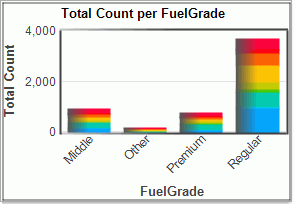
Touch a part of a display that represents data and dwell for a moment to learn more about it; this is called focus. Only one item is in focus at once, and this focus item is shown in all views that it is uniquely visible in.
For example, touch Arco to learn more about it. Since there is nothing in the second bar chart that represents only Arco, no focus is shown in the bar chart.
If you want to focus immediately without dwelling for a moment, hold down the Shift key.
The information displayed for focus may be customized for some views via the FocusFormat property, available from the Property Explorer.
These two displays show Survey data aggregated (accumulated) in different ways: by Oil Company and by Fuel Grade. Both come from the same data source; the charts compute the sums needed to display these different slices of the data from the same source automatically. You can dynamically change these as well.
The default aggregation is by Count the number of items in that category. You can also aggregate by summing another field in the data table, by taking the average, or by taking a ratio.
Notice that color stacking isn't supported for average aggregation; there is not an obvious mapping of the contribution of another field to the average.
Sweeping in a chart highlights (colors) the items you touched in that view, and also highlights the same entries (however they appear) in any other charts. For example:
By default a new selection replaces the current selection; you can modify the selection set instead by holding down the Shift key while dragging. This will toggle the selection state (selected becomes unselected, unselected becomes selected). Try this.
Besides selected and unselected, data may also be in the excluded state. When data is excluded, it is totally ignored: it does not appear in any charts and it is not used to compute ranges for axis. Data is excluded by applying exclusion to either the selected or unselected set, via the context menu or toolbar buttons. Excluded data can be restored. Use exclusion to remove outliers that distort the display, or to focus on a subset of the data.
This example has colored mapped to OilCo (Oil Company). In the pie chart, which shows OilCo directly, each pie slice is a single color. In the bar chart which shows Fuel Grades, each bar represents the sale of that fuel grade across all oil companies, so the colors are stacked. The large dark blue portion of the regular bar corresponds to Arco.
You can color by any field in your data and the color will be mapped onto all views if possible. First, colors are taken from a color scale, a linear sequence of colors. The default scale is the familiar rainbow scale, but others are available.
The same color scale is used for all views.
Color is mapped onto a field by taking colors from a color scale based on the type of the field:
Color adds another dimension in understanding your data. Within a single chart, color may provide a redundant encoding of information that is visible in other ways. Charts use color in a single way across all charts, which often provides an important linkage.
Color Mapping
Color is mapped to data tables. A table has a single coloring scheme. Each row in the table is assigned a color. Charts use this color when representing the data in that row. The easiest strategy is to map color using the values in a single field. The values in the field are ordered, a color scale (an ordered sequence of colors) is chosen, and colors are mapped to data values.
In the examples below, a table is colored by a categorical field (Sub-Type). The Pie Chart is built using this field, so each of the slices in the pie is colored differently. The Histogram, on field Volatility (%), is on the same table so it is colored in the same way. In this case, the histogram is colored in bands corresponding to the Sub-Type values. This coloring is called color stacking.
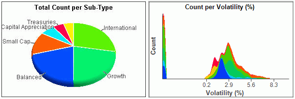
If these two charts were instead colored by Volatility (%) (the field the Histogram is based on), the result would look like this:
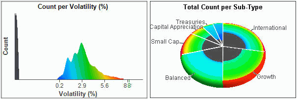
Now the Histogram is colored with a regular progression of colors, and the Pie Chart has color stacking. But again, the same data is colored in the same way. The black color represents missing values; note the missing values are shown in the histogram to the left of the plot. This did not occur in the original example because there were no missing values in the field being colored by, Sub-Type.
Fields are mapped to colors using the Color by pull down box in the Page tool bar. (If the Page toolbar is not present, go to the menu bar item, click View, select Toolbars, and check the item Page to display that toolbar, or right-click over the toolbar area in application window.
Color Scales
WebFOCUS Visual Discovery Workbench AE provides predefined, ordered sets of colors. Here are the options:
Rainbow. Is the default. Rainbow scales are best if you are coloring categorical data, but poor for coloring continuous data with magnitudes: how much bigger is blue than green? Adjacent values will have similar colors (until the transition between distinct hues occurs!), which may be difficult to distinguish.
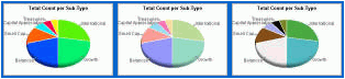
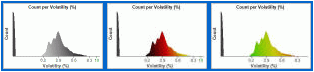
Color scales are chosen Color Scale pull down in the Page toolbar.
Custom Color Mappings
You may also define your own mapping of data field values to colors using the Color Workshop. Use the Color Workshop if the default field mapping are inappropriate for you data.
Colors and Excluded Data
When colors are applied to data, excluded values are ignored. So, for example, if data is excluded and you recolor a table and later restore the excluded data, it will be uncolored. To correct this, recolor the table by switching the Color By field to another field, then switching back to the original field.
Coloring by a continuous (numerical) field may have unexpected results. Colors are assigned equally to the total range of the field. If the data is highly skewed (for example, there are a small number of extreme values), then there may be large regions of the color scale for which there is no data. You can deal with this in two ways:
Chart Element Colors
Chart elements have standard colors that are used. Chart elements include backgrounds, lines, mouse drag graphics, unselected color, selected color (if not mapped to data), missing values, and overplotting indicator. The color for any of these elements can be changed using Select Chart Colors form the Tools menu bar item.
Selection highlights a subset of the data displayed in a chart. This selection is highlighted in all charts where that data appears. Selection is on a per Data Pool table basis.
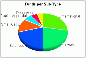
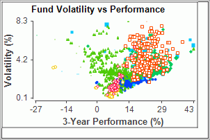
Sweep an area in either chart with the Left Mouse Button depressed; this selects the data in that region. The other chart is also updated to show the same items, highlighted in the same way. If data is colored, that coloring is maintained if possible.
A selection drag may be cancelled by clicking the Right Mouse Button before releasing the Left Mouse Button.
The two charts show the fund data at different granularities: the Pie Chart summarizes data by fund type and the Scatter Plot shows individual funds. Yet they are still linked; selecting a fund type in the Pie Chart selects all of those funds in that category, and selecting a set of funds in the Scatter Plot highlights the Pie Chart slices containing those funds, to the relative amount they represent.
Besides selecting a rectangular region, we can also select other regions. However, only the Rectangle works in 3D views (for example, 3D Multiscape, 3D Pie Chart, 3D Data Constellations, and Maps).
We can focus on a particular subset of the data. Select the categories International and Growth in the Pie Chart, than exclude from the context menu or tool bar icon.
Notice that the Scatter Plot changes as well to remove the excluded data. Now we are looking only at data for these two fund types. Restore data from the context menu or the tool bar icon.
The overall selection state can be controlled, using the Context Menu (select menu item) or using scripting. These operations are:
When you drag the mouse on a chart, you identify a set of items. These items are then combined with the existing selection state. Ways that this can be done are:
By default, sweeping with the Left Mouse Button (LMB) does Replace, and sweeping with LMB + CTRL Toggles.
The assignment of operations to the LMB may be changed with the Selecting Property Page tab or via scripting.
Unselected items typically may be displayed in the current unselected color, or omitted from the display. Omitting may make the display simpler to understand by omitting unnecessary detail.
Although this may appear the same as excluding, it is not. The data is still present in other views, it would not be if excluded.
Notice that hidden items may not be selected; they must be visible to be selected.
Most views allow you to manage your viewpoint: what part of the display you are looking at. Managing your viewpoint uses panning, zooming (magnifying), and possibly rotation.
To zoom, drag the edge of the central area to zoom in or out.
The size of the center bar in the zoom bar represents how much of the overall view is currently visible. At the start, the entire chart is visible so the center bar is full sized. You must zoom initially to magnify the display so that the window shows only a subset of the chart.
Many 3D charts have toolbar buttons that let you perform viewpoint operations with the Left Mouse Button. When selected, these switch the Left Mouse Button from selecting to changing viewpoint. For example, see the Data Constellations Toolbar.
The mouse can be to interact directly with the chart to adjust your viewpoint. The mouse can be used to pan and zoom, and in 3D views it can be used to rotate the scene.
|
Pan |
Zoom | |
|---|---|---|
|
2 button mouse |
CTRL-Right Mouse Button |
CTRL-Shift-Right Mouse Button |
|
wheel mouse |
Middle Mouse Button |
CTRL-Shift-Right Mouse Button |
All data types accept a special value indicating that the data is missing. For example, in a survey if a question wasn't answered the answer field should be marked as missing. Missing data is typically ignored by charts.
You can manage the handling of missing values in two ways:
In this section: |
All charts provide a common context menu:
Bar and Pie Charts provide additional context menu items:
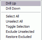
The additional Drill Up/Drill Down menu items allow you do drill up or down in a hierarchy that has been defined for the field currently visible in the chart.
These keyboard commands are available from most charts. Make sure that the chart has keyboard focus by clicking on it first! Charts with keyboard focus have a light border.
|
Keyboard |
Charts |
Action |
|---|---|---|
|
+, - |
Some |
Increase or decrease the size of glyphs. |
|
CTRL-c |
All |
Copy image to clipboard |
|
Home |
All |
Default pan/zoom position |
|
Shift-Home |
All |
Zoom to selected items only (supported only by some charts) |
|
Shift |
All |
Focus immediately |
|
CTRL |
All |
Alternative selection mode |
|
CTRL-a |
All |
Select all |
|
DEL |
All |
Exclude unselected |
|
CTRL-z |
All |
Undo |
|
CTRL-y |
All |
Redo |
|
CTRL-w |
All |
Save image to file; file name will be prompted for |
|
CTRL-s |
All |
Save Data Pool in binary format to file; file name will be prompted for |
|
I |
Bar, Line, Pie, Data Constellations |
Label item under mouse |
|
End |
3D |
Top view |
|
Up arrow |
3D |
Front view |
|
Down arrow |
3D |
Rear view |
|
Left arrow |
3D |
Left view |
|
Right arrow |
3D |
Right view |
|
Space |
3D |
Go to next viewpoint operation |
|
x |
3D |
Display current transforms for returning to this positioning |
| WebFOCUS |


 Circular node placement
 Hexagonal node placement
 Top down tree node placement
 Angular tree node placement


