axisname: {
  title: {
    text: 'textstring',
    visible: boolean,
    font: 'fstring',
    color: 'cstring'
  }
}
where:
- axisname
Can be:
- xaxisOrdinal
- xaxisNumeric
- yaxis
- zaxisOrdinal
- 'textstring'
Is a string that defines axis title text. The default value for xaxis is the sort field name or title, or the name assigned with an AS phrase. The default value for yaxis is 'Y Axis Title'. The default value for y2axis is 'Y2 Axis Title'. The default value for zaxis is 'Z Axis Title'.
- boolean
Controls the visibility of the axis title. Valid values are:
- true, which makes the axis title visible.
- false, which makes the axis title not visible. This is the default value.
- 'fstring'
Is a string that defines the size, style, and typeface of the axis title. The default value for xaxis is 'bold 9pt Sans-Serif'.
- 'cstring'
Is a string that defines the color of the axis title using a color name or numeric specification string. The default value is 'black'.
For information about defining colors, see Colors and Gradients.
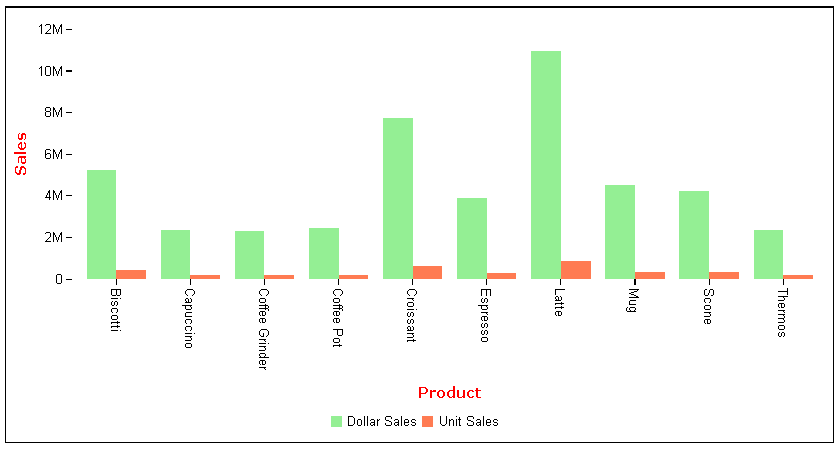
The following request against the GGSALES data source makes the axis titles visible and red. It changes the font for the axis titles to bold 10pt Verdana:
GRAPH FILE GGSALES
SUM DOLLARS UNITS
BY PRODUCT
ON GRAPH PCHOLD FORMAT JSCHART
ON GRAPH SET LOOKGRAPH VBAR
ON GRAPH SET STYLE *
*GRAPH_JS
  xaxisOrdinal: {title: {visible: true, color: 'red', font: 'bold 10pt Verdana'}},
  yaxis: {title: {visible: true, color: 'red', font: 'bold 10pt Verdana',text:'Sales'}},
series: [
    {series: 0, color: 'lightgreen'},
    {series: 1, color: 'coral'},
]
*END
ENDSTYLE
END
The output is:
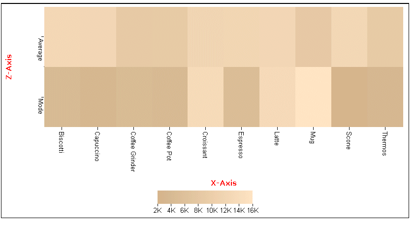
The following request generates a heatmap with x- and z-axis titles in red, with font bold 10pt Verdana:
GRAPH FILE GGSALES
SUM AVE.DOLLARS AS 'Average'
 MDE.DOLLARS AS 'Mode'
BY PRODUCT
ON GRAPH PCHOLD FORMAT JSCHART
ON GRAPH SET LOOKGRAPH SPECTRAL
ON GRAPH SET STYLE *
*GRAPH_JS
yaxis: {colorScale: {colors: ['tan', 'bisque'] }},
xaxisOrdinal: {title: {visible: true, color: 'red', font: 'bold 10pt Verdana',text: 'X-Axis'}},
zaxisOrdinal: {title: {visible: true, color: 'red', font: 'bold 10pt Verdana',text: 'Z-Axis'}},
*END
ENDSTYLE
END
The output is:
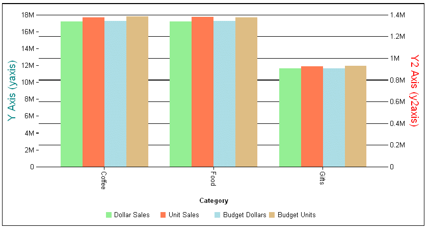
The following request assigns two series to the y-axis and two to the y2-axis and formats the titles for those axes:
GRAPH FILE GGSALES
SUM DOLLARS UNITS BUDDOLLARS BUDUNITS
BY CATEGORY
ON GRAPH PCHOLD FORMAT JSCHART
ON GRAPH SET LOOKGRAPH VBAR
ON GRAPH SET STYLE *
*GRAPH_JS
yaxis:{title: {visible: true, text: 'Y Axis (yaxis)',font: '14pt Sans-Serif', color: 'teal'}},
y2axis:{title: {visible: true, text: 'Y2 Axis (y2axis)', font: '14pt Sans-Serif', color: 'red'}},
series: [
    {series: 0, color: 'lightgreen', yAxisAssignment: 1},
    {series: 1, color: 'coral', yAxisAssignment: 2},
    {series: 2, color: 'lightblue', yAxisAssignment: 1},
    {series: 3, color: 'burlywood', yAxisAssignment: 2},
]
*END
ENDSTYLE
END
The output is:
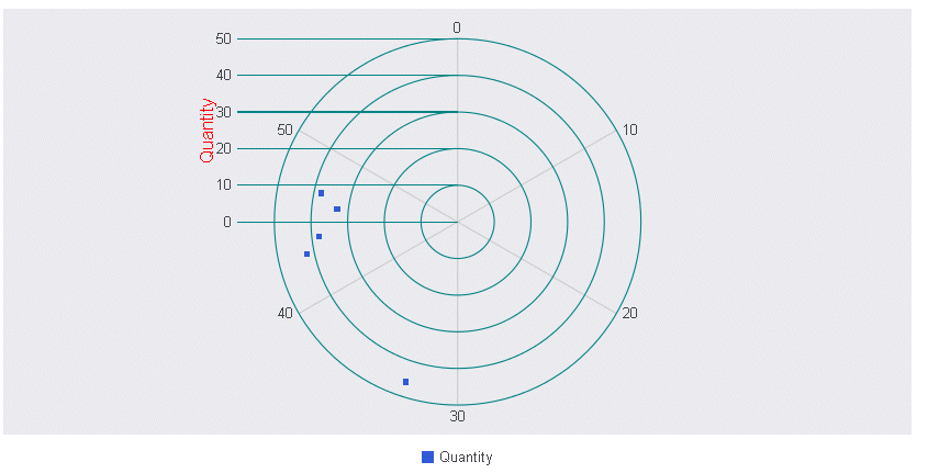
The following request generates a polar chart and formats the y-axis label:
GRAPH FILE GGORDER
PRINT QUANTITY AS 'Quantity'
ACROSS PRODUCT_CODE
WHERE PRODUCT_CODE EQ 'B144'
WHERE QUANTITY LT 51
ON GRAPH PCHOLD FORMAT JSCHART
ON GRAPH SET LOOKGRAPH POLAR
ON GRAPH SET STYLE *
*GRAPH_JS
legend: {visible: true},
polarProperties: {
  straightGridLines: false,
  extrudeAxisLabels: true
},
yaxis: {
  title: {visible: true, font: '12pt Sans-Serif', color: 'red'},
  majorGrid: {visible: true,lineStyle: {width: 1,color: 'teal'}},
},
*END
INCLUDE=ENIADefault_combine.sty,$
ENDSTYLE
END
The output is:
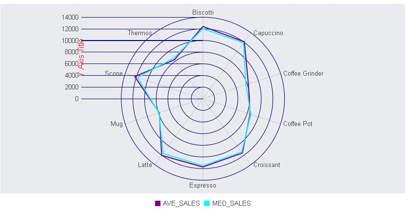
The following request generates a radar chart with a y-axis title:
GRAPH FILE GGSALES
SUM DOLLARS NOPRINT
AND COMPUTE
AVE_SALES = AVE.DOLLARS;
MED_SALES = MDN.DOLLARS;

ACROSS PRODUCT
ON GRAPH PCHOLD FORMAT JSCHART
ON GRAPH SET LOOKGRAPH RADARL
ON GRAPH SET STYLE *
*GRAPH_JS
legend: {visible: true},
polarProperties: {extrudeAxisLabels: true},
  yaxis: {title: {visible: true, font: '12pt Sans-Serif', color: 'red'},
  majorGrid: {lineStyle: {width: 1,color: 'navy'}},
},
series: [
   {series: 0, color: 'purple', border: {width: 2}},
   {series: 1, color: 'cyan', border: {width: 2}},
   {series: 2, color: 'grey', border: {width: 2}},
   {series: 3, color: 'teal', border: {width: 2}},
]
*END
INCLUDE=ENIADefault_combine.sty,$
ENDSTYLE
END
The output is: