How to:
Reference: |
You can customize the templates by selecting colors (or images, where applicable) for the following areas:
Note: Depending on the template and the items selected to be included in the view, certain items may not appear on the Custom Colors window.
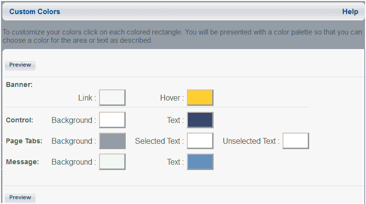
The following image shows the Custom Colors window containing color choices for Banner, Control, Domain, Page Tabs, and Content Block.
The color areas vary for each template. For details, see:
The Custom Colors window opens.
The Color Palette window opens, as shown in the following image.
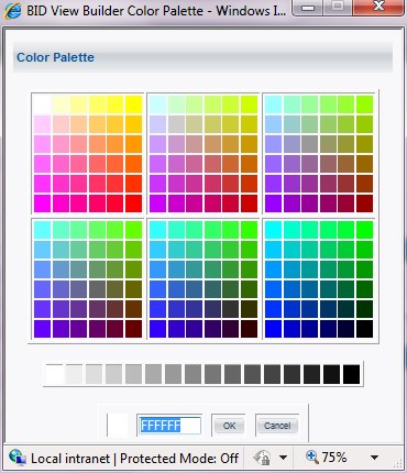
Click Close to close the Color Palette window without saving changes.
You return to the Custom Colors window.
The following table lists and describes the color areas for the banner.
|
Custom Color Area |
Designates |
|---|---|
|
Background 1 |
The area that does not contain a logo or links for templates 2, 3, 4, and 5. In templates 1 and 6, it is the area behind the links. |
|
Background 2 |
In template 1, the narrow bar above "Your Company LOGO". The area behind the links in templates 2, 3, and 4. In templates 5 and 6, the narrow bar at the bottom of the banner. |
|
Background 3 |
In templates 1 and 3, the narrow bar below "Your Company LOGO". In template 2, the bar beneath background area 1. The logo area in templates 3, 4, and 5. Background 3 is not applicable in template 6. |
|
Background 4 |
In template 1, the area behind "Your Company LOGO". In template 3, the line between "Your Company LOGO" and the link bar. Background 4 is not applicable for templates 2, 4, 5, and 6. |
|
Background 5 |
In template 5, the line between "Your Company LOGO" and the message of the day. Background 5 is not applicable for templates 1, 2, 3, 4, and 6. |
|
Link |
Text color for links in the banner and for the optional welcome message. |
|
Hover |
Text color for links when the cursor is positioned over the link. |
The following table lists and describes the color areas for the toolbar.
|
Custom Color Area |
Designates |
|---|---|
|
Background |
Color of the toolbar at the top of the tree and content blocks. |
|
Text |
Content block name. |
The following table lists and describes the color areas for page tabs.
|
Custom Color Area |
Designates |
|---|---|
|
Selected Tab Background |
Background color for the selected page tabs. |
|
Unselected Tab Background |
Background color for the unselected page tabs. Note: When default round corner tabs are used, the background color is the same for both selected and unselected tabs. |
|
Selected Tab Text |
Text color for the selected page tab. |
|
Unselected Tab Text |
Text color for the unselected page tabs. |
The following table lists and describes the color areas for the message.
|
Custom Color Area |
Designates |
|---|---|
|
Background |
Background color for the Message of the Day block. |
|
Text |
Color of the Message of the Day text. |
The following table lists and describes the color areas for toolbar 1 and toolbar 2.
|
Custom Color Area |
Designates |
|---|---|
|
Background 1 |
Area behind the text. |
|
Background 2 |
Toolbar item outline. |
|
Background 3 |
Toolbar background (area behind the items in the tool bar). |
|
Link |
Text color of links in the toolbar. |
|
Visited Link |
Text color for links in the toolbar after being accessed. |
|
Hover |
Text color for links in the toolbar when the cursor is positioned over the link. |
The Custom Colors window opens.
You can add a wallpaper effect in templates 2, 4, and 5.
Note that the image must be a GIF, JPG, or BMP file.
If the image is smaller than the banner area, it is repeated to fill the area.
Note: Dragging the items, including images, is not supported in View Builder.
The Preview window must be updated before exiting the Custom Colors window or your changes will not be saved.
The selected image file is copied to the WebFOCUS directory for access while running Dashboard. If the image file is modified in its original location, you will need to reinsert the image from View Builder. It will not be automatically updated.
The name of the image will not display when you reenter the View Builder.
<internal-var name="tabStyle" value="0"/>
to the following setting for square corner page tabs:
<internal-var name="tabStyle" value="1"/>
Note: After making changes to the bid-config.xml file, use the Console to clear memory cache, or restart the application. Until this is done, the change is not effective.
| WebFOCUS |