Getting Started With HTML Composer

How to:

Reference:

You can create procedures and HTML forms in one integrated process with HTML Composer. When you save your layout, the procedures are embedded in the HTML file, creating a single file for your application.

You can build HTML pages using templates and/or Guided Report Mode. These features are designed to simplify and automate a majority of the process that goes into creating HTML pages. For more information on templates, see Using Templates in HTML Composer. For more information on Guided Report Mode, see Creating Guided Report Forms.

Note: HTML Composer does not support OLAP-enabled reports. If you execute a report from HTML Composer with this option, the output window will not display the OLAP controls, and you will receive a scripting error. In order to execute this type of report, you must use a frame. For more information, see Adding a Frame to the Layout.


Top of page

x
Procedure: How to Access HTML Composer
  1. Create a new HTML file by completing one of these actions:
    • With the HTML folder highlighted, select New from the File menu, then select HTML File.

      or

    • Click Layout reports and graphs in the QuickLinks pane to create a new HTML file using Guided Report mode.
    • With the HTML folder highlighted, select New from the File menu, then select Guided Report Form.

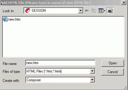
    The Add HTML File dialog box opens.

  2. Enter a name for the new HTML file in the File name field.
  3. Ensure that Composer is selected in the Create with field.
  4. Click Open.

    The Template selector window opens. To create an HTML page without using templates, select Cancel. For more information on using templates, see Using Templates in HTML Composer.

    You can select the Guided Report Mode check box to create a Guided Report Form. If you chose to create a HTML file using Guided Report Mode, see the Guided Report Mode chapter for more information.


Top of page

x
Reference: HTML Composer Windows and Toolbars

The following image is an example of HTML Composer.

The main elements of HTML Composer are:

Menu Bar

Displays pull-down menus for HTML Composer.

Developer Studio Toolbar

Displays tool buttons, such as Open and Run. For details, see the Creating Reporting Applications With Developer Studio manual.

Standard Toolbar

Displays buttons, such as Cut and Paste that allow you to edit the layout.

Components Toolbar

Contains buttons that add reporting objects and controls to the layout.

Formatting Toolbar

Displays buttons that format and align text when using a text element in the layout.

Positioning Toolbar

Contains buttons that control the appearance of the layout. For details, see Positioning Toolbar.

Utilities Toolbar

Contains buttons that control synchronization and chaining. For details, see Utilities Toolbar.

Properties Window

Displays the Properties tab, which contains the Properties subtab and the Events subtab when an object is selected in the layout. The Properties window also contains the Thumbnails tab.

  • The Properties subtab contains options for the properties of the object.
  • The Events subtab displays the JavaScript events associated with objects in the layout.

For details, see Working With the Properties Window.

Thumbnails Tab

Enables you to view a thumbnail of the page layout. Thumbnail view allows objects on the page to participate in actions with controls on the Parameters tab. You may also refresh the Thumbnails tab, enlarge or reduce the thumbnails, and change the zoom levels. Reports and graphs appear as placeholder objects on the Thumbnails tab.

QuickLinks Window

Displays links to information on Help, configuration options, metadata creation, and reports and procedures.

Note: QuickLinks is turned off by default. If you need to access QuickLinks, select QuickLinks from the View menu (when you are in the Developer Studio Explorer).

Design Tab

Displays the design view where you can add and position objects to the layout.

Parameters Tab

Displays information about the parameter values and input controls in your report or graph. For details, see Working With the Parameters Tab.

Embedded JavaScript

Displays the HTML code and the JavaScript code for objects in the HTML layout.

Note: You may reorder the position of the Design tab, Parameters tab, and Embedded JavaScript by left-clicking and dragging the tabs on the bottom of the HTML layout.


Top of page

x
Reference: Standard Toolbar

The Standard toolbar contains the following buttons:

Button

Description

Saves the HTML file to the current project. This button is dimmed once the layout is saved and no new changes have been made. When a change has been made to the layout, the Save button is active until the layout is saved again.

Removes the highlighted object(s) and saves it to the clipboard.

Copies the highlighted object(s) to the clipboard.

Pastes the object(s) to the specified location.

Deletes the highlighted object(s).

Resets the layout by reversing the last action performed.

Repeats the last action performed.

The Refresh All option enables you view any edits or changes that you made to your layout. Refresh All reloads all objects and reruns the reports and graphs in Design view.

Note: Refresh also shows changes made to reports and graphs that are referenced in your layout.


x
Reference: Components Toolbar

The Components toolbar contains the following buttons:

Button

Description

Inserts a report object to the layout.

For details, see Adding a Report, Graph, or Compound Document to HTML Composer.

Inserts a graph object to the layout.

For details, see Adding a Report, Graph, or Compound Document to HTML Composer.

Inserts a placeholder for a control.

For details, see Using Controls to Supply Incoming Parameter Values.

Inserts a placeholder for an IFRAME. An IFRAME can have its own URL and contain HTML content, and it can be a placeholder for a drill-down report.

For details, see Adding a Frame to the Layout.

Inserts a placeholder for an image.

For details, see Adding an Image to the Layout.

Inserts text.

For details, see Adding Text to the Layout.

Inserts a line.

For details, see Adding a Line to the Layout.

Adds a group box.

For details, see Adding a Group Box to the Layout.

Adds a text box.

For details, see Using a Text Box.

Adds a hidden control.

For details, see Using a Hidden Parameter Value.

Adds a drop-down list.

For details, see Using a Drop-Down List.

Adds a list box (a drop-down list that allows multiple selections).

For details, see Using a List Box.

Inserts a placeholder for a double list parameter control.

For details, see Using a Double List Control.

Adds a push button.

For details, see Adding a Push Button to the Layout.

Adds a reset button.

For details, see Adding a Reset Button to the Layout.

Adds a radio button.

For details, see Using Radio Buttons.

Adds a check box list.

For details, see Using Check Boxes.

Inserts a text area.

For details, see Using a Text Area.

Inserts a tree control.

For details, see Using Tree Controls.

Inserts a hyperlink.

For details, see Adding a Hyperlink to the Layout.

Adds a calendar.

For details, see Adding a Dynamic Calendar.

Adds an ActiveX control or a Visual Discovery control.

When adding ActiveX controls in HTML Composer, only true ActiveX controls are shown in the list. The first time that an ActiveX control is added, a message appears indicating that it is reading ActiveX controls from the registry. This list is cached for future use and only ActiveX controls are added.

For more information about Visual Discovery, see the Using WebFOCUS Visual Discovery to Develop Analytic Dashboards manual.

Inserts Flash content.

For details, see Adding Flash Content to the Layout.

Inserts a Save Selection button.

Note: This is specific to Managed Reporting and the ability to save parameterized reports with the Save Parameters dialog box.

Inserts a panel to group objects together. The panel is invisible at run time.

For details, see How to Group Objects on the HTML Page.

Inserts a slider parameter control bar.

For details, see Using a Slider Control.

Inserts a tab control.

For details, see Adding a Tab Control to the Layout.

Adds a Google map.

For more information about Google Maps™, see Using Maps in HTML Composer.

Inserts a label. A label is simply a piece of text. The label component enables you to create and name a label, and link it to a control.

For details, see Adding a Label to the Layout.

Inserts a Visual Discovery control. For more information on Visual Discovery, see the Using Visual Discovery in HTML Composer


x
Reference: Formatting Toolbar

The Formatting toolbar contains options that can be applied to individual strings of text, as well as to the entire text element, with the exception of the alignment options. The alignment options can only be applied to the text element.

For more information about using text elements, see Adding Text to the Layout.

Button

Description

Applies bold formatting to the text.

Applies italic formatting to the text.

Applies underline formatting to the text.

Applies superscript typography to the text.

Font style opens the Font dialog box where you can set the Font, Font Style, Size, Color, and Effect of the text.

Aligns the text element to the left.

Aligns the text element to the center.

Aligns the text element to the right.

Aligns the text to fill the width of the text element.


WebFOCUS