WebFOCUS Maintain makes it easy for you to add .jpg or .gif images
to your forms. You can add images in one of two ways:
Images are included in your project as resources. Resources are
part of your project, but you do not edit them directly using the
Maintain Development Environment. However, WebFOCUS Maintain will
take care of deploying them to the correct location so that your application
will run properly.
xChanging Image Properties
When you select your image, you will see a list of image
properties in the property sheet. Changing these properties will
change what your image looks like and what it does at run time.
Many of the styling properties can also be changed using a Cascading
Style Sheet. For more information on Cascading Style Sheets, see
Using Cascading Style Sheets.
Choose your property based on the task you wish to perform:
If you want to change the name of the image that identifies it to the procedure, use
the (Name) Property. For more information, see the (Name) Property.
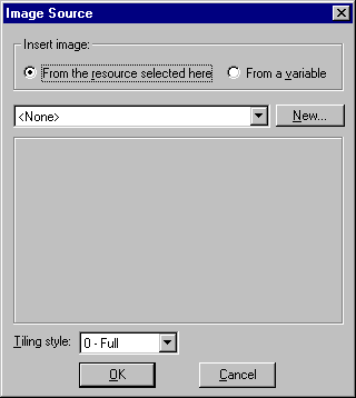
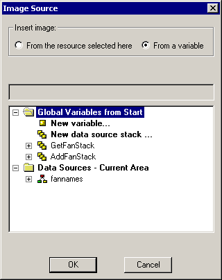
If you want to change which image will appear, use the
Image Property to open the Image Source Dialog Box.
If you want to change the size of the location or size of the image, use
a style sheet or resize the image directly in the form. You can
also use the Stretched Property and
the Bottom Property, Left Property, Right Property,
and Top Property.
If you want to add a border to the image, use a style
sheet or the Border Property to
determine whether you have a border and what type of border it is.
The BorderColor Property allows
you to determine the color of the border. The BorderWidth Property allows
you to determine the width of the border.
If you want to change what the image looks like when the end user selects the image, use
the ImageDown Property. For more information, see Changing Images at Run Time Using ImageDown and ImageOver.
If you want to make different regions of the image clickable, use
the Map Property. For more information, see Using Image Maps.
If you want to make the image inactive or make it invisible, use
the Enabled Property to determine whether the image is active or
not. If the image is inactive, nothing will happen when the end
user clicks it. You can also use the Visible Property to determine whether
the image is visible to the end user or use a style sheet. For more
information, see the Enabled Property and the Visible Property.
If you want to change what the cursor looks like when it is on top of the image, use
the CursorPointer Property or
use a style sheet.
If you want to change what the image looks like when the cursor is on top of the image, use
the ImageOver property. For more information, see Changing Images at Run Time Using ImageDown and ImageOver.
If you want to display a tooltip when the cursor is on top of the image, use the Alt Property or the ToolTipText Property.
If you want to display a tooltip when the cursor is on the top of the image, use
the ToolTipText Property.
If you want to assign a Help topic to the image, use the
Help Property. For more information, see Assigning Help to Your Forms and Controls.
If you want to move the image to another layer, use the
Layer Property. For more information, see Layering Controls.
If you want to control the display order of the image when more than one control is overlaid, use
the ZIndex Property. For more information, see the ZIndex Property.
x
Using the Map property, you can define separate clickable
areas on an image. At run time, end users can click on separate
areas of the image to trigger different actions. This enables you
to use one image instead of several, thus making your application smaller
and faster to download.
After you define an image map, when you open the Event Handler
editor for the image, you will see new events that correspond to
each of the areas in the image map.
x
Procedure: How to Define an Image Map
-
Select
the image control you want to apply an image map to and select the
Map property.
WebFOCUS Maintain opens the Image Map dialog box.
-
Click
New to create an image map.
-
Define
clickable areas in the image using one of the three tools.
You can define areas shaped like a circle, rectangle, or polygon.


To
delete an area, use the Delete and Delete all buttons.


-
If you
wish, rename your areas and apply tooltips to each.
-
Click
OK.
-
Open
the Event Handler editor for the image.
-
In the
list of events for the image, you will see Click events for each
of the areas you defined in the Image Map dialog box.
-
Define
event handlers for each of these events.
x
Reference: Image Map Dialog Box
Use the
Image Map dialog box, shown in the following image, to define clickable locations
in an image.
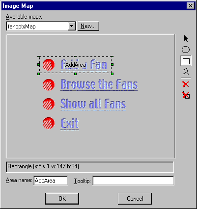
This dialog box includes the following options:
-
Available maps
-
Contains a list of the maps available for this image
resource (you can have more than one). To use one, select it. To
rename one, select it and type a new name.
-
New
-
Creates a new image map.
-
Image map area
-
Create and edits your image areas that define what
end users can click.
-

-
Enables you to select areas for editing.
-
-
Enables you to define circle-shaped areas on the
image.
-
-
Enables you to define rectangle-shaped areas on the
image.
-
-
Enables you to define irregular, polygon-shaped areas
on the image.
-
-
Deletes a selected area.
-
-
Deletes all areas defined in this image map.
-
Description of selected area
-
Describes what shape and size the selected area has.
-
Area name
-
Is the name of the selected area. To rename an area,
select it and type a new name here.
-
Tooltip
-
Enables you to enter a tooltip for the selected area.
xChanging Images at Run Time Using ImageDown and ImageOver
If you are defining your image to be clickable that
is, an end user clicking the image causes some action to occur,
then you may wish to provide visual feedback to your end users that
the image has been clicked. You may also want to have the image change
when end users move their cursors over the image, indicating that
the image is clickable. You can do this using the ImageDown and
ImageOver properties.
To use another image as an ImageDown or ImageOver, we recommend
the following:
- The image should
be the same size as the original image.
- The image should
be similar to the original image. For example, ImageDown images are
frequently negative versions of the original image.
x
Procedure: How to Change an Image When End Users Click It
-
Select
the image.
-
Double-click
the ImageDown or ImageOver property
to open the Image Source dialog box.
or
Right-click the image and in the shortcut
menu, click Change down image or
Change over image.
-
Follow
steps 2 through 6, as shown in How to Add an Image to Your Form.
 in the Controls
palette and select an area on the form approximately where you want
the image to go.
in the Controls
palette and select an area on the form approximately where you want
the image to go.
 . The Resource
Wizard will automatically preview the image you select.
. The Resource
Wizard will automatically preview the image you select.