How to: Reference: |
This topic provides step-by-step instructions for selecting and organizing the data that you want to include in a report. It also describes how to present the selected data in chart format, or in tabular format as a Rollup Table.
- Create an active report with an output format of either active report for Adobe Flash Player (FLEX) or active report for PDF (APDF).
- Run the active report.
-
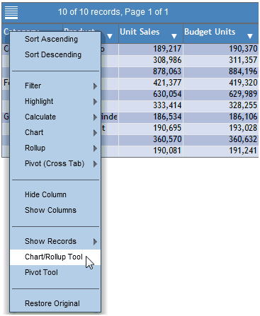
In any column
heading, click the arrow to display a drop-down menu. From the
menu, click Chart/Rollup Tool, as shown in
the following image.
The Chart/Rollup Tool opens, with the Series tab displayed, as shown in the following image.
The Series tab includes the Columns, Group By, and Measure lists. The Columns list includes all available columns in the active report. You can drag and drop columns from the Columns list into the Group By or Measure sort field. The Charts tab allows you to select the desired chart type. The Data tab displays the result of your report design as a Rollup Table.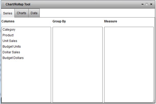
- Left-click and drag the desired columns from the Columns list into the Group By and Measure sort fields.
-
You can
edit the sort fields by clicking the X icon
to delete columns, drag multiple columns into the Group By and Measure
sort fields, reorder the columns in the sort fields, and change
the aggregation type of the Measure by clicking the Calculation
 icon.
icon.
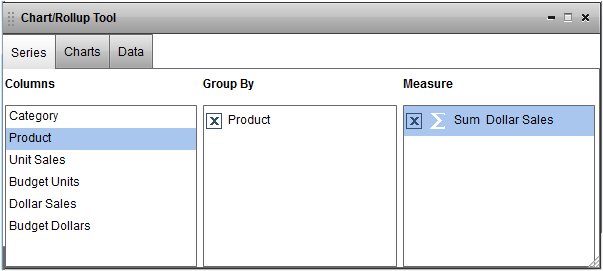
The following image shows a report that has been designed on the Series tab.
WebFOCUS automatically generates a new window that contains a pie chart when there is more than one field in the Group By and Measure sort fields.
-
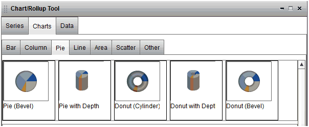
To change
the chart type, click the Charts tab and
then click the chart type of your choosing (Bar, Pie, Line, Scatter,
or Other), as shown in the following image.
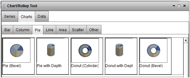
Only the four default charts (pie, bar, line, and scatter) are available on the Charts tab if you are running an active report or an active dashboard for PDF.
When you point to a chart label, the complete descriptive name of the chart is provided.
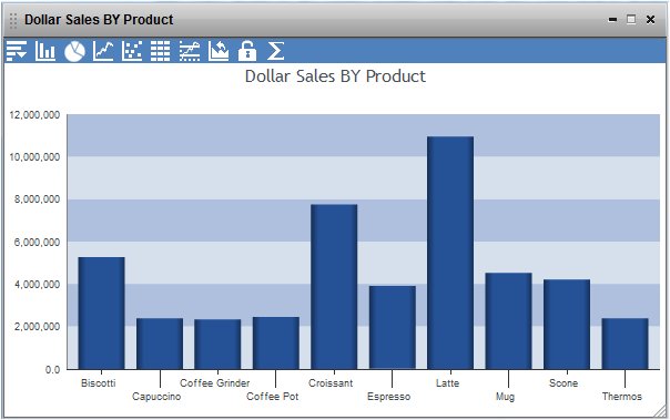
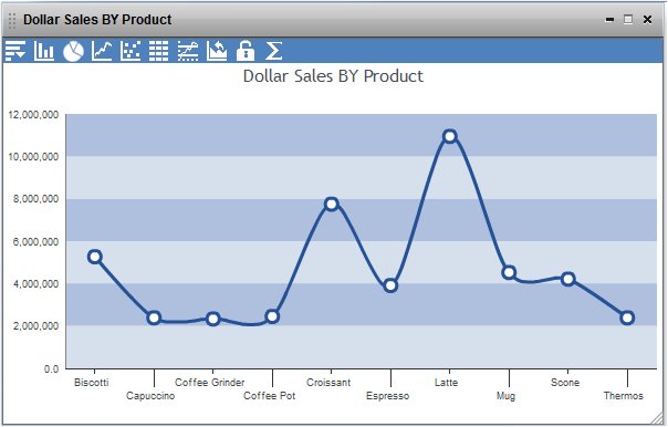
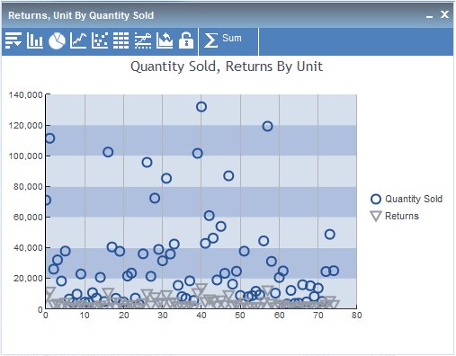
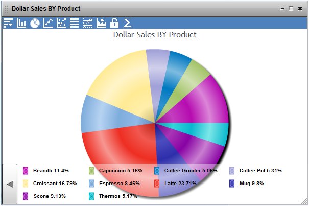
The chart type in the output window dynamically changes to the chart type selected. The chart image in the tool window is highlighted to indicate the chart type selected and displayed in the output window.
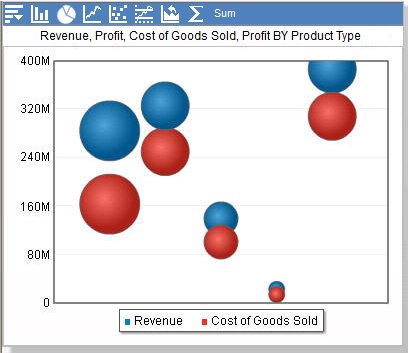
The following image shows an output window with the selected data presented as a pie chart.
- Click the close button, X, in the upper-right corner of the Chart/Rollup Tool to exit the tool.
-
From the
output window, you can change the chart format to one of the available
types.
- The Column
 icon
changes the type to the default column chart.
icon
changes the type to the default column chart. - The Pie
 icon
changes the type to the default pie chart.
icon
changes the type to the default pie chart. - The Line
 icon
changes the type to the default line chart.
icon
changes the type to the default line chart. - The Scatter
 icon
changes the type to the default scatter chart.
icon
changes the type to the default scatter chart.
You can click the Rollup
 icon
to display the data in tabular (grid) format.
icon
to display the data in tabular (grid) format.You can click the Advanced Chart
 icon
to return to the Series tab in the Chart/Rollup Tool.
icon
to return to the Series tab in the Chart/Rollup Tool.You can click the Lock/Unlock
 icon to
lock (freeze) the report.
icon to
lock (freeze) the report.You can click the Original Chart
 icon
to restore the current chart type to the initial chart type that
was displayed.
icon
to restore the current chart type to the initial chart type that
was displayed.You can click the Aggregation
icon
to change the aggregation type.You can click the Menu
 icon,
and click Chart/Rollup Tool, to open the
Chart/Rollup Tool again.
icon,
and click Chart/Rollup Tool, to open the
Chart/Rollup Tool again. - The Column
-
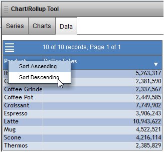
To display
the result of your chart design as a Rollup Table, open the Chart/Rollup
Tool and click the Data tab.
The selected data is displayed in tabular format. Click the arrow on a column heading to display a menu of your data sort options, as shown in the following image.
From the Data tab, you can return to the Series or Charts tab.
The following apply when you use the Chart/Rollup Tool in an active report for Adobe Flash Player:
- The Group By and Measure sort fields are required.
- You can use multiple Group By and Measure sort fields. Group By is the column used for the X-axis, and Measure is the column used for the Y-axis.
- You can use only one Measure sort field (as the Y-axis) when using a pie chart.
- The same column can appear in both the Group By and Measure sort fields.
- You can drag columns between the Group By and Measure sort fields, but you cannot drag them back to the Columns section.
- The Measure sort field displays Sum for numeric fields and Count for non-numeric fields by default.
- Headings for the chart are generated using the field name, or column title name. The report HEADING is inherited only if REPORT-VIEW=CHART is set in the WebFOCUS procedure.
- When you use the Chart/Rollup Tool with hidden columns (HIDE=ON StyleSheet setting), the hidden columns will not be displayed in the Rollup Table. To display the hidden columns in the Rollup Table, select Show Columns from the active report menu, and select the column name that you want to display.