|
How to: |
The following table lists and describes the Gadgets that are available in the current release of PMF.
- As of Release 8.1.1, Utility Tree Gadgets are no longer supported.
- As of Release 5.3.2, Flex Gadgets have been deprecated. If you migrate an existing data mart to Release 8, any Flex Gadgets and dashboards you are using for defaults will still be in the system, and unused ones will be removed. More Gadgets will be made available in subsequent releases.
|
Gadget |
Example |
Description and Filters |
|---|---|---|
|
Analysis Grid (Designer) |
 |
Lets you run an interactive grid based on the Analysis Designer templates, which offer nine combinations. Available layouts are grid types:
Available categories are:
You can choose groupings (such as by Dimension, Perspective, or Objective), components to display (such as Actual value or Target percent reached with indicator) and filters (such as on Measure, Objective, or Time Range). This allows for tens of thousands of possible grid designs for your dashboard. |
|
D3 Gadgets |
||
|
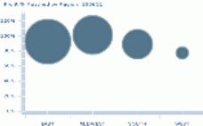
D3 - Metric Dimension Actual Circle Packing |
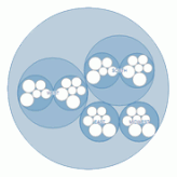 |
An animated visualization that shows proportionally-formatted Measure Actual data for any Dimensions you select, and broadcasts your selections to the entire Dashboard.
|
|
D3 - Metric Dimension Pct Circle Packing |
|
A smoothly animated visualization that shows proportionally-formatted Measure Percent Reached data for any Dimensions you select, and broadcasts your selections to the entire Dashboard.
|
|
D3 - Metric Dimensional Circular Indicator Heatmap |
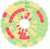 |
Displays Indicator status, with a callout hover that shows Actual value, Target value, and Percent Reached for every Measure. The Measure indicators are displayed in concentric circles, with each concentric circle representing indicators for a particular Measure (as labeled). The radius lines divide the indicators by a User selected Dimension. Filters:
|
|
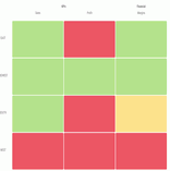
D3 - Metric Dimensional Heatmap Rectangular |
 |
Displays measure indicator status, with Measures shown as rows, and Dimensions shown as columns. Filters:
|
|
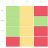
D3 - Metric Perspective Heatmap Rectangular |
 |
Displays measure indicator status, with Measures shown as columns, and Dimensions shown as rows. Measures are grouped by perspectives as a column group heading. Filters:
|
|
D3 - Metric Time Series Circular Indicator Heatmap |
|
Displays Indicator status, with a callout hover that shows Actual value, Target value, and Percent Reached for every Measure. The Measure indicators are displayed in concentric circles, with each concentric circle representing indicators for a particular Measure (as labeled). The radius lines divide the indicators by Time. Filters:
|
|
HTML5 Gadgets |
||
|
HTML5 - Metric Actual Target Prior Lines |
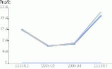 |
Displays a line graph showing the variance of actual values against the variance of target values, along with prior actual values for year-over-year comparison. Filters: Measures (Required) |
|
HTML5 - Metric Actual Target YTD & Prior Bars |
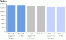 |
Provides a visual analysis using bar charts to display Year-To-Date and current period performance for actual, target, and prior year values. Filters: Measures (Required) |
|
HTML5 - Metric Actual v. Flattened Target Lines |
 |
Displays a line graph showing the variance of actual over target values, which is flattened to emphasize variances. Filters:
|
|
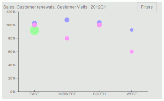
HTML5 - Metric Bubble Chart |
 |
Displays a placed distribution of performance values where the midpoint of each value falls along a horizontal dimensional axis and Performance on the vertical axis. Size of the bubble indicates the actual value. Filters:
|
|
HTML5 - Metric Bubble Value Chart |
 |
Displays a placed distribution of Measure Actual values where the midpoint of each value falls along a horizontal dimensional axis and Performance on the vertical axis. Size of the bubble indicates the actual value. Filters:
|
|
HTML5 - Metric Counts of Actual RYG Bars |
 |
Displays the total Hi-Mid-Low (H-M-L) counts of a metric range. Also shows the H-M-L share of the total count of metric values in the metric range of each indicator. Filters:
|
|
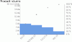
HTML5 - Metric Dim. Breakout Value Bars |
 |
Displays actual value distribution for any Dimension and level. Displays a series of bars across a selected Dimension using indicator colors for the current time period. Filters:
|
|
HTML5 - Metric Dim. Breakout Donut |
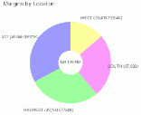 |
Displays a donut chart showing metric quantities distributed across a selected Dimension and level value. Filters:
|
|
HTML5 - Metric Dim. Breakout Perf. Bars |
|
Displays performance distribution for any Dimension and level. Displays a series of bars across a selected Dimension using indicator colors for the current time period. Filters:
|
|
HTML5 - Metric Dim. Breakout Pie |
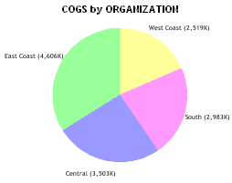 |
Displays a pie chart showing metric quantities distributed across a selected Dimension and level value. Filters:
|
|
HTML5 - Metric Dim. Pareto Distribution Chart |
 |
Shows the proportion of Actual values for all Measures for the selected Perspective for the current or any single-point Time Period. Differs by Scorecard. Filters:
|
|
HTML5 - Metric Dimension Stacked Bar |
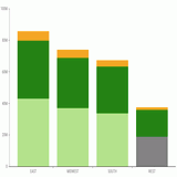 |
Shows the actual values of a measure stacked into each bar, for all measures selected. The values are broken out by a Dimension, for example, Time. Filters:
|
|
HTML5 - Metric Pct Reached for Perspective |
 |
Shows the percent reached for all Measures for the selected Perspective. Differs by Scorecard. Filters:
|
|
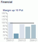
HTML5 - Metric Perf. Gauge |
 |
Displays the percent achieved for the selected Measure, and illustrates the Measure set tolerances in red/yellow/green. Filters:
|
|
HTML5 - Metric Perf. Trend Bars |
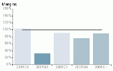 |
Displays a time series of bars using indicator colors. Filters:
|
|
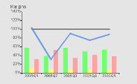
HTML5 - Metric Perf. Trend Lines & Bars |
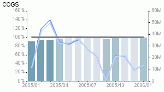 |
Displays a time series of bars using indicator colors with two lines drawn over the bars to show actual and target values. Filters:
|
|
HTML5 - Metric Single Dimension Stacked Bar |
|
Shows multiple combined Dimensional values for a single measure in each bar. The values are broken out by Time. Filters:
|
|
HTML5 - Metric Tree Map |
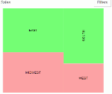 |
Displays a drillable tree map of shares of various contributors. Filters:
|
|
HTML5 - Metric Value Trend Bars |
|
Displays a time series of bars using indicator colors. Filters:
|
|
HTML5 - Metric Value Trend Lines & Bars |
|
Displays a time series of bars using indicator colors with two lines drawn over the bars to show actual and target values. Filters:
|
|
HTML5 - Metrics Value Multiline |
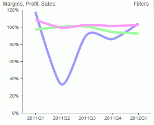 |
Displays a line chart to show the actual value with a smooth line. For comparison, each line is a different Measure. Filters:
|
|
HTML5 - Metrics Pct-Rchd Multiline |
|
Displays a line chart to show the percent reached with a smooth line. For comparison, each line is a different Measure. Filters:
|
|
HTML5 - Metrics Strategic Pct-Rchd Multibars |
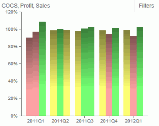 |
Displays a multi-bar chart to show the percent reached for groups of Measures across a dimensional breakout. For comparison, each color series of bar in each group represents a different Measure, and groupings indicate the dimensional breakout. Filters:
|
|
HTML5 - Metrics Value Multibars |
|
Displays a multi-bar chart to show the actual value for groups of Measures across a dimensional breakout. For comparison, each color series of bar in each group represents a different Measure, and groupings indicate the dimensional breakout. Filters:
|
|
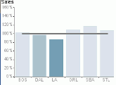
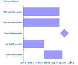
HTML5 - Perspective Compare Perf. - Horz Bars |
 |
Displays a horizontal grouping of performance trends for all objectives in a perspective. Filters:
|
|
HTML5 - Perspective Compare Perf. - Vert Bars |
|
Displays a vertical grouping of performance trends for all objectives in a perspective. Filters:
|
|
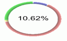
HTML5 - Perspective Perf. Gauge |
|
Displays the Percent Reached aggregate at the Perspective level for the selected Scorecard. Differs by Scorecard. Filters:
|
|
HTML5 - Project Gantt Chart |
 |
Displays a graphical overview of project status. Filters: Projects (Required) |
|
Metric Gadgets |
||
|
Metric - Advanced Properties |
 |
Allows end users with proper access to edit critical Measure properties directly from the Dashboard. Filters: Measures (Required) |
|
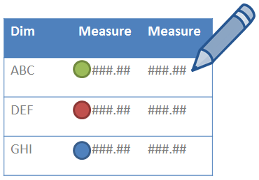
Metric - Big Number |
 |
Displays a rotating value for Actual and Percent Reached for the Measure. Filters:
|
|
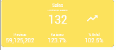
Metric - Big Number: Box (Indicator only) |
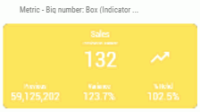 |
Displays Actual, Percent Reached against Target and Prior Value, while showing variance with a trend arrow. Background color is dependent on indicator. Filters:
Note: To hide the Percent Reached column, set the GDG_SHOW_PCT_RCHD custom parameter to N. |
|
Metric - Big Number: Box (Theme Color) |
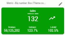 |
Displays Actual, Percent Reached against Target and Prior Value, while showing variance with a trend arrow. Background color is dependent on theme. Filters:
You can control the display colors used in this Gadget. For more information, see How to Change the Theme Color of a Big Number Gadget Note: To hide the Percent Reached column, set the GDG_SHOW_PCT_RCHD custom parameter to N. |
|
Metric - Big Number: Box YTD (Indicator) |
 |
Displays actual values for the current year and a prior year, while showing variance with a trend arrow. Filters:
Note: To hide the Percent Reached column, set the GDG_SHOW_PCT_RCHD custom parameter to N. |
|
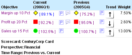
Metric - By Objective w/Prior Trend (Quadrant) |
 |
Displays a Target value for the current time period and the Actual value, as well as the indicator against the target for the Current time period. A trend compares the current to the previous time. Filters:
|
|
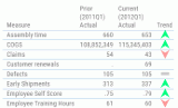
Metric - Curr. & Prior Values & Variances |
 |
Displays current and prior actual and target values, with an indicator for the current year and a prior year. Also shows current, YTD, prior, and prior YTD variances of actual from target, which are grouped by Perspective. Filters:
|
|
Metric - Curr. & Prior Values & Variances (by Dim) |
|
Displays current and prior actual and target values, with indicator for the current year and a prior year. Also shows current, YTD, prior, and prior YTD variances of actual from target, which are grouped by Perspective and also by Dimension. Filters:
|
|
Metric - Current v. Prior Value Grid w/Trend |
 |
Displays actual values for the current year and a prior year, with a trend comparing them both. Filters:
|
|
Metric - Sparkline & Bullet Chart Grid |
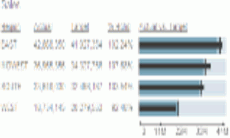 |
Displays actual, target, and variance data with an actual vs. target horizontal sparkline and bullet chart. Filters:
|
|
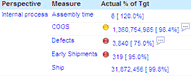
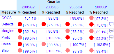
Metric - Performance Grid |
 |
Displays a grid of all metrics for the current scorecard and can show multiple Measure selections if desired. Optional grouping can be done on the Dimension name and level. Filters:
|
|
Metric - Values Grid |
|
Displays a grid of all metrics for the current scorecard and can show multiple Measure selections if desired. Optional grouping can be done on the Dimension name and level. Filters:
|
|
Metric - Dimensional Crosstab Across Measure Grid |
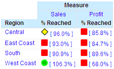 |
Displays a drillable grid view of multiple Measure values distributed in a particular Dimension and level for use as a quick comparison of metrics. Filters:
|
|
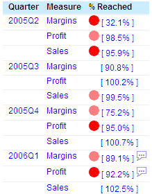
Metric - Performance Trend Grid |
 |
Displays a drillable grid view of values distributed for single or multiple Measures across a selectable time range to provide quick trending of one or more Measures. Filters:
|
|
Metric - Values Trend Grid |
|
Displays a drillable grid view of values distributed for single or multiple Measures across a selectable time range to provide quick trending of one or more Measures. Filters:
|
|
Perspective - Objectives Summary Grid |
 |
Displays a summary showing current and previous achievement percentages, trend, weight, and all corresponding indicators for the selected group of objectives. Filters: Perspective (Optional) |
|
Perspective - Compact Overview Grid |
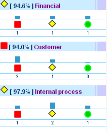 |
Displays a summary showing bars and indicators for the count of high, mid, and low objectives for each perspective included. Filters:
|
|
Scorecard - Strategy Map |
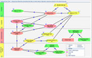 |
Displays a strategy map in the dashboard that is a peer in display. Filters: User Specified Dimension (Optional) |
|
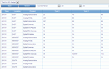
Utility - Administration - Measures Metadata Grid |
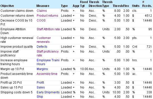 |
Displays detailed information about scorecard metrics to a PMF Administrator and contains drill downs to view detailed properties for all Measures. Filters: None Required |
|
Utility - Legend |
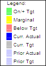 |
Displays the color language used in all Graph Gadgets on the dashboard. Since all legends on all charts would be the same, this saves space on your dashboard. Filters: None Required |
|
Utility - Action Block |
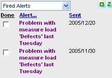 |
Displays the PMF Action Block which enables owners to work with their fired alerts, create new alerts, manage scheduled alerts, manage Schedule This reports, and input user-entered Measures for their scorecard. Filters: None Required |
|
Utility - Administration - DB Overview Grid |
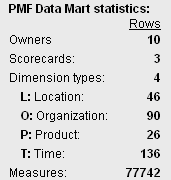 |
Displays overview statistics for the PMF data mart to a PMF Administrator. This grid also fires the resynchronization function if the data mart is switched to point to a different data mart. Filters: None Required |
|
Utility - Analysis Designer |
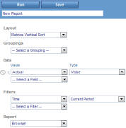 |
Displays the PMF Analysis Designer, which enables you to specify parameter options and run a view based on those options. The available parameter options are grouped into five sections: Layout, Groupings, Data, Filter, and Report. Filters: None Required |
|
Utility - UE Sources |
 |
Allows end users to input data for groups of User Entered Source Datapoints they have access to. Also filterable by Dimensions as defined on each Source. Filters: Time Range (Optional) |
|
Utility - Feedback Live with Update |
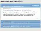 |
An easy-to-use accordion view that allows you to quickly view and respond to Feedback on any Measure for the current Dashboard. Filters: Measures (Required) |