The Dashboard Designer is available to the user if the user was given Administrator rights to the dashboard.
To access the Dashboard Designer from the Today page, click
the Unlock the Dashboard
 icon,
followed by the Edit current selected Today page
icon,
followed by the Edit current selected Today page
 icon
or click the Create a new Today Page
icon
or click the Create a new Today Page
 icon.
icon.
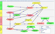
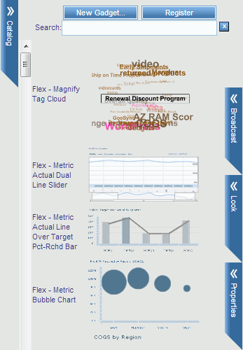
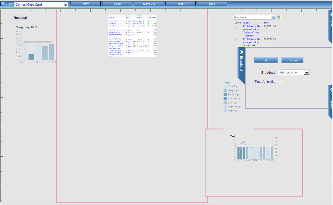
The Dashboard Designer opens, as shown in the following image.
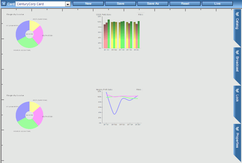
Dashboard Designer includes:
- A canvas, which is the surface on which you position and configure gadgets.
- Four chevrons on
the right:
- The Catalog chevron, which provides a list of the available gadgets currently registered with PMF. Each gadget is represented by a thumbnail preview image that lets you see how the gadget looks and works. A scroll bar directly to the right of the Catalog chevron enables you to view the entire list of available gadgets. From the list, you can drag and drop individual gadgets onto the canvas.
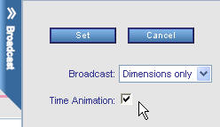
- The Broadcast chevron, which opens Broadcast design mode. The chevron controls the properties for the Broadcast capability. With this chevron, you configure the gadgets that belong to a particular Broadcast group. For more information on Broadcast, see Setting Up Broadcast on a Dashboard.
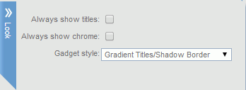
- The Look chevron, which you can use to change the overall look of your dashboard.
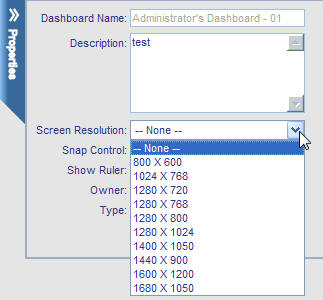
- The Properties chevron, where you supply a name for the new dashboard and an optional description.
When you click a chevron, it slides out to the applicable interactive panel. Clicking an open chevron closes that chevron. If you click a second chevron while another chevron is open, the open chevron is closed and the second chevron is opened.
- The ribbon, a toolbar
from which you can click:
- Card, to select a scorecard.
- New, to start a new dashboard design with a fresh canvas.
- Save, to save the current dashboard, including the gadgets that you added to the dashboard and their position on the page. For a new dashboard, you are prompted for a name when you click Save for the first time. If this option can be changed, you can also indicate whether the dashboard is public or private. A public dashboard is accessible to all PMF users at the site. A private dashboard is accessible only to you.
- Save As, to save the dashboard under a new name.
- Reset, to restore all default values to the dashboard and the currently selected Scorecard.
- Live, to preview the gadgets on the dashboard in run-time mode, with real interactive data, rather than use the supplied preview files.
-
Unlock the
Today page and click the Create a new Today Page
icon.
You can also click New from the Dashboard
Designer.
-
Click the Catalog chevron
to display a list of gadgets available for use in your design.
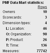
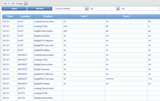
The following image shows part of a sample Catalog.
- Use the scroll bar directly to the right of the Catalog chevron to display the entire list of available gadgets. You can also search for a specific gadget by typing its name in the Search field.
-
Drag the
desired gadget or gadgets onto the design canvas.
PMF retrieves the default size for each gadget that you add to the canvas.
-
Perform
the following actions to achieve the desired result.
- To re-position a
gadget on the canvas, click anywhere inside the gadget to display
its title bar. Move the cursor inside the title bar of the gadget
to display the move
 symbol.
Drag the gadget to the desired location.
symbol.
Drag the gadget to the desired location.Dashboard Designer automatically aligns the top edges of gadgets that are in proximity.
- To resize a gadget
on the canvas, click the Resize
 button
in the lower-right corner of the gadget, and drag the borders of the
gadget to the desired height and width.
button
in the lower-right corner of the gadget, and drag the borders of the
gadget to the desired height and width. - To delete a gadget
from the dashboard, click the Remove Gadget
 button
on the title bar of the gadget.
button
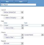
on the title bar of the gadget. - To change the values
used to display the data for a gadget, click the My Preferences
for this Gadget
 button
on the title bar of the gadget. Make your selections from the drop-down
menus. For details, see Changing Dashboard Gadgets and Preferences.
button
on the title bar of the gadget. Make your selections from the drop-down
menus. For details, see Changing Dashboard Gadgets and Preferences. - On the ribbon, click Live at any time to display the dashboard as it will appear at run time. From run-time mode, click Design to return to design-time mode.
- To re-position a
gadget on the canvas, click anywhere inside the gadget to display
its title bar. Move the cursor inside the title bar of the gadget
to display the move
-
Optionally,
click the Broadcast chevron to implement
simultaneous run-time changes across multiple gadgets.
For details on Broadcast, see Setting Up Broadcast on a Dashboard.
-
On the ribbon,
click Save when you are satisfied with your
design. When you are prompted, type a name for the new dashboard. If
this option can be changed, indicate whether the dashboard is public
or private.
The following image shows the Save As panel.
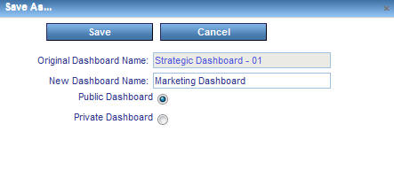
The following options are available:
- Public Dashboard. Visible to all owners in PMF. Administrator access is required to create a public dashboard.
- Private Dashboard. Visible only to the owner who created it. You can create a private dashboard with Edit or higher dashboard access.
-
In the Today
tab in PMF, click the Edit the current selected Today
page
icon.
The dashboard opens in the Dashboard Designer.
- Edit the dashboard. On the ribbon, click Save when you are done.
You can make changes to a gadget when its title bar appears. To display the title bar, click anywhere inside the gadget.
The gadget controls include the following:
-
Moving. You
can position the anchor point of any gadget. To move a gadget, click
inside the title bar and drag the gadget to the desired position.
The following image shows the symbol that appears when you click a title bar to move a gadget.
-
Resize button. You
can interactively adjust the height and width of a gadget. A click-and-drag
Resize button is located
in the lower-right corner of the gadget. Click the button and drag
the borders of the gadget to resize it as desired.
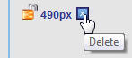
-
Remove Gadget button. The
Remove Gadget button
removes the selected gadget from the canvas.
-
Preferences button. A
separate Preferences button
exists for each gadget on a dashboard. The button opens a panel
on which you can change the values used to display the data for
that gadget. For more information on specifying preferences for
a gadget, see Changing Dashboard Gadgets and Preferences.
-
Refresh button. The
Refresh
 button
refreshes the gadget to the saved preferences.
button
refreshes the gadget to the saved preferences. -
Renaming the gadget. You
can change the default title of a gadget and rename it by going
to the Dashboard Designer and clicking the title bar of the gadget. Enter
the new title, as shown in the following image.
To revert back to the default title, click the X in the field.
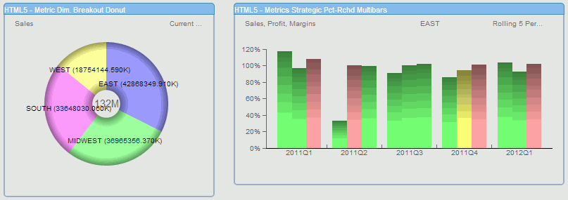
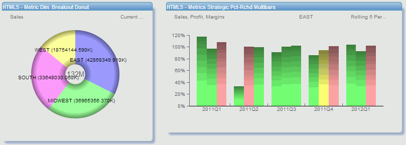
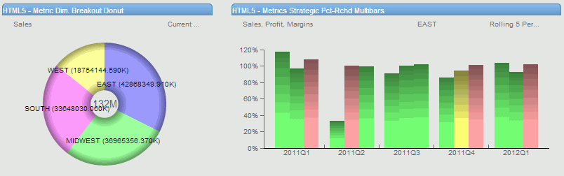
There is a built-in search capability in the Gadget Catalog which makes it easier to find specific gadgets for your dashboard.
To search for a gadget or a category of gadgets:
- Click the Catalog chevron in the Dashboard Designer.
-
In the Search field,
enter the first few letters of the gadget type or category, as shown
in the following image.
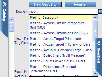
- Select the desired gadget from the list that appears. You can either select the listed category to view all gadgets related to your search, or select a specific gadget.
To
clear the search and show all available gadgets, click the Clear Search
 button.
You can place draggable guidelines on your Dashboard designs that enable you to lay out your Dashboards more precisely. With the guidelines, you can set and lock vertical and horizontal positions along which gadgets can be placed.
Guidelines are only visible to the dashboard designer. A consumer will not be able to see the guidelines unless the consumer was given rights to use the Dashboard Designer.
Any dashboards that are saved either by using the Save or Save As functions are saved along with the guidelines in their exact positions and locked state. If you enter the Dashboard Designer at a later time, all guidelines display in their last known position and locked state.
Vertical and horizontal guidelines can be added to your dashboard at any time.
Note: Rulers must be displayed in order to add a guideline.
From the Dashboard Designer:
-
Move the
pointer over the vertical or horizontal rule until the ruler line
flashes and the pointer becomes a double-headed arrow, as shown
in the following image.

-
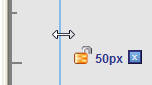
Click the
ruler line and drag the pointer to set the guideline. As you drag the
guideline, a hover control appears that shows the exact pixel position
of the guideline while it is being moved, as shown in the following
image.
- Once the guideline is positioned, release the pointer.
Guidelines can be locked on the dashboard or left floating. Unlocked guidelines can be moved at any time.
Guidelines can only be moved if they are not locked.
- Move the pointer over the guideline until the point becomes a double-headed arrow.
- Click the guideline and drag it into its new position.
- Release the pointer to set the guideline in place.
- Move the pointer over the guideline until the hover control appears.
-
Click the
lock
 button
to lock the guideline.
button
to lock the guideline.
Note: Locked guidelines cannot be moved but they can be removed.
Guidelines can be automatically placed on the Dashboard design based on the target screen size of the consumer. For example, if many of your users have a 1024 x 768 total screen resolution, your Dashboard designs can be targeted to display all onscreen with no scrollbars using this capability.
The Dashboard Designer allows you to perform multiple selection of gadgets, which enables you to move and position gadgets as a group.
- Select the first gadget you want to move.
- Press CTRL while selecting each gadget you want to group together.
- Move the group while continuing to press CTRL.
When you select gadgets to be moved as a group, the Dashboard Designer restricts the move by drawing a rectangle around all of the gadgets. This prevents you from dragging any portion of the group outside of the onscreen dimensions of the dashboard.
The auto-snap feature in the Dashboard Designer can be turned off, which enables you to freely move gadgets on the dashboard with no constraints on positioning.
To turn snap grid control off:
- Click the Properties chevron in the Dashboard Designer.
- Clear the Snap Control check box.
- Optionally, change the size of the snap grid by entering a different pixel value in the Snap Control field. The default snap grid size is 10 pixels.
Note: Saving the dashboard design will save with the state of the current snap control setting.
You can change the dashboard owner directly from the Dashboard Designer:
- Click the Properties chevron from the Dashboard Designer.
-
Select the
new owner from the Owner drop-down menu, as shown in the following
image.
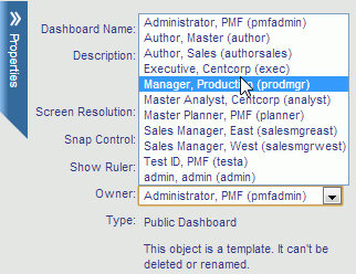
- Click Save.
Gadgets can be added directly from the catalog in the Dashboard Designer. Gadgets that are added and configured from the catalog are immediately available to use in dashboard designs.
From the Dashboard Designer:
- Click the Catalog chevron.
-
Click the New
Gadget button.
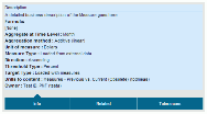
The new gadget designer window opens.
-
Enter all
values in their appropriate fields.
Note: This capability is only available to users with administration rights to dashboards.
Gadgets can be registered directly from the catalog in the Dashboard Designer. Gadgets that are added and configured from the catalog are immediately available to use in dashboard designs.
From the Dashboard Designer:
- Click the Catalog chevron.
-
Click the Register button.
The Register window opens.
-
Enter all
values in their appropriate fields. For more information, see Registering a Gadget.
Note: This capability is only available to users with administration rights to dashboards.
Dashboard user preferences can be reset to the default preferences in the original dashboard design.
The dashboard preferences control settings a user sees, such as metrics and dimensional filters. Preferences are stored for each of the following:
- User
- Dashboard
- Scorecard in the system
Default preferences are stored for each dashboard in the system. These preferences are set during the dashboard design process in the Dashboard Designer.
Users can override preferences set for a dashboard by saving their changes in the Preference panel in the dashboard.
User preferences can be reset from many areas within PMF. Where the reset is performed determines the scope of where those preferences are overridden.
If a user has administrator rights in a dashboard, the user has the ability to clear user preferences for any of their dashboard designs.
Any preferences that are changed from within the Dashboard Designer changes the default preferences for that dashboard, as well as each scorecard that can be selected and configured.
From the Dashboard Designer:
-
Click the Reset button
on the Dashboard Designer ribbon.
The Reset window opens, as shown in the following image.
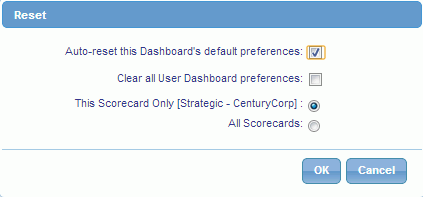
- Select Auto-reset this Dashboard’s default preferences to only clear the default preferences. Selecting Clear all User Dashboard preferences will delete any saved user preferences.
 icon.
Goes back to the previous page.
icon.
Goes back to the previous page.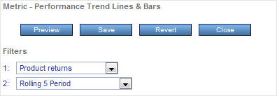
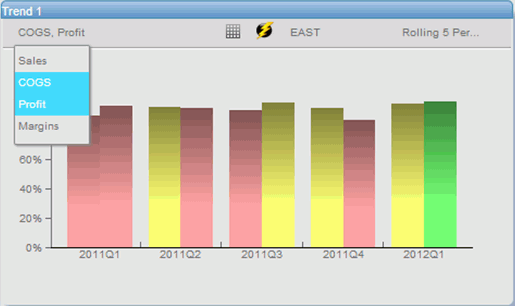
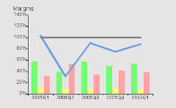
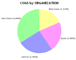
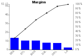
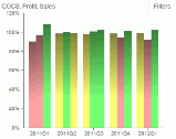
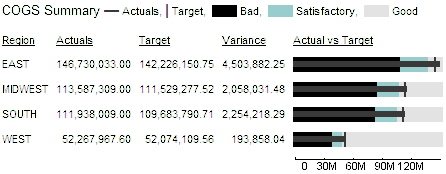
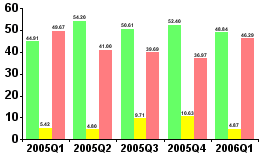
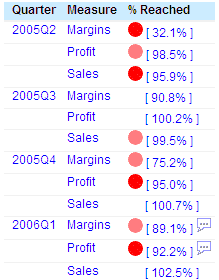
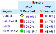
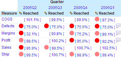
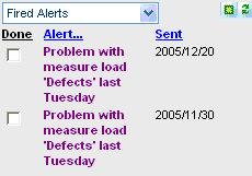
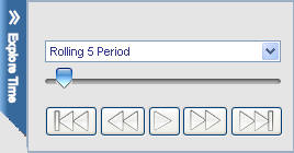
 button
on the tracking menu. The gadget view will change, as shown in the
following image.
button
on the tracking menu. The gadget view will change, as shown in the
following image.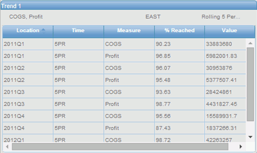
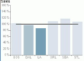
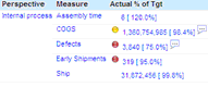
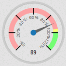
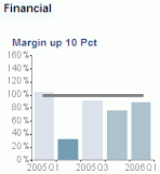
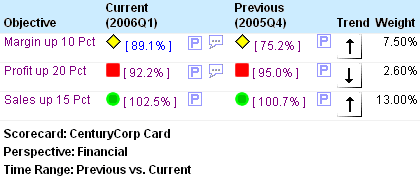
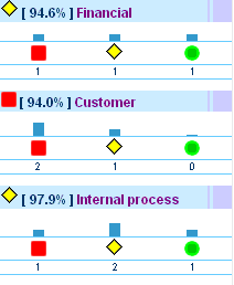
 button.
This will lock the gadget in place, which allows more control over comparative
analysis.
button.
This will lock the gadget in place, which allows more control over comparative
analysis.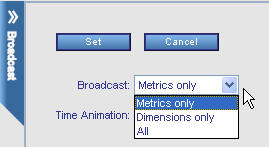