The following features have been added for HTML5 chart output (charts generated as FORMAT JSCHART).
The autoNumberFormats properties control the number formatting of data labels, stacked total labels, pie total labels, and tooltips.
autoNumberFormats: {
	  object: 'numberfmt', ...
}
where:
- object
Is one of the following objects.
- dataLabels
- tooltip
- stackTotalLabel
- totalLabel
Multiple objects can be included, separated by commas.
- numberfmt
Is a valid number format. For information about number formats, see the Creating HTML5 Charts With WebFOCUS Language manual.
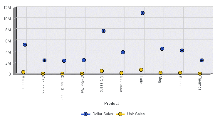
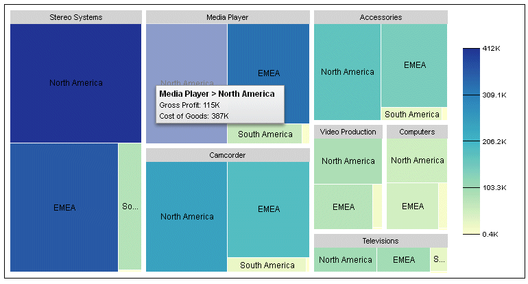
The following request generates a treemap.
GRAPH FILE WF_RETAIL_LITE
SUM GROSS_PROFIT_US COGS_US
BY PRODUCT_CATEGORY
BY BUSINESS_REGION
ON GRAPH PCHOLD FORMAT JSCHART
ON GRAPH SET LOOKGRAPH TREEMAP
ON GRAPH SET STYLE *
*GRAPH_JS
legend: {visible:true},
*END
ENDSTYLE
END
The default tooltip number format is shown in the following image.
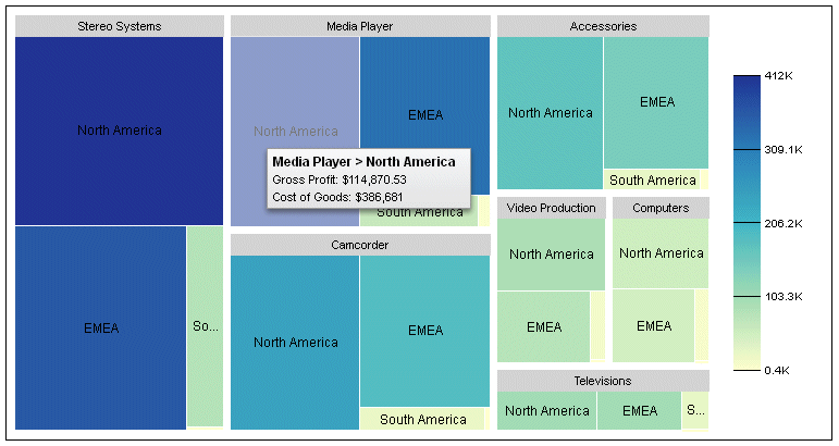
The following version of the request specifies a number format for the tooltips that includes a dollar sign, a thousands separator, and a decimal separator with two decimal places.
GRAPH FILE WF_RETAIL_LITE
SUM GROSS_PROFIT_US COGS_US
BY PRODUCT_CATEGORY
BY BUSINESS_REGION
ON GRAPH PCHOLD FORMAT JSCHART
ON GRAPH SET LOOKGRAPH TREEMAP
ON GRAPH SET STYLE *
*GRAPH_JS
legend: {visible:true},
autoNumberFormats:{tooltip:'$#,###.##'}
*END
ENDSTYLE
END
The new tooltip number format is shown in the following image. Note that decimal places are not displayed if they have the value zero.
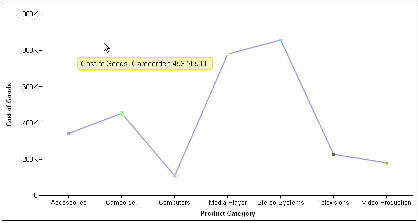
In prior releases, tooltips on line, scatter, and area charts were visible even when the mouse was not hovering directly over a data point. In this release, the default behavior for line, scatter, and area charts has been changed to conform to that of other chart types. Therefore, the tooltip will disappear as soon as the mouse moves away from a data point. To restore the previous behavior for line, scatter, and area charts, add the following property to the interaction object.
mousemove:'nearestNeighbor'
interaction: {
 mousemove : 'tooltipdetect'
}
where:
- 'tooltipdetect'
Controls the tooltip detection method for line, scatter, and area charts. Valid values are:
- 'over', which only displays a tooltip when the mouse hovers directly over a data point. This is the default value.
- 'nearestNeighbor', which displays the tooltip for the nearest data point on line, scatter, and area charts, even when the mouse moves away from a data point.
The following request generates a line chart with nearest neighbor tooltip detection:
GRAPH FILE WF_RETAIL_LITE
SUM COGS_US
BY  PRODUCT_CATEGORY
ON GRAPH PCHOLD FORMAT JSCHART
ON GRAPH SET LOOKGRAPH VLINE
ON GRAPH SET STYLE *
*GRAPH_JS
interaction: {
 mousemove : 'nearestNeighbor'
},
*END
END
The following image shows that the tooltip is visible even though the mouse is not hovering over a data point on the chart:
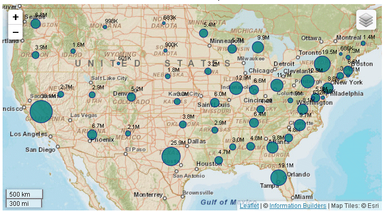
Data text labels will now display on a bubblemap if you show data values for all series and set the dataLabels property to true:
series: [{series:'all', showDataValues:true}],
dataLabels: {
visible: true
}
The following request generates a bubblemap with data text labels:
GRAPH FILE WF_RETAIL_LITE
SUM MDN.STATE_PROV_POPULATION
BY STATE_PROV_NAME
WHERE COUNTRY_NAME EQ 'United States'
WHERE STATE_PROV_NAME NE 'Puerto Rico'
WHERE TIME_YEAR EQ 2009
ON GRAPH PCHOLD FORMAT JSCHART
ON GRAPH SET LOOKGRAPH BUBBLEMAP
ON GRAPH SET STYLE *
*GRAPH_JSseries: [{series:'all', showDataValues:true}],
dataLabels: {
visible: true
},
legend: {visible:false},
bubbleMarker: {maxSize: '10%' },
series:[{series:0, marker:{color: 'teal', border:{color: 'navy', width: 1}},label: 'Population'}],
title: {visible: true, text: 'United States Population in 2009'},
mapProperties: {
  engine: 'leaflet',

leaflet: {
initPos: {
                  center: [37.8, -96],
                  level: 4
            },overlayLayers: [{
title: 'United States of America',
dataLookup: 'properties.state_name',
layerInfo: {
maxZoom: -1,
minZoom: -1,
type: 'regions'
},
type: 'tdg',
url: function(){ return tdgchart.getScriptPath() + 'map/US.json'}
}],
  controls: [
    {control: 'L.Control.Layers'},
    {
     control: 'L.Control.Scale',
     options: {
      imperial: true,
      metric: true }
    }
   ],
 baselayers: [{
   title: "ArcGIS_World_Street_Map",
   layerInfo: {
     maxZoom: 17,
     minZoom: 0,
      attribution: function(){ return "&|copy; <a target='_blank' href='http://www.InformationBuilders.com'>Information Builders</a> | " +
"Map Tiles: &|copy; Esri";}
},
  url: function(){ return 'http://services.arcgisonline.com/ArcGIS/rest/services/World_Street_Map/MapServer/tile/{z}/{y}/{x}';}
}]
}
},
*END
ENDSTYLE
END
The output is shown on the following image:
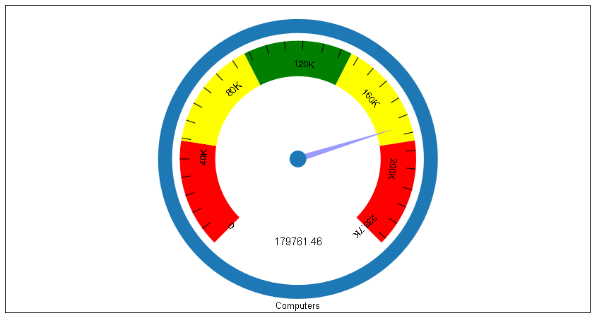
Gauge charts now support yaxis:minorGrid properties. By default, the minor grid lines are visible. Their default color is 'black' and their default length is '8%'. In addition, by default, major grid lines are not visible on a gauge chart.
The following request generates a gauge chart with default properties:
GRAPH FILE WF_RETAIL_LITE
SUM  REVENUE_US
BY PRODUCT_CATEGORY
WHERE PRODUCT_CATEGORY EQ 'Computers'
ON GRAPH PCHOLD FORMAT JSCHART
ON GRAPH SET LOOKGRAPH GAUGE1
ON GRAPH SET STYLE *
ENDSTYLE
END
On the output, only the minor grid lines display, as shown on the following image:
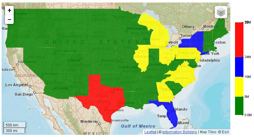
Two new color modes have been introduced for heatmaps and choropleths that define the way color transitions are visualized on the chart and in the legend.
Continuous mode is the default visualization. In continuous mode, the colors in the color scale form a blended gradient.
Discrete mode visualizes the colorScale in discrete color bands. You define an array of color bands that provide start and stop values for each color. The colorScale properties for discrete mode are:
colorScale: {
colorMode:{mode: 'discrete'},
colorBands: [
{
start: startval,
stop: stopval,
color: 'bcolor' }
   .
   .
   .
]
}
where:
- startval
Is a number or percent string that defines where to start the color band.
- stopval
Is a number or percent string that defines where to stop the color band.
- bcolor
Defines the color of the band.
Note: If you set the color mode to 'continuous' but define color bands, the chart will be visualized in discrete mode.
The following request defines a choropleth with discrete color bands.
GRAPH FILE WF_RETAIL_LITE
SUM MDN.STATE_PROV_POPULATION
BY STATE_PROV_NAME
WHERE COUNTRY_NAME EQ 'United States'
WHERE STATE_PROV_NAME NE 'Puerto Rico'
ON GRAPH PCHOLD FORMAT JSCHART
ON GRAPH SET LOOKGRAPH CHOROPLETH
ON GRAPH SET STYLE *
*GRAPH_JS
mapProperties: {
  engine: 'leaflet',

leaflet: {
initPos: {
                  center: [37.8, -96],
                  level: 4
            },overlayLayers: [{
title: 'United States of America',
dataLookup: 'properties.state_name',
layerInfo: {
maxZoom: -1,
minZoom: -1,
type: 'regions'
},
type: 'tdg',
url: function(){ return tdgchart.getScriptPath() + 'map/US.json'}
}],
  controls: [
    {control: 'L.Control.Layers'},
    {
     control: 'L.Control.Scale',
     options: {
      imperial: true,
      metric: true }
    }
   ],
baselayers: [{
title: "ArcGIS_World_Street_Map",
layerInfo: {
maxZoom: 17,
minZoom: 0,
attribution: function(){ return "&|copy; <a target='_blank' href='http://www.InformationBuilders.com'>Information Builders</a> | " +
"Map Tiles: &|copy; Esri";}
},
url: function(){ return 'http://services.arcgisonline.com/ArcGIS/rest/services/World_Street_Map/MapServer/tile/{z}/{y}/{x}';}
}]
}
},
legend:{visible:true},
colorScale: {
colorMode:{mode: 'discrete'},
colorBands: [
{start: 0, stop: 8000000,color:'green'},
{start: 8000000, stop: 16000000,color:'yellow'},
{start: 16000000, stop: 24000000,color:'blue'},
{start: 24000000, stop: 38000000,color:'red'}
]
}
*END
INCLUDE=ENIADefault_combine.sty,$
ENDSTYLE
ENDThe chart and legend are visualized using the discrete color bands defined in the color scale, as shown on the following image:
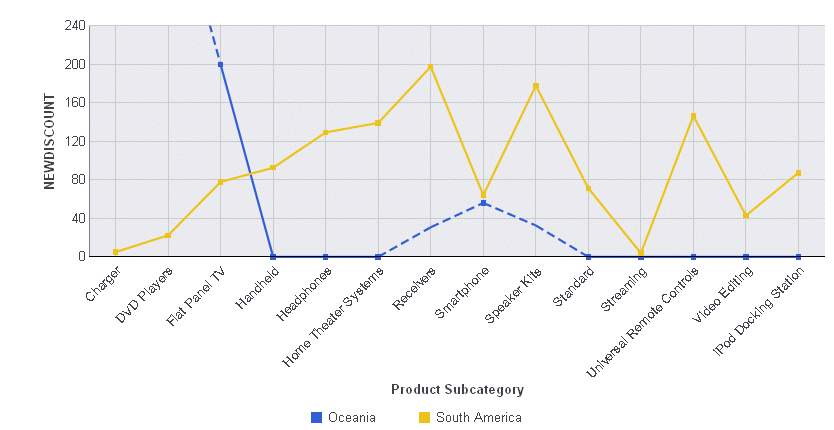
By default, if missing values are shown on a line chart, and if they start before the start of actual values in the data source, the line is extrapolated to include those missing values. The missingDataExtrapolate:false property omits those extrapolated values from the chart output:
blaProperties: {
  missingDataExtrapolate : false
}
The following request generates a vertical line chart with missing values that start before the actual values:
GRAPH FILE WF_RETAIL_LITE
SUM COMPUTE NEWDISCOUNT/D12.2=IF BUSINESS_REGION EQ 'South America'
   THEN DISCOUNT_US *.1
   ELSE DISCOUNT_US ;
BY BUSINESS_REGION
ACROSS PRODUCT_SUBCATEG
WHERE BUSINESS_REGION EQ 'Oceania' OR 'South America';
WHERE PRODUCT_SUBCATEG NE 'Blu Ray';
ON GRAPH PCHOLD FORMAT JSCHART
ON GRAPH SET GRAPHDEFAULT OFF
ON GRAPH SET VZERO OFF
ON GRAPH SET GRMERGE ADVANCED
ON GRAPH SET GRMULTIGRAPH 0
ON GRAPH SET GRLEGEND 1
ON GRAPH SET GRXAXIS 1
ON GRAPH SET LOOKGRAPH VLINE
ON GRAPH SET STYLE *
INCLUDE=ENIADefault_combine.sty,$
*GRAPH_SCRIPT
setFillMissingData(2);
*END
ENDSTYLE
END
On the chart output, the line is extrapolated to display those missing values, as shown on the following image:
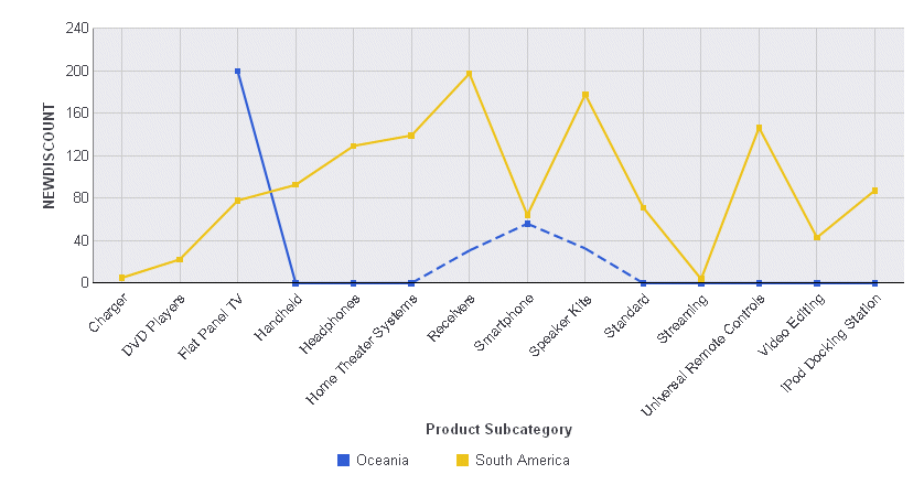
Running the request with the following *GRAPH_JS block removes the extrapolated line from the chart output:
*GRAPH_JS
blaProperties: {
missingDataExtrapolate : false
}
*END
The chart output is shown on the following image:
An annotation is text, a marker, or both that you want to place anywhere on a chart. Multiple annotations can be defined within the annotations array.
The following shows the properties and default values for annotations:
annotations: [
 position: {
   x: undefined,
   y: undefined,
   parent: 'background'
        },
 marker: {
   visible: true,
   color: 'red',
   size: 8,
   shape: 'circle',
   rotation: 0,
   border: {
     width: 1,
     color: 'black',
     dash: ''
           }
        },
 label: {
    visible: false,
    text: 'Annotation Label',
    font: '10pt Sans-Serif',
    color: 'black',
    position: 'center'
     }
 },
]
annotations: [
 position: {
   x: xvalue   y: yvalue,
   parent: 'parentcomponent''
     },
 marker: {
   visible: amboolean,
   color: amcolor,
   size: amsize,
   shape: 'amshape',
   rotation: amrotation,
   border: {
     width: ambwidth,
     color: 'ambcolor',
     dash: 'ambdash'
         }
     },
 label: {
         visible: alboolean,
         text: 'altext',
         font: 'alfont',
         color: 'alcolor',
         position: 'alposition'
     }
 },
   .
   .
   .
]
where:
- xvalue
Is the horizontal position for the annotation marker. Can be:
- A number. If the parent chart component is 'chart', the number represents a value on a numeric axis. Otherwise, it represents a number of pixels from the lower left corner of the parent component.
- A series and group label for a horizontal chart (in the form {series:n,group:m}), which places the annotation on that series or group. This requires the parent component to be 'chart'.
- A percent string (for example, ‘40%'), which places the annotation at a point the specified percentage horizontally from the lower left corner of the parent component.
- A pixel string (for example, '40px'), which places the annotation at a point that number of pixels horizontally from the lower left corner of the parent component.
- yvalue
Is the vertical position for the annotation marker. Can be:
- A number. If the parent chart component is 'chart', the number represents a value on a numeric axis. Otherwise, it represents a number of pixels from the lower left corner of the parent component.
- A series and group label for a vertical chart (in the form {series:n,group:m}), which places the annotation on that series or group. This requires the parent component to be 'chart'.
- A percent string (for example, ‘40%'), which places the annotation at a point the specified percentage vertically from the lower left corner of the parent component.
- A pixel string (for example, '40px'), which places the annotation at a point that number of pixels vertically from the lower left corner of the parent component.
- 'parentcomponent'
Can be one of the following chart components:
- 'background', which measures the position from the lower left corner of the chart frame and places the annotation behind the chart. This is the default value.
- 'chart', which measures the position from the lower left corner of the chart draw area and places the annotation on the chart.
- 'legend', which measures the position from the lower left corner of the legend area and places the annotation in the legend area.
- amboolean
Defines whether the annotation marker is visible. Valid values are:
- true, which makes the annotation marker visible. This is the default value.
- false, which makes the annotation marker not visible.
- amcolor
Defines the color for the annotation marker, defined by a color name or numeric specification string, or a gradient defined by a string. The default value is 'red'.
- amsize
Is the size, in pixels, of the annotation marker. The default value is 8.
- 'amshape'
Is a shape for the annotation marker. All valid marker shapes are supported. The default shape is 'circle'.
- amposition
Defines the marker position relative to data text labels for bullet charts as 'top', 'bottom', or 'middle', Not supported for other types of charts.
- amrotation
Is a number between 0 and 360 that defines the rotation angle of the marker, in degrees.
- ambwidth
Is a number that defines the width of the border in pixels. The default value is 1.
- 'ambcolor'
Is a color for the marker border defined by a color name or numeric specification string. The default value is 'black'.
- 'ambdash'
Is a string that defines the border dash style. Use a string of numbers that defines the width of a dash followed by the width of the gap between dashes. The default is no dash ('').
- alboolean
Defines whether the annotation label is visible. Valid values are:
- true, which makes the annotation label visible. This is the default value.
- false, which makes the annotation label not visible.
- 'altext'
Defines the annotation label text. The default value is no label text.
- 'alfont'
Defines the annotation label font. The default value is '10pt Sans-Serif'.
- 'alcolor'
- Defines the annotation label color defined by a color name or numeric specification string. The default value is 'black'.
- 'alposition'
Defines a position for the annotation label relative to the annotation marker. Valid values are:
- 'top', which places the annotation label above the annotation marker.
- 'bottom', which places the annotation label below the annotation marker.
- 'left', which places the annotation label to the left of the annotation marker.
- 'right', which places the annotation label to the right of the annotation marker.
- 'center', which places the annotation label centered on the annotation marker. This is the default value.
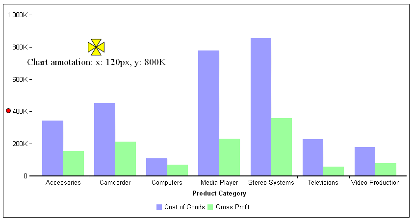
The following request specifies two annotations. The first annotation is on the chart component. Its marker is a yellow pirate cross with a black border that is 120 pixels horizontally from the left edge of the x-axis and at the 800K point along the y-axis (which is numeric). The label is positioned below the marker. The second annotation only has a position (representing pixels), so there is no label, and it has the default marker, a red circle that is 8 pixels in size.
GRAPH FILE WF_RETAIL_LITE
SUM COGS_US GROSS_PROFIT_US
BY PRODUCT_CATEGORY
ON GRAPH PCHOLD FORMAT JSCHART
ON GRAPH SET LOOKGRAPH VBAR
ON GRAPH SET STYLE *
*GRAPH_JS
annotations : [
    {
     position: {
       x: '120px',
       y: 800000,
       parent: 'chart'
       },
     marker: {
       visible: true,
       color: 'yellow',
       size: 30,
       shape: 'piratecross',
       rotation: 0,
       border: {
         width: 1,
         color: 'black',
         dash: ''
           }
       },
    label: {
       visible: true,
           text: 'Chart annotation: x: 120px, y: 800K',
           font: '14pt Times New Roman',
           color: 'black',
           position: 'bottom'
       }
   },
   {
   position: {
     x: 10,
     y: 200
       }
   },
  ]
*END
ENDSTYLE
END
The output is:
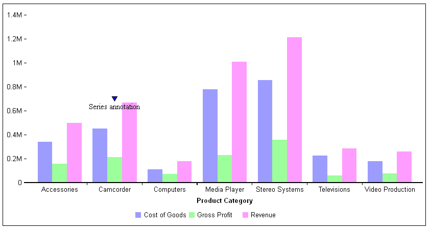
The following request has one annotation, on series 1 and group 1. The y value is at 50% along the y-axis. The marker is a blue triangle.
GRAPH FILE WF_RETAIL_LITE
SUM COGS_US GROSS_PROFIT_US REVENUE_US
BY PRODUCT_CATEGORY
ON GRAPH PCHOLD FORMAT JSCHART
ON GRAPH SET LOOKGRAPH VBAR
ON GRAPH SET STYLE *
*GRAPH_JS
annotations : [
    {
     position: {
       x: {series:1, group:1},
       y: '50%',
       parent: 'chart'
       },
     marker: {
       visible: true,
       color:'blue',
       shape: 'triangle',
       rotation: 0,
       border: {
          width: 1,
          color: 'black',
          dash: ''
           }
       },
     label: {
       visible: true,
       text: 'Series annotation',
       font: '10pt Times New Roman',
       color: 'black',
       position: 'bottom'
       }
   },
  ]
*END
ENDSTYLE
END
The output is:
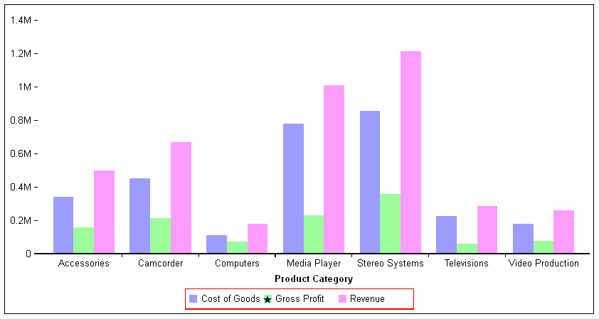
The following request places a blue star over the green legend marker in the legend area.
GRAPH FILE WF_RETAIL_LITE
SUM COGS_US GROSS_PROFIT_US REVENUE_US
BY PRODUCT_CATEGORY
ON GRAPH PCHOLD FORMAT JSCHART
ON GRAPH SET LOOKGRAPH VBAR
ON GRAPH SET STYLE *
*GRAPH_JS
legend: {lineStyle:{color:'red'}},
annotations : [
    {
     position: {
       x: '106px',
       y: '.14px',
       parent: 'legend'
       },
     marker: {
       visible: true,
       color:'blue',
       shape: 'fiveStar',
       rotation: 0,
       border: {
         width: 1,
         color: 'black',
         dash: ''
           }}
       },

  ]
*END
ENDSTYLE
END
The output is:
In some cases, you may want to use patterns to distinguish chart elements such as risers and markers, or to fill chart frames. This can be a useful technique in black and white environments where colors are not distinguishable.
color:{
  type:'pattern',
   color: 'cstring',
   backgroundColor: 'bcstring',
   shape: 'sstring',
   size: snumber,
   pad: pnumber}
where:
- 'cstring'
Defines the color of the pattern shape using a color name or numeric specification string.
- 'bcstring'
Defines the background color of the pattern space using a color name or numeric specification string.
- 'sstring'
Defines the shape for the pattern character. All marker shapes are supported.
- snumber
Is the size, in pixels, of the pattern shape.
- pnumber
Is the size, in pixels, of the padding between the pattern shapes.
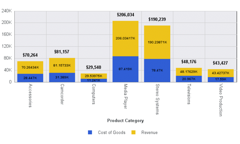
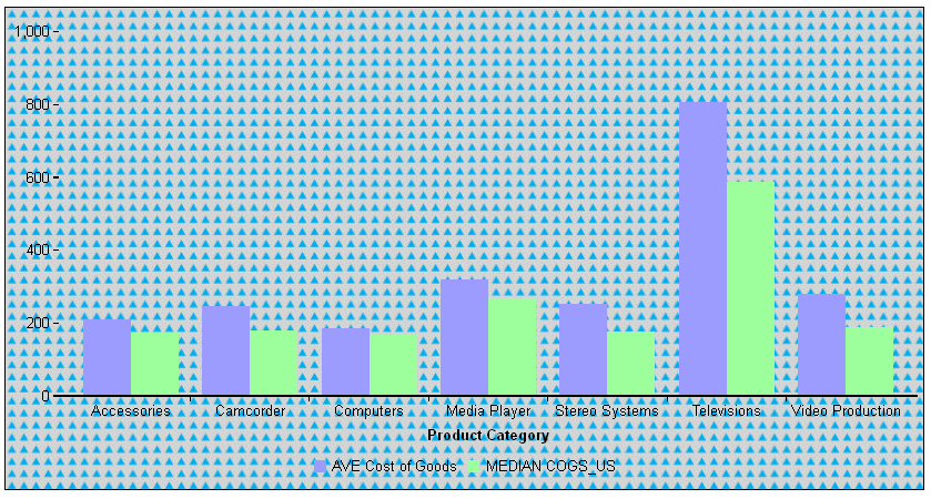
The following request fills the chart frame with triangles whose color is a version of blue and whose size is 10 pixels. The space between triangles is 8 pixels, and the background color is light gray:
GRAPH FILE WF_RETAIL_LITE
SUM AVE.COGS_US MDN.COGS_US
BY PRODUCT_CATEGORY
ON GRAPH PCHOLD FORMAT JSCHART
ON GRAPH SET LOOKGRAPH VBAR
ON GRAPH SET STYLE *
*GRAPH_JS
fill: {
  color:{
   type:'pattern',
     color: '#00aeef',
     backgroundColor: 'lightgray',
     shape: 'triangle',
     size: 10,
     pad: 8}}
*END
ENDSTYLE
END
The output is:
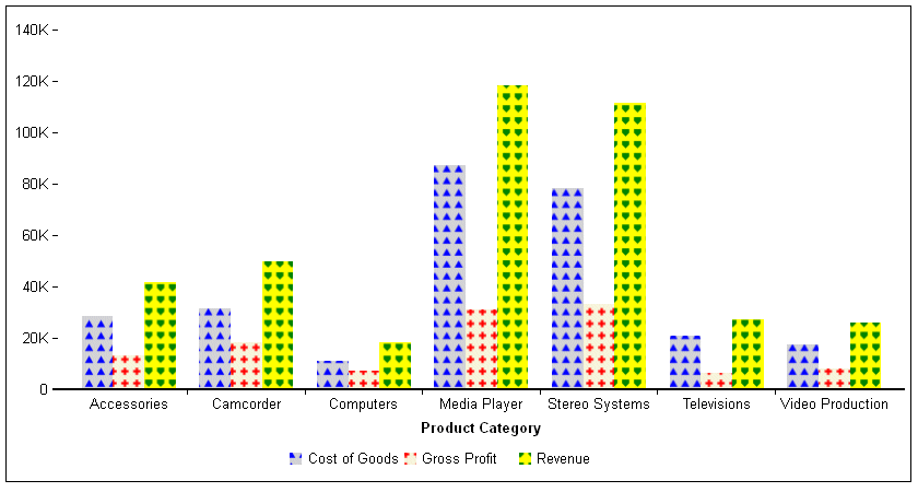
The following request defines patterns to color the risers for each series in a vertical bar chart:
GRAPH FILE WF_RETAIL_LITE
SUM COGS_US GROSS_PROFIT_US REVENUE_US
BY PRODUCT_CATEGORY
ON GRAPH PCHOLD FORMAT JSCHART
ON GRAPH SET LOOKGRAPH VBAR
ON GRAPH SET STYLE *
*GRAPH_JS
series:[
 {series:0, color:{type:'pattern',color: 'blue',backgroundColor: 'lightgray',shape: 'triangle',size: 10,pad: 8}} ,
 {series:1, color:{type:'pattern',color: 'red',backgroundColor: 'beige',shape: 'plus',size: 10,pad: 8}} ,
 {series:2, color:{type:'pattern',color: 'green',backgroundColor: 'yellow',shape: 'house',size: 10,pad: 8}}
]
*END
ENDSTYLE
END
The output is:
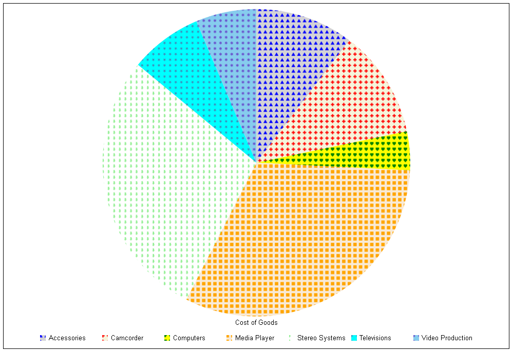
The following request defines patterns to color the risers for each series in a pie chart:
GRAPH FILE WF_RETAIL_LITE
SUM COGS_US
ACROSS PRODUCT_CATEGORY
ON GRAPH SET AUTOFIT ON
ON GRAPH PCHOLD FORMAT JSCHART
ON GRAPH SET LOOKGRAPH PIE
ON GRAPH SET STYLE *
*GRAPH_JS
series: [
 {series:0, color:{type:'pattern',color: 'blue',backgroundColor: 'lightgray',shape: 'triangle',size: 10,pad: 8}} ,
 {series:1, color:{type:'pattern',color: 'red',backgroundColor: 'beige',shape: 'plus',size: 10,pad: 8}} ,
 {series:2, color:{type:'pattern',color: 'green',backgroundColor: 'yellow',shape: 'house',size: 10,pad: 8}},
 {series: 3, color: {type:'pattern',color: 'orange',backgroundColor: 'antiquewhite',shape: 'square',size: 10,pad: 8}},
 {series: 4, color: {type:'pattern',color: 'lightgreen',backgroundColor: 'white',shape: 'arrow',size: 10,pad: 8}},
 {series: 5, color: {type:'pattern',color: 'steelblue',backgroundColor: 'cyan',shape: 'fiveStar',size: 10,pad: 8}},
 {series: 6, color: {type:'pattern',color: 'slateblue',backgroundColor: 'skyblue',shape: 'sixStar',size: 10,pad: 8}}
]
*END
ENDSTYLE
END
The output is:
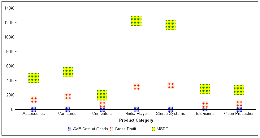
The following request generates a scatter chart. The markers for each series are filled with patterns and are sized large enough to fit the patterns:
GRAPH FILE WF_RETAIL_LITE
SUM AVE.COGS_US GROSS_PROFIT_US MSRP_US
ACROSS PRODUCT_CATEGORY
ON GRAPH PCHOLD FORMAT JSCHART
ON GRAPH SET LOOKGRAPH SCATTERS
ON GRAPH SET STYLE *
*GRAPH_JS
series: [
 {series:0, marker:{size:15},color:{type:'pattern',color: 'blue',backgroundColor: 'lightgray',shape: 'triangle',size: 10,pad: 8}} ,
 {series:1, marker:{size:20},color:{type:'pattern',color: 'red',backgroundColor: 'beige',shape: 'plus',size: 10,pad: 8}} ,
 {series:2, marker:{size:30},color:{type:'pattern',color: 'green',backgroundColor: 'yellow',shape: 'house',size: 10,pad: 8}}
]
*END
ENDSTYLE
END
The output is: