The following table lists each of the possible graph
types that you can select using the GraphType property:
x
This topic contains illustrations that show the different
types of 3D graphs.
x
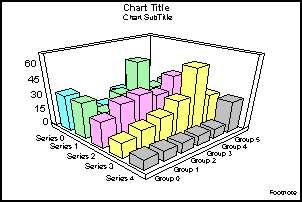
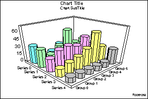
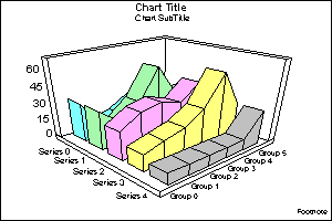
This is a standard 3D graph. It displays a bar for each
value in the data set.
x
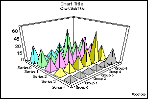
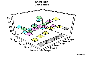
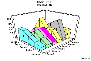
This shows pyramids to represent volume information,
such as an amount of some item.
x
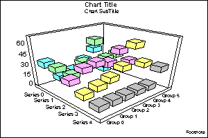
This shows octagons drawn in 3D. You can make them more
elliptical or more columnar.
x
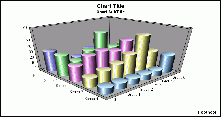
3D Cylinder (GraphType=3)
This shows cylinders drawn in 3D.
x
3D Floating Cubes (GraphType=4)
This shows a 3D graph type for data values that are
close to each other. You can see under and around the cubes.
x
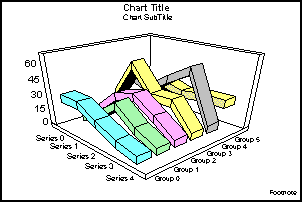
3D Floating Pyramids (GraphType=5)
This shows how the floating, diamond-shaped pyramids
can trace out your data points.
x
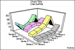
3D Connected Series Area (GraphType=6)
This shows trend information along the series dimension.
Note: This type of graph does not support drilldowns or
conditional styling.
x
3D Connected Series Ribbon (GraphType=7)
This shows trend information (represented in ribbon-shaped
bars) along the series dimension.
Note: This type of graph does not support drilldowns or
conditional styling.
x
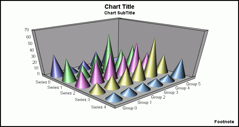
This shows how cones can highlight your data points.
x
3D Connected Group Area (GraphType=9)
This shows trend information along the group dimension.
Note: This type of graph does not support drilldowns or
conditional styling.
x
3D Connected Group Ribbon (GraphType=10)
This shows trend information (represented in ribbon-shaped
bars) along the group dimension.
Note: This type of graph does not support drilldowns or
conditional styling.
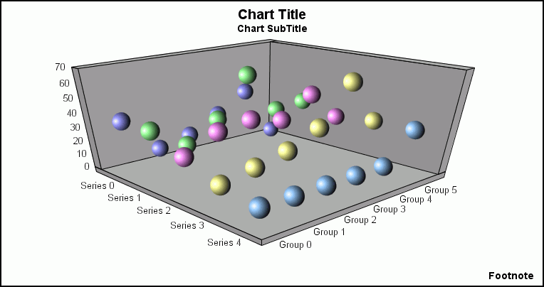
x
This shows how spheres can highlight your data points.
x
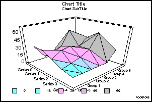
3D Surface (GraphType=12)
This graphs all data points as a 3D surface, using a
rolling wave-like effect.
Note: This type of graph does not support drilldowns or
conditional styling.
x
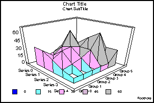
3D Surface with Sides (GraphType=13)
This graphs all data points as a 3D surface with solid
sides.
Note: This type of graph does not support drilldowns or
conditional styling.
x
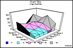
3D Honeycomb Surface (GraphType=14)
This graphs all data points as a 3D surface using a
honeycomb effect.
Note: This type of graph does not support drilldowns or
conditional styling.
x
3D Smooth Surface (GraphType=15)
This graphs all data points as a 3D smooth surface.
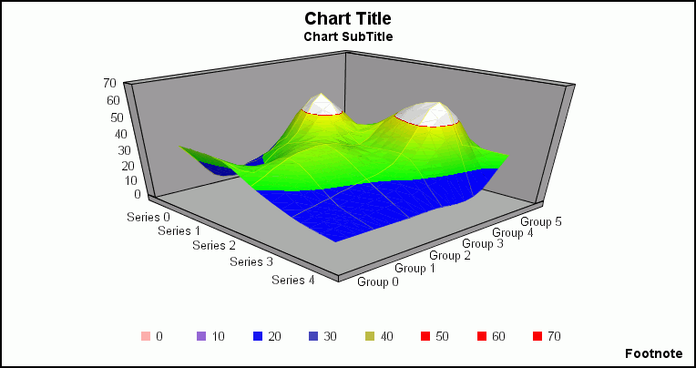
Note: This type of graph does not support drilldowns or
conditional styling.
x
3D Smooth Surface with Sides (GraphType=16)
This graphs all data points as a 3D smooth surface with sides.
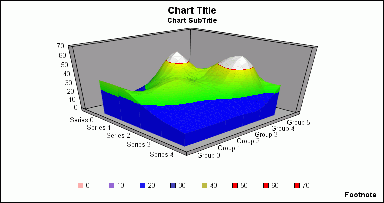
Note: This type of graph does not support drilldowns or
conditional styling.
x
The following illustrations show the vertical bar graphs.
All of the illustrations were created without 2.5D depth applied
to them (for example, DepthRadius = 0).
x
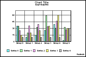
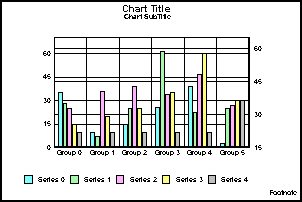
Vertical Clustered Bars (GraphType=17)
This shows bars grouped side by side. This is the standard
type of two-dimensional bar graph.
x
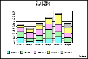
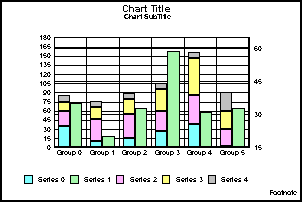
Vertical Stacked Bars (GraphType=18)
This shows stacked groups of bars. Each stack is comprised
of all series in a group. The series are added together and totaled.
The axis is the total value of the cumulative points.
x
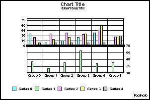
Vertical Dual-Axis Clustered Bars (GraphType=19)
This is also called a Dual-Y graph. You can assign any
series to either of the two axes.
x
Vertical Dual-Axis Stacked Bars (GraphType=20)
This is also called a Dual-Y stacked graph. Separate
stacks will be created for the data on each axis.
x
Vertical Bi-Polar Clustered Bars (GraphType=21)
This is also called a Dual-Y graph with the two axes
split into different sections so that each can be viewed separately.
x
Vertical Bi-Polar Stacked Bars (GraphType=22)
This is a stacked Dual-Y graph with the two axes split
into different sections so that each can be viewed separately.

x
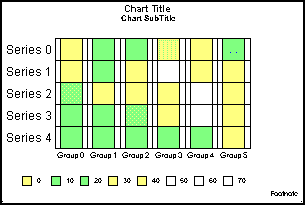
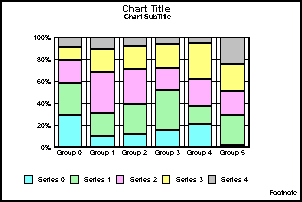
Vertical Percent Bars (GraphType=23)
This is a bar version of a pie graph. Each group calculates
the percentage of the total required for each series. The axis ranges
from 0 to 100%.
x
The following illustrations show the horizontal bar
graphs. All of the illustrations were created without 2.5D depth
applied (for example, DepthRadius = 0).
x
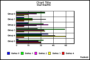
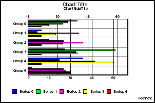
Horizontal Clustered Bars (GraphType=24)
This shows bars grouped side by side. This is the standard
type of two-dimensional bar graph.
x
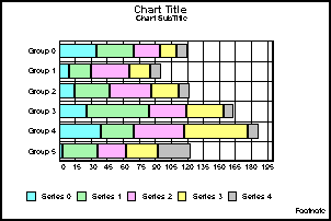
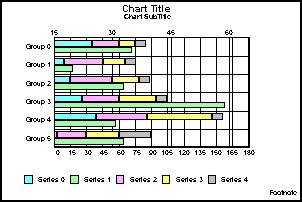
Horizontal Stacked Bars (GraphType=25)
This shows stacked groups of bars. Each stack is comprised
of all series in a group. The series are added together and totaled.
The axis is the total value of the cumulative points.
x
Horizontal Dual-Axis Clustered Bars (GraphType=26)
This is also called a Dual-Y graph. You can assign any
series to either of the two axes.
x
Horizontal Dual-Axis Stacked Bars (GraphType=27)
This is also called a Dual-Y stacked graph. Separate
stacks will be created for the data on each axis.
x
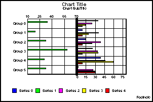
Horizontal Bi-Polar Clustered Bars (GraphType=28)
This is a Dual-Y graph with the two axes split into
different sections so that each can be viewed separately.
x
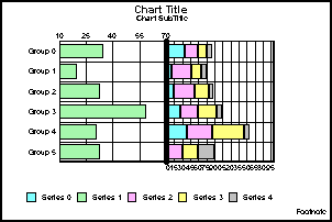
Horizontal Bi-Polar Stacked Bars (GraphType=29)
This shows a stacked Dual-Y graph with the two axes
split into different sections so that each can be viewed separately.
x
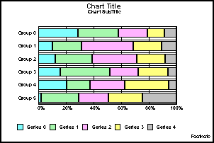
Horizontal Percent Bars (GraphType=30)
This is a bar version of a pie graph. Each group calculates
the percentage of the total required for each series. The axis ranges
from 0 to 100%.
x
The following illustrations show the vertical area graphs.
All of the illustrations were done without 2.5D depth applied (for
example, DepthRadius = 0).
x
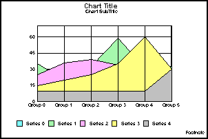
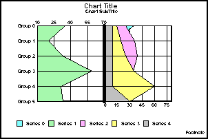
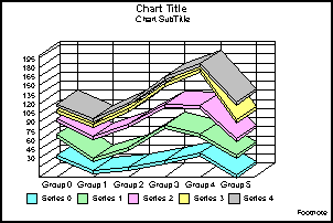
Vertical Absolute Area (GraphType=31)
This shows areas drawn on top of each other to represent
the absolute relationships between data series. You can use this
graph type if certain data overlaps.
x
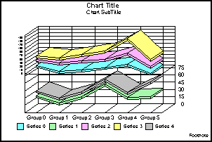
Vertical Stacked Area (GraphType=32)
This shows areas stacked on top of each other. The axis
is the cumulative total of all the groups.

x
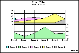
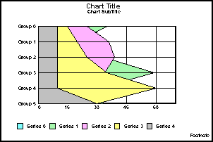
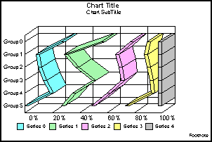
Vertical Bi-Polar Absolute Area (GraphType=33)
This shows a Dual-Y graph with the two axes split into
different sections so that each can be viewed separately.
x
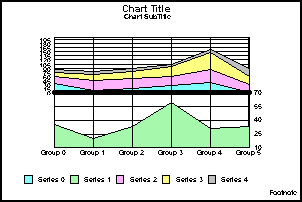
Vertical Bi-Polar Stacked Area (GraphType=34)
This shows a stacked Dual-Y graph with the two axes
split into different sections so that each can be viewed separately.
x
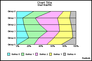
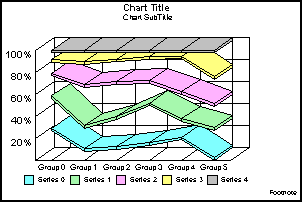
Vertical Percent Area (GraphType=35)
This shows an area version of a pie graph. Each group
calculates the percentage of the total required for each series.
The axis ranges from 0 to 100%.

x
The following illustrations show the horizontal area
graphs. All of the illustrations were done without 2.5D depth applied
(for example, DepthRadius = 0).
x
Horizontal Absolute Area (GraphType=36)
This shows areas drawn on top of each other to represent
the absolute relationships between data series. You can use this
graph type if certain data overlaps.
x
Horizontal Stacked Area (GraphType=37)
This shows areas stacked on top of each other. The axis
is the cumulative total of all the groups.

x
Horizontal Bi-Polar Absolute Area (GraphType=38)
This shows a Dual-Y graph with the two axes split into
different sections so that each can be viewed separately.
x
Horizontal Bi-Polar Stacked Area (GraphType=39)
This shows a stacked Dual-Y graph with the two axes
split into different sections so that each can be viewed separately.

x
Horizontal Percent Area (GraphType=40)
This shows an area version of a pie graph. Each group
calculates the percentage of the total required for each series.
The axis ranges from 0 to 100%.
x
x
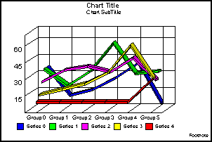
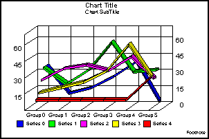
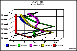
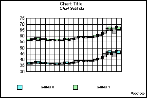
Vertical Absolute Line (GraphType=41)
This shows lines drawn on top and under each other to
represent the absolute relationships between data series.
x
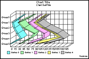
Vertical Stacked Line (GraphType=42)
This shows lines stacked on top of each other. The axis
is the cumulative total of all the groups.
x
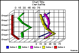
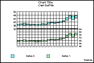
Vertical Dual-Axis Absolute Line (GraphType=43)
This is also called a Dual-Y line graph. You can assign
any series to either of the two axes.
x
Vertical Dual-Axis Stacked Line (GraphType=44)
This is also called a Dual-Y stacked line graph. Separate
stacks will be created for the data on each axis.

x
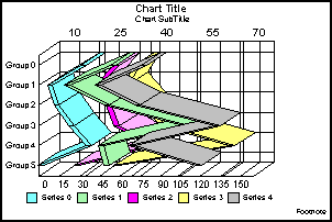
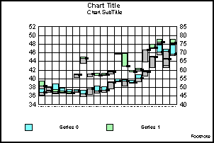
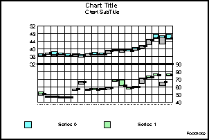
Vertical Bi-Polar Absolute Line (GraphType=45)
This is a Dual-Y graph with the two axes split into
different sections so that each can be viewed separately.

x
Vertical Bi-Polar Stacked Line (GraphType=46)
This shows a stacked Dual-Y graph with the two axes
split into different sections so that each can be viewed separately.
x
Vertical Percent Line (GraphType=47)
This shows a line version of a pie graph. Each group
calculates the percentage of the total required for each series.
The axis ranges from 0 to 100%.
x
x
Horizontal Absolute Line (GraphType=48)
This shows lines drawn on top and under each other to
represent the absolute relationships between data series.
x
Horizontal Stacked Line (GraphType=49)
This shows lines stacked on top of each other. The axis
is the cumulative total of all the groups.
x
Horizontal Dual-Axis Absolute Line (GraphType=50)
This is also called a Dual-Y line graph. You can assign
any series to either of the two axes.

x
Horizontal Dual-Axis Stacked Line (GraphType=51)
This is also called a Dual-Y stacked line graph. Separate
stacks will be created for the data on each axis.
x
Horizontal Bi-Polar Absolute Line (GraphType=52)
This shows a Dual-Y graph with the two axes split into
different sections so that each can be viewed separately.
x
Horizontal Bi-Polar Stacked Line (GraphType=53)
This shows a stacked Dual-Y graph with the two axes
split into different sections so that each can be viewed separately.

x
Horizontal Percent Line (GraphType=54)
This shows a line version of a pie graph. Each group
calculates the percentage of the total required for each series.
The axis ranges from 0 to 100%.
x
x
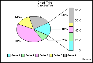
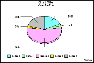
This shows the most widely used graph for displaying
percentages of a total.
x
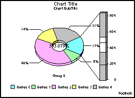
This shows a ring variant of a pie graph. The total
of all slices is placed in the center.

x
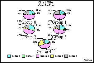
This shows separate pies to represent each group in
the data set. This is a pie variation on percentage bars.
x
Multi Ring Pie (GraphType=58)
This shows separate ring pies to represent each group
in the data set.

x
Multi Proportional Pie (GraphType=59)
This shows each pie sized in proportion to its total
across the entire data set.
x
Multi Proportional Ring Pie (GraphType=60)
This shows each ring pie sized in proportion to its
total across the entire data set.

x
The following illustrations show the scatter graphs.
All of the illustrations were created with the MarkerSizeDefault
set to 90 and UseSeriesShapes set to True.
Note: The X-axis for Scatter graphs is expected to be
numeric. While you are allowed to substitute with an alphanumeric
X-axis, not all features will work correctly.
x
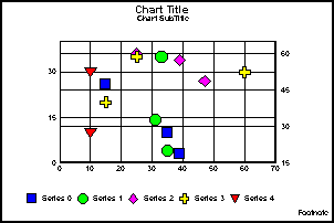
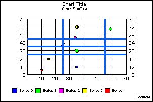
XY Scatter (GraphType=61)
This shows two values assigned to each marker, X and
Y, in that order. This is a standard X-Y plot.

x
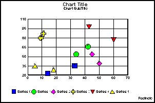
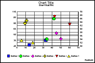
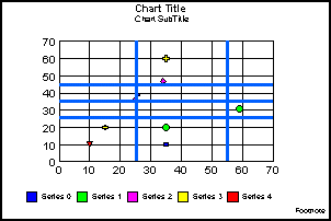
XY Scatter Dual-Axis (GraphType=62)
This is a Dual-Y scatter graph. There are two values
assigned to each marker, X and Y, in that order.
x
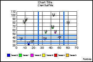
XY Scatter with Labels (GraphType=63)
This shows three values assigned to each marker—X, Y,
and text label—in that order. Each XY point is labeled.
x
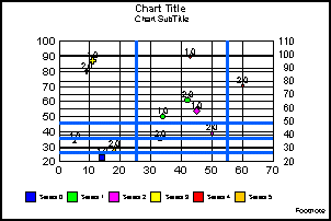
XY Scatter with Labels Dual-Axis (GraphType=64)
This shows a Dual-Y scatter graph with labeled markers.
It requires that three values are assigned to each marker—X, Y,
and text label—in that order.
x
x
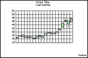
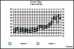
Open-Hi-Lo-Close Candle Stock Graph (GraphType=70)
This graph type requires that four values are assigned
to each marker: Open, High, Low, and Close, in that order.
The following is an example of Open-Hi-Lo-Close
graph output.
x
Open-Hi-Lo-Close Candle Stock Graph with Volume (GraphType=71)
This graph type requires that five values are assigned
to each marker: Open, High, Low, Close, and Volume.
x
Candle Stock Open-Close (GraphType=72)
This graph type requires that two values are assigned
to each marker: Open and Close.
x
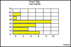
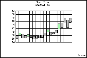
Stock Hi-Lo (GraphType=73)
This graph type requires that two values are assigned
to each marker: High and Low, in that order. This is a standard
financial equity graph.
x
Stock Hi-Lo Dual-Axis (GraphType=74)
This shows a Dual-Y HiLo graph. It requires two values
per marker: High and Low.
x
Stock Hi-Lo Bi-Polar (GraphType=75)
This shows a Dual-Y graph with the axis split into separate
sections. It requires that two values are assigned to each marker:
High and Low.
x
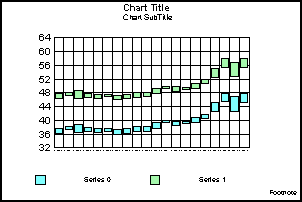
Stock Hi-Lo Close (GraphType=76)
This graph type requires that three values are assigned
to each marker: High, Low, and Close, in that order. This is a standard
financial equity graph.

x
Stock Hi-Lo Close Dual-Axis (GraphType=77)
This shows a Dual-Y version of a Hi-Lo Close graph.
It requires that three values are assigned to each marker: High,
Low, and Close.
x
Stock Hi-Lo Close Bi-Polar (GraphType=78)
This shows a Dual-Y graph with the axis split into separate
sections. It requires that three values are assigned to each marker:
High, Low, and Close.
x
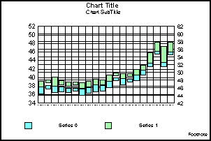
Stock Hi-Lo Open-Close (GraphType=79)
This graph type requires that four values are assigned
to each marker: Open, High, Low, and Close. This is a standard financial
equity graph.
x
Stock Hi-Lo Open-Close Dual-Axis (GraphType=80)
This shows a Dual-Y version of GraphType 79. It requires
that four values are assigned to each marker: Open, High, Low, and
Close.
x
Stock Hi-Lo Open-Close Bi-Polar (GraphType=81)
This shows a Dual-Y graph with two axes split into separate
sections. It requires that four values are assigned to each marker:
Open, High, Low, and Close.

x
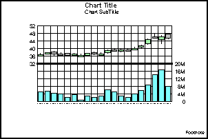
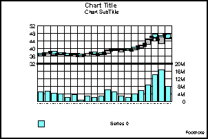
Stock Hi-Lo with Volume (GraphType=82)
This shows stock performance along with volume. It requires
that three values are assigned to each marker: High, Low, and Volume.

x
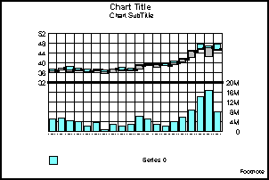
Stock Hi-Lo Open-Close with Volume (GraphType=83)
This shows stock performance along with volume. It requires
that five values are assigned to each marker: Open, High, Low, Close,
and Volume.
x
Candle Stock Open-Close with Volume (GraphType=84)
This shows a stock performance along with volume. It
requires that three values are assigned to each marker: Open, Close,
and Volume.
x
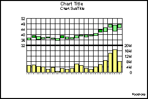
Stock Hi-Lo Close with Volume (GraphType=88)
This shows stock performance along with volume. It requires
that four values are assigned to each marker: High, Low, Close,
and Volume.
x
Note: The X-axis for Bubble graphs is expected
to be numeric. While you are allowed to substitute with an alphanumeric
X-axis, not all features will work correctly.
x
Bubble Graph (GraphType=89)
This shows three values assigned to each marker: X,
Y, and Z, in that order. This has an X-Y plot in which the marker
size depends on Z.
x
Bubble Graph with Labels (GraphType=90)
This shows that four values are assigned to each marker:
X, Y, Z, and text label, in that order. This has an X-Y plot in
which the marker size depends on Z, shown with labels.
x
Bubble Graph Dual-Axis (GraphType=91)
This shows that three values are assigned to each marker:
X, Y, and Z, in that order. This has an X-Y plot in which the marker
size depends on Z.
x
Bubble Graph with Labels Dual-Axis (GraphType=92)
This shows four values assigned to each marker: X, Y,
Z, and text label, in that order. This has an X-Y plot in which
the marker size depends on Z, shown with labels.
x
x
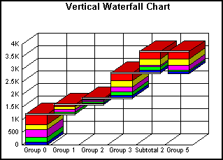
Vertical Waterfall Graph (GraphType=100)
The following is a vertical waterfall graph.
x
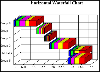
Horizontal Waterfall Graph (GraphType=101)
The following is a horizontal waterfall graph.
x
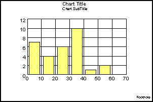
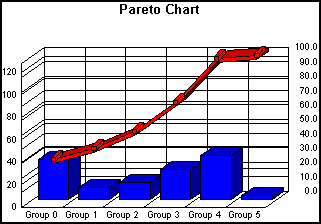
Pareto Graph (GraphType=102)
The following is a pareto graph.
x
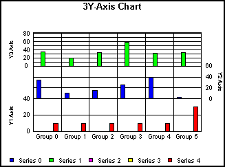
Multi-Y Y1/Y2/Y3-Axes Graph (GraphType=103)
This shows a vertical bar graph with three Y-axes.
x
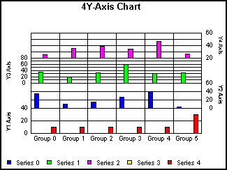
Multi-Y Y1/Y2/Y3/Y4-Axes Graph (GraphType=104)
This shows a vertical bar graph with four Y-axes.
x
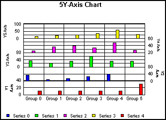
Multi-Y Y1/Y2/Y3/Y4/Y5-Axes Graph (GraphType=105)
This shows a vertical bar graph with five Y-axes.
x
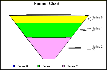
Funnel Graph (GraphType=106)
This shows a funnel graph that draws only one group
of data at a time.
x
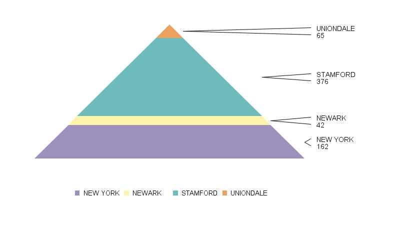
Pyramid Graph (GraphType=111)
This shows a pyramid graph that draws only one group
of data at a time.
x
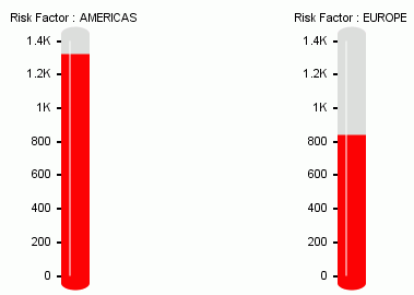
Thermometer Gauge Graph (GraphType=138)
This shows a thermometer gauge graph that compares two
types of data.
x
The following illustrations show the two types of box
plot graphs. Box plot graphs can be displayed as either a box graph,
or a whisker graph. For more information, see BoxPlotType.
x
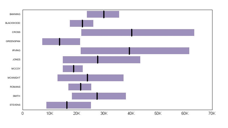
Box Plot Graph (GraphType=124)
This is a standard box plot graph.

x
Horizontal Box Plot Graph (GraphType=130)
This is a horizontal box plot graph.