When a gauge includes multiple needles (multiple measures),
use the secondaryNeedlesAsMarkers property to draw secondary needles
as markers.
x
Syntax: How to Draw Secondary Gauge Needles as Markers
gaugeProperties: {
   secondaryNeedlesAsMarkers: boolean,
},
where:
- secondaryNeedlesAsMarkers: boolean
Valid values are:
- true, which draws
the secondary needles as markers.
- false, which
draws multiple needles. The default value is false.
Note: When
secondaryNeedlesAsMarkers is true, use the series:marker property
to control the size and format of the markers.
Example: Drawing Secondary Gauge Chart Needles as Markers
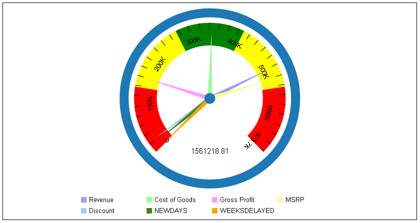
The following request draws the secondary
needles as needles:
GRAPH FILE WF_RETAIL_LITE
SUM REVENUE_US COGS_US GROSS_PROFIT_US MSRP_US
DISCOUNT_US AND COMPUTE
NEWDAYS = DAYSDELAYED *20;
WEEKSDELAYED = NEWDAYS/7;
BY PRODUCT_CATEGORY
WHERE PRODUCT_CATEGORY EQ 'Accessories'
ON GRAPH PCHOLD FORMAT JSCHART
ON GRAPH SET LOOKGRAPH GAUGE1
ON GRAPH SET STYLE *
*GRAPH_JS
gaugeProperties: {
groupLabel: {visible:false},
secondaryNeedlesAsMarkers: false
}
*END
ENDSTYLE
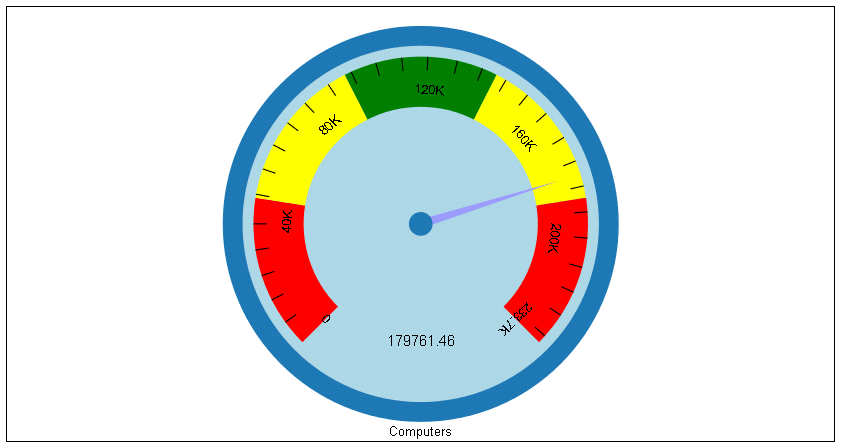
ENDThe output is:
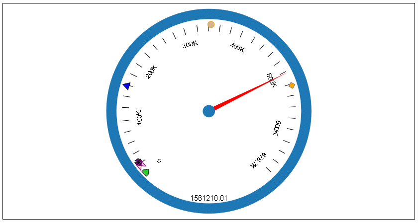
The following version of the request,
draws the secondary needles as markers, and sets marker shapes,
sizes, borders, and colors for them. To make the markers more visible,
the axis width is set to zero. Notice that series 0 is the primary
needle, and is still drawn as a needle:
GRAPH FILE WF_RETAIL_LITE
SUM  REVENUE_US COGS_US GROSS_PROFIT_US MSRP_US
       DISCOUNT_US AND COMPUTE
NEWDAYS = DAYSDELAYED *20;
WEEKSDELAYED = NEWDAYS/7;
BY PRODUCT_CATEGORY
WHERE PRODUCT_CATEGORY EQ 'Accessories'
ON GRAPH PCHOLD FORMAT JSCHART
ON GRAPH SET LOOKGRAPH GAUGE1
ON GRAPH SET STYLE *
*GRAPH_JS
legend: {visible:false},
gaugeProperties: {
  groupLabel: {visible:false},
  axisWidth: 0,
  secondaryNeedlesAsMarkers: true
},
series: [
{series: 0, color: 'red',},
{series: 1, color: 'tan',marker: {shape: 'circle', size: 12,
 border: {width: 1, color: 'orange'}}},
{series: 2, color: 'blue',marker: {shape: 'triangle', size: 12,
 border: {width: 1, color: 'black'}}},
{series: 3, color: 'orange',marker: {shape: 'diamond', size: 12,
 border: {width: 1, color: 'grey'}}},
{series: 4, color: 'purple',marker: {shape: 'pirateCross', size: 12,
 border: {width: 1, color: 'black'}}},
{series: 5, color: 'pink',marker: {shape: 'hourglass', size: 12,
border: {width: 1, color: 'purple'}}},
{series: 6, color: 'limegreen',marker: {shape: 'house', size: 12,
 border: {width: 1, color: 'black'}}}
]
*END
ENDSTYLE
END
The output is: