In this section: |
Whether you access series options from the ribbon or the right-click menu, you are presented with a dialog box of options. The following dialog boxes are commonly used for formatting a series:
- Format Series
- Edit Title
- Traffic Light Condition
For Instructions on how to open these dialog boxes, see the procedures in Using Series Properties.
The Format Series dialog box contains options to format the fill and border of each series on a chart.
The Format Series dialog box contains the following tabs:
- Fill
- Border
Use the Fill tab to modify the color of a chart series. The Fill tab is shown in the following image.
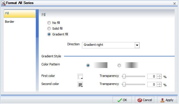
The Fill tab contains the following options:
- No fill. Select this option to remove the color from the series.
-
Solid fill. Select
this option to display the Color and Transparency options.
- Color. Click this icon to open the Color dialog box, where you can select a color for the series.
- Transparency. Move the slider to make the bands opaque (0%) or transparent (100%). The default is 0%.
-
Gradient fill. Select
this option to display the direction of the gradient, the color
pattern of the gradient, and the degrees of transparency for the
two colors that make up the gradient. A gradient is a smooth color
transition or blending of one color to another. The number of colors
to use in a gradient is defined by the stop or pin elements.
-
Direction. Select
from this drop-down menu to set the direction of the gradient fill.
The options are:
- Gradient right
- Gradient left
- Gradient down
- Gradient up
- Gradient down left
- Gradient up left
- Gradient down right
- Gradient up right
- Radial
- Radial top left
- Radial top right
- Radial bottom left
- Radial bottom right
- Radial pie
- Radial pie inverted
-
Direction. Select
from this drop-down menu to set the direction of the gradient fill.
The options are:
Use the Border tab to specify a border for a chart series. The Border tab is shown in the following image.
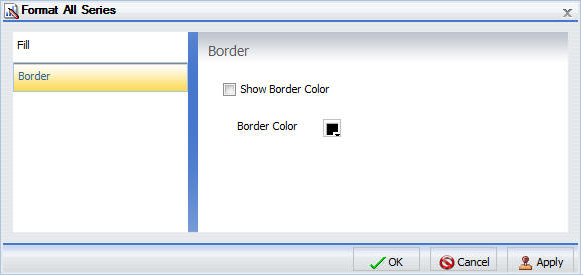
The Border tab contains the following options:
- Show Border Color. Select this option to show a border color around each series.
- Border Color. Click this icon to open the Color dialog box, where you can select a color for the border.
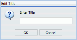
The Enter Title dialog box contains a text field in which you can type the title for a series on a chart. Click OK and the title appears on the chart.
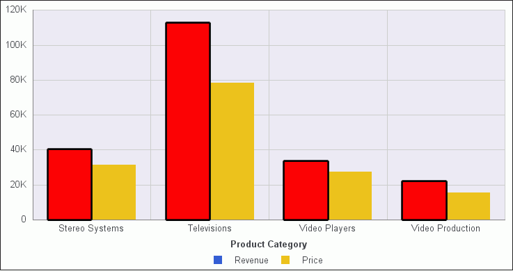
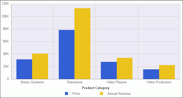
The Traffic Light Condition dialog box contains fields for adding new conditional styling or modifying existing conditional styling by applying a traffic light color to the selected field.
The Traffic Light Condition dialog box is shown in the following image.
The Traffic Light Condition dialog box contains the following fields.
-
Relational Operators. Select
from this drop-down menu to set the relational operator. The options
are:
- Equal to
- Not equal to
- Greater than
- Less than
- Greater than or equal to
- Less than or equal to
-
Type/Value. Click
this unlabeled field to open a dialog box that contains the following
fields:
- Type. Opens a drop-down menu of the following values Constant and Field. Select Constant to enter a constant value. Select Field to open a visual display of the fields in your data source.
-
Value: Enables you to specify a value based on the Type
that you select.
Note: If you are creating a Traffic Light condition on a full date field, the Value field will have a calendar icon adjacent to it. You can use this icon to select a date using a calendar control.
-
Get Values. Select
from this drop-down menu. The options are:
- All
- First
- Last
- Minimum
- Maximum
- From Field
The visual display of fields is shown in the following image.
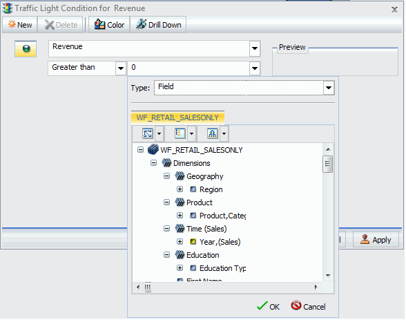
The Traffic Light Condition dialog box contains the following buttons:
- Selected Condition. Click this icon to select a condition to work on.
- New. Creates a new rule.
- Delete. Deletes a rule.
- Color. Opens the Color dialog box.
-
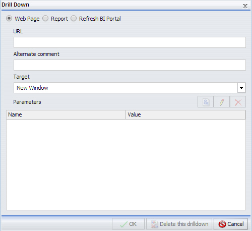
Drill Down. Opens
the Drill Down dialog box, shown in the following image, where you
can drill down to a webpage or a URL. Specify the following:
- URL of the webpage or location of the report
- An alternate comment
- Target (New Window, Same Window, a value that you enter)
- Parameters that you want to use (Name, Value)