Creating a Chart

In this section:

How to:

On the Format tab, the Chart Types group provides buttons for each of the five most commonly-used chart types. These include Bar (default), Pie, Line, Area, and Scatter, as shown in the following image. You also have access to Lightweight Mapping using the Map button. A button labeled Other gives you access to the complete chart library of advanced charts.

Chart Types group

Note: For more information on how to invoke the version of InfoAssist that you are using, please see Getting Started With InfoAssist.


Top of page

x
Procedure: How to Create a Basic Chart

You can run this procedure in Query Design view or Live Preview.

  1. On the Format tab, in the Chart Types group, click the button of the chart that you want to create. Bar chart is the default.

    The chart appears on the canvas.

  2. Populate the chart with your data in one of the following ways:
    • Drag the dimension fields and measure fields onto the chart.
    • Drag the dimension fields and measure fields into the appropriate field containers in the Query pane.

Top of page

x
Procedure: How to Create an Advanced Chart

You can run this procedure in Query Design view or Live Preview.

  1. On the Format tab, in the Chart Types group, click Other.

    The Select a chart dialog box opens. The chart types, depicted by icons, display on the left side of the dialog box.

  2. To display the name of a chart type, hover over the chart type with the mouse.

    From top to bottom, the chart type categories are Bar, Line, Area, Pie, XY Plots, 3D, Stock, Special, and HTML5.

  3. Click a chart type.

    All supported variations of the chart type appear as thumbnail images in the dialog box.

  4. Click an image to display a detailed description of that chart type.

    If you are not familiar with a chart type, be sure to read the description carefully before finalizing your selection. Some chart types require a certain number of data values, or a certain type of data values. If your data does not satisfy the requirements, the chart will not accurately represent the data.

    In the following image, the Pie chart type is selected. To the right, the dialog box displays thumbnail images of the chart variations that are supported. Once a selection is made, a description for that chart appears underneath.

    Other Chart Types

    You can also hover over an image with your mouse to display the chart type name, as shown in the following image.

    Pie Thumbnail

  5. In the Select a chart dialog box, click OK to finalize your selection and close the dialog box.
  6. Populate the chart with your data in one of the following ways:
    • Drag the dimension fields and measure fields onto the chart.
    • Drag the dimension fields and measure fields into the appropriate field containers in the Query pane.

Top of page

x
Procedure: How to Create a Combination Chart

You can run this procedure in Query Design view or Live Preview.

  1. On the Format tab, in the Chart Types group, click the button of the chart that you want to create. Bar chart is the default.

    The chart appears on the canvas.

  2. Populate the chart with your data in one of the following ways:
    • Drag the dimension fields and measure fields onto the chart.
    • Drag the dimension fields and measure fields into the appropriate field containers in the Query pane.
  3. Change a series type in one of the following ways:
    • Ribbon: On the Series tab, in the Select group, select the series that you want to display in a different chart type. Then, in the Properties group, from the Type drop-down menu, select the chart type.
    • Right-Click Menu: Right-click the series that you want to display in a different chart type, point to Series Type, and select the chart type.

    The series appears in the new chart type.


Top of page

x
Procedure: How to Create a Dual-Axis Chart

When you create a dual-axis chart, you assign one data series to the Y1 axis and another data series to the Y2 axis.

  1. Create a chart.
  2. On the Format tab, in the Chart Types group, click Other.

    The Select a chart dialog box opens.

  3. Select a dual-axis chart, such as dual-axis bar, and then click OK.
  4. Drag one field onto the Y1 field, and then drag another field onto the Y2 field.

Top of page

x
Procedure: How to Create a Multi-Axis Chart

When you create a multi-axis chart, you assign one data series to the Y1 axis and another data series to the Y2, Y3, Y4, and Y5 axes (as needed).

  1. Create a chart.
  2. On the Format tab, in the Chart Types group, click Other.

    The Select a chart dialog box opens.

  3. Select a multi-axis chart, and then click OK.
  4. Drag fields onto the Y1, Y2, Y3, Y4, and Y5 fields, as needed.

Top of page

x
Procedure: How to Create a Map

You use the Lightweight Mapping functionality to create a map in InfoAssist.

Note: You must use the HTML5 output format to access this functionality.

  1. Launch InfoAssist in Chart mode.
  2. On the Format tab, in the Chart Types group, click Map.

    The Select a map dialog box opens, as shown in the following image.

  3. From the Type group, select Choropleth map or Proportional Symbol map. Choropleth map is selected by default.
  4. From the Location group, using the Territory drop-down list, select a territory (for example, United States of America).

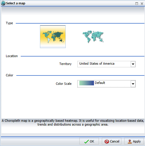
    Note: This section allows you to pick geographic locations for which maps are available. You can select a territory option from the drop-down list. For example, some of the available territories include World, Europe, or United States of America.

  5. From the Color group, using the color scale drop-down list, select a color scale. For example, Qualitative.

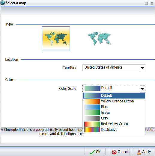
    Note: This section allows you to pick a color scale for a choropleth map, as shown in the following image. For a proportional symbol (bubble) map, the color selection option is disabled.

  6. Click OK.
  7. Add the following fields to the chart:
    1. A Measure field. For example, Discount.
    2. A Location field. For example, State.

      Note: Latitude and Longitude field containers are available for proportional symbol (bubble) maps. You can specify latitudinal or longitudinal data using these fields.

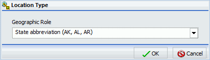
    When the location field is specified, the Location Type dialog box displays, as shown in the following image.

    Note:

    • The Location Type is needed for geocoding, which is a process through which fields are assigned to a specific geographic dimension (for example, ZIP Code, State, or Country) so that it can be matched correctly to the geographic coordinates. The geocoding process will occur once you add a geographic field to the Location data container.
    • You can also access the Location Type dialog box by right-clicking on the Location dimension in the Query Design pane. From the menu, select Geographic Role. The Location Type dialog box opens, from which you can make a selection.

  8. From the Geographic Role drop-down list, select State name.
  9. Click OK.

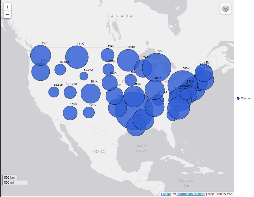
    The map displays based on your data and selections for Type, Location, and Color.

    For example, the following map shows the geographic location, using a proportional symbol map, of Discount data by State in the United States.


Top of page

x
Chart Outputs

You can create charts using one of the following output formats:

The HTML5 output format allows you to render a chart in the browser using a built-in JavaScript engine. Charts with this output format utilize the very latest capabilities of the HTML5 Web standard, including animation, high-quality vector output, and attractive alpha-channel and gradient effects.

Note: Not every chart type can be output in every format listed here. To make sure that the chart that you are creating can be output in the format that you want, please see the topic for that particular chart type.


WebFOCUS