In this section: |
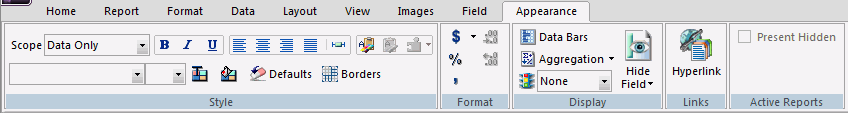
You use the Appearance tab while creating or editing a report to filter specific fields, sort data in a field, and style the titles and data of a field. The Appearance tab is located at the top of the App Studio interface. It is only accessible when a field is selected on the Report canvas. The Appearance tab is shown in the following image.
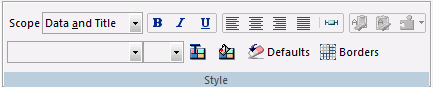
You can the style data, titles, and text of a selected field. The Style group is shown in the following image.
The commands are:
Indicates whether style options apply to the data, title, or both.
Applies bold font formatting to the text or selected object.
Applies italic font formatting to the text or selected object.
Underlines the text or selected object.
Aligns the text or selected object to the left.
Aligns the text or selected object to the center.
Aligns the text or selected object to the right.
Applies the default alignment options. In this case, numerals are aligned to the left and text is aligned to the right.
Sets column width options.
Copies the style of the selected object, enabling the Paste Style command.
Pastes your copied style settings to the selected field.
Copies the specific style settings from one column to another.
Changes typed or highlighted text to the selected font.
Changes typed text or a selected object to the selected size.
Changes typed text or a selected object to the selected color.
Changes the background color. Opens the Color dialog box, where you can select the background color.
Resets the typed text or a selected object to the default style settings.
Turns borders and gridlines on or off.
Related Information:
Use the tools in the Format group to change the formatting of numeric detail fields. For example, you can add percentage signs to data and indicate currency (with or without symbols). This group is unavailable when the format option or edit option for the selected field are eight characters in length or attempt to go over eight characters in length.
Note: If you select Sort Down, Sort Across, or For Row, the options in the Format group will be unavailable.
The Format group is shown in the following image.

The commands are:
Adds a currency symbol in front of the field data. Enables the selection of a currency, for example Floating Dollar or Fixed Euro. The symbol used is that of the currency selected. If a Fixed currency is selected, no symbol appears. If a Floating currency is selected, the currency symbol appears.
Adds a percentage symbol after the field data.
Enables the display of commas in the field data.
Decreases the number of decimal positions shown.
Increases the number of decimal positions shown.
In this section: |
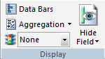
You can add a data visualization column to a report, display numeric data differently, and add conditional styling. The Specific group is shown in the following image.
The commands are:
Enable the Data Visualization dialog box, through which you can add a data visualization column to the right of a selected numeric field. The column displays values in each row using horizontal bars that extend from left to right in varying lengths, depending on the corresponding data values. For more information, see Data Visualization Dialog Box.
Displays numeric data using a variety of aggregation types. Different aggregation types are available depending on the field and the column type for that field. These aggregation types are:
You use the Traffic Lights functionality to set styling and hyperlinks conditions. Adds conditional styling or modifies existing conditional styling by applying colors to a field in the output when the field meets specified criteria. Options include: None or Add/Edit Conditions. If you select Add/Edit Conditions, the selection option changes to Sorted Data.
To style a specific condition, select a condition and then use the Style group. This will only style the condition you selected.
The styling you add to a condition appears as a preview in the Report canvas when you select the condition in the Traffic Lights drop-down list box.
You can hide or show a selected field in the output. Fields added to a report or chart are visible in the output by default. The Visibility group is shown in the following image. Options include On, Off, or Variable. When a data field is invisible, it appears on the Report canvas (dimmed) and is not visible in the report output.
Note: An invisible column or field may be used in the report as part of a calculation, even though it is set to invisible and will not display in the output.
You use the Data Visualization dialog box to define the data visualization bar graphs that appear in your report.
If you are setting conditions to control the display of bar graphs, you use the Data Visualization Conditional Styling dialog box instead of this one.
The Data Visualization dialog box contains the following fields or options:
Initiates the Data Visualization feature.
Specifies the color of the bar graphs. Select a color from the drop-down list. Black is used as the default color.
The color option is the default for HTML, PDF, and PS formats.
Specifies the shading patterns for bar graphs. Select a shading pattern from the drop-down list.
This option is only available for PDF and PS formats to make graphs in black and white reports more readable. If the report format is HTML, the Pattern option button is inactive because the shading option is only available for PDF and PS formats.
Specifies how the graph looks. Select a look from the drop-down list.
Note: Graphlook Gauge or Quality do not support negative values. Use Bar Graphs instead.
Specifies the relative bar graph scaling for multiple report columns under a common Across sort field to which you have applied data visualization.
Note: This option only appears when applied to the entire report.
Choose one of the following options from the Scale drop-down list:
Specifies that each vertical bar graph be scaled based on the minimum and maximum values of the entire set of values compiled from each Across column to which you have applied data visualization bar graphs.
Specifies that each vertical bar graph be scaled based on the distinct minimum and maximum values for each Across column to which you have applied data visualization bar graphs.
Specifies the length of the longest bar graph.
Default. The default length of 60 pixels is used for a vertical bar graph and 80 pixels for a horizontal bar graph.
Custom. Sets the value for displaying the vertical or horizontal bar graph for the maximum data value in the associated report column. This value must be a positive number.
This value is initially expressed in the current windows measurement units (inches, centimeters), then converted into the corresponding number of pixels.
Specifies the width of the bar graphs in a report.
Default. This value is preset based on the current font size.
Custom. Sets the value for displaying the width of the bar graphs in a report. This value must be a positive number.
This value is initially expressed in the current windows measurement units (inches, centimeters), then converted into the corresponding number of pixels.
Resets all defaults.
Opens the Data Visualization Conditional Styling dialog box where you can define conditions and colors for bar graphs.
How to: |
You can add a hyperlink or drill-down procedure to a selected field in a report. The Links group is shown in the following image.

The command is:
Adds a hyperlink or drill-down procedure to a selected field in a report. For more information, see How to Create a Drill Down Procedure.
The Drill Down dialog box displays.
The Drill Down fields are enabled.
Note: The Refresh BI Portal drill-down type will be displayed only when you are working with a report that was created in the Content development area.
Select the procedure to drill to and click OK.
The Parameters dialog box opens.
The Parameter fields are enabled.
The Parameters dialog box closes and you return to the Drill Down dialog box.
The Drill Down dialog box closes.
The Drill Down dialog box opens.
The Drill Down fields are enabled. The Drill Menu Items field is automatically populated with a default drill-down name. You may rename it as needed, or delete the name if you are using only one drilldown.
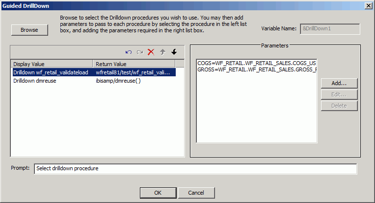
The Guided DrillDown dialog box opens.
The Open File dialog box opens.
To select multiple procedures, hold down the Control key and click the procedures.
You are returned to the Guided DrillDown dialog box, with the selected procedures displayed in the procedures list box.
The Drill Down Parameter dialog box opens.
You are returned to the Guided DrillDown dialog box, as shown in the following image.
You are returned to the Drill Down dialog box.
The Drill Down dialog box closes.
You can choose to show or hide columns in an active report, as shown in the following image.
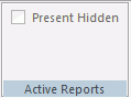
You can select which columns are hidden from view, in the report output, when using the HTML active report output format.
| WebFOCUS |