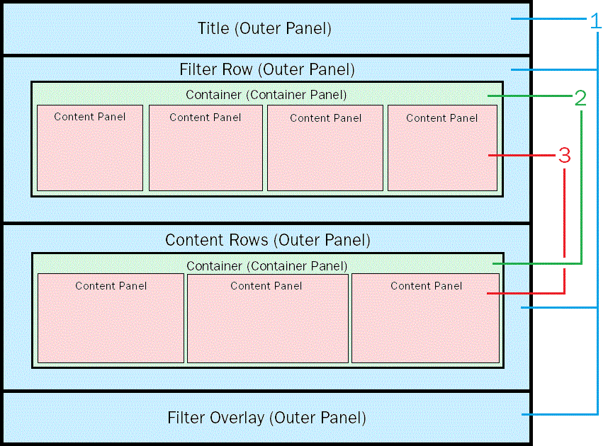
RDF pages are designed around the grid architecture shown in the following image.
1. Outer Panels. Contain the outer sections containing the title and filters.
2. Container Panels. Are the panels inside the outer panel that contain the content panels. The container panels are always centered on the screen (in the boxed layout) and the widths are adjusted for different screen resolutions. This is done with CSS3 media queries behind the scenes.
3. Content Panels. Contain HTML components and control objects. The content panels are also adjusted for different screen resolutions and will be influenced by the available space within its parent container panel. As container panels get narrower, the content panels fold underneath each other.
The resizing of these panels is determined by the CSS relative positioning and float properties (for example, float: left). The RDF Add-on uses JavaScript to dynamically assign these properties at runtime. This allows you to keep using absolute positioning during development in App Studio, if you follow the Unique Identifier and CSS class standards required by the framework.
When constructing or modifying RDF panels in App Studio, each panel object should be assigned to a CSS class as defined by the grid CSS and, optionally, a CSS class as defined by the theme CSS. The following are the grid CSS classes assigned to each panel type:
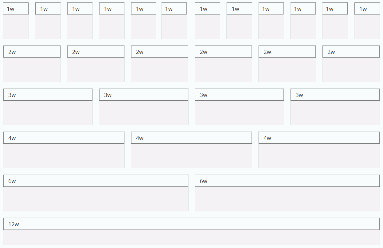
Standard content panel sizes range from 1/12 of the container width to the full width of the container. The following are the CSS classes that determine the width of each responsive panel:
Standard panel sizes are shown in the following image.
If you create your own panel layout instead of using a template, you can set the content of the panels to responsively resize by setting the Width property value in the App Studio Properties panel to 100%. If the contents are not sizing as expected, make sure that they are children of the correct panel by checking the drop-down menu at the top of the Properties panel. They should appear indented directly underneath the appropriate content panel. If they are not, you can assign a parent container by holding the Alt key and dragging them into the desired container.
As the page width goes below the thresholds of 1200 and 600 pixels, the panel width will be assigned to a different value, using CSS3 media queries, to allow content folding.
Typically, the width of the panels is doubled relative to the size of the page. For example, when the page is between 600 and 1199 pixels wide, the CSS classes set the following widths:
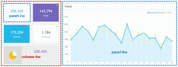
HTML pages created using the RDF Add-on can contain multiple responsive panels within a single container. This allows panels to resize and fold differently within each container. These are done using the column CSS classes. For example, placing panel1 and panel2 inside column1 causes them to stack when the screen width is too narrow to maintain rows of panels. An example of multiple responsive canvases within a single container is shown in the following image.
| WebFOCUS |