How to: Reference: |
Time tables show activities or tasks over a period of time. Tick marks representing individual data records are displayed across a grid in a pattern directly related to the time of their occurrence. Time tables are used to show large numbers of events over time and for studying the interrelationships between those events.
The time table control of WebFOCUS Visual Discovery enables you to monitor the timing and pattern of vital business activities. You can use shaped or angled glyphs or symbols to represent specific activities, group related ticks together on the grid, adjust the size and color of ticks to indicate event duration, and view the value of another variable.
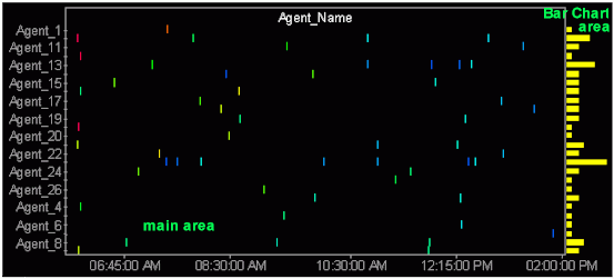
The following image shows an example of a time table.
The time table provides information in two areas of the graph: the bar chart area and the main window area. The bar chart area graphs the number of tick marks that occur in a row. In the default presentation, each tick mark in the main window area represents one record in the bar chart area.
The main area of the time table presents most of the information. The label for the vertical y-axis is displayed across the top of the graph. (In the following graphic, the label is Agent_Name.) The y-axis values appear along the vertical axis and time is plotted along the x-axis. The data is displayed using tick marks or other glyphs, depending on the field values you apply.
When a tick mark is not in focus, the bar chart provides a relative view of the tick marks and the number of times a tick mark occurs. When the tick mark is in focus, the:
Note:
The following image shows the Time Table tab in the Visual Discovery Properties dialog box.
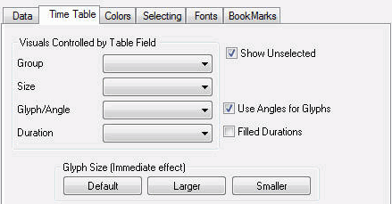
Organizes the data into data sets by the selected field.
Sizes the glyphs based on the selected field.
Displays glyphs using different shapes (instead of the default tick marks) according to the value of the selected field.
Shows durations according to the selected field. The glyphs will appear as a line (tail).
Shows unselected data in gray. If the Show Unselected check box is not selected, unselected data is omitted from the display.
To add unselected data, either select the Show Unselected check box in the Properties dialog box, or use the right mouse button menu in the view and click Select All.
Displays glyphs as angled tick marks instead of shapes. This change is applied to the field selected in the Glyph/Angle section of the Visuals Controlled by Table Field area.
Changes the default presentation from lines with tails to filled bars. This size change is applied to the field selected in the Duration section of the Visuals Controlled by Table Field area.
Changes the relative sizes of the glyphs back to their original size.
Increases the relative size of the glyphs.
Decreases the relative size of the glyphs.
The pop-up menu appears when you right-click a Visual Discovery control in the analytical dashboard. These options do not appear when you are developing in HTML Composer.
Shows unselected data in gray. If the Show Unselected check box is not selected, unselected data is omitted from the display.
To add unselected data, either select the Show Unselected check box in the Properties dialog box, or use the right mouse button menu in the view and click Select All.
Displays the glyphs as angled tick marks instead of shapes.
Changes the default presentation from lines with tails to filled bars.
Hides or shows the name of the selected label.
Orders the items in the selected group by category (y-axis labels).
Orders the items in the selected group by count (highest to lowest values).
Shows text in a normal, readable size.
Shows the entire table in the current window. If there are fewer table rows than will fit in the window at full size, then the lines are shown in a larger font with more spacing. If there are more lines than will fit, then they are reduced to a smaller size, with a minimum of 1 pixel high. If all table rows does not fit at 1 pixel high, then lines are overplotted to allow all to fit. When values are overplotted, the line that is the longest or with the hottest color is drawn on the top, obscuring all others under it.
Draws text as one-pixel-high lines. This is helpful when you need to reduce the size of the text to see more of the data. Depending on how many lines you have in your table, this may still require paging to see all rows.
Reverses the previous action. You may repeatedly undo actions retained in the history file for your current session by selecting Undo over and over again. A description of the previous action appears on the pop-up menu. If you have performed no action, Undo is not available for selection and no action appears to the right of the word Undo.
Restores the previous undo action. If you have performed no action, Redo is not available for selection and no action appears to the right of the word Redo.
Selects all of the items in the graph. When you choose Select All, any previous selections are ignored. Selection state returns to the original setting.
When selected, all of the items become unselected. All items appear in the unselected color (gray, by default) or are hidden in the graph (if hide unselected is active).
Reverses the selection state of items. Selected items become unselected and unselected items become selected.
Excludes (temporarily removes) items from the graph.
Restores the items you excluded. If you accidentally excluded the unselected, this menu option restores those excluded items.
Saves the graph to a GIF or JPEG file.
Copies the selected component and pastes it to another file.
Takes you to the collection of tabs available for the respective visualization component. Common tabs include Data, Selecting, and Colors.
The default glyph used in the time table is the tick mark. Depending on your intended purpose, other sizes, angles, and shapes of glyphs may be helpful. The following table shows different styles of tick marks and what type of data they represent.
|
Glyph |
Name |
Use |
Example |
|---|---|---|---|
|
|
Tick Mark |
The default presentation where each tick mark stands for one record. |
Each tick mark stands for one time that a call center agent is online. Tick marks can also be sized by a field value. The height of the tick mark represents another field. |
|
|
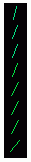
Angles for Glyphs |
Tick marks are angled to represent another field. May be useful when you want to see multiple data fields at the same time. |
Tick marks represent a class of skills. Each angled tick mark represents a subcategory of skill. If an agent has more than one subcategory skill, the lines cross. If an agent, for example, had the entire subcategory of skills, the glyph would look like a star so it would be easy to see who your most skillful agents are. |
|
|
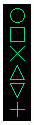
Glyph/ Angle |
Glyphs of different shapes (circle, X, line, square) are used to represent subcategories of a record. The first six unique values are assigned a shape. The remaining values are assigned a dot. |
Each shape represents a subclass of skills. If an agent has more than one subcategory of skills, only the last applied subclass is represented by a glyph. If you want to see how many agents have experience in a specific subclass, all those having the same shape may be more easily identified than those with the same angular line. |
|
|
Default Duration |
Line length is used to show the duration (span over time). The line is shown with a tail (tick mark) at the beginning. If rows of data overlap, this may be used to see the overlap more clearly than filled bars. Duration fields must be numeric. |
Duration lines are used to show the length of time an agent is online. The longer the agent is online, the longer the line. If there are many agents (Y values), the default duration presentation allows more agents to be shown in a smaller area. |
|
|
Filled Duration |
Changes the duration line to a bar. Bar length is used to show the duration (span over time). Duration fields must be numeric. |
Duration lines are used to show the length of time the agent is online. The longer the agent is online, the longer the bar. |
| WebFOCUS |