How to: Reference: |
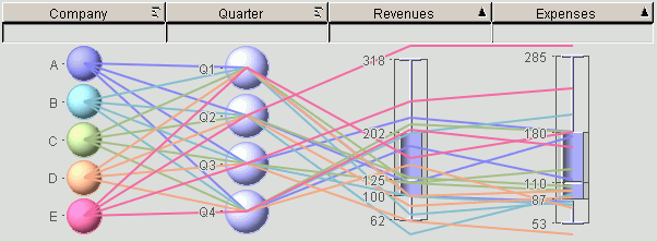
A parabox is a hybrid of box plots and parallel coordinate plots, and is made up of multiple columns. The first contains specific values from a data group (each displayed as a bubble, sized to demonstrate the number of records it represents), with the remaining columns each representing a specific characteristic of that group. Paraboxes can give you an overview of the distribution of values in a set of fields from a table and provide a simple summary of how a subset of data differs from the whole. Paraboxes are effective for simultaneously measuring and analyzing numerous attributes and complex relationships among multiple fields.
The following image shows an example of a parabox.
WebFOCUS Visual Discovery offers a unique parabox component. You can create intuitive paraboxes, then further enhance them by drawing lines that connect column values, so interaction patterns can be detected between fields and abnormalities that fall outside the regular range can be identified. You can also perform comparisons by population or selection, access individual data values, and choose from multiple plot styles.
Trade-off, constraints, and optimization analyses are just some of the analyses that can be performed using the parabox. Use the parabox to:
A boxplot shows ranges or distribution characteristics of values of selected categorical data. The central tendency and range or statistical variations are computed for each category of data and the selected values are presented in a box. This type of representation is useful when you want to compare a subset of a population to the whole population.
A boxplot provides a great deal of information. If selected items are visualized, two boxplots provide information. The boxplot always displays an outer and inner box. It represents all the items in the graph. The outer (dark gray) box shows where 95% of the data should lie according to a simple statistical model. Points outside the outer box area (often called outliers) are drawn as individual points on the central axis. The inner (lighter gray) box represents 50% of the data. In other words, it represents the middle half of the data in the distribution. The line across the box represents the median.
The following image shows an example of a boxplot.
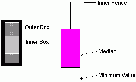
The optional boxplot is displayed in pink (by default). The outside lines (inner fence and minimum value or whiskers) are drawn from the box to the smallest and largest values.
If the selected items are all of the items in the set, the two boxes appear in the same space. That is, the inner fence and the minimum values from the optional box plot are the top and bottom edges of the first box plot. The median lines overlap.
You are more likely, however, to select items that are a subset of items depicted in the whole graph. In this case, depending on the values of the items in the subset, the optional box plot might fill above and/or below the first box plot.
The glyph changes to the strip representation that you selected.
Note: Only those options that are applicable to a specific data type are available for its parabox glyph. For example, the As Bubbles option is not available for real numbers.
The ordering icons appear in the right corner of a column. The icons and their meanings are described in the following table.
|
Icon |
Description |
|---|---|
|
|
The data is in its original order. |
|
|
The data is sorted by size, from largest (at the bottom) to smallest (at the top). |
|
|
The data is sorted by size, from smallest (at the bottom) to largest (at the top). |
|
|
The data is sorted by label, from a (at the bottom) to z (at the top). |
|
|
The data is sorted by label, from z (at the bottom) to a (at the top). |
|
|
The weighting field is shown in this strip. Active only when a weight by field has been selected. |
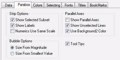
The following image shows the Parabox tab in the Visual Discovery Properties dialog box.
Displays an optional box plot in yellow (by default). The outside lines (inner fence and minimum value or whiskers) are drawn from the box to the smallest and the largest values of the selected subset.
Displays labels that explain the meaning of the glyphs on the graph.
In a parabox, the presentation options can be set to show Parallel Axis, Same Scale for Boxplots, and/or Show Selection. If you want the boxplots to be created using the same scale as the other glyphs, select Same Scale for Boxplots. By default, the boxplots are drawn to make them legible. In this case, the glyphs are not likely to be drawn to the same scale.
When you weight a field with a negative value, select:
Negative values are shown as unfilled circles.
When selected, parallel axis lines connect the fields.
Shows unselected data in gray. If the Show Unselected Lines check box is not selected, unselected data is omitted from the display.
To add unselected data, either select the Show Unselected check box in the Properties dialog box, or use the right mouse button menu in the view and click Select All.
Select this check box to display the parallel axis for unselected rows in the color defined as Background2 on the Colors tab. This makes the parallel axis for the unselected rows blend into the background. When the Use Background2 Color check box is not selected, the parallel axis for unselected rows uses the standard unselected color.
Displays the entire string of a truncated line when the cursor is placed in the column.
The pop-up menu appears when you right-click a Visual Discovery control in the analytical dashboard. These options do not appear when you are developing in HTML Composer.
Note: Only those options that are applicable to a specific data type are available for the parabox glyph. For example, string data types show only Parallel Axes, Show Selection, and Same Size. Whereas all options are available for integer data types.
When selected, lines connect the fields. When Parallel Axes is not selected, no lines connect the fields.
When selected, an optional box plot is displayed in yellow (by default). The outside lines (inner fence and minimum value or whiskers) are drawn from the box to the smallest and the largest values of the selected subset.
Shows all numbers in all columns in the graph on the same scale.
Changes the type of strip representation. For more information, see How to Set Parabox Presentation Options.
Reverses the previous action. You may repeatedly undo actions retained in the history file for your current session by selecting Undo over and over again. A description of the previous action appears on the pop-up menu. If you have performed no action, Undo is not available for selection and no action appears to the right of the word Undo.
Restores the previous undo action. If you have performed no action, Redo is not available for selection and no action appears to the right of the word Redo.
Selects all of the items in the graph. When you choose Select All, any previous selections are ignored. Selection state returns to the original setting.
When selected, all of the items become unselected. All items appear in the unselected color (gray, by default) or are hidden in the graph (if hide unselected is active).
Reverses the selection state of items. Selected items become unselected and unselected items become selected.
Excludes (temporarily removes) items from the graph.
Restores the items you excluded. If you accidentally excluded the unselected, this menu option restores those excluded items.
Enables you to save the graph to a GIF or JPEG file.
Enables you to copy the selected component and paste it to another file.
Takes you to the collection of tabs available for the respective visualization component. Common tabs include Data, Selecting, and Colors.
| WebFOCUS |


