How to: Reference: |
A line chart or line graph is a diagram that compares the relationship between two variables, one dependent and one independent. It demonstrates the effect of the independent variable on the dependent variable by showing successive points, each representing a different data value, connected by straight lines. Line charts show aggregated values rather than individual values. More than one data point must be present in order to create a line chart. These charts are particularly useful in examining a sequence of values to determine growth trends, displaying data that changes continuously over time and helping to identify patterns that make predictions about the results of data not yet recorded.
Line charts can be in one of two forms: a more traditional chart, which uses multiple y-axis fields and results in multiple plotted lines, or a single y-axis line chart, in which the default view is a series of bars connected by lines.
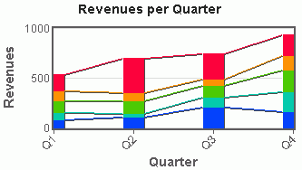
The following image shows an example of a multiple line chart diagram.
WebFOCUS Visual Discovery enables you to rapidly create a variety of line charts, including filled line charts, as well as multiple line charts that are directly stacked or stacked in separate panels. Additionally, you can display multiple lines within the same line chart and scroll or zoom for convenient navigation of long lines.
Other capabilities include:
 or the Vertical button
  .
.
Tip: In the pop-up menu, if Horizontal has a check mark next to it, then the graph has a horizontal orientation. Click Horizontal to remove the check mark and change the orientation to vertical.
The following image shows the Line Chart tab in the Visual Discovery Properties dialog box.
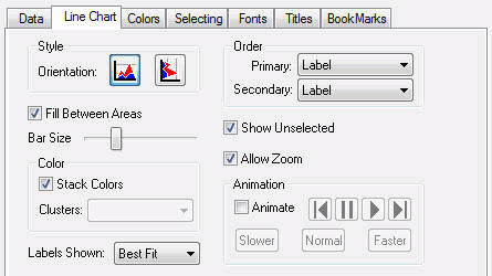
Orientation is horizontal or vertical.
Colors the space between the connecting lines. In essence, this creates an area graph.
Adjusts the bar size from narrow (slide the bar towards the left) to wide (slide the bar towards the right).
A glyph may be colored to show two fields that have been colored by a third field. See Assigning Color to the Data and the Graph.
Creates a line chart with multiple y-axis fields.
Sets the label mode. See Displaying Labels.
Controls the sequence in which glyphs are presented. See Selecting Primary and Secondary Order.
Shows unselected data in gray. If Show Unselected is not checked, unselected data is omitted from the display.
To add unselected data, either turn on Show Unselected in the Properties dialog box, or use the right mouse button menu in the view and choose Select All.
Enables the zoom bar. The zoom bar lets you zoom in on the details of data or zoom out to look at the big picture.
Select this option to put a single component or a perspective into a mode where its glyphs are automatically colored and not colored in sequential order. See Animating Data.
The pop-up menu appears when you right-click a Visual Discovery control in the analytical dashboard. These options do not appear when you are developing in HTML Composer.
Is the orientation of the graph. If Horizontal is checked, the orientation of the graph is horizontal. If it is not checked, the orientation is vertical.
Shows unselected data in gray. If Show Unselected is not checked, unselected data is omitted from the display.
To add unselected data, either turn on Show Unselected in the Properties dialog box, or use the right mouse button menu in the view and choose Select All.
Shows goal lines on the graph. See Using Goal Lines.
Select this option to put a single component or a perspective into a mode where its glyphs are automatically colored and not colored in sequential order. See Animating Data.
Displays the items in one of the following orders: Original Order, Label, Size, Total Selected, or Percent Selected. See Selecting Primary and Secondary Order.
Sets the label mode. See Displaying Labels.
Adds or removes the label from the selected data item.
Places a goal line on the graph. See Using Goal Lines.
Shows text in a normal, readable size.
Shows the entire table in the current window. If there are fewer table rows than will fit in the window at full size, then the lines are shown in a larger font with more spacing. If there are more lines than will fit, then they are reduced to a smaller size, with a minimum of 1 pixel high. If all table rows does not fit at 1 pixel high, then lines are overplotted to allow all to fit. When values are overplotted, the line that is the longest or with the hottest color is drawn on the top, obscuring all others under it.
Draws text as one-pixel-high lines. This is helpful when you need to reduce the size of the text to see more of the data. Depending on how many lines you have in your table, this may still require paging to see all rows.
Reverses the previous action. You may repeatedly undo actions retained in the history file for your current session by selecting Undo over and over again. A description of the previous action appears on the pop-up menu. If you have performed no action, Undo is not available for selection and no action appears to the right of the word Undo.
Restores the previous undo action. If you have performed no action, Redo is not available for selection and no action appears to the right of the word Redo.
Selects all of the items in the graph. When you choose Select All, any previous selections are ignored. Selection state returns to the original setting.
When selected, all of the items become unselected. All items appear in the unselected color (gray, by default) or are hidden in the graph (if hide unselected is active).
Reverses the selection state of items. Selected items become unselected and unselected items become selected.
Excludes (temporarily removes) items from the graph.
Restores the items you excluded. If you accidentally excluded the unselected, this menu option restores those excluded items.
Enables you to save the graph to a GIF or JPEG file.
Enables you to copy the selected component and paste it to another file.
Takes you to the collection of tabs available for the respective visualization component. Common tabs include Data, Selecting, and Colors.
| WebFOCUS |