Building an Application With Advanced Chart Controls

How to:

This section of the tutorial illustrates how to build a sample chart control interface that allows the manipulation of information on the HTML page during run time. The chart controls are applied to the sample page, vzMySales.htm, using Visual Discovery controls and JavaScript API.

For more information on the JavaScript API, see Using the Visual Discovery JavaScript API.

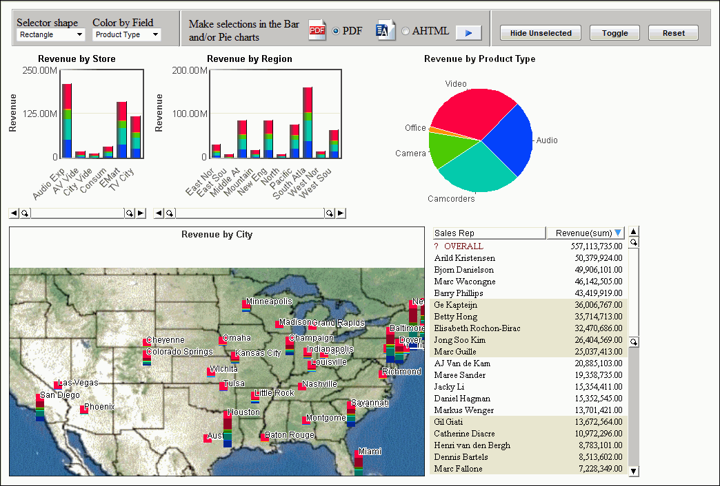
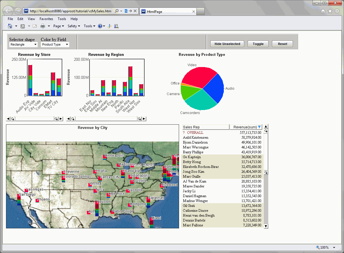
The final output should look similar to the following image:

HMTL Page final tutorial output


Top of page

x
Procedure: How to Create a Visual Discovery Control Panel Menu Bar
  1. From the Insert menu, click Controls, then click Group Box.
  2. Click and drag your cursor across the top of the canvas. A group box appears.
  3. Delete the Group Box text by right-clicking the words Group Box and selecting Delete.
  4. Access the Properties menu pane on the right. If needed, select Properties from the View menu.

    Make sure that groupbox1 <FIELDSET> is the selected property in the Properties menu pane, then click the Styling: Advanced (CSS) ellipsis button.

  5. From the options on the left, click Background, then click Silver from the color drop-down list in the Background color section.
  6. From the options on the left, click Position. Specify the attributes as follows:
    • Top: 10px
    • Left: 15px
    • Height: 55px
    • Width: 1015px
  7. Click OK and save your work.
  8. From the Insert menu, click Components, then click Line.
  9. Click and drag your cursor within the group box to draw the line.
  10. Access the Properties menu pane on the right. If needed, click Properties from the View menu.

    Make sure that line1 <SPAN> is the selected property in the Properties menu pane, then click the Styling: Advanced (CSS) ellipsis button.

  11. From the options on the left, click Background, then select Gray from the color drop-down list in the Background color section.
  12. From the options on the left, click Position. Specify the attributes as follows:
    • Top: 0px
    • Left: 240px
    • Height: 54px
    • Width: 2px
  13. From the options on the left, click Edges. In the Borders section, specify the attributes as follows:
    • Style: Inset
    • Width: Thin
  14. Click OK and save your work.
  15. Create another line by repeating Steps 8 through 13 in this procedure. When you create the second line, note the following:
    • The selected property in the Properties menu pane should now be line2 <SPAN>.
    • The positioning will be as follows:
      • Top: 0px
      • Left: 690px
      • Height: 54px
      • Width: 2px
    • All other values will be the same as the previous line.
  16. When the second line is inserted, save your work and run the webpage.
  17. Close the webpage and return to HTML Composer.

Top of page

x
Procedure: How to Create a Drop Down List Control for Selector Shapes

This procedure adds a Drop Down List control to the menu bar, which can be used to set the way the mouse selects data graphically at run time. This applies to non-3D components only.

  1. From the Insert menu, click Controls, then click Drop Down List.
  2. Click and drag your cursor within the group box. The drop-down list appears.
  3. Access the Properties menu pane on the right. If needed, select Properties from the View menu.

    Make sure that combobox1 <SELECT> is the selected property in the Properties menu pane. Set these attributes as follows:

    • Name: cboSelection
    • Position: Left: 5px
    • Position: Top: 25px
    • Size: Width: 100px
    • Styling: Font: Arial 8pt
    • Unique Identifier: cboSelection
  4. Click the Parameters tab located in the lower-left corner of the HTML Composer window.

    HTML Composer window

    The Properties and settings dialog box appears.

    Note: For the steps below, it is important that you make sure that cboSelection <SELECT> is the selected property in the Properties menu pane before you open the Parameters window. If it is not selected, you can select it from the drop-down menu at the top of the Properties menu. If it does not appear in the drop-down menu, you need to refresh the menu. You can do this by clicking anywhere on the active form, then back on the Properties menu pane.

  5. Click Static from the Data Type radio button area.
  6. Click the New button New value button, and add the following options:
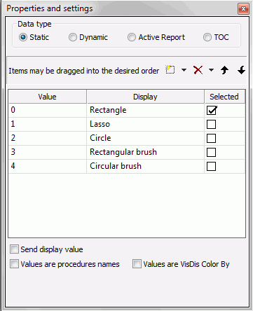
    Value

    Display

    0

    Rectangle

    1

    Lasso

    2

    Circle

    3

    Rectangular brush

    4

    Circular brush

    The following image shows the Properties and settings box with the newly added options.

    Properties and settings dialog box cboSelect

  7. Return to the Design view by clicking on the Design tab located in the lower-left corner of the HTML Composer window.
  8. Click the Events tab located at the bottom of the Properties toolbox pane.
  9. To add an event to the drop-down list whenever you select an option at run time, select the event onchange and click the ellipsis button.
  10. Add the code below to the cboSelection_onchange function and then save your work.
    //VzSelectorShapeEnum
    /*Shape	        Value     Description
    ------------------------------------
    VzSelRectangle    0       Rectangle
    VzSelLasso        1       Lasso
    VzSelCircle       2       Circle
    VzSelRectBrush    3       Rectangular brush
    VzSelCircleBrush  4       Circular brush
    */
    var vzBarOne             =document.getElementById('vzBarOne');
    var varSelected          =ctrl.options[ctrl.selectedIndex].value;
    vzBarOne.SelectorShape   =varSelected;

    Note: The steps above added JavaScript code to the project. For more information on JavaScript standards and best practices, see Using the Visual Discovery JavaScript API.

  11. Return to the design view by selecting the Design tab and return to the Properties menu pane by selecting the Properties tab at the bottom of the Properties toolbox pane.
  12. From the Insert menu, click Components, then click Text.
  13. Click and drag your cursor within the group box. The text appears.
  14. Double-click inside the text object. Enter the text Selector shape.
  15. Access the Properties menu pane on the right. If needed, click Properties from the View menu.

    Make sure that text1 <SPAN> is the selected property in the Properties menu pane. Set these attributes as follows:

    • Position: Left: 5px
    • Position: Top: 8px
    • Size: Height: 28px
    • Size: Width: 100px
    • Unique Identifier: txtSelector
  16. Save your work, then run the webpage.

    Note: The selector shape control allows you to choose portions of the Visual Discovery controls during run time, through use of different shape selection options. With the HTML page open, click Circle, in the Selector shape drop-down list. Click and drag your cursor across the pie chart. Notice the selection you choose is selected in a circular shape.


Top of page

x
Procedure: How to Create a Drop Down List Control to Color By Fields

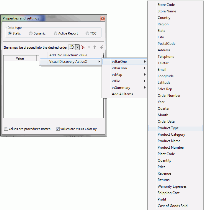
This procedure adds a Drop Down List control to the menu bar, which can be used to color any table in the data pool by the specified field at run time.

  1. From the Insert menu, click Controls, then click Drop Down List.
  2. Click and drag your cursor within the group box. The drop-down list appears.
  3. Access the Properties menu pane on the right. If needed, click Properties from the View menu.

    Make sure that combobox2 <SELECT> is the selected property in the Properties menu pane. Set these attributes as follows:

    • Name: cboColorBy
    • Position: Left: 115px
    • Position: Top: 25px
    • Size: Width: 100px
    • Styling: Font: Arial 8pt
    • Unique Identifier: cboColorBy

    Note: For the steps below, it is important that you make sure that cboColorBy <SELECT> is the selected properly in the Properties menu pane before you open the Parameters window. If it is not selected, you can select it from the drop-down menu at the top of the Properties menu. If it does not appear in the drop-down menu, you need to refresh the menu. You can do this by clicking anywhere on the active form, then back on the Properties menu pane.

  4. Click the Parameters tab located in the lower-left corner of the HTML Composer window.

    Note: The Properties and settings dialog appears, if not, select View in the HTML Composer menu bar, and then click Properties and settings.

  5. Click Static from the Data Type radio button area.
  6. Click the Values are VisDis Color By check box at the bottom of the dialog box.
  7. Click the New button chart control drop-down list New Chart Control Button, select Visual Discovery ActiveX, and choose the following options from the cascading menus:
    • Select vzBarOne, then Store Name.
    • Select vzBarTwo, then Region.
    • Select vzPie, then Product Type.

    The following image shows the cascading menu options of the Properties and settings dialog box.

    Properties and settings selection for Color by control

  8. Return to the Design view by clicking on the Design tab located in the lower-left corner of the HTML Composer window.
  9. On the Insert menu, click Components, then click Text.
  10. Click and drag your cursor within the group box. The text appears.
  11. Double-click inside the text object. Enter the text Color by Field.
  12. Access the Properties menu pane on the right. If needed, click Properties on the View menu.

    Make sure that text2 <SPAN> is the selected property in the Properties menu pane. Set these attributes as follows:

    • Position: Left: 115px
    • Position: Top: 8px
    • Size: Height: 28px
    • Size: Width: 100px
    • Unique Identifier: txtColorBy
  13. Save your work, then run the webpage.

    Note: The Color by Field control allows you to select a field in run time, and color the Visual Discovery controls on the page based on the field you choose. With the HTML page open, click Region, in the Color by Field drop-down list. Notice Visual Discovery controls on the page change color according to the region data. The same can be repeated for Store Name and Product Type.


Top of page

x
Procedure: How to Create a Push Button Control That Hides Excluded Items

This procedure adds a Push Button control to the menu bar that omits unselected items from the current display.

Note: This method is different from excluding. When you hide unselected items, the data is still present in other views. It would not be if excluded.

  1. From the Insert menu, click Controls, then click Push Button.
  2. Click and drag your cursor within the group box. The push button appears.
  3. Access the Properties menu pane on the right. If needed, select Properties from the View menu.

    Make sure that button1 <INPUT> is the selected property in the Properties menu pane. Set these attributes as follows:

    • Name: btnHide
    • Position: Left: 705px
    • Position: Top: 20px
    • Size: 24px
    • Size: Height: 25px
    • Size: Width: 120px
    • Styling: Font: Arial 8pt Bold
    • Unique Identifier: btnHide
    • Value: Hide Unselected
  4. Right-click Hide Unselected and click Create Hyperlink.
  5. In the Hyperlink properties dialog box, click the New button New Hyperlink button.
  6. Click Visual Discovery Exclude from the Action drop-down list, then the vzstoresales data pool from the Source drop-down list.

    The following image shows Visual Discovery Exclude and vzstoresales selected in the Hyperlink Properties dialog box.

    Hyperlink Properties dialog box

  7. Save your work, then run the webpage.

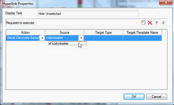
    Note: The Hide Unselected button allows you to select a field, option, or data selection from the HTML page, hiding all the unselected options. This control is not the same as excluding the data. With the HTML page open, click Video in the pie chart and click Hide Unselected. Notice other data is visible, and the only information on your page relates to the Video data.


Top of page

x
Procedure: How to Create a Push Button Control That Toggles Actively Selected Items

This procedure adds a Push Button control to the menu bar that toggles the actively selected items. Selected items become unselected, and the unselected items become selected.

  1. From the Insert menu, select Controls, then click Push Button.
  2. Click and drag your cursor within the group box. The push button appears.
  3. Access the Properties menu pane on the right. If needed, click Properties from the View menu.

    Make sure that button2 <INPUT> is the selected property in the Properties menu pane. Set these attributes as follows:

    • Name: btnToggle
    • Position: Left: 835px
    • Position: Top: 20px
    • Size: 15px
    • Size: Height: 25px
    • Size: Width: 75px
    • Styling: Font: Arial 8pt Bold
    • Unique Identifier: btnToggle
    • Value: Toggle
  4. Click the Events tab located at the bottom of the Properties toolbox pane.
  5. To add an event to the button whenever it is clicked, select the event onclick and click the ellipsis button.
  6. Add the code below to the btnToggle_onclick function and then save your work.
    vzBarOne.Command(7117, "", 0, 0); //***Toggle Unselected

    Note: The steps above added JavaScript code to the project. For more information on JavaScript standards and best practices, see Using the Visual Discovery JavaScript API.

  7. Return to the design view by selecting the Design tab and return to the Properties menu pane by selecting the Properties tab at the bottom of the Properties toolbox pane.
  8. Save your work, then run the webpage.

    Note: The Toggle button allows you to switch views between selected data of a Visual Discovery control and the unselected data. With the HTML page open, click Video in the pie chart. Click Toggle and notice that the unselected data in the controls are selected. Click Toggle again then notice that the Video data is selected.


Top of page

x
Procedure: How to Create a Push Button Control to Refresh Components

This procedure adds a Push Button control to the menu bar that refreshes all components on the page to their original state.

  1. From the Insert menu, click Controls, then click Push Button.
  2. Click and drag your cursor within the group box. The push button appears.
  3. Access the Properties menu pane on the right. If needed, click Properties from the View menu.

    Make sure that button3 <INPUT> is the selected property in the Properties menu pane. Set these attributes as follows:

    • Name: btnReset
    • Position: Left: 920px
    • Position: Top: 20px
    • Size: 44px
    • Size: Height: 25px
    • Size: Width: 75px
    • Styling: Font: Arial 8pt Bold
    • Unique Identifier: btnReset
    • Value: Reset
  4. Click the Events tab located at the bottom of the Properties toolbox pane.
  5. To add an event to the button whenever it is clicked, select the event onclick and click the ellipsis button.
  6. Add the code below to the btnReset_onclick function and then save your work.
    vzBarOne.Command(7112, "", 0, 0); //***Restore Excluded
    vzBarOne.Command(7115, "", 0, 0); //***Select All

    Note: The steps above added JavaScript code to the project. For more information on JavaScript standards and best practices, see Using the Visual Discovery JavaScript API.

  7. Return to the design view by selecting the Design tab and return to the Properties menu pane by selecting the Properties tab at the bottom of the Properties toolbox pane.
  8. Save your work, then run the webpage. The HTML Page should look similar to the following image.

    HTML Page output

    Note: The Reset button refreshes all components on the HTML page back to their original state. With the HTML page open, select Audio on the pie chart, and then click Toggle. Notice that only the Audio data is visible. Next click Reset, to refresh all data in its original state.


Top of page

x
Procedure: How to Create Radio and Push Button Controls to Collect Data and Pass to a Report

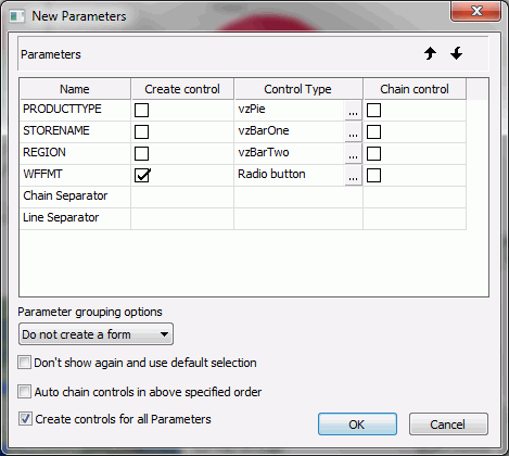
This procedure adds a Radio Button control and a Push Button control to the menu bar. Each control generates a list of strings representing the labels displayed for the selected items. One displays an active report, and the other displays a PDF.

  1. From the Insert menu, click Components, then click Text.
  2. Click and drag your cursor within the group box. The text appears.
  3. Double-click inside the text object. Enter the text Make selections in the Bar and/or Pie charts.
  4. Access the Properties menu pane on the right. If needed, click Properties from the View menu.

    Make sure that text3 <SPAN> is the selected property in the Properties menu pane. Set these attributes as follows:

    • Position: Left: 255px
    • Position: Top: 10px
    • Size: Height: 35px
    • Size: Width: 194px
    • Unique Identifier: txtCollect
  5. From the Insert menu click New Report, and drag your cursor across a blank area of the dashboard to draw a report container.
  6. Right-click the report container, and click Reference existing procedure. The Get source file dialog box opens.
  7. Click the VZDashboard.fex file and click Open.

    Note: If you did not add the ibidemo folder directory when you first created your new project in HTML Composer, you must copy the file into your application folder. VZDashboard.fex can be copied from \ibi\apps\ibidemo.

  8. In the New Parameters dialog box, click the ellipsis buttons under Control Type as follows:
    • PRODUCTTYPE. Select Existing control, then vzPie.
    • STORENAME. Select Existing control, then vzBarOne.
    • REGION. Select Existing control, then vzBarTwo.
  9. Select Do not create a form from the Parameter grouping options section.

    The following image shows the New Parameters dialog box.

    New Parameters report function dialog box

  10. Click OK. A panel with the PDF icon and radio button appear on your dashboard.
  11. From the Properties pane drop-down list, select radio1 <SPAN>.

    The chart control Properties and Settings dialog box opens.

  12. From the Properties and settings dialog box, click the New button New Value button to add a new control. Value2 appears below the PDF value.
  13. Edit Value2 as follows:
    • Name Value2, AHTML, under Value and Display.
    • Click the ellipsis button under Display. Select format_ahtml_32.png and click Open.

    An AHTML report icon and radio button appear next to the PDF icon and radio button.

    Note: format_ahtml_32.png, should be copied from the \ibi\DevStudio81\ibi_html\javaassist\ibi\html\describe folder to your application folder.

  14. Click the Parameters tab, at the bottom left of your screen.

    You must map the parameter names to the data pool fields properly to run the report selections properly.

  15. Click the arrowhead under vzBarOne.

    A Properties and settings dialog box appears.

  16. Click Store Name from the Use Value From drop-down list.
  17. Repeat for vzBarTwo, and vzPie. Select:

    Region under vzBarTwo. Product Type under vzPie.

  18. Select radio1 <SPAN> in the Properties pane, hold down the ALT key and drag the radio buttons up to the group box, next to the Make selections in the Bar and/or Pie Charts text.
  19. Make sure that <radio1 <SPAN> is the selected property in the Properties menu pane. Set the attributes as follows:
    • Position: Left: 405px
    • Position: Top: 0px
    • Size: Height: 55px
    • Width: 205px
  20. Select button4 <INPUT>, hold down the ALT key and drag the button up to the group box, next to the radio button selections.
  21. Right-click button4 <INPUT>, and click Hyperlink properties.

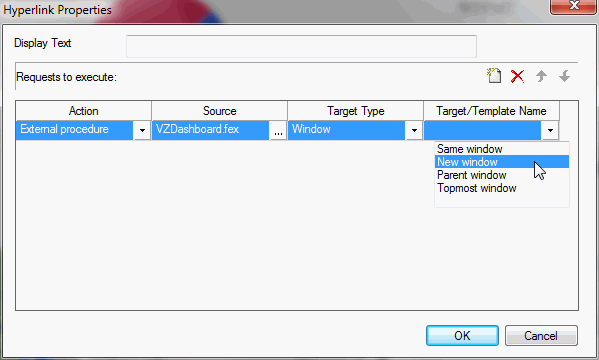
    The Hyperlink Properties dialog box opens.

  22. In the Hyperlink Properties dialog box, make the following changes:
    • Delete text from the Display Text field.
    • Select Window from the Target Type drop-down list.
    • Select New Window from the Target/Template Name drop-down list.

    The following image shows the Hyperlink Properties dialog box.

    Button 4 Hyperlink Properties dialog box

  23. Make sure that button4 <INPUT> is the selected property in the Properties menu pane. Set these attributes as follows:
    • Name: btnRun
    • Position: Left: 626px
    • Position: Top: 20px
    • Size: 20px
    • Size: Height: 22px
    • Size: Width: 38px
    • Unique Identifier: btnRun
  24. From the Properties pane drop-down list, select panel1 <SPAN> and press Delete on your keyboard. Repeat for report1 <IFRAME>.
  25. Save your work, then run the webpage. The final output should look similar to the following image.

    HTML Page final tutorial output

  26. Make selections in the bar and pie charts, then select the desired output format, PDF or AHTML, and click the Run button Run button.

    The values from the charts are passed to the report. The report contains the selected data only.

    Note: To accurately reflect the parameter values selected from the three charts, you must update the WHERE statements in the Vzdashboard.fex to use multi-select syntax.

    To update the Vzdashboard.fex:

    1. Make a backup copy of the Vzdashboard.fex file.
    2. Comment out the following lines:
      WHERE (PRODUCTTYPE EQ '&PRODUCTTYPE');
      WHERE (STORENAME EQ '&STORENAME'); 
      WHERE (REGION EQ '&REGION');
    3. Add the following multi-select WHERE statements:
      WHERE PRODUCTTYPE EQ &PRODUCTTYPE.(OR(FIND PRODUCTTYPE IN CENTURYSALES)).; 
      WHERE STORENAME EQ &STORENAME.(OR(FIND STORENAME IN CENTURYSALES)).;
      WHERE REGION EQ &REGION.(OR(FIND REGION IN CENTURYSALES)).;
    4. Save the updated Vzdashboard.fex file.
    5. Run the webpage. Now, when you make selections in the bar and pie charts, multiple parameters can be passed to the report.

WebFOCUS