In this section:
How to: Reference: |
You can view data in your active report as a line, bar, scatter, or pie chart. For example, the following image shows an HTML active report.
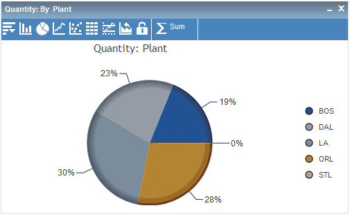
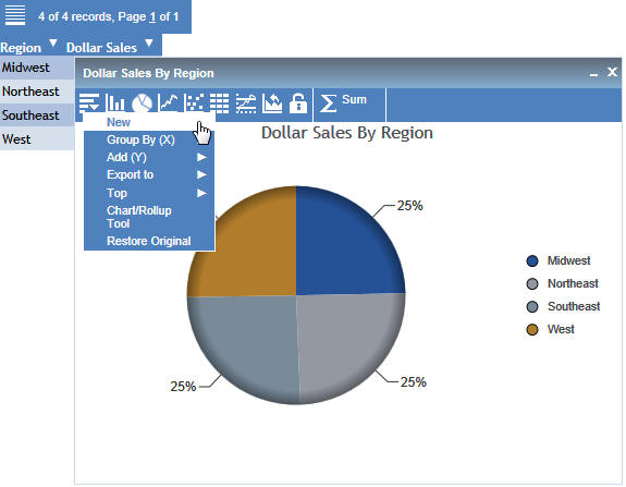
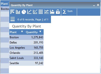
The following image shows a chart that was rendered from the data in the report. This is a pie chart that shows the sum of the values in the Quantity field by Plant.
Once a chart is rendered, you can use the chart icons as follows.
|
Chart Icon |
Action |
|---|---|
|
|
Create new charts to compare values, especially when using the Freeze options. Change or add fields. You can only add fields to a bar or line chart. Export charts to another application or open the Chart/Rollup Tool. |
|
|
Change the chart type to a bar chart. |
|
|
Change the chart type to a pie chart. |
|
|
Change the chart type to a line chart. |
|
|
Change the chart type to a scatter chart. Scatter charts are available for numeric columns.
|
|
|
View the chart as a report in table format. |
|
|
Return to the Series tab in the Chart/Rollup Tool. |
|
|
Restores the current chart type to the initial chart type that was displayed. |
|
|
Freeze chart. You can link or unlink a chart to the filters you have applied in your report using the Freeze chart icon. The icon indicates whether the report is linked to the filter (Freeze chart) or not (UnFreeze chart). |
|
|
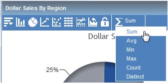
Change the aggregation method. |
Note: If your startup presentation is an active chart instead of a tabular active report, then the Rollup and Freeze icons are not available. For example, on the Format tab in the Report Options dialog box in Report Painter, if the Initial Presentation is set to Bar Chart instead of Grid, then you will not see the Rollup and Freeze icons on the bar chart toolbar.
Scatter charts are available for numeric columns.
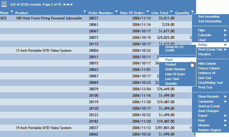
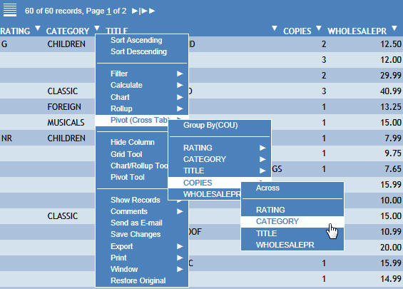
The menu that appears shows you how the chart is going to be created. The first row tells you the calculation, for example Group By (SUM), then the following rows list the vertical (By) sort fields in the report that you can select for the X-axis. The column title you clicked is the field that displays on the Y-axis.
The chart is rendered. You can create a new chart from the chart window, create a Rollup Table, change the type of calculation for the column, and view data tips for the chart items.
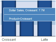
Tip: To view data tips in a chart, point to the pie slice (or column, or dot, depending on your chart type), to view the data tip for the field. For example, the following image shows a data tip for a column in a bar chart.
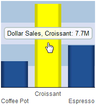
If you click on a column, the data tip includes the column data and name, as shown in the following image.
Another chart window opens with the same chart.
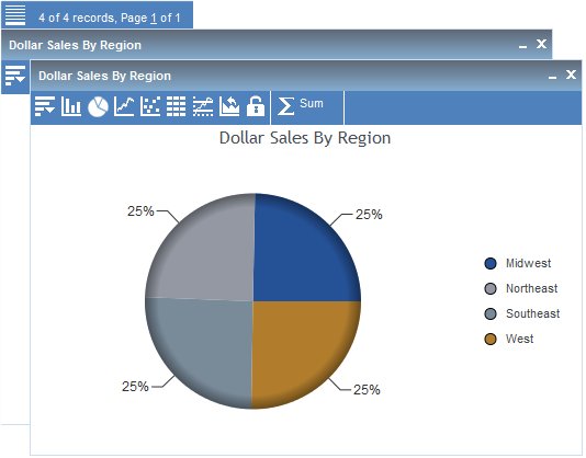
Any additional filters that you apply do not affect this chart window.
Select the Freeze icon again to unfreeze the chart and link the chart to the report when new filters are applied.
You can select Sum, Avg, Min, Max, Count, or Distinct as the aggregation method (calculation type) for numeric data. You can select Count or Distinct as the aggregation method (calculation type) for non-numeric data.
For more information about the available types of calculation in active reports, see Calculating Data.

The following apply to charts.
In some cases, the behavior is the result of the Active Technologies chart engine that you are using. The ARGRAPHENGINE setting specifies the chart engine used for rendering charts in Active Technologies. For more information on the ARGRAPHENGINE syntax and settings for the chart engine, see Switching the Chart Engine.
How to: |
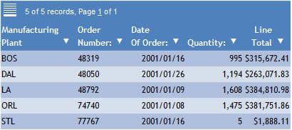
You can view data in an active report in a Rollup Table. For example, consider an active report that has the Order Number, Date of Order, Line Total, and Quantity sorted by Plant and by Product. If you need to see only the quantity in stock for each plant, you can create a Rollup Table with only those fields, as shown in the following image.
How to: Reference: |
Pivot Tables reorganize and summarize selected fields of data in order to obtain a specific report. A Pivot Table pivots, or turns, the data to view it from different perspectives, without actually changing the data from the report.
The selected Group By field is the vertical sort field, and the selected Across field is the horizontal sort field in the Pivot Table.
The Pivot Table appears in the same web browser session.
The Pivot Table inherits the style used in the original active report.
You can use the Pivot controls and Pivot Table menu options to select additional values and calculations.
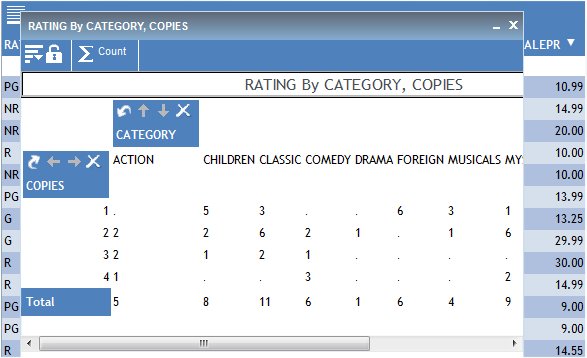
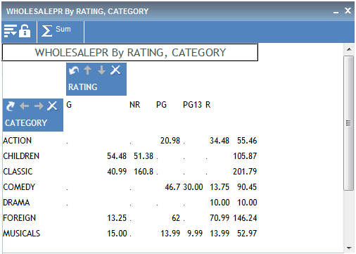
The following image is an example of a Pivot Table for an HTML active report.
The following icons are available from the Pivot Table:
The New  icon
opens a new window with the same Pivot Table. This Pivot Table window
can be used to compare values, especially when you use the Freeze
option.
icon
opens a new window with the same Pivot Table. This Pivot Table window
can be used to compare values, especially when you use the Freeze
option.
Add additional vertical sort fields (Add (Y)) and horizontal sort fields (Group By (X)) to the Pivot Table.
You can also export the Pivot Table to another application and open the Pivot Tool.
Select the Freeze ![]() icon
to keep the Pivot Table frozen so that additional selection criteria
does not reflect in the Pivot Table.
icon
to keep the Pivot Table frozen so that additional selection criteria
does not reflect in the Pivot Table.
Select the Freeze icon again to unfreeze the table and reflect new selection criteria in the Pivot Table.
The Calculation ![]() icon
identifies the calculation value for the Pivot Table. Options are
Sum, Avg, Min, Max, Count, and Distinct.
icon
identifies the calculation value for the Pivot Table. Options are
Sum, Avg, Min, Max, Count, and Distinct.
Sum is the default calculation value.
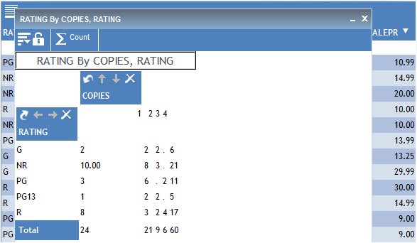
The Pivot Table has individual controls for each sorting column or row. These controls enable you to alternate the sorting to analyze the data. The following image is an example of the Pivot controls in a Pivot Table.
The following controls are available from the Pivot Table.
|
Button |
Control |
|---|---|
|
|
Moves a column sort to a row sort or vice versa. |
|
|
Up and down arrows enable you to switch the order of the sorts and move the column to a new position in the Pivot Table. Arrows are unavailable if there is only one sort column. |
|
|
Left and right arrows enable you to switch the order of the sorts and move the row to a new position in the Pivot Table. Arrows are unavailable if there is only one sort row. |
|
|
Deletes the column or row from the Pivot Table. |
How to: |
An accordion report is a report that has expandable views of data for each vertical (By) sort field. Only data values of the first (highest-level) vertical sort field are shown initially for accordion reports. All other data is hidden.
You can use an inner sort with accordion reports, where the sort column values are sorted within the parent to which they belong. To sort on all values in the report, you must first expand all data in the report.
You can expand your view to expose data values of lower-level sort fields, either manually by clicking the plus signs (+) or if you are viewing an accordion report.
Click the arrow in a column heading. From the Accordion menu, select Expand All.
| WebFOCUS |