Customizing the Interface
The following information provides the basic customization
options that you can control within the App Studio interface. These
options customize the appearance of the application window. You
can modify these options at any time during development.
xAdding Commands to the Quick Access Toolbar
The New, Open, Save, Quick Print, Undo, Redo, Cut, Copy,
Paste, and Run buttons appear on the Quick Access Toolbar, by default.
You can add the commands that you use most often. You can quickly
add commands to the Quick Access Toolbar by right-clicking the ribbon,
groups, or the individual commands, and selecting Add
to Quick Access Toolbar. In addition, you can follow
the steps in How to Add Commands to the Quick Access Toolbar.
x
Procedure: How to Add Commands to the Quick Access Toolbar
To add
frequently used commands to the Quick Access Toolbar, follow these
steps:
-
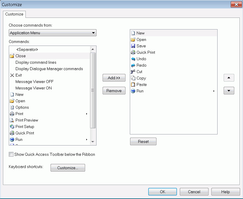
On the Quick
Access Toolbar, click the arrow, and then click More
Commands.
The Customize dialog box opens, as shown in the following
image.
-
In the Choose
commands from drop-down list, select a command group.
The commands associated with the command group that you
selected appear in the Commands list.
-
Select a
command name, and then click Add.
The command name appears in the Quick Access Toolbar list.
Note
the following about the Commands list:
- Commands are represented
by icons that appear on the ribbon.
- Not every command
appears as an icon.
- A command that does
not have an icon, but has a vertical arrow, is a command group.
- A command that has
an icon and a horizontal arrow is a command with a submenu.
- You can add all commands,
command groups, and commands with submenus to the Quick Access Toolbar.
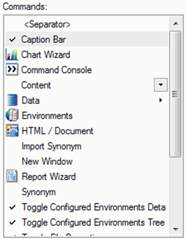
If
you select a command group or a command with a submenu, all associated commands
are accessible from the Quick Access Toolbar, as shown in the following image.

To
remove a command name from the Quick Access Toolbar list, select
the command, and then click Remove.
-
Click the
arrow buttons to rearrange the order of command names in the list.
This action also rearranges how the command buttons appear
in the modified Quick Access Toolbar.
-
Click OK to
save your changes.
xUsing the Panel Customization Options
By default, all panels, except the Environments Tree
panel, are auto hidden when they first open. You can use the panel
customization options, which are located in the upper-right corner
of the panel, to change the appearance and location of the panels
around the canvas.
x
Procedure: How to Rearrange Panels on the Canvas
To rearrange
a panel on your canvas using the panel properties menu, follow these
steps:
-
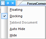
Click the Window
Position button
 .
.
The panel properties menu opens, as shown in the following
image.
-
Select from
among the following options:
-
Floating to
undock the panel and move it freely around your canvas.
-
Docking to
dock the panel onto the edge of your canvas where it last appeared.
-
Auto Hide to
hide the panel as a tab on the edge of your canvas. When you pause
over the tab, the panel reopens.
-
Hide to
close the panel.
Note: You
can also open the panel properties menu if you right-click the top
of the panel.
x
Procedure: How to Pin and Unpin Panels to the Canvas
You
can pin a panel to the canvas to keep it open while you develop
your application. When you unpin the panel, it becomes auto hidden
again, and appears as a tab on the edge of the canvas. When you
hover the mouse over this tab, the panel reopens.
- To pin a panel
to your canvas, click the Auto Hide (horizontal
pin) button
 .
.
- To unpin a panel from your canvas, click the Auto
Hide (vertical pin) button
 .
.
x
Procedure: How to Close and Reopen Panels
- To close a panel,
click the Close button
 in the
upper-right corner of the panel.
in the
upper-right corner of the panel.
- To reopen the panel,
go to the Home tab, and in the View group, select
the appropriate check box.
x
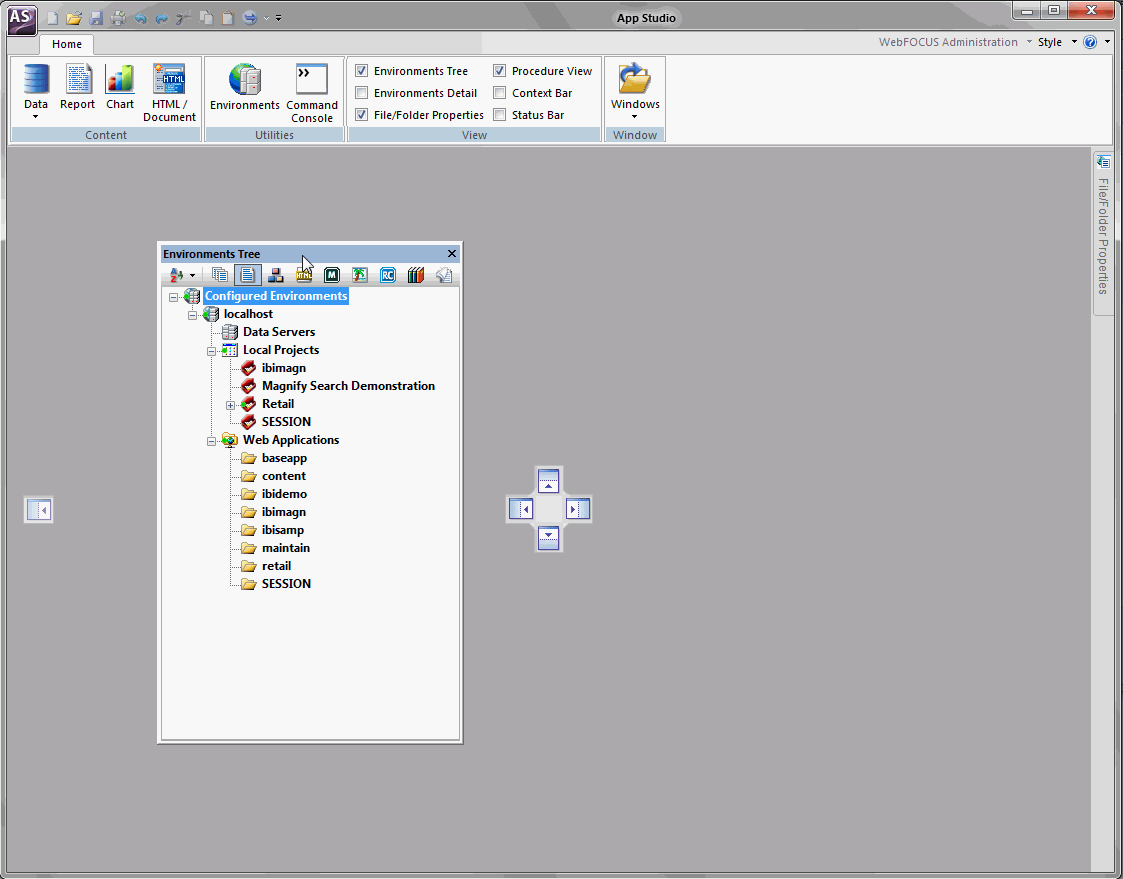
You can dock floating panels within the canvas to ease
accessibility. When you drag a panel across the App Studio canvas,
a set of handles appears. These handles guide the placement of the
panel, and automatically dock the panel to the edge of the canvas
upon which you rest the mouse.
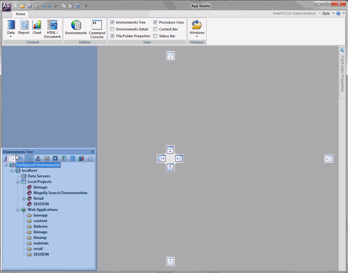
The following image shows an example of the handles that appear
when you drag the Environments Tree panel across the canvas.
x
Procedure: How to Dock Panels Around the Canvas Using Handles
-
From the
panel customization toolbar, click the arrow, and then click Floating.
-
Drag the
panel across the canvas and rest the mouse on a handle.
When you rest the mouse over a handle, a shaded area appears.
This shaded area provides a preview of where the panel will dock
if you release the mouse, as shown in the following image.
-
Release
the mouse when you are satisfied with the previewed location of
the panel.
The panel automatically docks to the edge of the canvas.
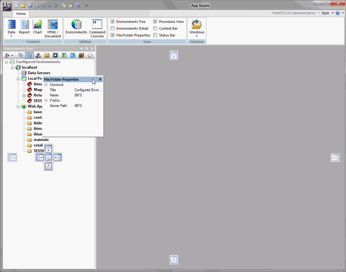
Additional
panels open as you develop applications throughout the product. To
conserve space around the canvas, you can combine these panels.
When you mouse over a docked panel, a tabbed handle option appears,
as shown in the following image.
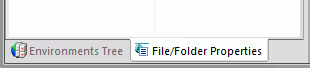
This
handle option combines the panels into a single container with tabs.
You can switch between the panels by clicking the appropriate tab
at the bottom of the container. An example of the Environments Tree
tab and File/Folder Properties tab, in a combined panel container,
are shown in the following image.
x
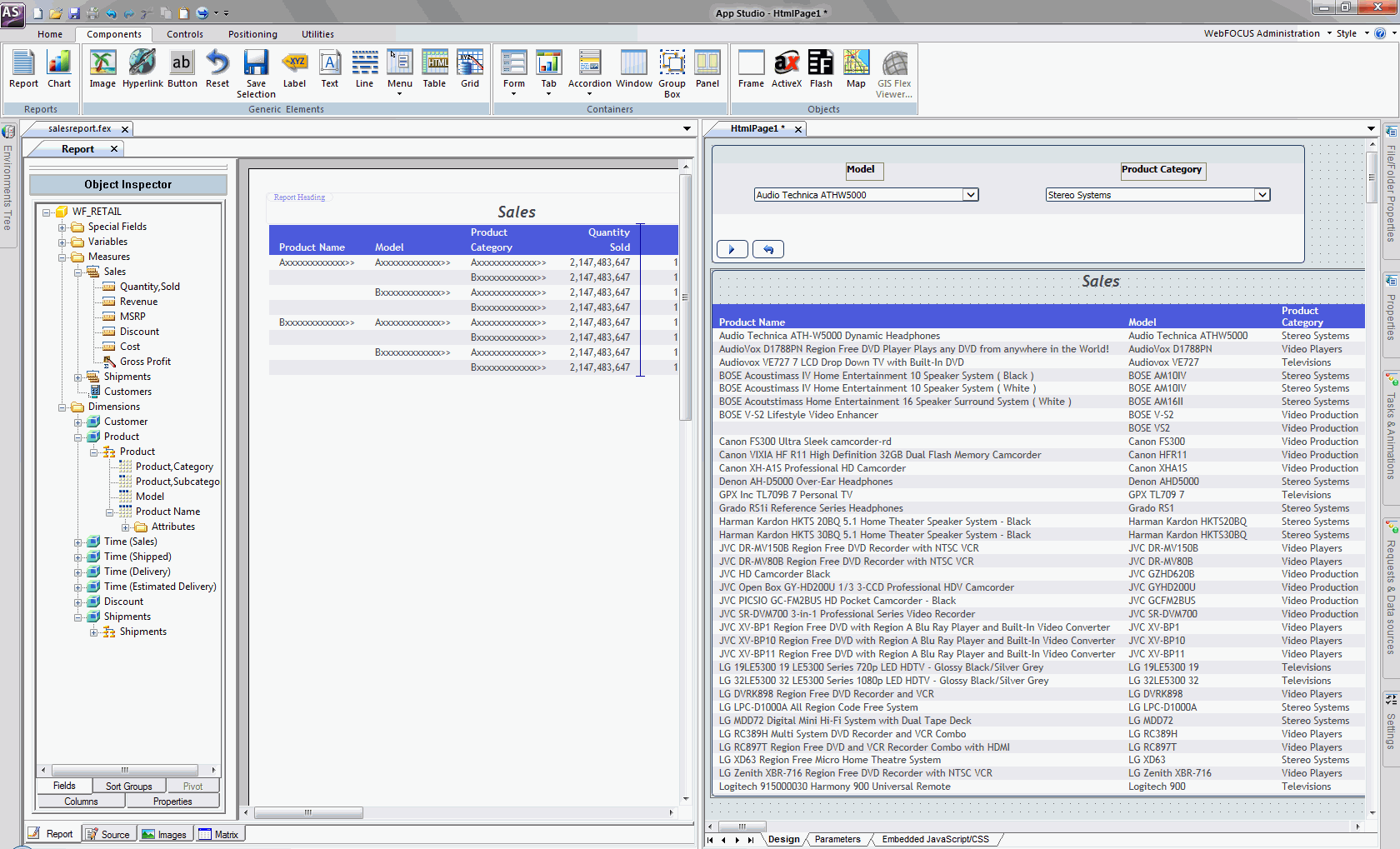
You can switch between the canvases by clicking the
colored tab at the top of the canvas. You can also develop in the
canvases side by side.
The following image shows an HTML canvas next to a Report canvas.
x
Procedure: How to Move Canvases for Side-by-Side Development
To create
side-by-side canvas development, follow these steps:
-
Drag one
canvas tab away from its original position.
A pointer with a document icon  appears.
-
Drag the
pointer with the document icon to the upper-right corner of the canvas.
The canvases now appear side by side.
Tip: Repeat
the preceding steps to develop on additional canvases side by side.