Developing an Analytic Dashboard From Developer Studio
Before you begin to develop your Visual Discovery controls, you must create the following objects:
- The data file. For more information, see the Using WebFOCUS Visual Discovery to Develop Analytic Dashboards manual.
- The canvas for your controls, using HTML Composer in Developer Studio. For more information, see the Using WebFOCUS Visual Discovery to Develop Analytic Dashboards manual.
After you create a canvas and insert a Visual Discovery control, you can begin to edit the control properties. For example, you can select the data, assign colors, show labels, and more. The topics in this chapter cover tasks and options that you may apply to all Visual Discovery controls (unless noted).
Important: When you edit the properties of a control, it is necessary to load the data first, and then select your x-axis field and y-axis field from the loaded data.
For a tutorial on creating a complete Visual Discovery dashboard using sample data, see Visual Discovery Tutorial.
For graph-type specific tasks and options, see the Using WebFOCUS Visual Discovery to Develop Analytic Dashboards manual.
x
Procedure: How to Create a WebFOCUS Visual Discovery Analytic Dashboard
-
Open Developer Studio.
-
From the Developer Studio Explorer, right-click the HTML Files folder in your project folder and select New, HTML File. The Add HTML File dialog box opens.
-
Enter a name for the file and click Open.
-
If the HTML Composer Template selector opens, click No, thanks.
The HTML Composer canvas opens.
Note: Visual Discovery controls are not available if you choose to create an HTML page using templates. You can click the Don't show again check box to turn the Template selector off. The next time you create an HTML page using HTML Composer, the Template selector will not appear.
-
Click the Visual Discovery button
 on the controls toolbar, or click Insert, Controls, then click Visual Discovery Control.
-
Drag your mouse across the canvas to insert the control. The Insert ActiveX Control dialog box opens.
Tip: When you insert a control, its size (height and width) defaults to predefined dimensions. However, after you select the type of control from the Insert ActiveX Control dialog box (step 6), you can change its size using any standard resizing feature.
-
Select a Visual Discovery control and click OK.
-
From the Properties and settings dialog box, click Add Data Pool. The Get source file dialog box opens.
-
Add data and click Open. The selected data will appear in the Available Data Pools drop-down menu.
-
Click ActiveX Properties and edit your graph properties as desired.
x
When you add a new Visual Discovery control to the HTML Composer canvas, HTML Composer assigns it a default Name and Unique Identifier. The naming convention for the control is activexn, where n is an iterative number.
For example, when you add the first control, it is assigned the name activex1. When you add the next control, it is assigned the name activex2, and so on.
You can view and modify the Name and Unique Identifier of a control in the Properties pane. If you rename a control, using a more descriptive Name and Unique Identifier, then the next control you add will still increase by 1.
x
All components in an analytic dashboard share the same data source. This means that when you select a data source for the first control, that data source is automatically added to the Available Data Pools list, and made readily available for all subsequent controls.
x
Procedure: How to Add and Select Data
-
From the Properties and settings dialog box, click Add Data Pool. The Get source file dialog box opens.
-
Add your data source, a .txt file or .fex file with PCHOLD FORMAT VISDIS, and click Open. The selected data source appears in the Available Data Pools drop-down list.
Important: If you are developing remotely, you must either map a drive to the remote location of the data source or copy the data source to the local machine.
-
Click ActiveX Properties and edit your graph properties as desired. Repeat step 2 as necessary.
-
Add fields by clicking the box adjacent to the field. Click once to add the x-axis field, click twice to add y-axis field.
-
Click Apply, and then OK.
x
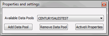
Reference: Properties and Settings Dialog Box
The following image shows the Properties and settings dialog box.
-
Available Data Pools
-
Enables you to select a data file to use to populate the Visual Discovery control. After you select the file name, and click ActiveX Properties, the file is loaded. Its tables and fields display in the tree view panel on the Data tab.
-
Add Data Pool
-
Enables you to select a data file to use to populate the Visual Discovery control and add it to a list of available data pools.
-
Remove Data Pool
-
Removes all data sources from Available Data Pools drop-down list.
-
ActiveX Properties
-
Opens the Visual Discovery Properties dialog box, where you can edit the fields, colors, control features, font style, and titles for a particular Visual Discovery control.
-
The first tab in the Visual Discovery Properties dialog box is the Data tab. It will guide you on which types of fields, and how many fields you can select.
x
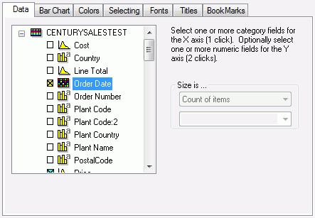
The following image and brief description of the Data tab is to guide you as to which types of data fields, and how many fields you can select for a particular control.
The bar chart control was used for the example shown in the following image.
-
Data Instructions
-
The text that appears above the Size is drop-down selection menu, on the top-right corner of the Data tab, instructs you on how to select a category field for the x-axis, and one or more category fields for the y-axis.
-
Size is
-
Determines the method to calculate the size of the glyph. For more information, see the Using WebFOCUS Visual Discovery to Develop Analytic Dashboards manual.
Note: When creating Visual Discovery controls in HTML Composer at design time, you select the data source through the Properties and settings dialog box. At run time, this dialog box does not appear. Instead, you can select your data source, .txt files only, through a modified version of the Data tab.
x
Reference: Data Tab Icons
The following table shows the possible icons that appear in the Data tab and what they indicate for the field.
|
Icon
|
Indicates...
|
|---|
|

|
A table with no items colored.
|
|

|
A table with a field that colors the graph.
|
|

|
The field is a real number.
|
|

|
The field is a real number and colors the graph.
|
|

|
The field is a number (integer).
|
|

|
The field is a number (integer) and colors the graph.
|
|

|
The field is a string.
|
|

|
The field is a string and colors the graph.
|
|

|
The field is a date.
|
|

|
The field is a date and colors the graph.
|
|

|
An x-axis selected field.
|
|

|
A y-axis selected field.
|
|

|
The field is not available for selection.
|
xAssigning Color to the Data and the Graph
You can use color to change how your graph displays. You can change the color scale of the glyphs based on a field that you select. For more information, see the Using WebFOCUS Visual Discovery to Develop Analytic Dashboards manual. You can also change the colors of the basic graphical elements (such as background color, foreground color, label color, selected variables, and overlay text color) in your graph control.
x
Procedure: How to Change Graph Element Colors
-
Select the control and click ActiveX Properties.
The Visual Discovery Properties dialog box for the selected control opens.
-
Click the Colors tab.
-
Select the colors:
- Using one of the Standard Tool Element Colors options. When you select one of these (Black, Blue, or White), the colors in the Component Element Colors field automatically change to the colors associated with that color scheme.
- Manually in the Component Element Colors field. For details on each component in the Component Element Colors field, see the Using WebFOCUS Visual Discovery to Develop Analytic Dashboards manual.
-
Click Apply, and then OK.
x
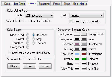
The following image shows the Colors tab in the Visual Discovery Properties dialog box.
-
Color Using Field
-
These settings apply to the entire Visual Discovery webpage.
-
-
Table
-
Specifies the name of the table for the current view. Other tables may be selected, even if they are not shown by the current view, by entering the table name in this field. If you have entered the name before, you may select the arrow key to the right of the entry field and scroll down to the desired name.
-
Field
-
Names the field in the table that is used to color the graph. If no field is selected, the table is not colored.
-
Re-apply color to field
-
Reapplies the color scale to a subset of data.
-
Color Scale
-
Changes the color scale for the graph. For more information, see the Using WebFOCUS Visual Discovery to Develop Analytic Dashboards manual.
-
Standard Tool Element Colors
-
Changes the background color of the graphs to black (the default setting), blue, or white. A default set of visualization component element colors is automatically selected for each background color.
-
Component Element Colors
-
-
Background
-
Specifies the color behind the graph. By default, the background color is black. A default set of element colors is automatically selected to go with the black background. Select this to change just the background color. If you want to change the entire color scheme, select one of the options in the Standard Tool Element Colors section.
-
Foreground
-
Specifies a data element in the visualization component. For example, sometimes it is the color of the outline of the glyphs.
-
Selected
-
Specifies the color of the items that are selected. If a color scale has been used, that color scale is used instead of the default selected color if the graph corresponds to individual colored data items.
-
Missing
-
Specifies the color of values that are missing.
-
Goal Lines
-
Specifies the color of the visualization component line that you can create and place in bar and line graphs.
-
Overlay
-
Specifies the color of the label or labels (including text and/or items) and any graphs that may be used to denote the items in focus.
-
Shine
-
Specifies the color of the outline of the bottom and/or right of the graph objects. It helps provide the appearance of depth to the graph. This applies only to bar chart and line chart graphs.
-
View Title
-
Specifies the color for the title of the visualization component. You can change the title text from the Titles tab.
-
Background2
-
Specifies the color of the second background element, if one is available. For example, in the data sheet visualization component, a second background color (by default, gray) is used to make rows of data easier to read.
-
Label
-
Specifies the color of the static text or graphic that identifies items on a graph. For example, the field names for the x-axis and y-axis in the bar chart, histogram, or line chart graphs.
-
Unselected
-
Specifies the color of the items that are not selected.
-
Border
-
Specifies the color of the line that is drawn around glyphs so they stand out from the background. This applies only to bar chart and line chart graphs.
-
Overplotting
-
Specifies the color of the small tick marks (shown at the top of the graph) that indicate items are plotted on top of or overlapping other items.
This element is available for the bar chart, line chart, and time table graphs.
-
Selector
-
Specifies the color of the shape, indicated in the Selector Shape section of this tab, used to select items.
-
Shadow
-
Specifies the color of the outline of the top/left of graph objects. It helps provide the appearance of depth to the graph. This applies only to bar chart and line chart graphs.
-
Axis Title
-
Specifies the color for the x-axis and y-axis titles.
xColoring a Graph by a Field
When you color a graph by a field, you provide another level of meaning to the graph. It is a way to add more information, an additional variable, to the graph. The field you choose to control color is usually based on the type of data you want to analyze and how you want it to appear. Coloring by a particular field helps you study the effect of that field on your data. You can also use color to highlight exceptional values (for example, the high values in a distribution), as well as categories of values.
Coloring depends on the color scale you select. For example, the Rainbow color scale ranges from blue to red. Color is uniformly applied as a continuous scale across the entire range of values in that column. Colors are assigned from low to high for numeric values and in alphabetical order for string values.
x
Procedure: How to Color a Graph by a Selected Field
-
Select the control and click ActiveX Properties.
Note: If you are selecting colors for a bar chart, histogram, line chart, or pie chart that has more than two fields, make sure the Stack Colors check box is selected on the chart-specific tab.
-
Click the Colors tab.
-
In the Color Using Field, ensure the correct data pool is selected from the Table drop-down list.
-
From the Field drop-down list, select the field you want to color the graph by.
-
In the Color Scale field, select the color scale:
-
Green/Red goes from green on one end to red on another. This color scale uses the stop light metaphor (green means go or OK, yellow means caution, and red means stop or immediate attention).
-
Pastel is a red to blue scale using pastel shades.
-
Equalized is an alternate scale with equal perceptual changes between each entry in the scale.
-
Categorical is a field for which the values represent categories or classes. Categorical variables do not have natural scale or units of measurement. A field containing country names, such as the United States, United Kingdom, and Germany, is categorical.
-
Rainbow is the common red-to-blue scale. This is the default.
-
Gray enables unselected items to be shown in gray, making them seem to fade from view. The Gray color scale uses shades of black and white, instead of a set of colors, to show differences or similarities between/among items.
-
Thermal mimics the color changes in a heated iron, from cold (black) through warm (yellow) to extremely hot (white).
-
Smallest Values are High Priority. By default, the highest values are set to the highest priority. This means that the values are assigned a color based on the placement of the value within the selected color scale. The highest value is at one end of the color scale and the lowest value is at the other end. By selecting this option, the coloring of the values is reversed.
-
Click Apply, and then OK.
Note: When you select a subset of data and exclude the unselected items, you might want to apply the color scale to the range of values in the subset instead of it remaining applied to the entire set of data. If the remaining items (the subset) are from the same area of the original data set, the colors of all the items might be very similar. If you reapply the color just to those remaining items, each item might stand out more because the color scale is applied to a smaller range.
To reapply the color scale to a subset of data, select Re-apply color to field in the Color Using Field section and click Apply.
xValues are VisDis Color By
Another way to color your Visual Discovery controls is through an HTML Composer Visual Discovery integration feature called Values are VisDis Color By. Values are VisDis Color By is an option only available through the Properties and settings dialog box of a list box, drop-down list, or double list box. You must first create a canvas using HTML Composer, add a Visual Discovery control, and then add a list box, double list box or drop-down list that contains the field names from the data pool of the Visual Discovery control.
When you run the HTML page, you are able to select a field name from the list to change the colors of the Visual Discovery control.
x
Procedure: How to Color a Visual Discovery Control Using Values are VisDis Color By
The following procedure provides the steps to color a Visual Discovery control using the Values are VisDis Color By option.
-
In HTML Composer, create a Visual Discovery control, such as a bar chart.
-
Select a data pool, and the desired x-axis field and y-axis field for the control.
-
From the Insert menu, select Controls, then click Drop Down List.
Note: You may also choose a list box or a double list box instead of a drop-down list.
-
Drag your cursor across the canvas. The drop-down list appears.
-
With the drop-down list selected, click the Parameters tab in the lower-left corner of the HTML Composer window.
The Properties and settings dialog box appears, as shown in the following image.
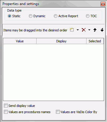
Note: If the Properties and settings dialog box does not appear, you must select it from the View menu.
-
Select Static from Data type radio button area.
-
Click the Values are VisDis Color By check box at the bottom of the dialog box.
Note: The Values are VisDis Color By check box only appears when Visual Discovery controls are on the HTML page.
-
Click the New button drop-down list, click Visual Discovery ActiveX, the name of your Visual Discovery control that contains the fields to be used as color by values, and then select a field name option from the cascading menus, as shown in the following image.
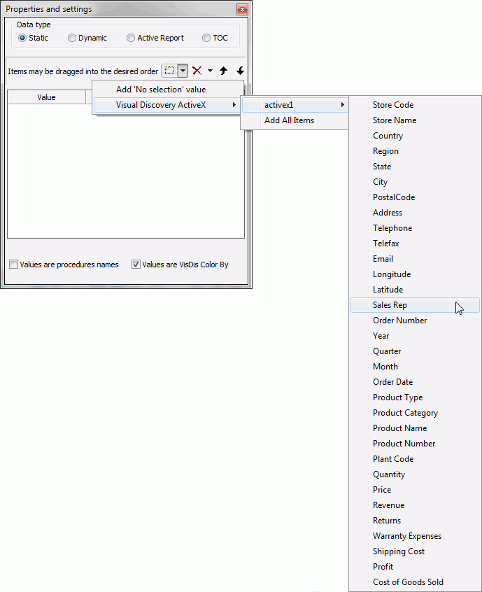
The New button drop-down list changes to allow the selection fields from data pools, only when you have clicked the Values are VisDis Color By check box.
-
Repeat step 6 for a second field name option of your choice.
You can also click Add All Items, which adds every available field name option to the drop-down list control.
-
Click the Design tab located in the lower-left corner of the HTML Composer window.
-
Save your work, and Run the page.
When you run the HTML page, select a field from the drop-down list. Notice that the colors of your Visual Discovery control are now colored according to the selected field.
xChoosing Selection Options
In interactive data visualization controls, selection enables you to retrieve data of interest (and effectively answer questions about the data) just as written queries do. However, many of the methods to visually select data are different from written queries. Since all controls in your dashboard share the same data pool, when you select data in one control, the same data is selected in all controls.
You select by sweeping an area of the interactive data visualization control with the mouse, and clicking on items. Additionally, in the data sheet control, you can perform textual selection.
The Selecting tab controls how selection with the mouse works. These properties affect all views, not just the current view. In addition to selecting a group of items with the mouse, you can also select, unselect, exclude all data, and toggle the selection states using the pop-up menu.
Note:
- The data constellation control has specific selection features. For more information, see the Using WebFOCUS Visual Discovery to Develop Analytic Dashboards manual.
- Although all selector shapes can be selected on the tab, only the rectangle is allowed as a selector shape for 3D controls.
x
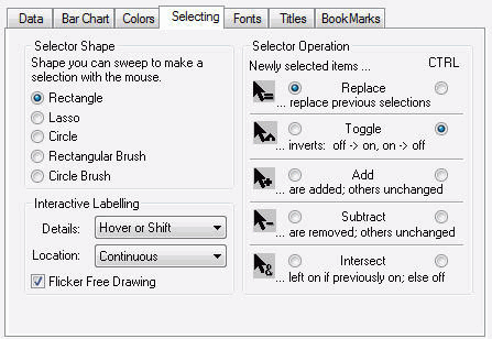
The following image shows the Selecting tab in the Visual Discovery Properties dialog box.
-
Selector Shape
-
-
Rectangle
-
The default shape used to select items. To select or sweep using a rectangle, move the cursor to one corner to the desired data, press and hold the left mouse button, move the cursor to the opposite corner of the desired area, and release the mouse button. The data within the rectangle is selected.
-
Lasso
-
When Lasso is selected, you may draw a free style curve. When the left mouse button is pressed, the lasso follows the cursor and selects items the cursor passes until the mouse button is release.
-
Circle
-
When Circle is selected, it enables you to sweep or select data within a circle, whose center is the position where the left mouse button was initially pressed, and the perimeter is where that mouse button is released. When the Circle selector shape is active, a dot appears in the small circle next to the text.
-
Rectangular Brush
-
When Rectangular Brush is selected, a rectangle follows the mouse and identifies objects that it passes over.
-
Circle Brush
-
When Circle Brush is selected as the selector shape, a circular shape follows the mouse and identifies objects that it passes over.
-
Interactive Labeling
-
-
Details
-
Options include the following. Note that details cannot be presented in a histogram, because the histogram displays the distribution of single continuous fields. Individual values are not shown.
Hover or Shift. The detailed information about a glyph appears when you hover over or move the cursor over an item while holding down the Shift key. This is the default.
Hold Down Shift. Turns on the detailed information when you press the Shift key and pass over the items. When you are not over an item, the option turns off until you press the Shift key again.
Continuous. When you pass over an item, the detailed information appears about that item.
-
Location
-
Options include:
Continuous. The coordinates (location on the x-axis and y-axis) of a glyph appear when you move the cursor over the item. This is the default.
Hover or Shift. When you hover over or move the cursor over an item while holding down the Shift key, you see the coordinates for that point.
Hold Down Shift. Turns on the location information when you press the Shift key and pass over the items.
-
Flicker Free Drawing
-
When the cursor moves over a graph, it may cause flickering. Select this option to eliminate the flicker. Graphs may take longer to render with this option set.
-
Selector Operation
-
-
Replace
-
Replaces the existing selection set with the next items identified.
-
Toggle
-
Reverses the selection state of items. Selected items become unselected. Unselected items become selected.
-
Add
-
Select this option to add identified items to the selection set.
-
Subtract
-
Removes identified items from the selection set, if they are in it.
-
Intersect
-
Selects only those items that were previously selected and are in the set of identified items.
xSpecifying Fonts and Titles
The Fonts tab sets the font type and size for the view title (the title for the control or graph, which you set in the Titles tab), the axis titles, and the labels. The Titles tab sets the titles of the view (the graph) and the axes of the graph.
x
The following image shows the Fonts tab in the Visual Discovery Properties dialog box.
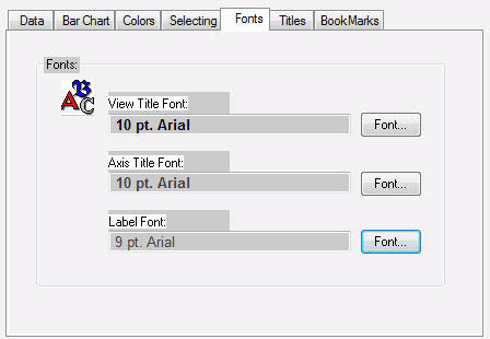
To change the font, font style, or font size, click the appropriate Font button.
x
The following image shows the Titles tab in the Visual Discovery Properties dialog box.
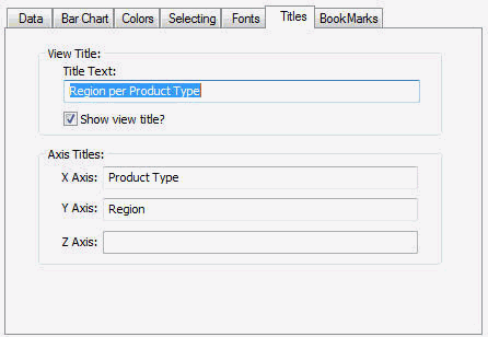
Type the titles in the Title Text field. If you do not alter the titles, they will default to the field names from the data table you selected in the Data tab.
This tab is not available for the counts, data sheet, parabox, or time table controls.
x
You can use goal lines in a bar or line chart.
Goal lines are lines you can place on a bar or line chart in the report output. Goal lines display in front of the graphed data, enabling you to compare your data with one or more set values. You can see which values are above or below a level you specify.
Before selecting glyphs above or below a goal line, negative and positive values are added. If your graph contains negative and positive numbers, some glyphs that you may initially expect to appear above or below the goal line (depending on which button you select), may have a cumulative value different than what you might expect and the glyph will not be selected.
Note: Goal lines are not available when what you are using a spine plot, since the bar glyphs are the same height.
x
Procedure: How to Add Goal Lines
-
Ensure Show Goal Lines is selected on the bar chart or line chart pop-up menu.
-
From the pop-up menu, select Create Goal Line. A blue line appears.
-
Repeat step 2 for each desired goal line.
x
Procedure: How to Move Goal Lines
Select a goal line and drag it to the desired value. Use the focus information to position the goal line.
x
Procedure: How to Hide Goal Lines
From the pop-up menu, clear the check mark for Show Goal Lines.
Note: This does not permanently remove the goal line from the graph.
x
Procedure: How to Remove Goal Lines
-
Move the cursor over the goal line.
-
Click the close (X) button.
x
Procedure: How to Select Values Above/Below the Goal Line
-
Move the cursor over the goal line.
-
Click the:
-
Up button
 to select all values above the goal line.
-
Down button
 to select all values below the goal line.
The graph changes to reflect your selection.
x
You can animate data in a bar, line, or pie chart.
Animation is when each glyph is sequentially highlighted and then restored to its original state. Animation is especially helpful when you are analyzing two or more interactive data visualization controls at the same time because you can easily see the highlighted items in all displayed controls simultaneously. Animation is also helpful when you are viewing complex data, because it can highlight unexpected relationships.
When you set and control animation in a control (bar chart, line chart, and so on), the animation effect occurs in all the displayed controls that use the same data source.
xSelecting Primary and Secondary Order
You can select primary and secondary order in a bar, line, or pie chart.
Order controls the sequence in which glyphs are presented. You can select primary and secondary order in bar, line, and pie charts.
x
Procedure: How to Select Primary and Secondary Order
-
In the Visual Discovery Properties dialog box, click the chart-specific tab (either the Bar Chart, Line Chart, or Pie Chart tab).
-
In the Order field, from the Primary drop-down list, select:
-
Original order to show the order in which the data was initially presented. This is the default.
-
Label order to alphabetize the data by category name.
-
Size to display the categories by the number of cases (from the largest count to the smallest).
-
Total Selected to display the categories by the number of cases selected.
-
% Selected to display the categories by the percentage of cases in that category that are selected.
Note: The Primary drop-down list and the Secondary drop-down list contain the same options.
-
Select the Secondary order option.
Secondary order is applied at the same time as the primary order and becomes apparent only when two or more items have the same value according to the primary order.
-
Click Apply, and then click OK.
Note: On the pop-up menu, click Primary Order and then select an option.
x
You can display labels in a bar, line, or pie chart.
You can choose how and which labels to display in the control when you are creating the control. You can also show and hide individual labels using the pop-up menu.
Note: X-axis and Y-axis labels come from the field names in your data source.
x
Procedure: How to Select Label Mode
-
In the Visual Discovery Properties dialog box, click the chart-specific tab (either the Bar Chart, Line Chart, or Pie Chart tab).
-
Select the desired option from the Labels Shown drop-down list. Options include:
-
Best Fit which displays labels in equally spaced increments. This is the default option.
-
Selected which displays labels for the selected (colored) data only.
-
All which displays labels for all data on the graph.
-
Off which displays no labels.
-
Custom which enables you to select which labels to display.
-
Click Apply, and then click OK.
Tip: From the pop-up menu, select Label Mode and then select the desired option.
x
Procedure: How to Show or Hide Individual Labels Using the Pop-up Menu
-
Right-click the label you want to show or hide.
-
Select Label 'name' from the menu.
x
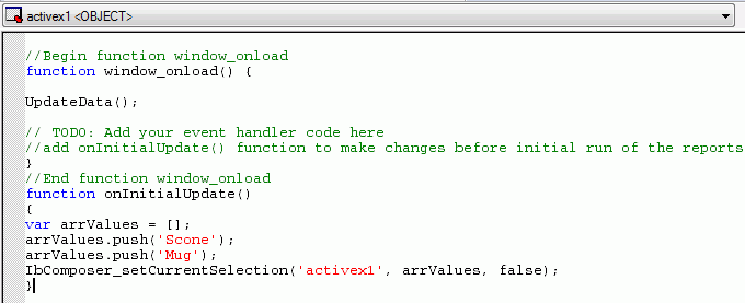
You can preselect values of a Visual Discovery control that display at run time, by adding the onInitialUpdate() function to the Embedded JavaScript tab of HTML Composer. When you run the HTML page, the values you preselected display.
x
Procedure: How to Preselect Values
-
In HTML Composer, create a Visual Discovery control, such as a bar chart.
-
Select a data pool, and the desired x-axis field and y-axis field for the control.
-
Click the Embedded JavaScript tab.
-
Below //End function window_onload, create the onInitialUpdate() function that calls the IbComposer_setCurrentSelection() JavaScript API function. Specify the necessary parameters to preselect and display values at run time.
An example of the onInitialUpdate() function code, with two preselected values, is shown in the following image.
-
Run the page.
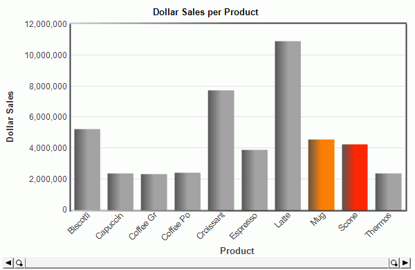
When you run the page, the preselected values will display on the Visual Discovery control, as shown in the following image.
xPassing Between a Report and a Visual Discovery Control
Using HTML Composer, you can add custom parameters that pass data between Visual Discovery controls and reports on a webpage. You can build a webpage in which a Visual Discovery control passes data to a report, or a webpage in which a report passes data to a Visual Discovery control. Each option requires use of the same data pool.
x
Procedure: How to Pass a Parameter From a Visual Discovery Control to a Report
The following procedure provides steps to create a Visual Discovery control parameter that passes data to a report at run time.
-
Create a parameterized procedure that shares the same values as the data pool you select for your Visual Discovery control.
-
In HTML Composer, create a Visual Discovery control, such as a bar chart.
-
Select a data pool, and the desired x-axis field and y-axis field for the control.
-
From the Insert menu, click New Report.
-
Drag your cursor across the canvas. A report placeholder opens.
-
Right-click the report placeholder and select Reference existing procedure.
The Get source file dialog box opens.
-
Navigate to the parameterized procedure you created in step 1, and click Open.
The New Parameters dialog box opens.
-
Click the ellipsis button under Control Type.
-
Click Existing control, and the name of your control.
-
Click OK. The Report and Run buttons appear.
-
Save your work and then run the webpage, as shown in the following image.
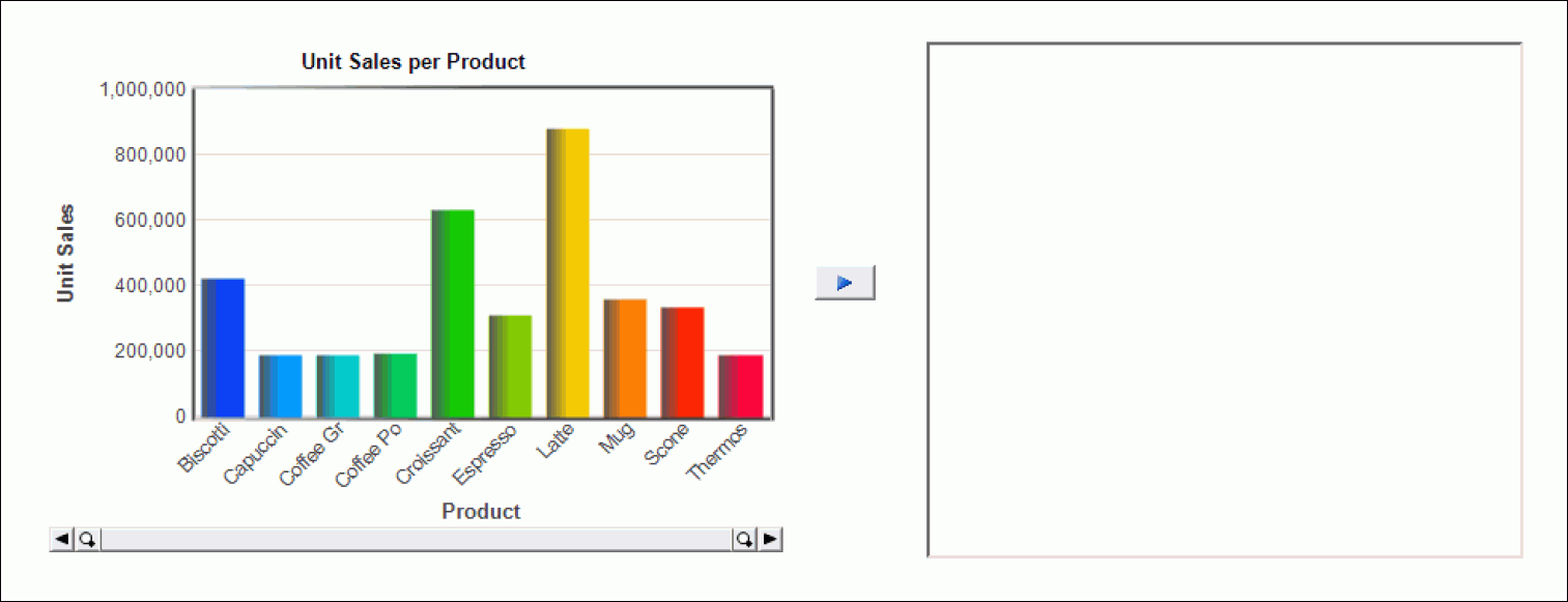
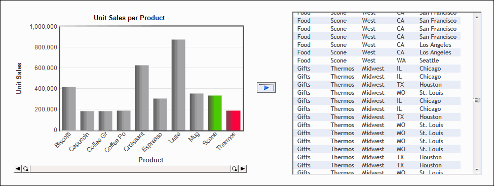
Select specific data in your Visual Discovery control, and click the Run button to view the report results, as shown in the following image.
x
Procedure: How to Pass a Parameter From a Report to a Visual Discovery Control
The following procedure provides steps to create a report parameter that passes data to a Visual Discovery control at run time.
-
In HTML Composer, create a Visual Discovery control, such as a bar chart.
-
Select a data pool, and the desired x-axis field and y-axis field for the control.
-
Click the Parameters tab.
-
Right-click the page and select Add parameter.
The parameter Properties and settings dialog box opens.
-
Type a parameter name in the Name Field.
Note: The same parameter name will be used in the report.
-
Select the new parameter, and create a binding line to your Visual Discovery control, as shown in the following image.
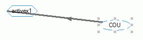
-
Select the arrow on the binding line.
A new Properties and settings dialog box opens, as shown in the following image.
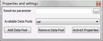
-
Click the ellipsis button and select the datapool field that should be selected, based on the parameter created in step 2.
-
Save your work and close HTML Composer.
Once you have created the HTML webpage with a Visual Discovery control, you must then create a report that will pass data to the Visual Discovery control.
-
Open Report Painter to create a new Report using the same Master File as your data source.
-
Select the Report fields.
-
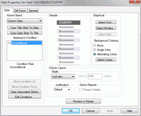
Right-click the field on the Report Painter canvas whose value should be passed to the Visual Discovery HTML page, and click Options.
The Field Properties for Field dialog box opens, as shown in the following image.
-
Click the Drill Down tab.
-
On the Active Object drop-down list, click Column Data.
-
On the Drill Down Type drop-down list, click URL.
-
Type the fully qualified URL to your HTML page.
-
Under With Parameters, click Add.
The Drill Down Parameter dialog box opens, as shown in the following image.
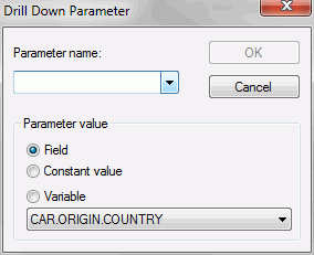
-
Type the same parameter name that you selected in step 2, and click OK.
-
Click OK to close the Drill Down Parameter dialog box.
-
Click OK to close the Field Properties for Field dialog box.
-
Save your work and run the report.
Note: When you run the report, the chosen parameter field appears with underlined text, as shown in the following image.
Click an underlined text field. Notice that the Visual Discovery control you created earlier appears with the appropriate parameter selected, as shown in the following image.
xChaining Into a Visual Discovery Control
Using the HTML Composer chaining feature, you can integrate Visual Discovery controls and data within a listbox, double list, or drop-down list. Adding this functionality to your dashboard creates an interactive webpage from which end users can select values in the list, and automatically view them in a Visual Discovery control.
x
Procedure: How to Chain Into a Visual Discovery Control
-
Create a parameterized, PCHOLD FORMAT VISDIS procedure that contains a multi-select parameter and the fields you want to be displayed in the Visual Discovery control.
Note: Because a Visual Discovery control is always multi-select, you must always use a multi-select parameter.
-
In HTML Composer, create a Visual Discovery control, such as a bar chart, using the parameterized procedure you created as the data pool.
-
Create a list box that will display the values you want shown in the Visual Discovery control.
Note: You may also use a double list or a drop-down list instead of a list box.
-
In the Properties pane, change the Multiple option to Multiple.
-
Click the Parameters tab.
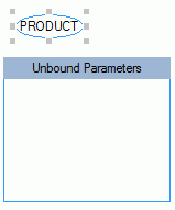
-
Remove the multi-select parameter from the unbound box, as shown in the following image.
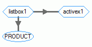
-
Bind your list box to the multi-select parameter and the Visual Discovery control, as shown in the following image.
-
Save your work and run the webpage.
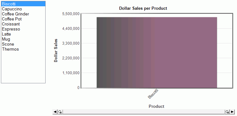
The HTML page shows your list box, populated with the values, and your Visual Discovery control, as shown in the following image.
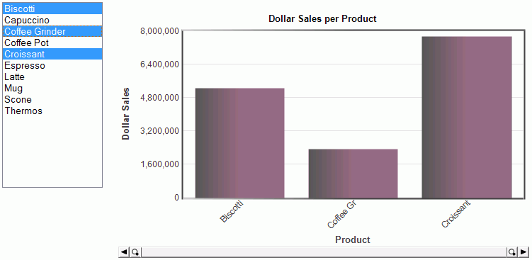
Selecting values from the list box will display data in the Visual Discovery control, for those values only. The following image shows three values selected with the corresponding data displayed in the Visual Discovery control.
xExcluding and Restoring Data
In addition to the Visual Discovery selection features at run time, you can use the exclude and restore hyperlink actions to link Visual Discovery controls and button controls on a webpage. With this option, end users can select data on a control and click the Exclude button to view only the selected data. To restore the unselected data, end users can click the Restore button.
x
Procedure: How to Exclude and Restore Data
-
In HTML Composer, create a Visual Discovery control, such as a bar chart.
-
Select a data pool, and the desired x-axis field and y-axis field for the control.
-
Create two push buttons on the page with your Visual Discovery control.
-
Right-click the first button and click Create hyperlink.
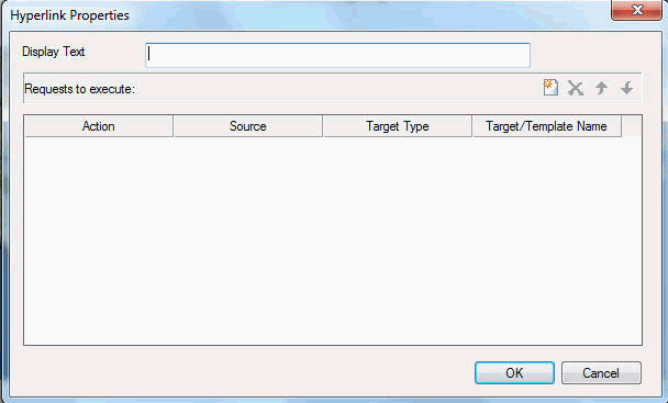
The Hyperlink Properties dialog box opens, as shown in the following image.
-
In the Display Text field, type Exclude.
-
Click the new hyperlink button
 .
.
-
Edit the properties of the new hyperlink.
Note: Target Type and Target/Template Name are not available.
-
Click OK to close the Hyperlink Properties dialog box.
-
Repeat steps 3 through 7 for the second button, noting the following:
-
Save your work and run the webpage.
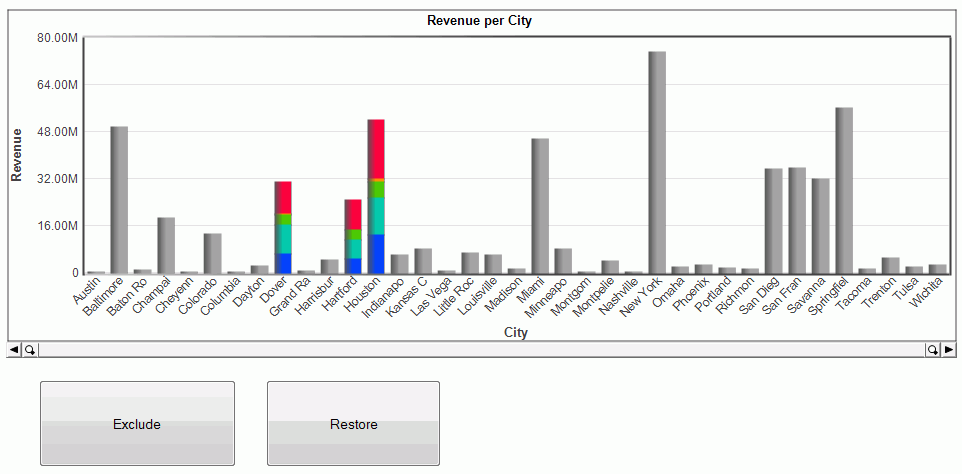
When selecting data from the Visual Discovery control, you can click the Exclude button to hide all of the unselected data, as shown in the following images.
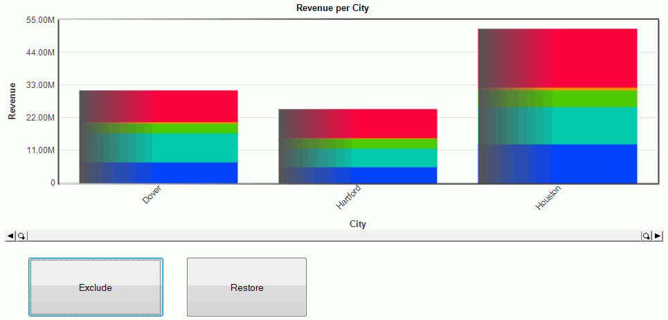
When you click the Restore button, the hidden data is brought back.
 to go back one bar. Backward does not reverse animation.
  to temporarily stop animation.
 to restart the animation after it has been paused.
  to go forward one bar. Forward does not restart animation.