Creating a Report Page Layout
You can use HTML Composer to create an HTML page that launches
and displays your reports and graphs. You can add elements to the
HTML page, such as reports, graphs, text, and controls.
You can also set properties for the HTML page in HTML Composer.
For details, see Setting HTML Page Properties.
xAdding a Report, Graph, or Compound Document to HTML Composer
You can add reports and graphs to HTML Composer that
will display when you run the layout. You can add a new report (that you create in Report
Painter), a new graph (that you create in the Graph tool), or add an
existing report or graph that resides on an available server. You can also launch Document Composer
from HTML Composer and create compound documents.
You can also include parameters in a report or graph whose values
can be assigned with controls that are added with HTML Composer.
For information, see Using Controls to Supply Incoming Parameter Values.
You can set the graphic used as a placeholder for a report or
graph in the layout using the HTML Page tab, located in the Developer
Studio Options dialog box. For details, see How to Set Page Properties.
Note:
-
In order for
a graph to fit an HTML Composer frame properly at run time, in InfoAssist,
you must select the Autofit command and verify that any graph headings are
embedded. You must also embed the graph, into the HTML page, using
the Import existing graph command.
-
You can reference
an existing graph in your HTML page. To ensure the entire graph
is displayed without the need to scroll, you must resize the frame
so the entire graph fits.
-
InfoMini procedures
cannot be referenced in an HTML page.
x
Procedure: How to Add a New Report or Graph to an HTML Page
-
Insert
a report or graph object by doing one of the following:
- Click the Report or Graph button
from the Components toolbar.
- From the Insert
menu, select New Report or New
Graph.
- Right-click
in the layout and select New Report or New
Graph from the context menu.
The cursor
changes into a crosshair.
-
Drag
the crosshair to create a report or graph object and adjust it to
the size you want.
A report or graph object is created in the layout and assigned
the name report(n) or graph(n),
where n is a number. The object will appear
in gray and white to indicate that the placeholder does not have
a report or graph associated with it. Once a report or graph is
associated with the object, the object displays the contents of
the report or graph if live or simulated data is active (live data
is the default) or a colored placeholder if preview is off in the
HTML Page tab, located in the Developer Studio Options dialog box.
-
Create
a report or graph by doing one of the following:
- Double-click
the placeholder.
or
- Right-click
the placeholder and select New Report for
a report, or New Graph for a graph.
The
Open dialog box opens.
-
Select
the Master File you want to report against from the Master File list,
and click Open.
The selected tool opens. For details on using these tools,
see the Creating Reports With Report Painter manual
and the WebFOCUS InfoAssist User’s Manual.
-
Optionally,
after creating the report or graph, you can change its properties
by adjusting the properties displayed in the Properties tab of the
Properties window. For details, see Report Properties in the Properties Window.
x
Procedure: How to Add an Existing Report or Graph to a Layout
-
Insert
a report or graph object by doing one of the following:
- Click the Report or Graph button
from the Components toolbar.
The cursor changes into a crosshair.
Drag the crosshair to create a report or graph object and adjust
it to the size you want.
A report or graph object is created
in the layout and assigned the name report(n) or
graph(n), where n is
a number. The object will appear in gray and white to indicate that
the placeholder does not have a report or graph associated with
it. Once a report or graph is associated with the object, the object
displays the contents of the report or graph if live or simulated
data is active (live data is the default) or a colored placeholder
if preview is off in the HTML Page tab, located in the Developer
Studio Options dialog box.
- From the Insert menu, select Import
Existing Procedure.
Note: To access the Manage
Layout dialog box, choose this method.
- Right-click
in the layout and select New Report or New
Graph from the context menu.
-
Add a report or graph:
- For a report,
right-click the report object and select Import existing
report.
- For a graph,
right-click the graph object and select Import existing graph.
The
Get source file dialog box opens.
-
Enter
the name of the procedure you want to add to the layout.
-
Click Open.
The report or graph object appears in the Design view of
HTML Composer.
-
To edit the report or graph, double-click
the object.
The Procedure Viewer opens.
-
Open the report or graph, and make
any necessary changes.
-
Close the Procedure Viewer to return
to HTML Composer.
-
Optionally,
change the properties by adjusting the properties displayed in the
Properties tab of the Properties window. For details, see Report Properties in the Properties Window.
x
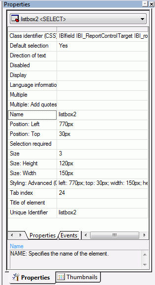
Reference: Report Properties in the Properties Window
When
a report is selected, the Properties tab in the Properties window
contains options that control the properties of your report and reporting objects.
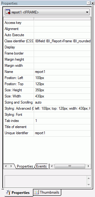
Click
a property to display a description of the selected property at
the bottom of the Properties window.
x
Reference: Graph Properties in the Properties Window
When a graph is selected, the Properties tab in the Properties
window contains options that control the properties of your graph.
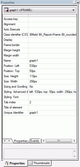
Click
a property to display a description of the selected property at
the bottom of the Properties window.
x
Procedure: How to Add a Compound Document to an HTML Page
-
Insert a
report object by doing one of the following:
-
Drag the
crosshair to create a report object and adjust it to the size you want.
-
Right-click
the report object and select Open document composer from
the context menu.
Document Composer opens. For details on using Document
Composer, see the Creating Compound Reports With Document
Composer manual.
xSelecting Components to Import Into a Procedure
You can select to include or exclude components to be
imported into your procedure with the Manage Layout dialog box.
The Manage Layout dialog box allows you to select from components
of your request, such as TABLE, SET, and GRAPH.
If you have several requests in one procedure, you can use the
Manage Layout dialog box to suppress the display of individual TABLE,
SET, and GRAPH components (for example, temporary HOLD files). By
default, the last TABLE is set to display.
x
Procedure: How to Select Components to Import Into a Procedure
-
Select Import
Existing Procedure from the Insert menu.
The Get source file dialog box opens.
-
Select
a file name and click Open.
The Manage Layout dialog box opens. For
details, see Manage Layout Dialog Box.
x
Reference: Manage Layout Dialog Box
The following image is the Manage Layout
dialog box.
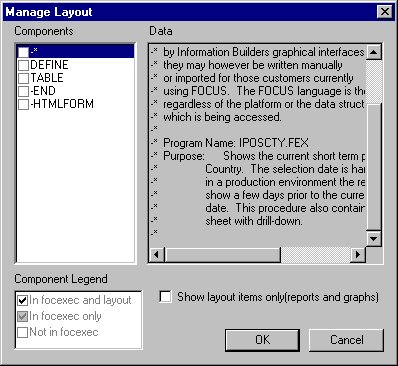
The
Manage Layout dialog box contains the following fields/options:
-
Components
-
Displays all the components (SET, DEFINE, and so on) in the request.
-
Data
-
Displays the contents of the selected component.
-
Component Legend
-
Determines whether the request is included in the procedure,
outside of the procedure, or in the procedure and layout.
-
In focexec and layout
-
Activates the component and displays the component in the layout.
-
In focexec only
-
Deactivates the component and does not display the component
in the layout. This is a good method for hiding report requests
that produce temporary files.
-
Not in focexec
-
Removes the component from the procedure.
-
Show layout items only (reports and graphs)
-
Displays the layout reports and graphs in the Data field.
This
check box only displays when you access the Manage Layout dialog
box from the Insert menu. When accessing it from the context menu,
only the report or graph component displays, and the check box does
not apply.
xAdding a Frame to the Layout
You can use a frame to embed additional web sources
or run reports. You can also use a frame as the output location
or target for a drill-down report. You can also use a frame to run
a table of contents report, an OLAP report, a PDF report, an Excel® report,
or a Maintain procedure.
x
Procedure: How to Add a Frame to the Layout
-
Insert
a frame by doing one of the following:
- Click the Frame button.
- From the Insert
menu, select Components, then click Frame.
The
cursor changes into a crosshair.
-
Drag
the crosshair to create a frame and adjust it to the size you want.
A frame is created in the layout and assigned the name
iframen, where n is a number.
-
Optionally,
change the properties of the frame by adjusting the properties displayed
in the Properties tab of the Properties window. For details, see Frame Properties in the Properties Window.
x
Procedure: How to Assign a URL, HTML File, or Report to a Frame
-
Insert
a frame by doing one of the following:
- Click the Frame button.
or
- From the Insert
menu, select Components, then click Frame.
The
cursor changes into a crosshair.
-
Drag
the crosshair to create a frame and adjust it to the size you want.
A frame is created in the layout and assigned the name iframe(n),
where n is a number.
-
Right-click
the frame, and select Frame Properties from
the context menu.
The Hyperlink Properties dialog box opens.
-
Click
the New button to create a new action. From
the drop-down list in the Action field you can select:
-
URL. To
assign a URL address to the frame, select URL and
enter the fully-qualified URL in the Source field.
-
HTML File. To
assign an HTML file to the frame, click select HTML File and
enter the file location in the Source field, or click the browse (...) button
to browse to the location. An HTML file refers to the HTML files
in your application.
-
External procedure. To
assign an external procedure to the frame, select External
procedure and enter the procedure location in the Source
field, or click the browse (...) button to
browse to the location. You can also select
Maintain procedures (.mnt, .fcm) here.
-
Click OK.
-
Optionally,
change the properties of the frame by adjusting the properties displayed
in the Properties tab of the Properties window. For details, see Frame Properties in the Properties Window.
x
Procedure: How to Show/Hide a Frame in the Layout
-
From HTML
Composer, use the controls to supply parameter values for a report.
Note: A report with parameters requires that you
select values (at run time) in order to generate the output.
-
Click
the frame (report object) and select False from
the Auto Execute drop-down list in the Properties tab of the Properties window.
Note: False is the default Auto Execute option for
reports with parameters.
-
Right-click
the frame (report object) in the Design view and select Style from
the context menu.
The
Style Composer opens.
-
Select Layout from
the left side of the Style Composer to view the layout options for
the selected frame.
-
From
the Flow control area, select Do not display from
the Display drop-down list.
This
option hides the frame at run time until the values are selected.
-
Click OK to
close the Style Composer.
-
Run
the HTML page.
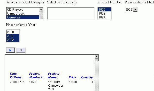
In the example below, the frame is not shown before the
values are selected.
In
the same example below, parameter values have been selected and
the frame appears showing the output results.
x
Reference: Frame Properties in the Properties Window
When a frame is selected, the Properties
tab in the Properties window contains options that control the properties
of frames.
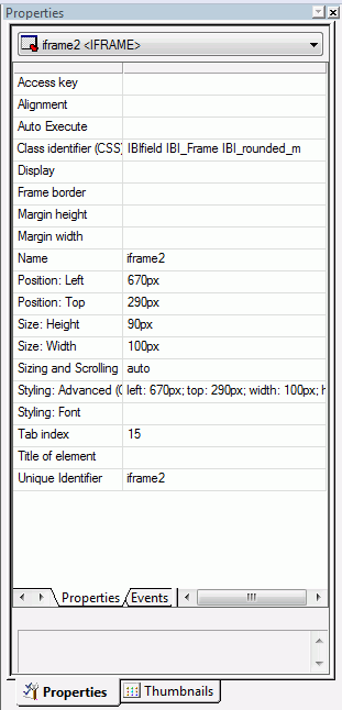
Click
a property to display a description of the selected property at
the bottom of the Properties window.
xAdding a Line to the Layout
You can add a horizontal or vertical line to the layout.
This is useful for distinguishing between sections of your launch
or display page.
x
Procedure: How to Add a Line to the Layout
-
Do one
of the following to add a line:
- Click the Line button.
or
- From the Insert
menu, select Components, then click Line.
The
cursor changes into a crosshair.
-
Drag
the crosshair to create a horizontal or vertical line.
A line is created in the layout.
-
Optionally,
change the line properties by adjusting the properties displayed
in the Properties tab of the Properties window. For details, see Line Properties in the Properties Window.
x
Reference: Line Properties in the Properties Window
When
a line is selected, the Properties tab in the Properties window
contains options that control the properties of lines.
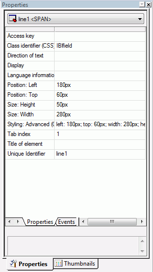
Click
a property to display a description of the selected property at
the bottom of the Properties window.
xAdding an Image to the Layout
You can add an image to the layout. This is useful for
including graphics, such as a company logo.
You can insert an image into your report layout and add a hyperlink
to it. After you run your report and click the image you can launch
a URL or run a report or Maintain procedure the
same way you can by clicking a hyperlink or push button. For more information,
see How to Add a Hyperlink to a Push Button or an Image.
Note: When inserting images, images must be referenced
from a specific directory location. Links to images are not supported.
x
Procedure: How to Add an Image to a Layout
-
Do one
of the following to add an image:
- Click the Image button
from the Components toolbar.
or
- From the Insert
menu, select Components, then click Image.
The
cursor changes into a crosshair.
-
Drag the
crosshair to create the image object and adjust it to the size you
want.
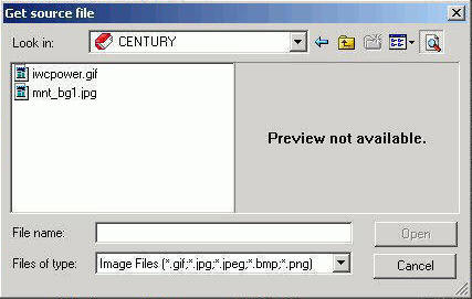
The Get source file dialog box opens.
-
Navigate
to the directory where the image is located using the Look in drop-down
list, then select the image you want to add to the layout.
Note:
- You may also specify
a fully-qualified URL or a relative URL that points to an image
file by entering it in the File name area. A fully-qualified URL
must start with http:// or https://. A relative URL must start with
a known context root that WebFOCUS uses, such as /approot/appname/imagename.png.
- You can multiselect
image files from the Get source files dialog box. The files will be
cascaded on the canvas and can then be moved as required.
-
Click Open.
-
Optionally,
change the properties of the image by adjusting the properties displayed
in the Properties tab of the Properties window. For details, see Image Properties in the Properties Window.
Note: You can always return an image to its original
size by right-clicking the image and selecting Restore
size from the context menu.
Images will retain
their aspect ratio if they are resized by pressing and dragging their
corner borders.
x
Reference: Image Properties in the Properties Window
When
an image is selected, the Properties tab in the Properties window
contains options that control the properties of selected images.
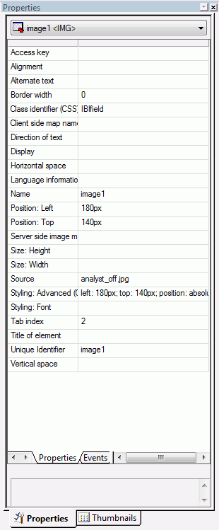
Click
a property to display a description of the selected property at
the bottom of the Properties window.
xAdding Flash Content to the Layout
You can add .SWF files that are Adobe® Flash Player
compatible to accompany reports or graphs on an HTML page.
Note:
- When inserting Flash
animations, only files that are 1 MB or smaller can be run using
HTML Composer.
- Internet Explorer®
6 does not support the use of Flash content.
x
Procedure: How to Add Flash Content to a Layout
-
Do one of
the following to add an .SWF file that is Adobe Flash Player compatible:
- Click the Insert
Flash Content button from the Components toolbar.
or
- From the Insert menu,
click Components, then click Flash
Content.
The cursor changes into a crosshair.
-
Drag the
crosshair to create the Flash content object and adjust it to the size
you want.
The Get source file dialog box opens.
-
Navigate
to the directory where the .SWF file is located using the Look in
drop-down list, then select the .SWF file you want to add to the
layout.
-
Click Open.
-
Optionally,
change the properties of the Flash content by adjusting the properties
displayed in the Properties tab of the Properties window.
-
Click Run to
view the flash content.
x
Reference: Flash Properties in the Properties Window
When
Flash content is selected, the Properties tab in the Properties
window contains options that control the properties of the Flash
component.
Click
a property to display a description of the selected property at
the bottom of the Properties window.
xAdding Text to the Layout
You can add text to the layout. This is useful for including
headings in your webpage, or adding directions or an explanation
for your report or graph.
x
Procedure: How to Add Text to a Layout
-
Insert
text to the layout by doing one of the following:
- Click the Text button
from the Components toolbar.
or
- From the Insert
menu, select Components, then click Text.
The
cursor changes into a crosshair.
-
Drag the
crosshair to create the text object and adjust it to the size you want.
A text object is created in the layout and assigned the
name textn, where n is
a number.
-
Replace
the text with the text you want to appear in the layout.
-
Optionally,
change the text properties by adjusting the properties displayed
in the Properties tab of the Properties window. For details, see Text Properties in the Properties Window.
x
Procedure: How to Format Text in the Layout
You may apply
various formatting and style options to words and individual text
characters within the text element. The formatting options are available from
the text element shortcut menu in HTML Composer.
Note: Any
formatting and styling that you may have applied to individual text strings
within the text element will remain unchanged. Changes made to the
entire text element are only applied to part of the text string
that has not been formatted.
-
Insert a text element into the layout
and type text in the text element.
-
Select the text that you wish to format.
- To format the entire text element, click
the text object in the layout.
- To format an individual word or text
character, highlight part of the text within the text element.
The
Formatting toolbar is activated.
Note: The
Bold, Italic, Underline, Superscript, and Font Style options are available
when formatting individual words or text characters. The Font Style
and Alignment options are available when the entire text element
is selected.
-
Select from the formatting options available from the Formatting toolbar.
-
Select Font Style from the Formatting
toolbar to open the Font dialog box, from which you can change the
type, style, color, size, and effect of the font.
Tip: You can also access the Font Style dialog box
from the Font ellipsis button of the Styling Font field in the Properties
window.
-
Click OK to close the Font dialog box.
The
format options are applied to the text selected.
x
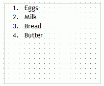
Procedure: How to Insert a Bulleted or Numbered List Into a Text Element
To insert
a bulleted or numbered list into a text element:
-
Insert a
text element into the layout and enter text on different lines,
as shown in the following image.
-
Highlight
and right-click the text.
The right-click context menu opens.
-
Select Bullets and
then either Disc, Circle,
or Square if you want a bulleted list. Select Numbering and
then either Numbers, Lowercase
Letters, Uppercase Letters, Small
Roman numerals, or Large Roman numerals if
you want a numbered list. Both options are shown in the following
image.
For
example, the following image shows each item of text on a different
line with a bullet next to it.
Note:
- Alternatively, you
can select a bullet type before typing text to begin the list. Pressing
Enter will begin the next item in the list on a separate line.
- To change the bullet
or number list type of an existing list, place your cursor on the list
level you want to change and reselect a bullet or number list type.
Selecting None will remove the bullets or numbers for that
level and move any nested lists up one level. In order to switch
between bullets and numbers, you must first remove the current list
option by selecting None and then applying the list option
you want.
x
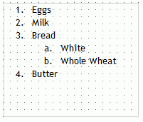
Procedure: How to Insert Nested Lists Into a Text Element
To
insert a nested list into the text element:
-
Insert a
text element into the layout and create a list, as shown in the
following image.
-
Place your
cursor after a list item.
-
Right-click
and select Nested List and then select a
bulleted or numbered list option.
A list is started within the current list, allowing you
to enter text on that list level, as shown in the following image.
Note: Pressing
Tab while your cursor is on the same line as a list item will move
that item one level down, resulting in a nested list. The bullet
or number type selected is the next list type in the right-click
context menu. For example, if you have a bulleted list that uses
the disc bullet type, pressing Tab to move an item down one level will
cause that nested list to have a circle bullet type.
You can
continue to nest lists within other lists by using the same steps
shown above.
Note: You cannot skip a list level. For
example, in order to insert a nested bulleted list or nested numbered
list on a lower level, there must be a list one level up from it.
x
Reference: Text Properties in the Properties Window
When
text is selected, the Properties tab in the Properties window contains
options that control the properties of the text component.
Click
a property to display a description of the selected property at
the bottom of the Properties window.
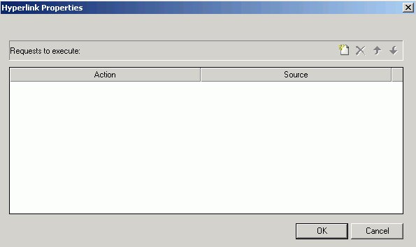
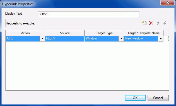
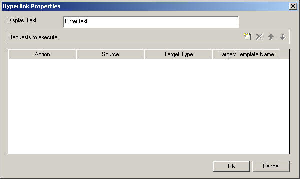
xAdding a Hyperlink to the Layout
You can create a hyperlink for your HTML page. A hyperlink
can execute a report or Maintain procedure,
link to a URL, or open an HTML page. You can create a hyperlink
in two ways:
The following is an image of the Hyperlink Properties dialog
box.
-
Action
-
The URL action will create a hyperlink that brings you to
a webpage. This action will allow you to enter a URL in the Source
section.
-
The HTML File action will create a hyperlink that will bring
you to an HTML Composer page. You will be able to select the HTML
file to link to from the Source section.
-
The URL File action will create a hyperlink that will invoke
a Managed Reporting .url file. You will be able to select the .url
file to link to from the Source section. This action is only available
if you are creating an HTML page hyperlink in the Repository area.
-
The Embedded Procedure action will link to a procedure that
is already embedded in the page. The Source section will allow you
to choose from the procedures already linked to the current page.
-
The Schedule action enables you to schedule a report or graph
using ReportCaster. For more information on using scheduling, see Adding ReportCaster Schedule Capability to HTML Composer.
-
The External Procedure action will link to a procedure that
is not embedded in the page. You must navigate to and specify the
procedure from the Source section.
-
The Visual Discovery Exclude action is only available when
a Visual Discovery control is used on the page. From the Source
section, you will be able to choose a datapool already located on
the page. This action will cause the currently Visual Discovery
data to remain, while hiding the unselected data.
-
The Visual Discovery Restore action is only available when
a Visual Discovery control is used on the page. From the Source
section, you will be able to choose a datapool already located on
the page. This action will cause hidden Visual Discovery data to
be shown on the Visual Discovery control.
-
The Refresh Active Reports action is only available when
an Active Report is on the page. This action will refresh all active
reports currently on the page.
-
Source
-
The source of where the hyperlink directs to. For URL actions,
this is a hyperlink. For HTML actions, you will need to navigate
to the HTML file you are directing to. For the Embedded Procedure
action, this would be a selection from a list of available procedures.
For the External Procedure action, you would have to navigate to
the procedure you are directing to.
-
Target Type
-
The Window Target Type will execute the action in a new window.
-
The Frame Target Type will execute the action in a selected
frame.
-
The Deferred Target Type will run the report deferred.
-
The InfoWindow Target Type will execute the action in the WebFOCUS generated InfoWindow.
-
Target/Template Name
-
The Target/Template Name contains a list of targets in which
the action can be executed from. These targets can be controls,
frames, windows, or distribution methods when the Action is set
to Schedule. These options can be different for specific actions.
Note: If
the distribution method is a combination (for example, email, report
library, and FTP) then, at run-time, you will be presented with
an intermediate dialog requesting you to choose a single distribution method.
-
Size (Width/Height)
-
Allows for customization of the InfoWindow dimensions. This
option will replace Target/Template Name when using InfoWindow as
the Target Type.
When a parameter is added to the HTML page, the Additional parameters
button becomes available at the bottom of the Hyperlink Properties
dialog box, as shown in the following image.
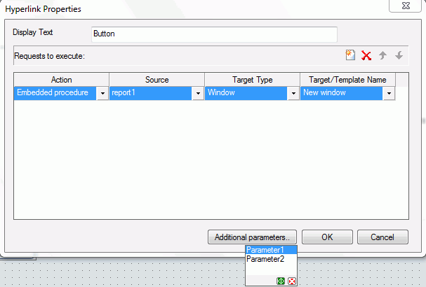
The Additional parameters button lets you pass the selected parameter
in the hyperlink being defined. Clicking the green OK button
selects the parameter. Clicking the red Cancel button
closes the parameter drop-down list.
x
Procedure: How to Create a Hyperlink
-
Do one
of the following to create a hyperlink:
- Click the Hyperlink button
from the Components toolbar.
or
- From the Insert
menu, select Components, then click Hyperlink.
The
cursor changes into a crosshair.
-
Drag the
crosshair to create a hyperlink object and adjust it to the size you
want.
The Hyperlink Properties dialog box opens.
-
Enter
the text you want to display as the hyperlink in the Display Text field.
-
Set the action of the hyperlink:
-
Optionally,
direct the output to a specific location by selecting Window or Frame in
the Target Type field.
-
Specify
a name for the target window or frame by selecting one of the default
values from the Target/Template Name drop-down list or by typing
the name of a new or existing window or frame in the Target/Template
Name field.
-
Click OK.
Note: If linking hyperlink properties to another
page or procedure, HTML Composer parses the other file for unresolved
parameters and opens the New Parameters dialog box.
-
Execute
the request and click the hyperlink to launch the source you entered
in the Hyperlink Properties dialog box.
Note: If your hyperlink target type is an InfoWindow,
you can move the InfoWindow by clicking the title bar and dragging
it. You can move the InfoWindow regardless of if it is pinned or unpinned.
x
Procedure: How to Add a Hyperlink to a Push Button or an Image
To
add a hyperlink to a push button or image, complete the following
steps.
-
Insert
a push button or image from the Components toolbar and add it to
the layout.
-
Right-click
the push button or image, and select Create hyperlink.
The Hyperlink Properties dialog box opens.
-
Click
the New button to generate a new request
and select URL from the Action drop-down
list.
-
Type
a URL in the Source field.
-
Optionally,
in the Target Type field, direct the output to a specific location by
selecting Window or Frame from the
drop-down list.
-
In the
Target/Template Name field, specify a target window or frame by selecting
one of the default values from the drop-down list or by typing the
name of a new or existing window or frame.
-
Click OK.
Note: If linking hyperlink properties to another
page or procedure, HTML Composer parses the other file for unresolved
parameters and opens the New Parameters dialog box.
-
Execute
the request and click the push button, or image, to launch the source
you entered in the Hyperlink Properties dialog box.
xAdding a Group Box to the Layout
A group box can be used to create a border around a
group of objects, for example, forms or reports and graphs.
x
Procedure: How to Add a Group Box
-
Insert
a group box by doing one of the following:
- Click the Group
box button from the Components toolbar.
or
- From the Insert
menu, select Controls, then click Group
Box.
The cursor changes into a crosshair.
-
Drag
the crosshair to create a group box and adjust it to the size you want.
A group box is created in the layout and assigned the name groupbox(n),
where n is a number.
-
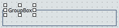
Optionally, you may change the default
name of the group box and format the text, as shown in the image
below.
For
more information about formatting text, see How to Format Text in the Layout.
-
Optionally,
change the group box properties by adjusting the properties displayed
in the Properties tab of the Properties window. For details, see Group Box Properties in the Properties Window.
x
Reference: Group Box Properties in the Properties Window
When
a group box is selected, the Properties tab in the Properties window
contains options that control the properties of group boxes.
Click
a property to display a description of the selected property at
the bottom of the Properties window.
xAdding a Push Button to the Layout
In this section: How to: Reference: |
You can add a push button to the layout. A push button
enables you to execute a report or Maintain
procedure, or link to a URL or HTML file. This behavior is
similar to a hyperlink.
x
Procedure: How to Create a Push Button in Place of a Submit Button
-
If the
submit button is deleted from the layout, a push button can be used
to replace the button. Insert a push button by doing one of the following:
- Click the Push
Button from the Components toolbar.
or
- From the Insert
menu, select Controls, then click Push
Button.
The cursor changes into a crosshair.
-
Drag
the crosshair to create a push button and adjust it to the size
you want.
A push button is created in the layout and assigned the
name button(n), where n is
a number.
-
Right-click
the push button and click Create hyperlink.
The Hyperlink Properties dialog box opens. Use the Hyperlink
Properties dialog box to assign a target and action to the push
button.
-
Click OK to
close the Hyperlink Properties dialog box.
-
Run the
HTML page.
-
Click
the push button to submit your request.
x
Procedure: How to Run Multiple Reports With One Submit Button
The
submit button on a control enables you to submit your request after
selecting parameter values at run time. You may run multiple reports
with one submit button.
Note: A push button
can also be used in place of a submit button.
-
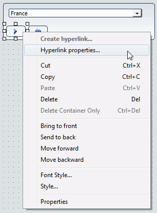
Right-click
the submit button or the frame for the whole control, and select Create
hyperlink from the context menu.
The following
image is an example of the submit button selected.
The following image is an example of
the whole control selected.
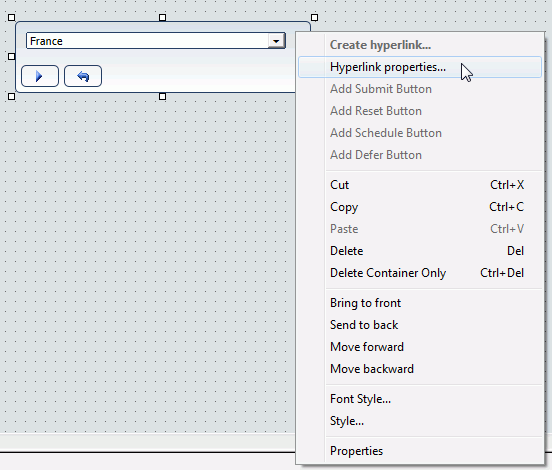
The
Hyperlink Properties dialog box opens.
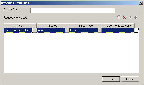
-
Click the New button
and use the drop-down lists to add the second report request to
be executed with the submit button.
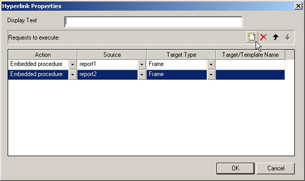
Repeat
these steps for multiple procedures.
x
Reference: Push Button Properties in the Properties Window
When
a push button is selected, the Properties tab in the Properties
window contains options that control the properties of your buttons.
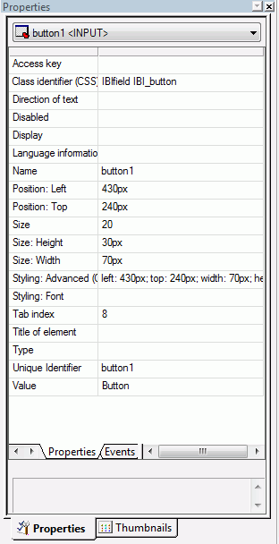
Click
a property to display a description of the selected property at
the bottom of the Properties window.
x
Maintain From HTML Composer
HTML Composer enables you to select Maintain procedures
(.mnt, .fcm) to run from your HTML form, either within a frame or
in a new window. Select a Maintain procedure as the source for the
External procedure in the Hyperlink Properties dialog box. This
makes it easy to create customized launch forms for WebFOCUS Maintain,
and to integrate WebFOCUS reporting and Maintain in your applications.
For details about inserting a frame, see How to Assign a URL, HTML File, or Report to a Frame.
xAdding a Reset Button to the Layout
You can add a reset button to the layout. A reset button
enables you to reset the entire page back to its initial settings.
x
Procedure: How to Create a Reset Button
-
If the
reset button is deleted from the layout, you may create a new reset
button. Insert a reset button by doing one of the following:
- Click the Reset button
from the Components toolbar.
or
- From the Insert
menu, select Controls, then click Reset
Button.
The cursor changes into a crosshair.
-
Drag
the crosshair to create a reset button and adjust it to the size
you want.
A reset button is created in the layout and assigned the
name reset(n), where n is
a number.
-
Run the
HTML page.
-
When
selecting criteria to submit a report, click the reset button to
reset the entire page back to its initial settings.
x
Reference: Reset Button Properties in the Properties Window
When
a Reset button is selected, the Properties tab in the Properties
window contains options that control the properties of your buttons.
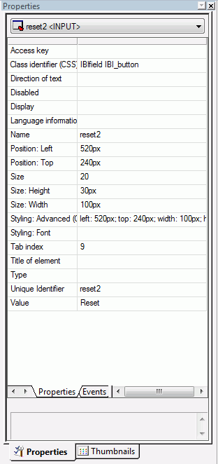
Click
a property to display a description of the selected property at
the bottom of the Properties window.
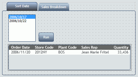
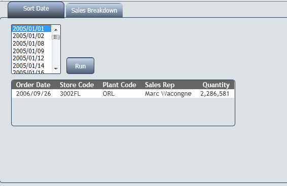
xAdding a Tab Control to the Layout
You can add a tab control to the layout. Tab controls
enable you to create multiple pages in one HTML form and present
a better display for viewing secondary information.
When a tab control object is added to the layout, each tab control
consists of:
- A tab item.
A
tab item is the tab label. You may edit the name of the tab item,
style the tab item, and add multiple tab items. Each tab item is
associated with a tab body.
- A tab body.
A
tab body is the tab page where you associate your components, such
as report and graph objects, images, and lines.
The Tab control can be displayed as a full screen or part of
an HTML page.
In the example below, the selected tab shows a report and a second
tab that contains a graph.
x
Procedure: How to Create a Tab Control
-
Insert
a tab control to the layout by doing one of the following:
- Click the Tab
control button from the Components toolbar.
or
- From the Insert
menu, select Components, then click Tab
Control.
The cursor changes into a crosshair.
-
Drag
the crosshair to create a tab control object and adjust it to the
size you want.
Tip: You should make the object large enough to
associate report/graph components within the tab control.
A tab control object is created in the layout and
assigned the Properties name tab(n), where n is
a number of the tab. By default, the tab control has one tab page.
Each tab page consists of a tab item (tabitem(n))
and tab body (tabitembody(n)).
-
Optionally,
change the properties of the tab control by adjusting the properties
displayed in the Properties tab of the Properties window.
x
Procedure: How to Enable Full Screen Mode for the Tab Control
You may resize the tab control to fit the full screen
of your layout, making the tab control the full background of your
browser window at run time. When set to full screen mode, scroll bars
will not be applied to the output window. Therefore, you may have
to adjust the tab control (and any items on the tab) in the layout
to ensure that they appear appropriately for display at run time.
Note: It is recommended
you set the tab control to full screen mode at the beginning of
the development process. If there are existing components on the
layout that are not part of the tab control, these components will
become inaccessible if the tab control is changed to full screen
mode.
-
From the Insert menu, select Components,
then click Tab Control.
The cursor changes into a crosshair.
-
Drag the crosshair in the layout to create the tab control object.
-
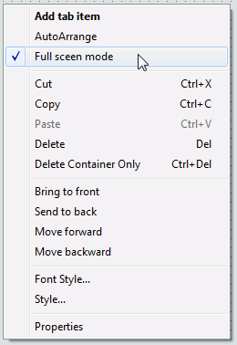
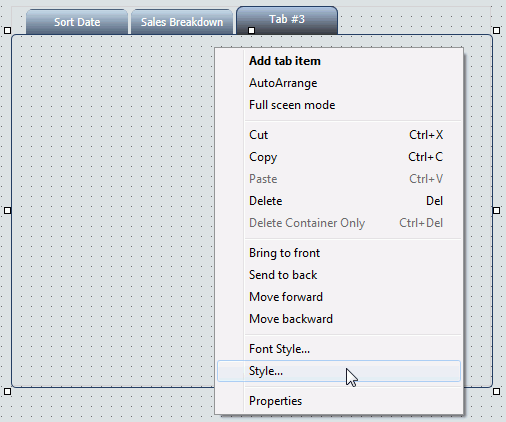
Right-click the tab control and select Full screen mode from
the context menu, as shown in the image below.
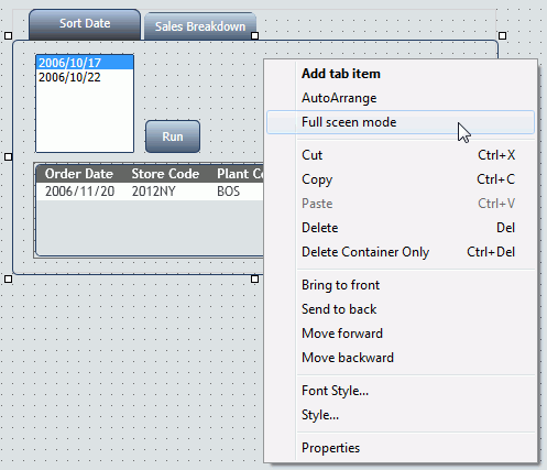
The tab control displays
as a full screen in the layout, as shown in the image below.
Note: This
setting can be applied only to one tab control in your application. If
one tab control is set to full screen mode, the full screen mode
item will be greyed out for any additional tab controls.
-
To resize the tab control, right-click and uncheck the Full screen
mode option, as shown in the image below.
x
Procedure: How to Add Additional Tabs
-
Select
the tab control object in the layout.
-
Right-click
and select Add tab item from the context
menu.
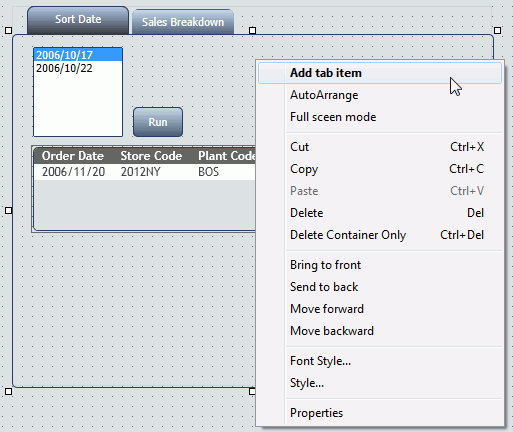
A
tab is added to the tab control object.
-
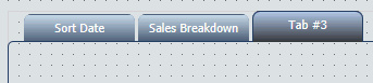
To align
multiple tab items, select the tab control object and click AutoArrange from
the context menu,
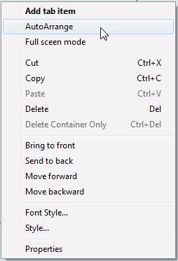
The
tab items are resized to the size of the widest tab item and evenly spaced.
x
Reference: Tab Control Properties in the Properties Window
When a tab control is selected, the
Properties tab in the Properties window contains options that control
the properties of your tabs.
Note: You may set
options for the tab control, individual tab items, and the tab body.
Click
a property to display a description of the selected property at
the bottom of the Properties window.
x
Procedure: How to Modify and Style the Tabs
You may modify and style the tab
items and tab body properties.
-
Use the Formatting toolbar to format
the text in the tab item.
-
Click
the tab item/tab body and use the right-click context menu to edit the
text (if applicable), Font Style, Style, and Properties.
x
Procedure: How to Modify the Size, Appearance, and Location of the Tabs
When
the tab control is selected, you may change the default size of
the tab labels, the appearance of the tabs, and the location of
the tab items on the tab control.
These properties are available from the Properties
tab of the Properties window when the tab control is selected. The
tab control appears as tab(n) in the Properties
window drop-down list.
-
To change the default size of the tab labels, adjust the Tab:
default distance, Tab: default height,
and Tab: default width properties.
-
To change the appearance of the tabs, select Straight or Round from
the Tab: edges properties field.
The default tab edge is Straight.
-
To change the location of the tab items on the tab control,
select Top, Bottom, Left,
or Right from the Tab: location properties
field.
The default tab location is Top.
Note: If
the tab location changes, any background images applied to the tabs
will not be rotated. You will have to reinsert a different image
that is rotated appropriately.
x
Procedure: How to Use the Tab Item Background Properties Field
In addition to using the Style Composer, you can add background
images to tab items by using the Background properties field.
The Background properties field is
available from the Properties tab of the Properties window when
the tab item is selected. The tab item appears as tabitem(n) in
the Properties window drop-down list.
-
Select the tab item in the layout, or click the tabitem(n) property
from the Properties window drop-down list.
-
Click the Background ellipsis button
from the tab item properties window.
The Get source
file dialog box opens, as shown in the image below.
-
Select a File name and click Open.
The background image is added to the tab
item.
You may have to manually
resize the tab item to fit the image.
Note: If the
tab location is changed (from Top to Left for example), any background
images applied to the tabs will not be rotated. You will have to
reinsert a different image that is rotated appropriately.
x
Procedure: How to Add Background Images to Tabs
You
may add background images to a tab item or tab body using the Style
Composer. For example, you may add a small icon with text to a tab
item or your company logo as the background image for a tab body.
Note: Background
images can also be applied to tab items by using the Background
properties setting. For more information, see How to Use the Tab Item Background Properties Field.
-
Select Style from
the right-click context menu of the tab item/tab body.
The Style Composer dialog box appears.
-
Select Background to
show the Background image options.
-
Select
a source file in the Image field and adjust
the Tiling, Scrolling, and Position options.
Tip: If you are adding an icon to a tab item, select
a small image and do not tile the image.
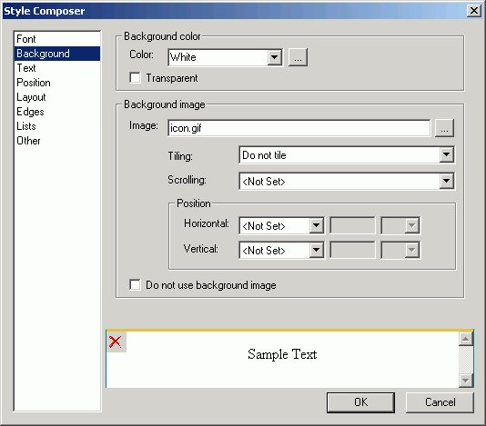
-
If you
are using text in addition to a background image for a tab item, select Text from
the Style Composer to view and change the Alignment options.
-
Click OK to
close the Style Composer.
The background image is added to the tab item/tab body.
x
Procedure: How to Associate Components to the Tab Body
You may associate any component from the Insert menu (such
as an image or line) to the tab body. This procedure details how
to add a report or graph object component to the tab body.
-
To add
a new report or graph object to the tab body:
-
To associate
an existing component in the layout to a tab body:
- Select the component
in the layout.
- Press the Alt
key and drag the component into the tab body.
The component
is associated to the tab body.
xAdding a Label to the Layout
You can add a label to the layout. A label is simply
a piece of text. The label component enables you to create and name
a label. You can also link it to a control by assigning the label
HTML for property the same value as the Unique Identifier property
for the control.
x
Procedure: How to Add a Label
-
Insert a label to the layout by doing one of the following:
- Click the Insert
Label button from the Components toolbar.
or
- From the Insert
menu, select Components, then click Label.
The
cursor changes into a crosshair.
-
Drag the
crosshair to create the label and adjust it to the size you want.
A label is created in the layout and assigned the name labeln,
where n is a number.
-
Replace the label text with the text you want to appear in
the layout.
-
Assign the label to an existing control in the layout by assigning
the label properties:
x
Reference: Label Properties in the Properties Window
When
label is selected, the Properties tab in the Properties window contains
options that control the properties of the label in your layout.
New pages will show labels as <LABEL> tags in the Properties
window.
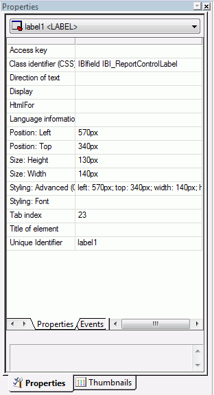
Click
a property to display a description of the selected property at
the bottom of the Properties window.
xWorking With the Properties Window
The Properties window is a dockable window that consists
of several tabs and components.
- A Properties
tab consists of the following components:
- A hierarchical
drop-down list of objects that are currently in the layout. For the
selected object, there are additional subtabs on the Properties
tab.
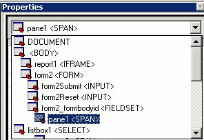
- A Properties
subtab that lists attributes for the selected object. The attributes appear
on the left. Click in the right column to set the properties for
the attribute.
The
Properties subtab options are accessible in the Design view of HTML Composer.
- An Events subtab
lists all JavaScript events that can be assigned an action for an
object.
Note:
- To code a JavaScript
event for an object, select a JavaScript event and click the ellipsis
button in the Events subtab. HTML Composer adds the event to the
HTML code and switches from Design to HTML view. In the HTML view,
you are prompted to define the event. Add the appropriate JavaScript
code.
- When copying a control
that has event handlers, the copied control inherits the original
controls event handlers. You must manually change the copied controls
event handlers in the event tab. You can then create the JavaScript
for those event handlers.
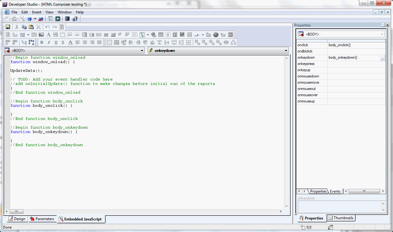
The
following image is an example of the HTML code that appears when
a JavaScript event is selected from the Events subtab in HTML Composer.
- A Thumbnails tab enables you to view
a thumbnail of the page layout. Thumbnail view allows objects on
the page to participate in actions with controls on the Parameters tab.
You may also refresh the Thumbnails tab, enlarge or reduce the thumbnails,
and change the zoom levels. Reports and graphs appear as placeholder
objects on the Thumbnails tab.
x
Procedure: How to Dock the Properties Window
For
layout purposes, you may want to dock or reposition the Properties
window. You can dock the Properties window on all four sides of
HTML Composer. When you choose to dock the Properties window on
the top or bottom, the columns are split in half.
-
Click the Properties title
bar on the Properties window.
The Properties window appears as shown in the following
image when you double-click the title bar.
-
Drag the
Properties window to the side of the screen that you prefer, or it
can float in the middle of the screen.
-
Release
the mouse when the Properties window is on the side of the screen
that you prefer.
If you dock the Properties window on the bottom of
the screen, it will appear as shown in the following image.

To
undock the Properties window, click the Properties title
bar, then move the window to the desired location in the layout.
x
You can layer objects that are added to the page layout
by using the object right-click menu, as shown in the following
image.
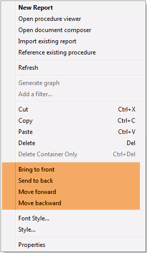
The options are:
-
Bring to front. Moves
an object to the front so that it is stacked on top of every other
object it overlaps.
-
Send to back. Moves
an object to the back so that it is stacked below every other object
it overlaps.
-
Move forward. Moves
an object forward one position in the stacking z-order.
-
Move backward. Moves
an object backwards one position in the stacking z-order.
When using any of these commands, the stacking order of the object
will change. This is reflected in the z-index property in the Properties
window. The z-index is the stacking order of a specific object.
xWorking With the Events Subtab
The Events subtab displays a list of all available JavaScript
events that can be used in conjunction with an object. The events
that are available change depending on what type of object is selected.
For example, a report object has different events available than
a button object. When no object is selected, events for the HTML
page are displayed.
Double-clicking on an event will create a function block for
the selected object, using that event. You can view the created
functions in the Embedded JavaScript tab, where you can type the
JavaScript code to execute when the selected event occurs.
The following is a list of events that are available from the
Event subtab and the circumstances in which the JavaScript code
is called.
|
Event
|
Circumstance
|
|---|
|
Load
|
Page is loaded.
|
|
UnLoad
|
Page is unloaded.
|
|
Click
|
Object or page is clicked.
|
|
Double Click
|
Object or page is double-clicked.
|
|
Mouse Down
|
Mouse pointer is moved down.
|
|
Mouse Up
|
Mouse pointer is moved up.
|
|
Mouse Over
|
Mouse pointer is moved over an object.
|
|
Mouse Move
|
Mouse pointer is moved.
|
|
Mouse Out
|
Mouse pointer is moved away from an object.
|
|
Key Pressed
|
Key is pressed and released.
|
|
Key Down
|
Key is pressed.
|
|
Key Up
|
Key is released.
|
|
Focus
|
Object is the current focus.
|
|
Blur
|
Object is not the current focus.
|
|
Before Load
|
Before a control is populated.
|
|
After Load
|
After a control is populated.
|
|
Value Selected
|
Value within the control is selected.
|
|
Value Changed
|
Value within the control is changed.
|