Business Intelligence Portal
The Business Intelligence Portal (BI Portal) is new in WebFOCUS
8. It is the successor to the Business Intelligence Dashboard (BI
Dashboard), which focused exclusively on building dashboards. You
can use the Business Intelligence Portal to provide users with access
to view and analyze information quickly in a self-service environment.
It enables you to build complete, modern websites with different
views, using web-based tools, such as InfoAssist and the InfoDiscovery
Workbench. These tools enable you to develop Business Intelligence
content, such as dashboards, visualizations, reports, charts, maps,
and InfoApps.
For more information on the BI Portal, see the Business
Intelligence Portal manual.
x
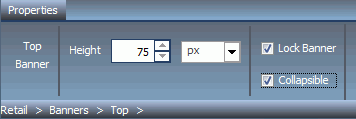
A collapsible banner allows optional visibility at run
time, expanding the display area of the portal. This enhancement
is especially useful when a portal is optimized for mobile devices.
To enable the feature, select the Collapsible check
box in the Properties panel, as shown in the following image.
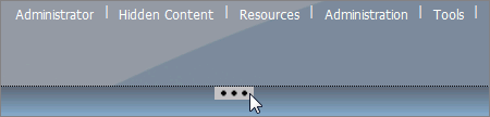
To hide or reveal a banner at run time, click the collapsible
banner indicator, as shown in the following image.
x
On a fluid canvas, the content automatically fills the
page area in equal proportions. You can manually rearrange and nest
these elements on the page. The display area changes its size depending
on your browser dimensions. When the fluid canvas is enabled, items
are dragged to a floating drop target that arranges the content
evenly and redistributes space, as more items are added. You can
access the fluid canvas feature in one of the following ways:
- On the ribbon, on the Layout tab, in the Page
& Banner group, click Layout, and
then click Fluid Canvas.
- Right-click a page canvas and click the Page Layout.
The Layout menu in the Page & Banner group opens. Then click Fluid Canvas.
x
Visualizations centralize information by providing different
views of data that are pertinent to a particular objective. For
example, reviewing trends or fluctuations in data over a period
of time or within a region. A visualization provides you with a
quick glance of information on a single screen. Visualizations support
the use of different types of charts, maps, and grids. For example,
you may want to use a bar, pie, and line chart to show different
views of the same data. Alternatively, you may want to offset a
particular visual by showing other types of related data that employ
a different type of visual. You can also add a text cell to your
visualization to provide explanatory text or information that other
users can reference. Visualizations allow you to monitor changes
in data. They also serve to provide information in real-time, based
on changes in underlying data or other components. A visualization
can be updated, changed, or revised at any time to account for shifts
in data needs.
To access the online Help for visualizations, click the Help
button, located in the upper-right corner of the InfoDiscovery Workbench.
x
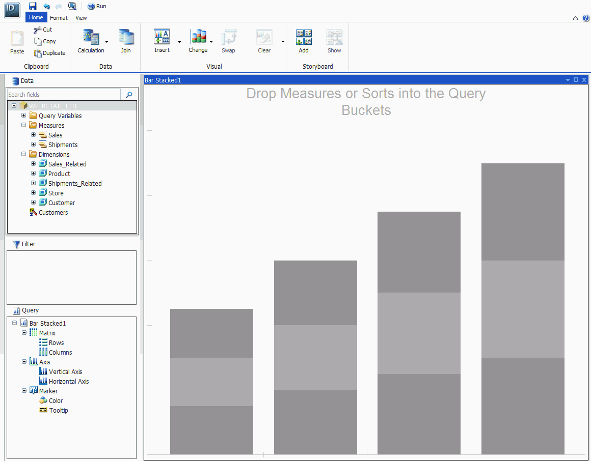
Procedure: How to Create a New Visualization
-
From the Content node in the Resource
tree, right-click a folder, point to New,
and click Visualization.
-
Select a Master File from the list and click Open.
The WebFOCUS InfoDiscovery Workbench opens, as shown in
the following image, where you can create a visualization.
x
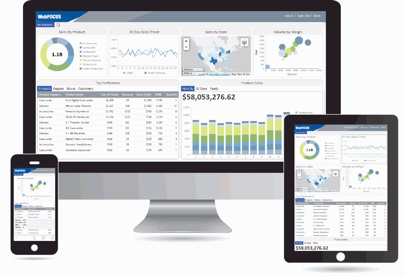
The responsive container is designed to help you build
a responsive portal that automatically adapts to different screen
sizes and mobile devices. It intuitively changes the layout when
you change the size of your browser. The default width and height
of the container, and the inserted items, are pre-configured to
offer the best positioning of the elements on the screen. By employing
the responsive container, you can build a responsive portal on your
desktop, and make it available to users on different platforms.
The following image shows an example of a responsive portal displayed
on a desktop, tablet, and smartphone.