series: [
   {
      series: snumber,
      group: gnumber, // optional
      marker: {
         visible: boolean,  // Line Charts Only
         color: 'cstring'
         size: sznumber,
         shape: 'sstring',
         rotation: rnumber,
         position: 'pstring',
         fillMode: 'fmstring',
         fillEffect: 'festring',
         border: {width: bwnumber,color: 'bcstring',dash: 'bdstring'}
      }
   }
]
where:
- snumber
Is a zero-based series number. If the series does not exist in the chart, the property is ignored.
- gnumber
Is an optional zero-based group number. If the group does not exist in the chart, the property is ignored. If a group number is not specified, the marker definition is applied to all risers in the series.
- boolean
Controls the visibility of markers in line charts only. Valid values are:
- true, which makes the markers visible. This is the default value.
- false, which makes the markers not visible.
- 'cstring'
Is a color for the marker, defined by a color name or numeric specification string, or a gradient defined by a string.
For information about defining colors and gradients, see Colors and Gradients.
- sznumber
Is a number that defines the size of the marker in pixels.
- 'sstring'
Is a string that defines the shape of markers for a series. Valid values are:
- 'arrow'.
- 'bar'.
- 'circle'.
- 'circleMinus' (a circle with a minus sign inside it).
- 'circlePlus' (a circle with a plus sign inside it).
- 'cross'.
- 'diamond'.
- 'fiveStar'.
- 'hexagon'.
- 'hourglass'.
- 'house'.
- 'pie' (for bubble and scatter charts only).
- 'pin'.
- 'pirateCross'.
- 'plus'.
- 'rectangle'.
- 'sixStar'.
- 'square'. This is the default value.
- 'thinPlus'.
- 'tick'.
- 'triangle'.
Note that bar, circlePlus, circleMinus, cross, and tick markers require a border width and color.
- rnumber
Is a number between 0 and 360 that defines the angle (in degrees) of the marker.
- 'pstring'
For bullet charts only, defines the position of the marker relative to data text. Valid values are:
- 'bottom', which draws the data text label above the marker.
- 'middle', which draws the data text label according to the general property dataLabels:position.
- 'top', which draws the data text label below the marker.
- 'fmstring'
Defines the marker fill mode. Valid values are;
- undefined, which uses the existing marker border color and fill color. This is the default value.
- 'seriesHollow', for which the marker fill area is hollow (transparent), and the marker border is the color set by the series:color property. You must define a non-zero border width.
- 'seriesFill', for which the marker draws with no border, and the fill is the same as the series:color property.
- 'seriesWhite', for which the marker fill area is white, and the marker border is the color set by the series:color property. You must define a non-zero border width.
- 'seriesAuto', for which the marker draws with the border 20% darker than the series color and the fill draws 20% lighter than the series color.
- 'festring'
Can be either:
- A percentage string that defines the transparency of the marker fill color. The default value is '100%' (fully opaque).
- 'seriesAuto', which causes the chart engine to fill the markers
with the following fills:
- 'seriesHollow' for scatter and radar charts.
- 'seriesLighten' for bubble, map, and polar charts.
- 'seriesWhite' for line charts.
- 'seriesFill' for other types of charts, which uses the series color as the fill.
For descriptions of the fill types, see the definition for fmstring above.
- bwnumber
Is a number that defines the width of the border in pixels.
- 'bcstring'
Is a color for the marker border defined by a color name or numeric specification string.
- 'bdstring'
Is a string that defines the border dash style. Use a string of numbers that defines the width of a dash followed by the width of the gap between dashes.
Note:
- The bar, cross, circlePlus, circleMinus, and tick marker shapes require a border width and color.
- The special pie marker shape is for bubble and scatter charts only and requires the use of series: 'all', {marker: {shape: 'pie'}}. For details and examples, see bubble and scatter chart properties in Chart-Specific Properties.
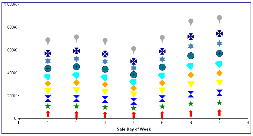
The following request generates a scatter chart with different marker shapes:
DEFINE FILE WF_RETAIL_LITE
COGS1 = COGS_US;
COGS2 = COGS1 +500;
COGS3 = COGS1 +1000;
COGS4 = COGS1 +1500;
COGS5 = COGS1 +2000;
COGS6 = COGS1 +2500;
COGS7 = COGS1 +3000;
COGS8 = COGS1 +3500;
COGS9 = COGS1 +4000;
COGS10 = COGS1 +4500;
END
GRAPH FILE WF_RETAIL_LITE
SUM COGS_US COGS2 COGS3 COGS4 COGS5 COGS6 COGS7 COGS8 COGS9 COGS10
ACROSS TIME_DAYOFWEEK
ON GRAPH PCHOLD FORMAT JSCHART
ON GRAPH SET LOOKGRAPH SCATTERS
ON GRAPH SET STYLE *
*GRAPH_JS
border: {color: 'navy'},
legend: {visible: false},
series: [
{series: 0, color: 'red', marker: {shape:'arrow', size: 20}},
{series: 1, color: 'green', marker: {shape:'fiveStar', size: 20}},
{series: 2, color: 'blue', marker: {shape:'hourglass', size: 20}},
{series: 3, color: 'yellow', marker: {shape:'triangle', size: 20}},
{series: 4, color: 'orange', marker: {shape:'diamond', size: 20}},
{series: 5, color: 'cyan', marker: {shape:'house', size: 20, rotation:45}},
{series: 6, color: 'teal', marker: {shape:'circlePlus', size: 20, border:{width:1, color:'navy'}}},
{series: 7, color: 'steelblue', marker: {shape:'sixStar', size: 20}},
{series: 8, color: 'darkblue', marker: {shape:'pirateCross', size: 20}},
{series: 9, color: 'darkgrey', marker: {shape:'pin', size: 50}},
]
*END
ENDSTYLE
END
On the output, note that the house marker shape is rotated 45 degrees, and that the circlePlus marker shape has a border width and color, as required:
In the following request, series 0 (zero) has the fill mode seriesHollow, and series 1 has the fill mode seriesWhite. In each case a border is required:
GRAPH FILE WF_RETAIL_LITE
SUM COGS_US REVENUE_US
ACROSS TIME_DAYOFWEEK
ON GRAPH PCHOLD FORMAT JSCHART
ON GRAPH SET LOOKGRAPH VLINE
ON GRAPH SET STYLE *
*GRAPH_JS
border: {width: 2, color: 'teal'},
chartFrame: {
   fill: {
      color: 'antiquewhite'
   },
   border: {
      width: 2,
      color: 'blue',
      dash: '2 2'
        }
},
blaProperties: {lineConnection: 'curved'},
series: [
{series: 0, color: 'red', marker: {border:{color:'red',width:1},shape:'square', size:20,fillMode: 'seriesHollow'}},
{series: 1, color: 'green', marker:{border:{color:'green',width:1}, shape:'circle', size: 20,fillMode: 'seriesWhite'}},
]
*END
ENDSTYLE
END
The output is:
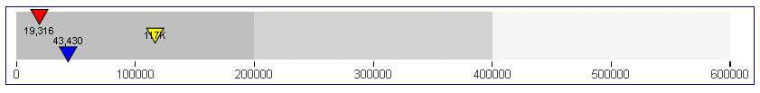
The following request generates a bullet chart and sets the positions of the markers:
GRAPH FILE WF_RETAIL_LITE
SUM MSRP_US
BY PRODUCT_CATEGORY
WHERE PRODUCT_CATEGORY EQ  'Accessories' OR 'Computers' OR 'Stereo Systems'
ON GRAPH PCHOLD FORMAT JSCHART
ON GRAPH SET VAXIS 80
ON GRAPH SET LOOKGRAPH CUSTOM
ON GRAPH SET STYLE *
*GRAPH_JS
chartType: 'bullet',
border: {width:1, color:'navy'},
bulletProperties: {drawFirstValueAsBar: false},
dataLabels: {visible: true, font: '6pt'},
yaxis: {
   colorBands: [
         {start: 0,stop: 200000,color: 'silver'},
         {start: 2100000,stop: 400000,color: 'lightgrey'},
         {start: 400000,stop: 600000,color: 'whitesmoke'},
       ],
},
series: [
{series: 'all', showDataValues: true},
{series: 0, group: 0, color: 'blue', marker: {size: 15, position: 'bottom'}},
{series: 0, group: 1, color: 'red', marker: {size: 15, position: 'top'}},
{series: 0, group: 2, color: 'yellow', marker: {size: 15, position: 'middle'}}
]
*END
INCLUDE=ENIADefault_combine.sty,$
ENDSTYLE
END
On the output, the yellow marker is positioned in the middle of the data text, the red marker is above the data text, and the blue marker is below the data text:
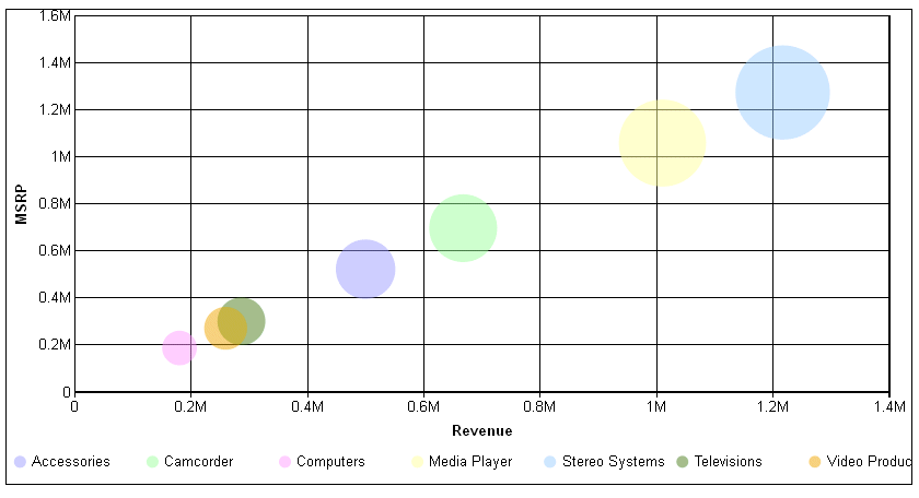
In the following request, the fillEffect:'50%' property makes the bubble markers partially transparent:
GRAPH FILE WF_RETAIL_LITE
SUM  REVENUE_US MSRP_US DISCOUNT_US
BY PRODUCT_CATEGORY
ON GRAPH PCHOLD FORMAT JSCHART
ON GRAPH SET LOOKGRAPH BUBBLE
ON GRAPH SET STYLE *
*GRAPH_JS
series:[
{series: 'all', marker: {shape:'circle',fillEffect: '50%'}}
]
*END
ENDSTYLE
END
On the output, the bubble markers are 50% transparent, as shown on the following image:
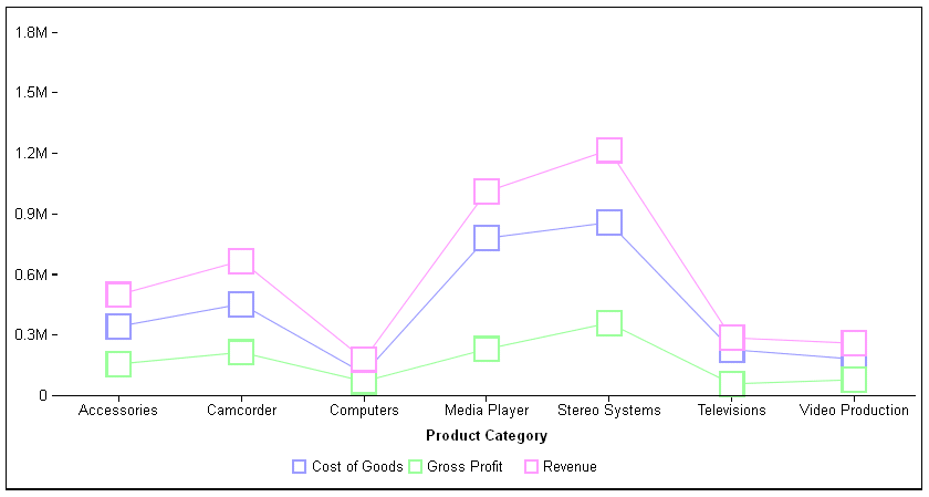
The following request generates a line chart with the 'seriesAuto' fill effect which, for line charts, is equivalent to 'seriesWhite':
GRAPH FILE WF_RETAIL_LITE
SUM COGS_US GROSS_PROFIT_US REVENUE_US
BY PRODUCT_CATEGORY
ON GRAPH PCHOLD FORMAT JSCHART
ON GRAPH SET LOOKGRAPH VLINE
ON GRAPH SET STYLE *
*GRAPH_JS
series: [
   {series: 'all', marker: {border: {width:2},
     size:20, fillEffect:'seriesAuto'}},
]
*END
ENDSTYLE
END
The output is shown on the following image: