Syntax: How to Define Discrete a Color Scale for a Heatmap or Choropleth
For discrete mode, the syntax follows.
colorScale: {
colorMode:{mode: 'discrete'},
colorBands: [
{
start: startval,
stop: stopval,
color: 'bcolor' }
   .
   .
   .
]
}
where:
- startval
Is a number or percent string that defines where to start the color band.
- stopval
Is a number or percent string that defines where to stop the color band.
- bcolor
Defines the color of the band.
For continuous mode, the syntax follows.
colorScale: {
  colorMode:{mode: 'continuous'},
  colors: ['color1','color2', '..., 'colorn']
}
where:
- 'color1','color2', '..., 'colorn'
Specify the colors to be blended.
Note: If you set the color mode to 'continuous' but define color bands, the chart will be visualized in discrete mode.
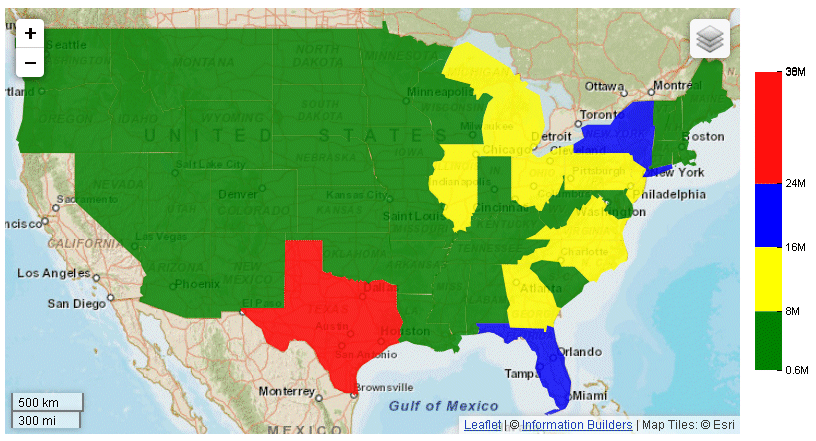
Example: Defining a Discrete Set of Color Bands for a Choropleth
The following request defines a choropleth with discrete color bands.
GRAPH FILE WF_RETAIL_LITE
SUM MDN.STATE_PROV_POPULATION
BY STATE_PROV_NAME
WHERE COUNTRY_NAME EQ 'United States'
WHERE STATE_PROV_NAME NE 'Puerto Rico'
ON GRAPH PCHOLD FORMAT JSCHART
ON GRAPH SET LOOKGRAPH CHOROPLETH
ON GRAPH SET STYLE *
*GRAPH_JS
mapProperties: {
  engine: 'leaflet',

leaflet: {
initPos: {
                  center: [37.8, -96],
                  level: 4
            },overlayLayers: [{
title: 'United States of America',
dataLookup: 'properties.state_name',
layerInfo: {
maxZoom: -1,
minZoom: -1,
type: 'regions'
},
type: 'tdg',
url: function(){ return tdgchart.getScriptPath() + 'map/US.json'}
}],
  controls: [
    {control: 'L.Control.Layers'},
    {
     control: 'L.Control.Scale',
     options: {
      imperial: true,
      metric: true }
    }
   ],
baselayers: [{
title: "ArcGIS_World_Street_Map",
layerInfo: {
maxZoom: 17,
minZoom: 0,
attribution: function(){ return "&|copy; <a target='_blank' href='http://www.InformationBuilders.com'>Information Builders</a> | " +
"Map Tiles: &|copy; Esri";}
},
url: function(){ return 'http://services.arcgisonline.com/ArcGIS/rest/services/World_Street_Map/MapServer/tile/{z}/{y}/{x}';}
}]
}
},
legend:{visible:true},
colorScale: {
colorMode:{mode: 'discrete'},
colorBands: [
{start: 0, stop: 8000000,color:'green'},
{start: 8000000, stop: 16000000,color:'yellow'},
{start: 16000000, stop: 24000000,color:'blue'},
{start: 24000000, stop: 38000000,color:'red'}
]
}
*END
INCLUDE=ENIADefault_combine.sty,$
ENDSTYLE
ENDThe chart and legend are visualized using the discrete color bands defined in the color scale, as shown on the following image: