Vertical or horizontal bar graphs highlight relationships and trends among data.
-
Vertical Bar Graph. You
can apply a vertical bar graph to report columns associated with
an ACROSS sort field. The report output displays a vertical bar graph
in a new row above the associated data values, as shown in the following
image.
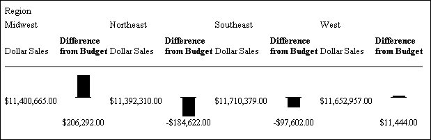
Bar graphs that project above the zero line represent positive values, while bar graphs that project below the zero line represent negative values.
-
Horizontal Bar Graph. You
can apply a horizontal bar graph to report columns. The report output
displays a horizontal bar graph in a new column to the right of
the associated data values, as shown in the following image.
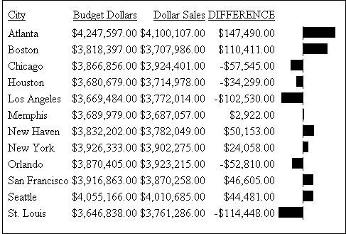
Bar graphs that project to the right of the zero line represent positive values, while bar graphs that project to the left of the zero line represent negative values.
The length of each vertical or horizontal bar graph is proportional to the magnitude of its associated data value. The shortest bar graph appears for the value with the minimum magnitude, the longest bar graph for the value with the maximum magnitude, and bar graphs of varying length appear for each value within the minimum-maximum magnitude range. Notice in the figure that a value of 147,490.00 produces a longer horizontal bar graph than a value of 50,153.00. Therefore, a complete row of vertical bar graphs or a complete column of horizontal bar graphs forms a bar chart.
You can only apply data visualization bar graphs to numeric report columns (integer, decimal, floating point single-precision, floating point double-precision, and packed). Bar graphs applied to alphanumeric, date, or text field formats are ignored.
You can display data visualization bar graphs in:
- OLAP-enabled HTML reports, where bar graphs are applied to measures. For more information on OLAP, see the Online Analytical Processing (OLAP) manual.
- Other HTML,
PDF, or PostScript reports, where bar graphs are applied to columns. See Associating Bar Graphs With Columns in
the Creating Reports With Report Painter manual.
You can also apply data visualization bar graphs to columns by adding a StyleSheet declaration to a procedure that includes the GRAPHTYPE attribute. For details, see the Creating Reports With WebFOCUS Language manual.