- Sign in to WebFOCUS as a developer or an administrator.
-
In the Resource
tree, right-click the Portals node, then
click New Portal.
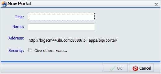
The New Portal dialog box opens, as shown in the following image.
-
Populate
the fields of the New Portal dialog box.
See Launching the Portal Designer for more information on creating a new portal.
-
Click OK.
The Portal Designer opens.
-
In the Properties
panel, set the Width to Responsive, as shown
in the following image.
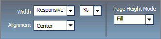
Keep the default values for the Alignment and Page Height Mode options.
The banner width changes in live preview to match the closest preset width.
-
Click the
page canvas to select it.
The Properties panel changes to the Page properties.
-
Set the
Margins to 0 and select the Same for All check
box, as shown in the following image.
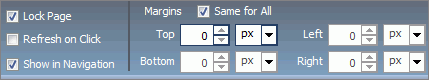
Note: Keep the Lock Page check box selected to prevent end users from interfering with the responsive behavior.
- Change the Page Title, if needed.
-
Right-click
the page canvas, and then click Page Layout.
The Choose a Layout menu opens.
- Click One Column.
-
On the Insert tab,
in the Containers group, click Responsive.
The responsive container is inserted, taking up the full width of the page.
-
In the Properties
panel, change the Height to auto.
The responsive container now fills the entire canvas area.
-
In the Properties
panel, click the Responsive Panel Properties button.
The Responsive Panel Properties dialog box opens, as shown in the following image.
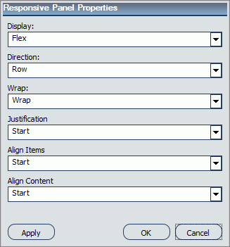
- Under Justification, click Center. Keep the default values for all other properties, and then click OK.
-
Install
the sample content files by typing the following link into your browser: https://techsupport.informationbuilders.com/tech/wbf/wbf_Responsive_BI_Portal.html
Note: The sample content files include sample charts, reports, and development widgets, which you can use to familiarize yourself with the responsive design principles. You can also use the development widgets to create a visual template of your portal, and then populate this template with your existing content.
Follow the instructions provided with the sample content to import the files and developement widgets to the Resource tree of your portal.
-
On the Insert tab,
in the Content group, click WebFOCUS Resources.
The Resource tree opens on the right side of the Portal Designer.
- In the Resource tree, under the Content node, locate your sample content.
-
Drag four
small and two large development widgets onto the canvas.
Each widget displays its own dimensions, such as width and height in relation to the browser size. It also shows the width and height range for a device and portal page at run time.
- Multiselect the two large widgets by holding the Ctrl key.
-
Click the
arrow in the upper-right corner of either of these widgets, then click Responsive
Item Properties.
The Responsive Item Properties dialog box opens, as shown in the following image.
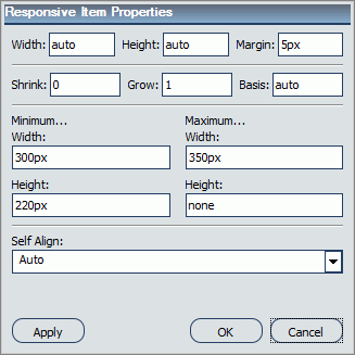
Note: In a responsive portal, setting fixed dimensions for items is not recommended, because the viewport width and height continually change from device to device. Responsive layouts need to adapt to this change, whereas fixed dimensions create too many constraints. For this reason, you must only set a range between minimum and maximum width and height, defining the amplitude with which the item can vary in size.
-
Set the
responsive item properties, as follows:
- Set Minimum Width to 380px.
- Set Maximum Width to 710px.
- Set Minimum Height to 420px.
Keep the default values for all other properties, and click OK.
The two large widgets change size simultaneously. The layout now features two even lines of widgets, as shown in the following image.
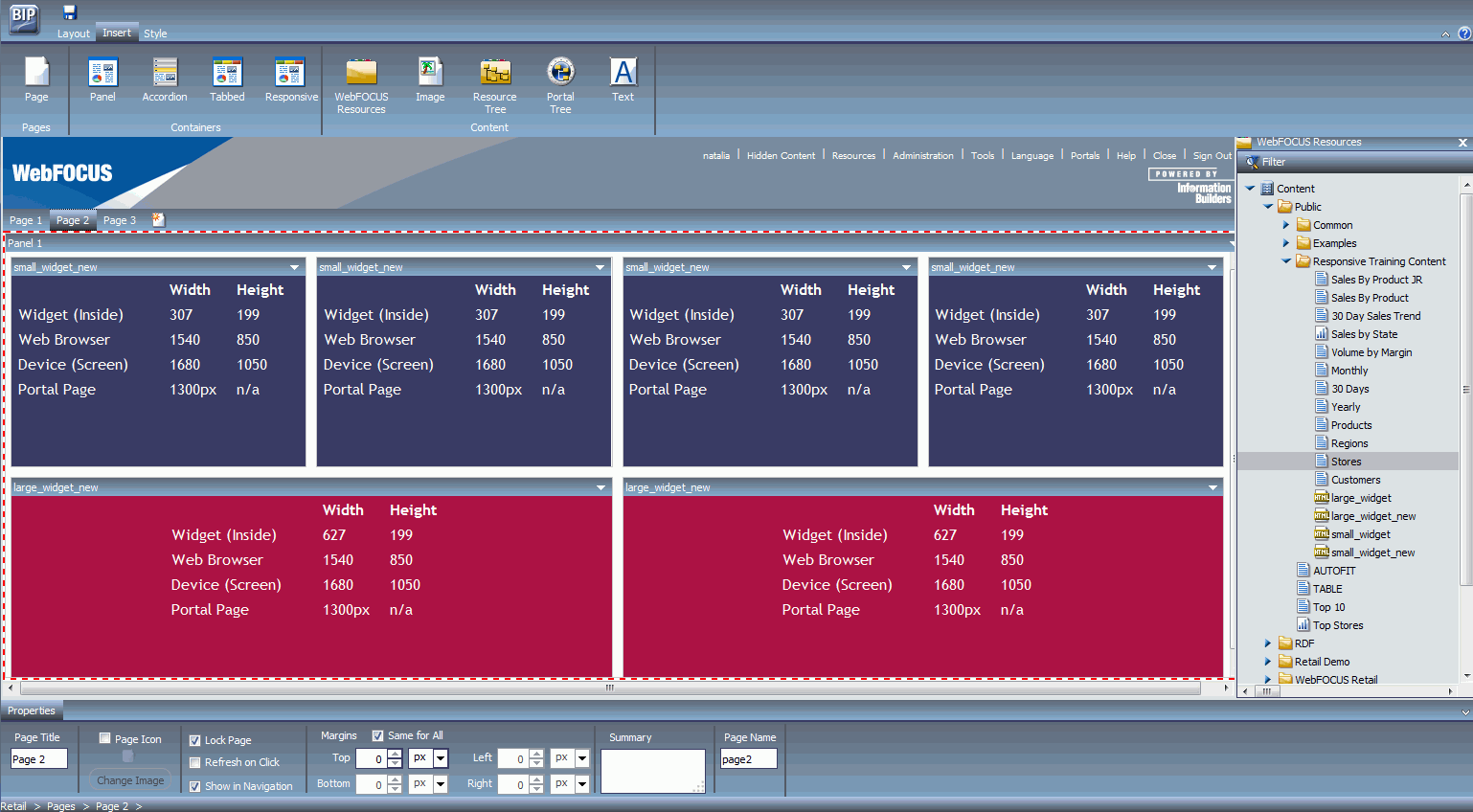
Your template is now ready to be populated by content.
-
Drag reports
and charts on top of each widget to populate it.
The widgets refresh displaying the selected content, as shown in the following image.
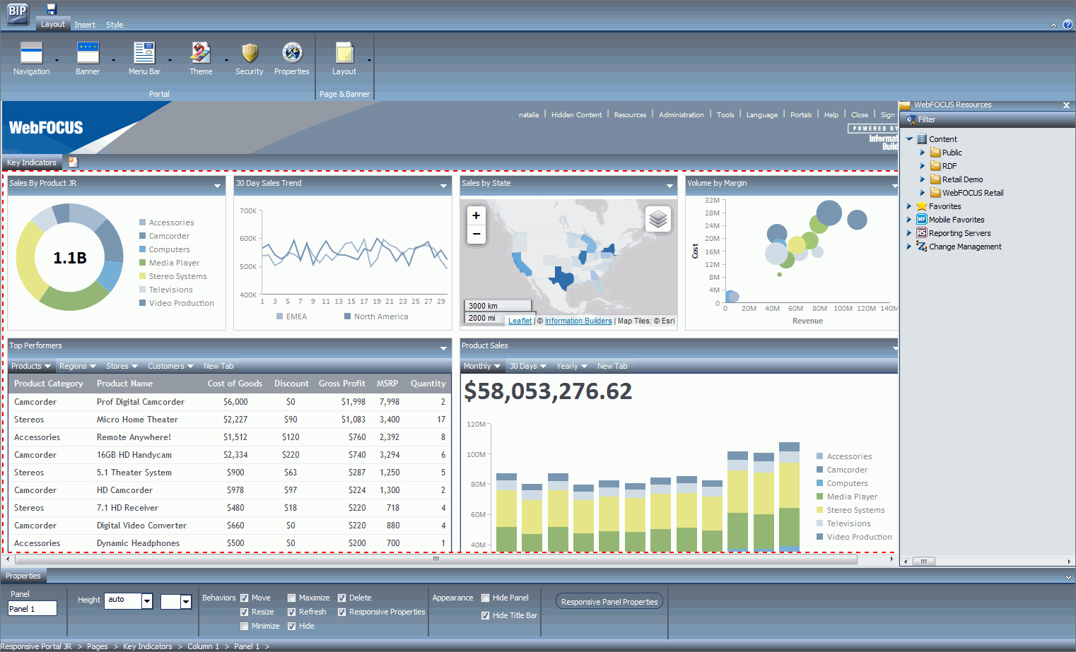
Note: You can drag several items onto a singular widget, or add items to the existing content while holding the Ctrl key, to create tabs.
-
To ensure
clean and uncluttered look of the portal at run time, make the following
customizations:
- Click the responsive container, and then select the Hide Title Bar check box in the Properties panel.
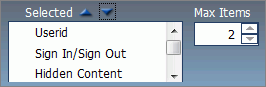
- Click on the Menu
bar, and then edit Max Items and Selected in the Properties panel
to make the Menu Bar compatible with the small devices. The examples
of the shortened Menu Bar and its corresponding settings is shown
in the following images.
- Click the Powered by Information Builders logo, and then clear the Show check box in the Properties panel.
- Click the banner,
and then set Height to 46 and select the Collapsible check
box in the Properties panel, as shown in the following image.
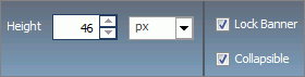
Note: Clear the Minimize, Maximize, Move, Resize, Hide, Delete, and Responsive Properties check boxes in the Properties panel, to prevent end users from interfering with the responsive behavior.
-
Click the Save button
and close the Portal Designer.
Your new responsive portal now appears below the Portals node in the Resource tree.