The responsive container is designed to help you build
a responsive portal that automatically adapts to different screen
sizes and mobile devices, providing an optimal viewing experience
for users everywhere. You can build your responsive portal on your desktop,
and make it available to users on different platforms. The following
image shows an example of a responsive portal displayed on a desktop,
tablet, and smartphone.

The responsive container intuitively changes its layout when
you change the size of your browser. The default width and height
of the container, and the inserted items, are pre-configured to
offer the best positioning of the elements on the screen. You can
manually change the dimensions of the items in the Responsive Item
Properties dialog box. You can also change the layout options in
the Responsive Panel Properties dialog box.
xResponsive Item Properties
The Responsive Item Properties dialog box provides options
to change the dimensions of an individual item within the responsive
container. You can access the Responsive Item Properties dialog
box at design time by clicking the arrow in the upper-right corner
of the item panel, as shown in the following image.
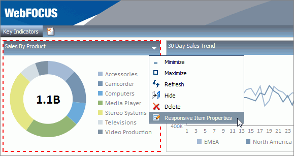
Note: The arrow is only visible if one or more check boxes
are selected in the Panel properties.
The Responsive Item Properties dialog box is shown in the following
image.
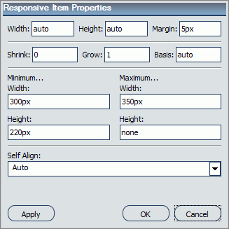
The properties for a responsive item are:
-
Width. Defines
the width of the item.
-
Height. Defines
the height of the item.
-
Margin. Defines
the space between the adjacent items.
-
Shrink. Defines
the ability of the item to shrink if necessary.
-
Grow. Defines
the ability of the item to grow if necessary.
-
Basis. Specifies
the initial size of the item, before any available space is distributed
according to the responsive factors.
-
Minimum Width. Sets
the minimum width of the specified element. This setting overrides
the Width setting.
-
Maximum Width. Sets
the maximum width of the specified item. This setting overrides
the Width setting.
-
Minimum Height. Sets
the minimum height of the specified item. This setting overrides
the Height setting.
-
Maximum Height. Sets
the maximum height of the specified item. This setting overrides
the Height setting.
-
Self Align. Provides
access to the following options:
-
Auto. Intuitively
places the item in the best available space inside the responsive
container.
-
Start. Aligns
the item to the left side of the responsive container.
-
End. Aligns
the item to the right side of the responsive container.
-
Center. Aligns
the item to in the center of the responsive container.
-
Stretch. Stretches
the item to fill the available space inside the responsive container,
while respecting width and height constraints.
-
Baseline (text). Aligns
the baseline of text inside the responsive container.
Note: In a responsive portal, setting fixed dimensions
for items is not recommended, because the viewport width and heigh
continually change from device to device. Responsive layouts need
to adapt to this change, whereas fixed dimensions create too many
constraints. For this reason, you must only set a range between
minimum and maximum width and height, defining an amplitude with
which the item can vary in size.
xResponsive Panel Properties
The Responsive Panel Properties dialog box provides
options to manually change the layout of the items inside a responsive
container. You can access the Responsive Panel Properties at design
time by clicking the arrow in the upper-right corner of the container
panel, as shown in the following image.
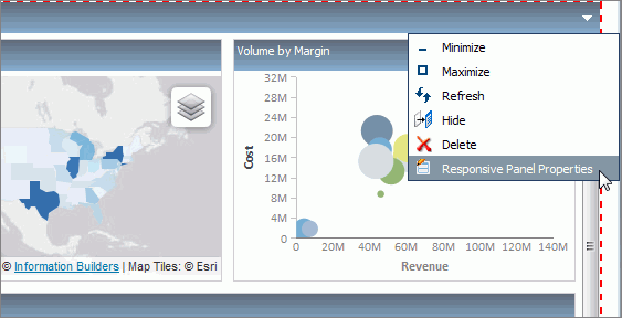
Note: The arrow is only visible if one or more check boxes
are selected in the Panel properties.
The Responsive Panel Properties dialog box is shown in the following
image.
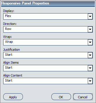
The properties for a responsive panel are:
-
Display. Determines
the behavior of the items inside the responsive container. The values
are:
-
Direction. Specifies
how items are placed in the responsive container, defining the main
axis and the direction (normal or reversed). The values are:
-
Row. Aligns
items in a horizontal line, where the main axis follows the direction
of the content.
-
Row Reverse. Same
as Row, but the start and end points are reversed.
-
Column. Aligns
the items in a vertical line, in descending order.
-
Column Reverse. Aligns
the items in a vertical line, in ascending order.
-
Wrap. Determines
whether the items are forced into a single line or can flow across
multiple lines. The values are:
-
Wrap. Forces
the items flow across multiple lines.
-
No Wrap. Forces
the items into a single line.
-
Justification. Defines
how a browser distributes the available space between, and around
items, when aligning them inside the responsive container. The values
are:
-
Start. Aligns
the items along the right side of the responsive container.
-
End. Aligns
the items along the left side of the responsive container.
-
Center. Aligns
the items symmetrically along an axis in the middle of the container,
leaving an equal gap on either side.
-
Space Between. Distributes
the items evenly along the line with an equal space between the
adjacent items. There is no gap on either side of the container.
-
Space Around. Distributes
the items evenly along the line with an equal space between the
adjacent items. The gap of each side of the container equals half
of the space between two adjacent items.
-
Align Items. Aligns
the items inside the responsive container in the same way as the
Justification property, but in the perpendicular direction. The
values are:
-
Start. Aligns
the items along the top of the responsive container.
-
End. Aligns
the items along the bottom of the responsive container.
-
Center. Aligns
the items symmetrically along a cross-axis of the container. If
the height of the item is larger than the responsive container canvas, it
will overflow equally in both directions.
-
Stretch. Stretches
the items to fill the container canvas without any gaps, while respecting
width and height constraints.
-
Baseline (text). Aligns
the baseline of text inside the responsive container.
-
Align Content. Determines
the alignment of the lines of items inside the responsive container.
This property has no effect on single line formations. The values are:
-
Start. Aligns
the lines of items along the top of the responsive container. There
are no gaps between the lines.
-
End. Aligns
the lines of items along the bottom of the container. There are
no gaps between the lines.
-
Center. Aligns
the lines of items toward the center of the container. There are
no gaps between the lines. The space between the top edge of the container
and the first line is equal to the space between the bottom edge
of the container and the last line.
-
Stretch. Stretches
the lines of items to use the available space. The free space is
split equally between all the lines.
-
Space Between. Distributes
the lines of items evenly inside the container. The spaces between
the adjacent lines are the same. There are no gaps between the edges
of the container and the lines.
-
Space Around.Distributes
the lines of items evenly inside the container. The spaces between
the adjacent lines are the same. The space before the first and
after the last lines equals half of the space between two adjacent lines.