In this section: |
The following image shows the Layout tab.
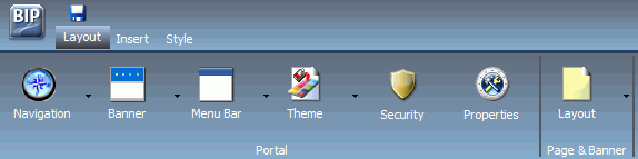
The layout tab has two groups, Portal and Page & Banner.
The following topics describe the options in the Portal group.
The following image shows the Choose a Navigation Layout option.
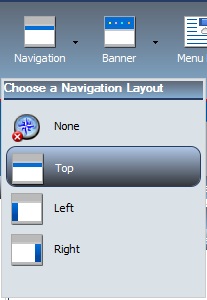
As shown, you can choose among:
- None. There is no navigation menu.
- Top. The navigation menu is located beneath the banner at the top of the window. This is the default layout.
- Left. The navigation menu is located on the left side of the screen in the left banner.
- Right. The navigation menu is located on the right side of the screen in the right banner.
The following image shows the Choose Banner Areas option.
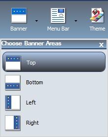
A banner is an area that is visible in the portal no matter what page you are on. You can choose to have no banner or any combination of top, bottom, left, and right banners.
As shown, you can choose among:
- Top. The banner is at the top of the window. This is the default area.
- Bottom. The banner is at the bottom of the window.
- Left. The banner is at the left of the window.
- Right. The banner is at the right of the window.
Click each menu option to turn the associated banner on or off.
The following image shows the Menu Bar.
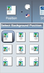
The next image shows the Select Location & Alignment option for the Menu Bar.
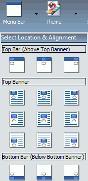
The Menu Bar button allows you to use a visual interface to change the location of the links. You can choose from three main locations:
- Top Bar. The links are displayed above the top banner.
- Top Banner. The links are displayed within the top banner. This is the default location, with a right alignment of the links.
- Bottom Bar. The links are displayed below the bottom banner.
The bar options are thin strips, either at the top or bottom of the window. They are always visible, no matter how far down or up you scroll.
In each of the locations, you can choose alignment options as shown. For example, you can align the links to the left, in the center, or to the right.
The following image shows the Choose a Theme option.
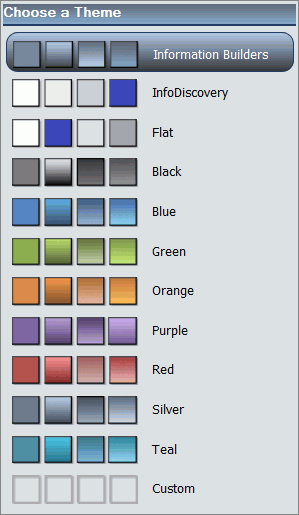
On the Theme menu, you can select from several predefined themes, including a Custom theme. Each theme controls the styling of the banner, the page tabs, the panels, and the styling of the reports.
The default theme is Information Builders.
The Security button launches the Security Rules dialog box, which enables you to specify an audience for the portal and add other designers.
The following image shows the Security Rules dialog box.
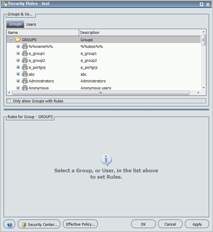
There are four permission sets for portals:
- BIPCreatePortal. Allows you to create a portal.
- BIPFullControl. Gives you design access and personalization features on a portal.
- BIPViewAndCustomize. Provides access to run-time mode only. It saves the position of any content that you rearrange and lets you add new content to your copy of the portal.
- BIPViewOnly. Does not save anything that you do in run-time mode. One use for this operation is anonymous access.
The Page & Banner group has a single Layout button. The following image shows the Choose a Layout option.
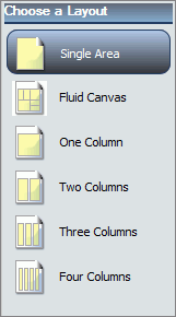
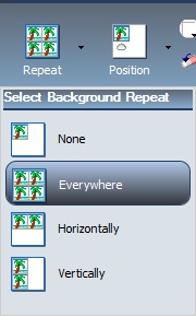
By default, all banner areas and pages are single area (free-form) layouts. You can use the Layout option to change to a column-based layout or to a fluid layout. In a column-based layout, dragging a panel results in a drop indicator, showing where the panel goes. In a fluid layout, the content automatically fills the page area in equal proportions. You can manually rearrange and nest these elements on the page. The display area changes its size depending on your browser dimensions. A page can have one of the following layouts:
- Single Area (default). There is no grid, and all items are free flowing.
- Fluid Canvas. Items are dragged to a floating drop target that arranges the content evenly and redistributes space as more items are added.
- One Column. The content stretches to fill the entire page area.
- Two Columns. The page is evenly divided into two columns.
- Three Columns. The page is evenly divided into three columns.
- Four Columns. The page is evenly divided into four columns.
When you choose any option other than Single Area, items snap to place within the area.
 launches
the color selection dialog box for setting a page background color.
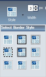
The same icon is used in the Border and Font groups to set the border
and font colors, respectively.
launches
the color selection dialog box for setting a page background color.
The same icon is used in the Border and Font groups to set the border
and font colors, respectively.
 in the
Background group resets the background styling to the theme settings
for the currently selected state. The same icon is used in the Border
and Font groups to reset those groups.
in the
Background group resets the background styling to the theme settings
for the currently selected state. The same icon is used in the Border
and Font groups to reset those groups.
 launches
the color selection dialog box for setting the Font color.
launches
the color selection dialog box for setting the Font color.