
In this section: |


Guidelines
When you are designing a visual display of your data, consider these factors:
Too many Charts on a Page?
Here are things to try if you find your Page to be unable to fit all of the charts you think you need:
Ranking with Filters. The primary focus is on a measure (like sales) broken down by a categorical grouping like product line. Typically, data is grouped in bar chart and/or pie chart. The Bar Chart or Pie Chart provide the grouping; other supportive components are included for slicing, filtering, and details.

Multiscape with filters. The primary focus is on a measure broken down by the cross-product of two groupings (example: quarterly sales by region). Data is grouped in a Multiscape chart. To see trends, you can rotate, zoom, or scale the Multiscape.

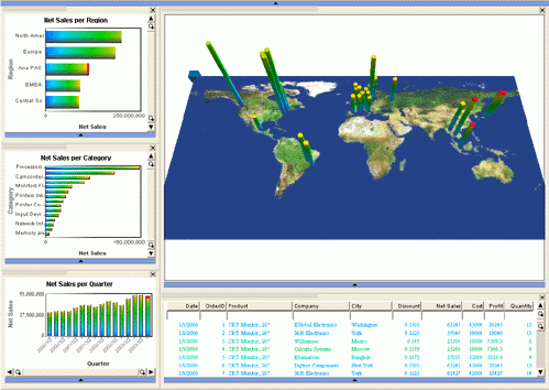
Maps. The focus of this page is where. Data points are plotted on an image or vector map with height representing a measure. Optional links highlight relationships between geographical entities. To see trends, you can rotate, tilt, zoom or scale the map as required.
Relationships with filters. Use this type of page to view abstract structures or relationships (examples: product affinities, organizational structures). Data points are displayed in a graph hierarchically or in a mesh. Node size/color/shape can represent different entity attributes. To see trends, you can rotate, tilt, zoom or scale the graph as required.

Correlations with Filters. Use this type of page to view correlations between data items with size, color, shape for displaying attributes and univariate displays for understanding other attributes and for filtering.

Advanced correlation with filters. This page type can be used to correlate multiple metrics and/or multiple dimensions in a single chart. A Parabox is used to display data.

Multiple relationships. Interactions of multiple fields are shown via a Parabox; geospatial aspects are shown via a map. Univariate displays provide filtering, and a Data Sheet provides details.

KPIs with filters. This page is very effective when you want to focus on KPIs across multiple dimensions. Charts used in this type of page include: Line Chart, Histogram, and Scatterplot.

Multiple univariate displays. Multiple univariate displays show multiple fields. Coloring and selection show interactions between dimensions. Use the normal bar charts to select a subpopulation. The Pie Chart and spine plot variety of Bar Chart provide comparison of that subset of the population to the whole population as a fraction of the whole.

| WebFOCUS |