Using Grids and HTML Tables

In this section:

How to:

Reference:

The Grid controls and the HTML Table control display the contents of a data source stack to end users. The Grids differ from the HTML Table in that they enable you to directly change data in a stack.

There are two different read/write grids available: the ActiveX Grid and the JavaScript Grid.

The ActiveX Grid control has been available since WebFOCUS Maintain 4. It supports JavaScript and VBScript.

Installation of WebFOCUS Developer Studio will automatically register the control on your machine to enable it for local deployment.

For web deployment, the first time an application containing the ActiveX Grid control is run, it requires a one-time download of the signed ActiveX control for registration on the client (except if WebFOCUS Developer Studio is also installed on the client). The browser security settings under Internet Options should allow a prompt or enable for downloading signed ActiveX controls.

Some browsers, such as Firefox®, do not support ActiveX.

The JS Grid is available for new development as of WebFOCUS Maintain Release 7.7. It is not an ActiveX control and does not require anything to be registered on the client. It can be run in non-IE browsers, such as Firefox.

Note: VBscript is not supported with the JS Grid.

The ActiveX Grid and the JS Grid share the same dialogs and most settings within the MDE, including Properties and Events. The exceptions are noted. Functions must be coded differently and are outlined in separate sections.

For an example of using the original ActiveX grid, see the WebFOCUS Maintain Advanced Tutorial in the Maintain Getting Started manual. For an example of using HTML tables, see the WebFOCUS Maintain Basic Tutorial in Maintain Getting Started manual and Using an HTML Table to Display the Results of a WebFOCUS Report.


Top of page

x
Procedure: How to Place a Read/Write Grid or an HTML Table on a Form
  1. Select the ActiveX Grid control ActiveX Grid control, the JS Grid control JS Grid control, or the HTML Table control HTML Table control in the Controls palette.
  2. Draw a rectangle on your form approximately where you want to place your read/write grid or HTML table, at approximately the size you want.
  3. WebFOCUS Maintain automatically opens the Control Columns dialog box. You can also open this dialog box by double-clicking the read/write grid or with the Columns property. Select a data source stack from the Stack drop-down list. You can create a data source stack by clicking New. For more information, see How to Create a Data Source Stack Explicitly Using the Stack Editor.
  4. Select the columns in the data source stack that you want to display and click the right arrow button . 
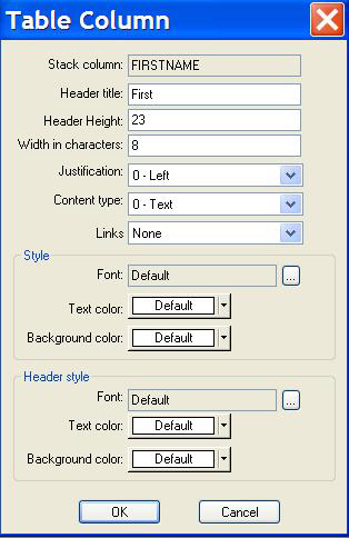
WebFOCUS Maintain adds these columns to the Table Columns box.

    To remove a column from the Table Columns box, select it and click the left arrow button .

  5. If you want to remove row numbers, clear the Include a row number column check box.
  6. If you want to change the order of the columns in the Column Selection box, select them and use the up To change columns button and down arrows To change columns button .
  7. To sort your columns by title, column, or width, click the corresponding button (Header Title, Column, or Width) in the Table Columns box.
  8. To format a column, double-click in the Table Columns box to open the Grid Column Properties or Table Column dialog box.
  9. Click OK to leave the Control Columns dialog box.
  10. Giving your grid or HTML Table a more meaningful name than gridn or HTMLTablen is optional, but recommended.
  11. If necessary, readjust the size and placement of your grid or HTML Table.

Tip: If you want to add a column to your HTML Table from the data source stack used by the table, drag it from the Project Explorer to the HTML Table. WebFOCUS Maintain will add it to the end.


Top of page

x
Reference: Control Columns Dialog Box

Use the Control Columns dialog box, shown in the following image, to populate a grid or HTML Table with data.

Control Columns Dialog box

This dialog box includes the following options:

Stack

Displays the data source stacks available in this procedure.

New

Creates a data source stack with the Stack Editor.

List of columns in selected data source stack

Contains the columns in the data source stack you selected in the Stack list.

right arrow button

Includes the column you selected in the list of data source stack columns in the Table columns box.

left arrow buttom

Removes the column you selected in the Table columns box.

Table columns

Lists the columns that the HTML Table will display.

Header Title

Displays each of the column headings, and sorts the table by the header title when clicked.

Header Height

The default height for the header can be changed to accommodate additional lines in the Header Title. The default value for the Header Height is 23.

Note: Changing this value for a column adjusts the height for the entire header line.

Applies to HTMLTable and JS Grid.

Column

Displays the name of the column in the data source stack, and sorts the table by its column name when clicked.

Width

Displays the number of characters in a column, and sorts the table by width when clicked. Data values will automatically wrap when the length exceeds the width of the column.

Include a row number column

Displays row numbers in the HTML Table when checked.

Move Up buttton

Moves a selected column up in the list of columns.

Move Down button

Moves a selected column down in the list of columns.


Top of page

x
Reference: Table Column/Grid Column Properties Dialog Box

Use the Grid Column Properties/Table Column dialog box, shown in the following image, to format columns in your grid or HTML Table.

Table Column dialog box

This dialog box contains the following elements:

Stack column

Displays the column name.

Header title

Contains the title of the column that will be displayed at run time. By default, this is the column name, but you can type something else here.

Header height

The default height for the header can be changed to accommodate additional lines in the Header Title. The default value for the Header height is 23.

Note: Changing this value for a column adjusts the height for the entire header line. This applies to HTMLTable and JS Grid.

Width in characters

Contains the width of the column. You can type a new value here.

Justification

Enables you to left-justify, center, or right-justify the contents of a column.

Content Type

For HTML Tables only. Specifies the content of your column as text, HTML, or the path to an image. If you specify the content of your column as text, your stack column will be displayed in the table. If you specify the content of your column as HTML, WebFOCUS Maintain assumes that you have HTML code in your stack column. Therefore, it interprets the column as HTML. If you specify the path to an image, WebFOCUS Maintain assumes that the stack column contains the name and location of an image. Note that if the path contains backslashes, you must use double backslashes (for example, C:\\ibi_img\\graphic.gif).

Links

For HTML Tables only. Specifies whether your table will have drill-down links from the column body or heading. For more information, see Creating Links in HTML Tables.

Read Only

For Grids only. Prohibits users from writing to the read/write grid when checked.

Font

Changes the font, font style, and size of the text in your column or header.

Text Color

Changes the color of the text in your column or header. For more information on text color, see Defining Colors for Your Form and Controls.

Background Color

Changes the background color of your column or header. For more information on background color, see Defining Colors for Your Form and Controls.


Top of page

x
Reference: Events Available in a Read/Write Grid

The following section lists the events available for the ActiveX and JS read/write grids.

Note: Maintain and IWC triggers are not supported for the following events: Focus, OnEditStart, OnEditFinish, OnColSized, OnColChange, OnCanViewMove. These events must be called using JavaScript (JS grid, ActiveX grid) or VB Script (ActiveX grid).

Blur

Occurs when the cursor or focus is moved to another cell or object. This event is called by On Entry in the V3 grid.

Focus

Occurs when the cell is highlighted. Maintain triggers and IWC triggers are not supported for this event. This event is called by On Exit in the V3 grid.

OnCanViewMove

Occurs any time a new column or row comes into view by each up, down, left or right arrow key and also by the scroll bar.

It will trigger for each row or cell, so the scroll bar will cause it to trigger repeatedly. Maintain triggers and IWC triggers are not supported for this event. This event is called by ViewPortChanged in the V3 grid.

OnCBDClicked

Occurs when the end user double-clicks the corner button.

OnCBLClicked

Occurs when the end user left mouse clicks on the corner button.

OnCBRClicked

Occurs when the end user right-clicks on the corner button.

OnCellChange

Occurs when a cell changes focus.

OnCellChanged

Occurs when the cursor moves to another control.

OnCharDown

Occurs when the end user presses a character on the keyboard.

OnColChange

Occurs when a column changes focus. Maintain triggers and IWC triggers are not supported for this event.

OnColSized

This notification can be used to assign any given columns a specific width. If you are creating an application such as a calendar, you must assign each column a specific width. Maintain triggers and IWC triggers are not supported for this event.

OnEditFinish

This notification enables you to cancel any edits which the user has performed on the cell. Maintain triggers and IWC triggers are not supported for this event.

OnEditStart

Occurs when a edit is about to start. You can edit a cell by calling the StartEdit function. For example, a message box can be used to inform users when they are about to edit a cell. Maintain triggers and IWC triggers are not supported for this event.

OnHitBottom

Occurs if the bottom row of the grid has been reached. By processing this notification, new rows can be added to the grid dynamically. If the grid tries to go past its current bottom, it first asks the default data source to check and see if more records exist (up to numrows+rowspast).

OnKeyDown

Occurs when the end user presses a key on the keyboard. This event encompasses the following events from V3: Page Up, Page Down, Home, End, Up Arrow, and Down Arrow.

OnLClicked

Occurs when the end user left mouse clicks on a given cell.

OnRClicked

Occurs when the end user right-clicks on a given cell.

OnRowChange

Occurs when the end user changes the focus from Row A to Row B.

OnRowSized

Occurs when the end user changes the row size.

OnRowSizing

You can use this notification to set a default size for all of the rows. After this is set, the end user cannot change the size of the rows.

OnSHDClicked

Occurs when the end user double-clicks the side heading.

OnSHLClicked

Occurs when the end user left-clicks the side heading.

OnSHRClicked

Occurs when the end user right-clicks on the side heading.

OnTHDClicked

Occurs when the end user double-clicks event the Top heading. Remember the top heading has a value of -1, and if there are multi-top headings, then each heading has a value which decrements by -1.

OnTHLClicked

Occurs when the end user left-clicks the Top Heading.

OnTHRClicked

Occurs when the end user right-clicks the Top heading.

Note: The following parameters are reserved for internal use and are not to be reset by the developer: processed, updn, and cancelflag.


Top of page

x
Changing the Properties of a Grid or HTML Table

When you select your grid or HTML Table, you will see a list of grid properties in the property sheet. Changing these properties will change what your grid or HTML Table looks like and how it behaves at run time.

Many of the styling properties can also be changed using a Cascading Style Sheet. For more information on Cascading Style Sheets, see Using Cascading Style Sheets.

Choose your property based on the task you wish to perform:

If you want to change the contents of the grid or HTML Table, use the Columns Property to open the Control Columns dialog box. For more information, see Control Columns Dialog Box.

If you want to change the name of the grid or HTML Table that identifies it to the procedure, use the (Name) Property. For more information, see the (Name) Property.

If you want to change the size or location of the grid, use the Bottom Property, Left Property, Right Property, Top Property, or use a style sheet. For more information, see the Bottom Property, Left Property, Right Property, and Top Property. You can also move or resize the grid directly in the form.

If you want to change the size or location of the HTML Table, use the Overflow Property set to Clip or Scroll. The Clip setting allows you to restrict the length of the HTML Table. Only the Scroll setting allows the entire HTML Table, including the width, to be resized. Vertical and horizontal scroll bars are automatically provided when the data exceeds the control size. Use the Bottom, Left, Right, or Top properties, if they are regulated by the Overflow setting. You can also move the location of the HTML Table directly on the form.

If you want to omit the header, use a style sheet or use the Headers Property.

If you want to change the color of the grid or HTML Table, the BackColor and ForeColor properties have the precedence in the following order:

  1. Use the Columns Property to open the Control Columns dialog box and then double-click a column to open the Table Column/Grid Column Properties Dialog Box.
  2. Use the HeaderForeColor Property to determine the color of the text in the header. For more information, see HeaderForeColor Property .
  3. Use the HeaderBackColor Property to determine the color of the background of the header. For more information, see HeaderBackColor Property.
  4. Use the AlternateRowColor Property to turn every other row a different color. For more information, see AlternateRowColor Property.
  5. Use the ForeColor Property to determine the color of the text. For more information, see ForeColor Property.
  6. Use the BackColor Property to determine the background color. For more information, see BackColor Property.
  7. Use the column header color.
  8. Use the column back or fore color, which overrides the column color, but not the control header color.
  9. Use the control header color.
  10. Use the control back or fore color.

For an HTML Table only, you can use a style sheet.

If you want to control which columns remain stationary while scrolling the grid, use the FixedColumns Property. For more information, see FixedColumns Property.

If you want to change the text of the font, the Font Property has precedence in the following order:

  1. Use the Columns Property to open the Control Columns dialog box and then double-click a column to open the Table Column/Grid Column Properties dialog box. For more information, see Table Column/Grid Column Properties Dialog Box.
  2. Use the Font Property and HeaderFont Property. For more information, see Font Property and the HeaderFont Property.
  3. Use the column header font.
  4. Use the column back font, which overrides the column font but not the control header font.
  5. Use the control header font.
  6. Use the control back font.

For a HTML Table only, you can use a style sheet.

If you want to add a border to the HTML Table, use the Border Property to determine whether you have a border and what type of border it is. The BorderColor Property allows you to determine the color of the border. The BorderWidth Property allows you to determine the width of the border. You may need to increase the BorderWidth and change BorderColor in order to take full advantage of some of the border types. You can also use a style sheet for HTML Table only.

If you want to display lines between columns and rows, use a style sheet for HTML Table only or use the GridLines Property. For more information, see GridLines Property.

If you want to make the grid or HTML Table inactive or make it invisible, use the Enabled Property to determine whether the button is active or not. If the button is inactive, it will be dimmed out and nothing will happen when the end user clicks it. You can also use the Visible Property to determine whether the button is visible to the end user or use a style sheet. For more information, see the Enabled Property and the Visible Property.

If you want to change what the cursor looks like when it is on top of the grid or HTML Table, use the CursorPointer Property or use a style sheet. For more information, see the CursorPointer Property.

If you want to display a tooltip when the cursor is on the top of the grid or HTML Table, use the ToolTipText Property. For more information, see the ToolTipText Property.

If you want to assign a Help topic to the grid or HTML Table, use the Help Property. For more information, see Assigning Help to Your Forms and Controls.

If you want to move the grid or HTML Table to another layer, use the Layer Property. For more information, see Layering Controls.

If you want to control the display order of the HTML Table or JS Grid when more than one control is overlaid, use the ZIndex Property. This cannot be used with the ActiveX grid control. For more information, see the ZIndex Property.


Top of page

x
Creating Links in HTML Tables

How to:

A link in an HTML Table enables the end user to click a cell to drill down to other tables, forms, reports, or webpages.

For an example of this process, see the Maintain Getting Started manual.


x
Procedure: How to Create Links in an HTML Table Column
  1. Select the HTML Table and use the Columns property to open the Control Columns dialog box.
  2. Double-click a column that you want to be clickable to open the Table Column dialog box.
  3. In the Links list, select Header only if you want the header for that column to be clickable. Select Body only if you want the body of the column to be clickable. Select Body and Header if you want both the header and body to be clickable.
  4. Click OK to close the Table Column dialog box and return to the Control Columns dialog box.
  5. Repeat steps 2 through 4 for any additional columns you want to be clickable.
  6. Click OK to close the Control Columns dialog box.

    When you deploy and run your application, you will see that the areas you designated as clickable, will be blue and underlined.

  7. Open the Event Handler editor for the HTML Table and select the ClickLink event.
  8. Enter the code for the action to be performed when an end user clicks one of the links in the HTML Table.

    If your action is a Maintain function, you can use special syntax to determine the row number, column number, or value of the cell that is clicked. For more information, see How to Determine Row Number, Column Number, or Value of the Cell When an HTML Table Is Clicked.

    If your action is a JavaScript or VBScript function, you can use special syntax to determine the row number, column number, or value of the cell that the end user clicked. For more information, see Defining Events and Event Handlers.

Note: Because clicking on a row in an HTML Table does not result in a selection (unlike clicking an item in a list or combo box), WebFOCUS Maintain does not set the FocIndex of the underlying data source stack to the number of the current row (as it does for list box or combo box selections). To set FocIndex to the last clicked row, see How to Reset FocIndex in a Data Source Stack for an HTML Table.


x
Syntax: How to Determine Row Number, Column Number, or Value of the Cell When an HTML Table Is Clicked

If you use a Maintain function to handle the ClickLink event in an HTML Table, then you can use special syntax in your function to determine what part of the HTML Table the end user clicked.

If you want to determine the row number, use:

formname.tablename.ClickRow

The header row returns 0, and the first data row returns 1.

If you want to determine the column number, use:

formname.tablename.ClickColumn

If you want to indicate the value of the cell, use:

formname.tablename.Value


x
Syntax: How to Reset FocIndex in a Data Source Stack for an HTML Table

When the end user clicks a row in an HTML Table, use the following syntax to reset the value of FocIndex (the number of the current row) for the data source stack associated with that table:

COMPUTE stack.FocIndex = form.HTMLTable.ClickRow;

This is useful if you want to perform some operation on that particular row of the data source stack (display it or change it).


Top of page

x
Using Functions in the Read/Write Grids

How to:

Reference:

Within the read/write grids, you can use script functions to alter the properties of the grid. Functions for the ActiveX Grid can be written using either VBScript or JavaScript. Functions for the JS Grid can be written in JavaScript only. For a complete list of functions available for each grid, see Property Functions in the ActiveX Read/Write Grid and Property Functions in the Read/Write JS Grid. Examples are given for the most commonly used functions.


x
Reference: Property Functions in the ActiveX Read/Write Grid

Name of Function

VBScript

Result

AddFont

fontid=Formn.Gridn.AddFont 
(fontid, 0, 1)

Text in the cell indicated by column and row number will appear in the font indicated by fontid.

QuickSetFont

Formn.Gridn.QuickSetFont c,r, fontid

Sets font for specified cells.

RedrawAll

Formn.Gridn.RedrawAll

Updates grid when you have made changes.

AddTab

Formn.Gridn.AddTab "text", n

When the tab is clicked the sheet will display the text in cell n.

CellGetReadOnly

CellSetReadOnly

Formn.Gridn.GetCell c, r, 
Formn.Gridn.
CellSetReadOnly [True|False]
read=Formn.Gridn.CellGetReadOnly

Sets specified cell to read only access when set to True.

CellGetText

CellSetText

Formn.Gridn.GetCell c, r,
Formn.Gridn.GetCellText
Formn.Gridn.CellSetText "text"

Retrieves the text of a given cell and sets the text of that cell.

QuickSetText

Formn.Gridn.QuickSetText c,r, "text"

Serves as an alternative method to using CellGetText and CellSetText individually.

CellGetTextColor

color = Formn.Gridn.
CellGetTextColor(r g b)

Specifies the color of the text in a cell. Values for r, g, and b specify the desired intensity of red, green, and blue. The values are on a scale of 0 to 255.

QuickSetTextColor

Formn.Gridn.QuickSetTextColor
0, 0, RGB(r,g,b)

Sets the text color of the specified cell.

QuickSetBackColor

Formn.Gridn.QuickSetBackColor
0, 0, RGB(r,g,b)

Sets the background color of the specified cell.

GetCurrentColumn

column=Formn.Gridn.
GetCurrentColumn

Identifies the column that is clicked on or selected by user.

GetCurrentRow

row=Formn.Gridn.GetCurrentRow

Identifies the row that is clicked on or selected by user.

GetGridDefault

Formn.Gridn.GetGridDefault

Default grid is set to 10 columns and 10 rows.

QuickSetMask

Formn.Gridn.QuickSetMask 0,
0, "###"

Selectively includes or excludes certain values from a field. For more information on how to use Mask options, see How to Use the Mask Function With the ActiveX Grid.

QuickSetAlignment

Formn.Gridn.QuickSetAlignment
0, 0, 2

Sets the alignment of the specified cells.

GotoCell

Formn.Gridn.GotoCell c, r

The cell specified by column and row number will be in focus.

GotoColumn

Formn.Gridn.GotoColumn c

The column specified by column and row number will be in focus.

LockColumns

Formn.Gridn.LockColumns c

The specified number of columns remain visible when scrolling horizontally.

LockRows

Formn.Gridn.LockRows r

The specified number of rows remain visible when scrolling vertically.

SetCurrentColumn

Formn.Gridn.
SetCurrentColumn c

Focus will be on the column indicated by c.

SetCurrentRow

Formn.Gridn.SetCurrentRow r

Focus will be on the row indicated by r.

SetGridDefault

Formn.Gridn.SetGridDefault

Enables you to specify the default values for a grid.

SetGridDefault

Formn.Gridn.SetGridDefault

Enables you to specify the default values for a grid.


x
Syntax: How to Use the Mask Function With the ActiveX Grid

To use the mask feature you have to call UseMaskedEdit(1) from the OnEditStart notification. Otherwise, the mask will have no effect.

Then use the following syntax string when coding in JavaScript:

Formn.Gridn.QuickSetMask (0, 0, "#");

where:

#

Is any combination of the following values:

Value

Description

0

Digit (0 through 9). Entry is required. Plus (+) and minus (-) signs are not allowed.

9

Digit or space. Entry is optional. Plus (+) and minus (-) signs are not allowed.

L

Letter (A through Z). Entry is required.

?

Letter (A through Z). Entry is optional.

A

Letter or Digit. Entry is required.

a

Letter or Digit. Entry is optional.

&

Any character or a space. Entry is required.

C

Any character or a space. Entry is optional.

. , 
: ; 
- /

Decimal placeholder and thousands, date, and time separators. The actual character used will depend on the regional settings specified in the Windows Control Panel.

\\

Causes the character that follows to be displayed as a literal character. Used to display any of the characters listed in this table as literal characters. For example, \\A is displayed as just A, \\& is displayed as just &, and so on.

For an example of how the Mask function can be used, see Setting a Mask in a Grid Cell.


Example: Displaying a New Font in a Grid Cell

To change the font in which the text in a cell appears, use the following VBScript within the push button event handler:

fontid = Form1.Grid1.AddFont (Garamond, 14, 1)
Form1.Grid1.QuickSetFont 0,0,fontid
Form1.Grid1.QuickSetText 0,0,"New Font"
Form1.Grid1.RedrawAll

When the push button is clicked, the first cell will display the text New Font in the Garamond font.


Example: Setting a Grid Cell to Read-Only Access

To set a grid cell to allow read-only access, use the following VBScript within the push button event handler:

Form1.Grid1.GetCell 0,0
Form1.Grid1.CellSetReadOnly True
Form1.Grid1.SetCell 0,0
Form1.Grid1.GetCell 0,0

When the push button is clicked, the first cell will be restricted to read-only access.


Example: Displaying a Message When a Grid Column Is Clicked

To display a message when a grid column is clicked, use the following VBScript within the OnLClicked grid event:

column = Form1.Grid1.GetCurrentColumn
message = "The column which was clicked is " & column
MsgBox message

When the grid is left-clicked, the message, The column which was clicked is 0, is displayed when column 1 is clicked. Column 1 will display 0, column 2 will display 1, and so on.


Example: Displaying a Message When a Grid Row Is Clicked

To display a message when a grid row is clicked, code the following VBScript within the OnLClicked grid event:

row = Form1.Grid1.GetCurrentRow
message = "The row which was clicked is " & row
MsgBox message

When the grid is left-clicked, the message, The row which was clicked is 0, is displayed when row 1 is clicked on. Row 1 will display 0, row 2 will display 1, and so on.


Example: Setting the GoToCell Function

To set the GoToCell function, code the following VBScript within the push button event handler:

Form1.Grid1.GoToCell 0, 0
Form1.Grid1.RedrawAll

When the push button is clicked, the first cell will be in focus.


Example: Setting the GoToColumn Function

To set the GoToColumn function, code the following VBScript within the push button event handler:

Form1.Grid1.GoToColumn 2
Form1.Grid1.RedrawAll

When the push button is clicked, the third column will be in focus.


Example: Setting the SetCurrentColumn Function

To set the SetCurrentColumn function, code the following VBScript within the push button event handler:

Form1.Grid1.SetCurrentColumn 3
Form1.Grid1.RedrawAll

When the push button is clicked, focus will be on the third column.


Example: Setting the SetCurrentRow Function

To set the SetCurrentRow function, code the following VBScript within the push button event handler:

Form1.Grid1.SetCurrentRow 3
Form1.Grid1.RedrawAll

When the push button is clicked, focus will be on the third row.


Example: Setting a Mask in a Grid Cell

To set an information mask in a cell, use the following VBScript:

Form1.Grid1.QuickSetMask (0, 1, "(###) ###-####");

The example allows the user to enter a ten digit number. The first three numbers appear in parentheses, and a dash appears after the next three numbers, as in a telephone number.


Example: Setting Text in a Grid Cell

To set the text of a cell, use the following VBScript within the push button event handler:

Form2.Grid1.GetCell 1,1
Form2.Grid1.CellSetText "NewText"
Form2.Grid1.SetCell 1,1
Form2.Grid1.RedrawAll

When the push button is clicked, the text of the selected cell will change to "NewText."


Example: Setting Text Color in a Grid Cell

To set the background color of a cell, use the following VBScript within the push button event handler:

Form1.Grid1.QuickSetTextcolor 2, 1, RGB(255,0,0)
Form1.Grid1.RedrawAll

This example specifies that the second cell in the first row will display the text color red.


Example: Dynamically Changing Text Color in a Grid Cell

To set the color of the text in a cell, use the following JavaScript with the OnSHLClicked event:

row=Form1.Grid1.GetCurrentRow();
numRows = Form1.Grid1.GetNumberRows();
numCols = Form1.Grid1.GetNumberColumns();
for(col=0; col < numCols; col++)
{
Form1.Grid1.GetCell(col, row);
Form1.Grid1.CellSetTextColor(0x0000ff);
Form1.Grid1.SetCell(col, row);
Form1.Grid1.Redrawall();
}

When the side heading is left-clicked, the text color in the selected cell will change.

Note: This JavaScript is recommended for use with the following events: OnSHDClicked, OnSHLClicked, OnSHRClicked, OnTHDClicked, OnTHLClicked, OnTHRClicked.


Example: Dynamically Changing Read-Only Access

To dynamically set a cell to read-only access, use the following JavaScript with the OnTHLClicked event.

numRows = Form1.Grid1.GetNumberRows();
for(row=0; row < numRows; row++)
{
  Form1.Grid1.GetCell(col, row);
  Form1.Grid1.CellSetReadOnly(1);
  Form1.Grid1.SetCell(col, row);
}

When the top heading is left-clicked, the selected cell becomes read-only.

Note: This JavaScript is recommended for use with the following events: OnSHDClicked, OnSHLClicked, OnSHRClicked, OnTHDClicked, OnTHLClicked, OnTHRClicked.


x
Reference: Property Functions in the Read/Write JS Grid

Name of Function

JavaScript

Result

CellGetBackColor

CellSetBackColor

Formn.Gridn.CellGetBackColor(col,row)
Formn.Gridn.CellSetBackColor(col,row,color)

where color is ,”rgb(r,g,b)”);

Retrieves or sets the background color of the specified cell.

CellGetReadOnly

CellSetReadOnly

Formn.Gridn.CellGetReadOnly(col, row)
Formn.Gridn.CellSetReadOnly(col, row, True|False)   

Retrieves the read-only setting, or sets the specified cell, row, or column to read-only access when set to True. Default is False.

CellGetText

CellSetText

Formn.Gridn.CellGetText(col, row)   
Formn.Gridn.CellSetText(col, row, text) 

Retrieves or sets the text of a given cell.

CellSetFont

Formn.Gridn.CellSetFont(col,row,font)

Sets the font for the specified cell.

CellSetFontSize

Formn.Gridn.CellSetFontSize
(col,row,fontsize)

Sets the font size for the specified cell.

CellSetFontStyle

Formn.Gridn.CellSetFontStyle
(col, row, style)

Sets the font style for the specified cell.

Font, font size and style can be set at one time using CellSetFontStyle.

CellGetTextColor

CellSetTextColor

Formn.Gridn.CellGetTextColor(col,row)
Formn.Gridn.CellSetTextColor(col,row,color)

where color is ,”rgb(r,g,b)”);

Retrieves or sets the color of the text for the specified cell.

ColumnSetContentType

Formn.Gridn 
ColumnSetContentType
(col,contentType);

Where contentType is:

  • 0 - Text
  • 1 - HTML
  • 2 - Image

Allows HTML and images as well as text to be used as the content of the specified column.

Usage notes:

  • This function should be set before the form loads using JSGridOnLoad, rather than in a control event.
  • Use the GetHTMLfield command to retrieve the HTML values.
  • It is recommended that you set HTML columns as read-only to avoid having the HTML viewable when it is double-clicked.
  • For images to display, the data in the cell must have a path to the file. For example,
    /approot/ibi
    samp/sample.gif

GetCurrentColumn()

Formn.Gridn.GetCurrentColumn()

Identifies the column that is clicked on or selected by the user.

GetCurrentRow()

Formn.Gridn.GetCurrentRow()

Identifies the row that is clicked on or selected by the user.

GetNumberColumns

Formn.Gridn.GetNumberColumns()

Gets the total number of columns in the grid stack.

GetNumberRows

Formn.Gridn.GetNumberRows()

Gets the total number of rows in the grid stack.

OneClickEdit

Formn.Gridn.OneClickEdit(True|False)

Allows for one click edit.

SetCellFocus

Formn.Gridn.SetCellFocus(col, row)

Place the cursor on a Grid Cell.

Note: When specifying the number of columns, the row number is counted. When specifying current row and column, the first cell is 0,0.

To change the appearance of the JS Grid before the form is displayed, create your own JavaScript function called JSGridOnload, as shown in the following codeblock, and embed it onto the form.

function JSGridOnload()
{
Form1.Grid1.ColumnSetContentType(2,1);
}

All JS Grid functions, including ColumnSetContentType, CellSetBackColor and CellSetText, can be set using this method. Note that JavaScript is case-sensitive.

For more information on embedding JavaScripts into your Maintain form, refer to Using Script Functions in Your Project.


Example: Displaying New Fonts in a Grid Cell

To change the font in which the text in a cell appears, use the following JavaScript within the push button event handler:

Form1.Grid1.CellSetFont(2,1, "HERALD");

When the push button is clicked, the cell in column 2 row 1 will display the text in the Herald font.


Example: Displaying New Font Styles in a Grid Cell

To change the font style in which the text in a cell appears, use the following JavaScript within the push button event handler:

Form1.Grid1.CellSetFontStyle(1,1,"font-weight: 700;font-size: 12px; 
font-style: italic; text-decoration: underline;");

When the push button is clicked, the cell in column 1 row 1 will display the text in italics with a size of 12 and underlined.

CellSetFontSize can also be used to set only the size of the font.


Example: Setting the Focus on a Cell

To set the focus on a cell, code the following JavaScript within the push button event handler:

Form1.Grid1.SetCellFocus(0,0);

When the push button is clicked, the first cell will be in focus.


Example: Getting the Current Column and Current Row

To get the current column or row, code the following JavaScript within the grid event handler for a grid event such as OnRClicked:

var crow = Form1.Grid1.GetCurrentRow();
var ccol = Form1.Grid1.GetCurrentColumn();
alert("You are on row  " + crow + " and column " + ccol);

When right-clicking on a particular cell, the alert will display the column and row numbers for that cell.


Example: Getting the Total Number of Rows and Columns

To get the total number of rows and/or columns in the grid, use the following JavaScript code from within the grid event handler for a grid event such as OnRClicked:

var nrow = Form1.Grid1.GetNumberRows();
var ncol = Form1.Grid1.GetNumberColumns();
alert("This grid has " + " " + nrow + " rows and " + ncol + " columns");

When right-clicking on the grid, the alert will display the total number of rows and columns in the grid.


Example: Setting Text in a Grid Cell

To set the text of a cell, use the following JavaScript within the push button event handler:

var x = Form1.Grid1.CellGetText(1,1);
alert(x);
Form1.Grid1.CellSetText(2,2,'NewText');

When the push button is clicked, the alert will show the starting text of the selected cell and the text will change to NewText.


Example: Setting Text Color in a Grid Cell

To set the text color of a cell, use the following JavaScript within the push button event handler:

Form1.Grid1.CellSetTextColor(0,0,"rgb(255,0,0)");

This example specifies that the first cell will display the text color in red.


Example: Setting Back Color in a Grid Cell

To set the background color of a cell, use the following JavaScript within the push button event handler:

Form1.Grid1.CellSetBackColor(0,0,"rgb(255,0,0)");

This example specifies that the first cell will display the background color in red.


Example: Setting a Grid Cell to Read-Only Access

To set a grid cell to allow read-only access, use the following JavaScript within the push button event handler:

Form1.Grid1.CellSetReadOnly(0,0, "TRUE");

When the push button is clicked, the first cell will be restricted to read-only access.


Example: Setting Content Type for a Grid Column

To set the content type for a column, create a JSGridOnLoad function that uses the following JavaScript to specify the content prior to the display of the form:

Form1.Grid1.ColumnSetContentType(1,2);

This example sets the content type of the second column to Image. The data for the column is a variable that must be defined with a path to the image file, as in the following:

Compute stk(i).pic/a100=”/approot/ibisamp/logo.gif”;

WebFOCUS