In this section: |
These properties control the appearance of header cells and cell borders in a treemap chart.
Note: In a treemap, if legend: {visible:true} is in effect, you will get a color scale legend only if the chart includes color data. You will get a series legend only if the chart includes series IDs data.
If a data label in a Treemap does not fit into its rectangle, it will be truncated and appended with an ellipsis (...), as in the following image.
This syntax segment shows the default values.
treemapProperties: {
   scaleCellFonts: false,
   header: {
      height: undefined,
      fill: 'lightgrey',
      border: {
         width: 0,
         color: 'lightgrey',
         dash: ''
      },
      label: {
         visible: true,
         font: '8pt Sans-Serif',
         color: 'black'
      }
   },
   cellBorder: {
      width: 1,
      color: 'white',
      dash: '',
      outerCellWidth: 3
   }
},
How to: |
The scaleCellFonts property controls how labels are drawn in the treemap cells.
treemapProperties: {
   scaleCellFonts: boolean,
where:
Valid values are:
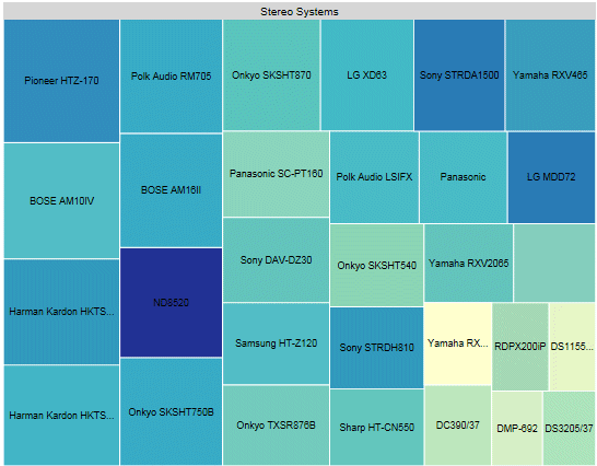
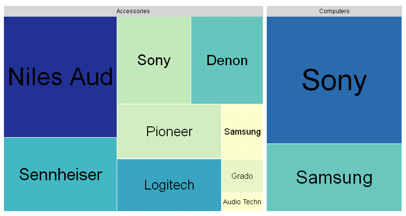
The following request generates a treemap chart. The scaleCellFonts property is set to true:
GRAPH FILE WF_RETAIL_LITE
SUM GROSS_PROFIT_US COGS_US
BY PRODUCT_CATEGORY
BY BRAND
WHERE PRODUCT_CATEGORY EQ 'Computers' OR 'Accessories'
ON GRAPH PCHOLD FORMAT JSCHART
ON GRAPH SET LOOKGRAPH TREEMAP
ON GRAPH SET STYLE *
*GRAPH_JS
treemapProperties: {
   scaleCellFonts: true},
colorMode:'byInterpolation',
colorModecolors: ['teal','cyan', 'beige', 'burlywood', 'yellow', 'cream']
*END
ENDSTYLE
END
On the output, the cells with larger areas have labels with larger font sizes:
How to: |
These properties format the header in a treemap chart.
treemapProperties: {
      header: {
      height: height,
      fill: ‘string’,
      border: {
         width: width,
         color: 'string',
         dash: 'string'
      },
      label: {
         visible: boolean,
         font: 'string',
         color: 'string'
}Defines the height of the header. Valid values are:
Can be undefined, a color definition, or a gradient definition. The default value is 'lightgrey'. For information about defining colors and gradients, see Colors and Gradients.
Defines the properties of the header border.
Is a number of pixels that defines the width of the header border. The default value is 0.
Is a color or gradient definition string that defines the border color. The default value is 'lightgrey'.
Is a string that defines the dash style of the header border. The default value is '', which produces a solid line. Use a string of numbers that defines the width of a dash followed by the width of the gap between dashes (for example, dash: '1 1' draws a dotted line).
Defines the properties of the header labels.
Controls the visibility of the header label. Valid values are:
Is a font string that defines the font of the header label. The default value is '8pt Sans-Serif'.
Is a color definition string that defines the color of the header label. The default value is 'black'.
The following request generates a treemap chart. The header is 25 pixels high. Its border is a grey dashed line 4 pixels wide, filled with a linear gradient that transitions from teal to cyan. The label in the header is white and bold 10pt Sans-Serif:
GRAPH FILE WF_RETAIL_LITE
SUM GROSS_PROFIT_US COGS_US
BY PRODUCT_CATEGORY
BY BRAND
ON GRAPH PCHOLD FORMAT JSCHART
ON GRAPH SET LOOKGRAPH TREEMAP
ON GRAPH SET STYLE *
*GRAPH_JS
treemapProperties: {
  header: {
   height: 25,
   fill: 'linear-gradient(0%,0%,100%,0%, 20% teal, 95% cyan)',
   border: {width: 4,color: 'grey', dash:'1 1'},
   label: {visible: true,font: 'bold 10pt Sans-Serif',color: 'white'}
   }
}
*END
ENDSTYLE
END
The output is:
How to: |
These properties format the treemap cell borders.
treemapProperties: {
    cellBorder: {
      width: number,
      color: 'string',
      dash: 'string',
      outerCellWidth: number   }
},
where:
Is a number that defines the width of the cell border in pixels. The default value is 1.
Is a color or gradient definition string that defines the cell border color. The default value is 'white'.
Is a string that defines the dash style of the cell border. The default value is '', which produces a solid line. Use a string of numbers that defines the width of a dash followed by the width of the gap between dashes (for example, dash: '1 1' draws a dotted line).
Is a number of pixels that defines the width of the border to draw around the top-level of cells. This property controls the width of the borders around only the top-level (root) nodes. The default value is 3.
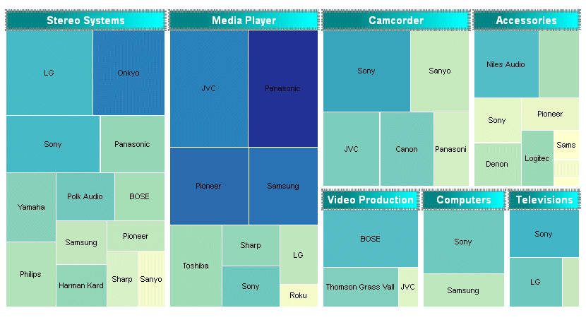
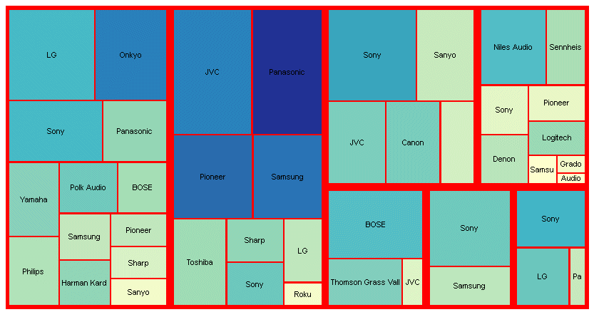
The following generates a treemap chart. The headers are eliminated by making their height zero (0). The cell borders are red with a width of 2 pixels, and the outer border has a width of 4 pixels:
GRAPH FILE WF_RETAIL_LITE
SUM GROSS_PROFIT_US COGS_US
BY PRODUCT_CATEGORY
BY BRAND
ON GRAPH PCHOLD FORMAT JSCHART
ON GRAPH SET LOOKGRAPH TREEMAP
ON GRAPH SET STYLE *
*GRAPH_JS
treemapProperties: {
header: {height: 0},
  cellBorder: {width: 2,color: 'red', outerCellWidth: 4}
}
*END
ENDSTYLE
END
The output is:
| WebFOCUS |