It is important that you choose a chart that is appropriate
for your data. InfoAssist provides a complete chart library of both
basic and advanced charts. You can choose from a wide variety of
charts to best represent the data that you want to display.
x
Bar charts plot numerical data by displaying rectangular
blocks against a scale (numbers or variable measure fields that
appear along the axis). The length of a bar corresponds to a value
or amount. You can clearly compare data series (fields) by the relative
heights of the bars. Use a bar chart to display the distribution
of numerical data. You can create horizontal and vertical bar charts.
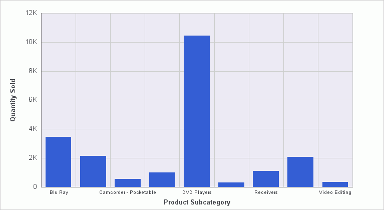
When to use: Use a bar chart when individual values are
important. For example, the following image is a basic vertical
bar chart that compares the individual products sold to the
total amount in sales for each product. A retailer would find it
important to know which pieces of inventory are selling and how
much revenue each item is generating for the company.
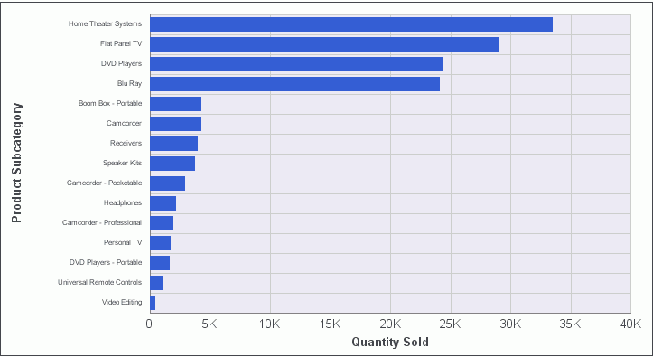
A horizontal bar chart becomes useful when you want to
emphasize a ranking relationship in descending order, or the X-axis
labels are too long to fit legibly side-by-side. For example, the
following image is a basic horizontal bar chart that ranks in descending order
which products are generating the most revenue for the retailer.
x
The following table lists the available bar chart types.
|
Available Bar Chart Types
|
|---|
|
Vertical Clustered Bar
|
Horizontal Clustered Bar
|
|
Vertical Stacked Bar
|
Horizontal Stacked Bar
|
|
Vertical Dual-Axis Clustered Bar
|
Horizontal Dual-Axis Clustered Bar
|
|
Vertical Dual-Axis Stacked Bar
|
Horizontal Dual-Axis Stacked Bar
|
|
Vertical Bi-Polar Clustered Bar (Not in HTML5)
|
Horizontal Bi-Polar Clustered Bar (Not in
HTML5)
|
|
Vertical Bi-Polar Stacked Bar (Not in HTML5)
|
Horizontal Bi-Polar Stacked Bar (Not in HTML5)
|
|
Vertical Percent Bar
|
Horizontal Percent Bar
|
|
Vertical Histogram
|
Horizontal Histogram
|
|
Vertical Waterfall
|
Horizontal Waterfall
|
|
Vertical Multi-3Y Bar (Not in HTML5)
|
Vertical Multi-5Y Bar (Not in HTML5)
|
|
Vertical Multi-4Y Bar (Not in HTML5)
|
Error Bar
|
x
A pie chart is a circular chart that represents parts
of a whole. A pie chart emphasizes where your data fits, in relation
to a larger whole. Pie charts work best when the data consists of
several large segments. As a best practice, limit your pie chart
to five measure fields. Too many measure fields can divide a pie
into many thin components that could become difficult to see. Use
color on individual segments to create visual contrast.
Note: You cannot plot negative data on a pie chart.
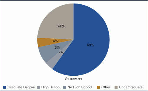
When to use: Use a pie chart when you have several large
segments of data that you want to display as a whole. For example,
the following image is a pie chart that shows the educational background
of the customers of a retailer.
x
The following table lists the available pie chart types.
|
Available Pie Chart Types
|
|---|
|
Multi Pie
|
Multi Ring Pie
|
|
Multi Proportional Pie (Not in HTML5)
|
Multi Proportional Ring Pie (Not in HTML5)
|
|
Single Pie
|
Single Ring Pie
|
|
Pie-Bar (Not in HTML5)
|
Ring Pie-Bar (Not in HTML5)
|
x
Line charts are useful for emphasizing the movement
or trend of numerical data over time. They allow you to trace the
evolution of a data point by working backwards or interpolating.
Highs and lows, rapid or slow movement, or a tendency towards stability are
all types of trends well suited to a line chart.
You can also plot line charts with two or more scales to present
a comparison of the same value, or set of values, in different time
periods.
When to use: Use a line chart when you want to trend data
over time. For example, monthly changes in employment figures, or
yearly sales of an item in your inventory. For example, the following
image is a line chart that traces gross profit in sales for four
products over a four-year period.
Radar charts are essentially analogous to line charts, except
that the scale wraps around. Radar charts compare two or more data
sets. They work well with data that is cyclical, such as the months
of a year. A radar line chart is available in the line chart category,
and a radar area chart is available in the area chart category.
You can use axes or polygons to represent values in a star or spider
configuration.
x
The following table lists the available line chart types.
|
Available Line Chart Types
|
|---|
|
Vertical Absolute Line
|
Horizontal Absolute Line
|
|
Vertical Stacked Line
|
Horizontal Stacked Line
|
|
Vertical Dual-Axis Absolute Line
|
Horizontal Dual-Axis Absolute Line
|
|
Vertical Dual-Axis Stacked Line
|
Horizontal Dual-Axis Stacked Line
|
|
Vertical Bi-Polar Absolute Line (Not in HTML5)
|
Horizontal Bi-Polar Absolute Line (Not in
HTML5)
|
|
Vertical Bi-Polar Stacked Line (Not in HTML5)
|
Horizontal Bi-Polar Stacked Line (Not in
HTML5)
|
|
Vertical Percent Line
|
Horizontal Percent Line
|
|
Radar Line
|
|
x
Area charts are similar to line charts except that
the area between the data line and zero line (or axis) is usually
filled with color. Area charts allow you to stack data on top of
each other. Stacking allows you to highlight the relationship between
data series, showing how some data series approach a second series.
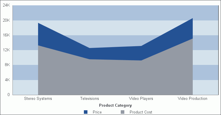
When to Use: Use an area chart when you want to distinguish
the data more dramatically by highlighting volume with color. For
example, the following image is a basic area chart that depicts
the price and product cost for four products. The data is more boldly distinguished
on this chart in comparison to the line chart.
x
The following table lists the
available area chart types.
|
Available Area Chart Types
|
|---|
|
Vertical Absolute
Area
|
Horizontal Absolute
Area
|
|
Vertical Stacked Area
|
Horizontal Stacked
Area
|
|
Vertical Bi-Polar
Absolute Area (Not in HTML5)
|
Horizontal Bi-Polar
Absolute Area (Not in HTML5)
|
|
Vertical Bi-Polar
Stacked Area (Not in HTML5)
|
Horizontal Bi-Polar
Stacked Area (Not in HTML5)
|
|
Vertical
Percent Area
|
Horizontal
Percent Area
|
|
Radar Area
|
|
x
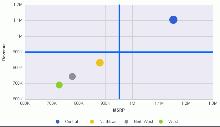
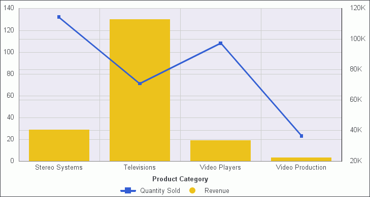
Bar, line, and area chart types have multi-axis options,
such as dual-axis charts and multi-Y charts, where you can compare
one X-axis value to several Y-axis measure fields.
InfoAssist allows you to assign each individual series to the
Y1 through Y5 axis. For more information, see How to Create a Dual-Axis Chart.
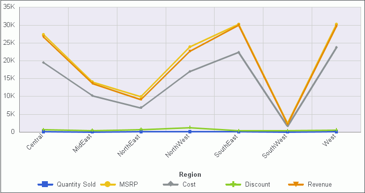
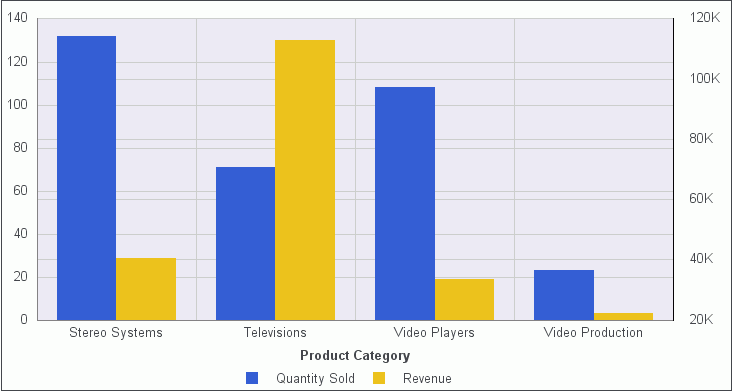
When to use: Use a multi-axis chart when you want to plot
values on an additional axis, or multiple axes, to compare multiple
sets of data that are on different scales. For example, the following
image is a dual-axis chart that shows the quantity of inventory
pieces sold and the revenue that their sales generate.
x
An XY plot chart depicts the relationships among the
numeric values in several data series. It plots two groups of numbers,
where for every X value, there is a corresponding Y value. This
results in a single point of XY coordinate.
When to use: Use XY plot charts when you have two sets
of numbers to compare and want to perform trend analysis.
-
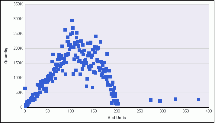
Scatter. Scatter
charts show a relationship between X and Y values. They compare
two sets of numbers at once, possibly revealing patterns and trends.
You
can plot data using variable scales on both axes. When you use a
scatter chart, the data is plotted with a basic line pattern so
that you can visualize the density of individual data values around
particular points, or discern patterns in the data. A numeric X
axis, or sort field, always yields a scatter chart by default.
If
your chart reveals clouds of points, there is a strong relationship
between X and Y values. If data points are scattered, there is a
weak or no relationship.
Scatter charts share many of the
characteristics of basic line charts. Scatter charts and line charts
are distinguishable from one another only by virtue of their X-axis
format. Line charts can appear without connecting lines, making
them look like scatter charts, and scatter charts can appear with
connecting lines, making them look like line charts.
-
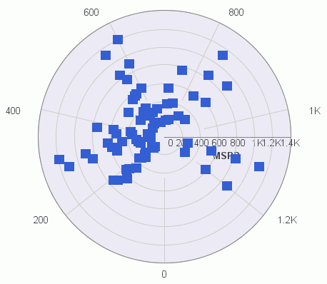
Polar. A polar
chart is a circular chart. Data is displayed on a polar chart in
terms of values and angles. Polar charts share characteristics with
scatter charts. Only one column field is allowed, in the following
order: X (degree) for the column field, and Y (distance from the
center) for the Across or By field.
-
Bubble. A
bubble chart is a chart in which the data points are represented by
bubbles. Bubble charts can have two column fields representing X
and Y data values, or have three column fields representing X, Y,
and Z data values, in that order. The third variable (Z) represents
size. The size of each bubble is used to show the relative importance
of the data.
x
The following table lists the available XY plot chart
types.
|
Available XY Plot Chart Types
|
|---|
|
XY Scatter
|
XY Polar
|
|
Bubble
| |
x
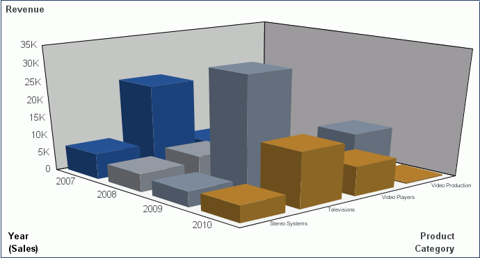
A 3D chart uses three axes, X, Y, and Z to display data
from two or more data sets so that trends are most apparent.
When to use: Use a 3D bar chart when you want to look
at the general shape of the data, but add visual depth to a chart
presentation. A 3D chart would not be a good choice for presenting
exact values, since it is difficult to determine values in a 3D
chart. The following image is a 3D chart that shows the cost and
revenue for four products.
x
The following table lists the
available 3D chart types.
|
Available 3D Chart Types
|
|---|
|
3D Bar
|
3D Pyramid (Not in
HTML5)
|
|
3D Octagon (Not in
HTML5)
|
3D Cylinder (Not in
HTML5)
|
|
3D Floating Cubes
(Not in HTML5)
|
3D Floating Pyramids
(Not in HTML5)
|
|
3D Connected Series
Area
|
3D Connected Series
Ribbon
|
|
3D Connected Group
Area
|
3D Connected Group
Ribbon
|
|
3D Cone (Not in HTML5)
|
3D Sphere (Not in
HTML5)
|
|
3D Surface
|
3D Surface with Sides
(Not in HTML5)
|
|
3D Smooth Surface
(Not in HTML5)
|
3D Smooth Surface
with Sides (Not in HTML5)
|
|
3D Honeycomb Surface
(Not in HTML5)
|
|
x
Stock charts track the trend of a particular stock.
They show the trading volume of the stock, its opening and closing
values, and its high and low values over a specific time period.
The data is represented by sets of bars or lines.
x
The following table lists the available stock chart
types.
|
Available Stock Chart Types
|
|---|
|
Stock Hi-Lo (Not in
HTML5)
|
Stock Hi-Lo with Volume
(Not in HTML5)
|
|
Stock Hi-Lo Open-Close
(Not in HTML5)
|
Stock Hi-Lo Open-Close
with Volume (Not in HTML5)
|
|
Open-Hi-Lo-Close Candle
Stock
|
Open-Hi-Lo-Close Candle
Stock with Volume (Not in HTML5)
|
x
Special charts include a variety of additional chart types.
-
Gauge. A gauge
chart indicates the current position of a single data value within
a given spectrum. This chart has a circular shape.
-
Gauge Thermometer. A
gauge thermometer chart indicates the current position of a single
data value within a given scale. This chart has the shape of a thermometer.
It is not available in HTML5.
-
Pareto. A
Pareto chart uses the X axis to show group members, and the Y axis
to show the percent of the total of all groups that each group represents.
This chart highlights the differences between groups of data.
-
Vertical Box Plot. A
vertical box plot is oriented vertically, and shows the distribution
of data through five-number summaries: Upper limit, Upper Quartile, Median,
Lower Quartile, and Lower Limit. This chart can be represented with
or without outliers, also known as whiskers.
-
Horizontal Box Plot. A
horizontal box plot is oriented horizontally, and shows the distribution
of data through five-number summaries: Upper limit, Upper Quartile,
Median, Lower Quartile, and Lower Limit. This chart can be represented
with or without outliers, also known as whiskers.
-
Funnel. A
funnel chart is essentially a pie chart, displaying only one group of
data at a time, from the first series to the last series at the
bottom of the funnel.
-
Pyramid. A
pyramid chart is essentially a pie chart, displaying only one group
of data at a time, from the first series to the last series at the
top of the pyramid.
-
Spectral Map. A
spectral map contains a row or column matrix of markers that are
displayed in different colors, according to the data values.
x
A combination chart displays multiple series using two
or more different types of data graphics from a bar, line, or an
area chart. Combining these charts improves clarity in the presentation
of your data, and highlights the relationship between various data sets
on one graph. This combination chart is referred to as a mixed,
composite, or overlay graph.
When to use: For example, a retailer might want to combine
a vertical bar chart that shows revenue with a line chart that shows
quantity sold.
x
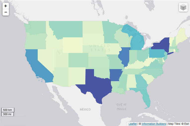
The Lightweight Mapping functionality enables you to
display your underlying data regionally. Using the Geographic Information
System (GIS) capabilities that are built into WebFOCUS
8, the map functionality converts
data values into maps that can be used for visualizing patterns
or trends. More specifically, data that is bound to a geo-location,
such as State, Country, and ZIP Code, can be viewed as symbol layers
integrated into a powerful map viewer. The mapping functionality supports
a variety of popular formats, such as bubble markers and heat-filled
polygons (also known as choropleths). These map formats are described
below.
-
Choropleth. A
geographically-based heat map. It is useful for visualizing location-based
data, trends, and distributions across a geographic area.
-
Proportional Symbol (Bubble). A
technique that uses symbols of different sizes to represent data
associated with different areas or locations within the map.
For information on creating a map, see How to Create a Map.
The following image illustrates one of the types of maps that
can be generated.
The mapping architecture features an HTML5 map viewer with zoom,
pan, and scale controls. It also includes a mapping server with
nine levels of zoom.
Note: You can use the plus (+) and minus (-) symbols within
the map to zoom in and out of different areas of the map. You can
also click your left mouse button to zoom in.
Like all HTML5 visualizations, the highlighted markers and regions
on the maps support drill, multi-drill, and informational tooltips.
When to use: The Lightweight Mapping functionality enables
business users to make informed decisions. They can also visualize
patterns, trends, and relationships related to the location information
in their data.
x
Reference: Query Field Containers by Map Type
This
section presents the Query field containers that display for charts,
by map type.
|
Query field container
|
Choropleth Map
|
Proportional Symbol Map
|
|---|
|
Measure (Sum). One data field, containing
measure data.
|

|
|
|
Location. One data field, containing
location data.
|
|
|
|
Latitude. One data field, containing
latitude data.
|

|
|
|
Longitude. One data field, containing
longitude data.
|
|
|
|
Multi-graph. Up to one data field
(not required).
|
|
|