In this section:
Reference: |
The Resources panel displays the Data pane in the upper half of the panel and the Query Design pane in the lower half of the panel by default. You can customize how the Resources panel displays by using the options on the Home tab and View tab. For example, on the View tab, in the Design group, click Query to split the Data pane and Query Design pane.
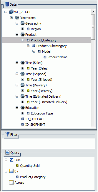
The following image shows the default view of the Resources panel, which displays the Data pane above the Query Design pane when you create a report.
The Data pane, which contains all the fields from the selected data sources, is always displayed.
You can manually adjust the size of the Resources panel and Results panel. To do so, move the mouse pointer over the border. When the pointer changes to a two-way arrow, drag the border.
In the Resources panel, each field has an image associated with it. The following table displays each image and describes what it represents.
Note: This list of icons changes based on the type of database that is in use.
|
Icon |
Type |
|---|---|
|
|
Database |
|
|
Dimension |
|
|
Measure |
|
|
Locked Segment |
|
|
Unique Segment |
|
|
Key Field |
|
|
Index Field |
|
|
Blob |
|
|
Text or Alpha Field |
|
|
Date or Date and Time Field |
|
|
Numeric Field |
|
|
Calculated Date Field |
|
|
Calculated Numeric Field |
|
|
Calculated Other Field |
|
|
Calculated Text Field |
|
|
Cube |
|
|
Cube Dimension |
|
|
Cube Property |
|
|
Dimension Hierarchy |
|
|
Folder Closed |
|
|
Folder Open |
|
|
Measure |
|
|
Measure Group |
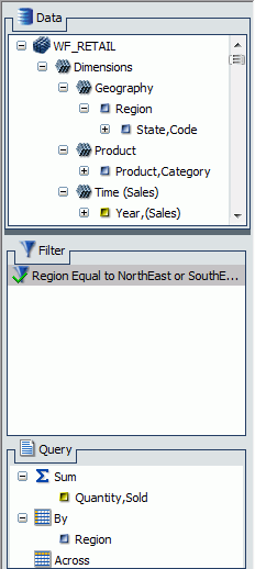
The Filter area of the Query Design pane displays all filters that have been created for the selected report. The Filter area is shown in the following image.
For more information on filtering, see Field Tab and Data Tab.
Note: The Filter area displays all created filters, both active (included) and inactive (excluded).
There are several ways that you can add data source fields to a report. You can drag, double-click, or right-click data source fields in the Data pane to add them to a Query field container or Filter area in the Query Design pane.
After you add data source fields to a Query field container, you can change the order of the fields by dragging and dropping one field above or below another field.
Drag. This method provides the most control. You can drag data source fields from the Data pane to the appropriate Query field container or Filter area in the Query Design pane.
For a larger work area in which to drop data source fields in the appropriate Query field container, make sure that Query Design view is selected, and then, on the View tab, in the Query Panel group, click Areas 2x2 or Areas 1x4.
You select Query Design view on the Home tab, in the Design group, by clicking Query or on the View tab, in the Design group by clicking Query. That selection expands the Query Design pane so that it is opened in the Results Panel.
Multi-Select. You can multi-select data source fields that you want to add to a report in Live Preview, Query Design view, and Document view. To select multiple data source fields to add to a report, click the appropriate fields while holding the Ctrl key on the keyboard. You can drag fields onto the canvas, or add them to the Query field container.
Double-Click. To automatically add a field to the appropriate field container in the Query Design pane, you can double-click a data source field in the Data pane.
You cannot automatically add a field to the Across (Column Label) Query field container for a report, or to the Legend (Series) and Multi-graph Query field containers for a chart.
Right-Click. You can right-click a field in the Data pane to add it to the Filter area or a Query field container in the Query Design pane. For reports, the available right-click options are as follows:
For charts, the available right-click options are as follows:
A measure is a numeric value, such as Gross Profit or Cost of Goods Sold, that you may want to aggregate. All numeric values that can be summed are measures. Numeric fields that cannot be summed, such as product number and miles per gallon, are not treated as measures. Instead, they may be used in the same way as dimension fields to analyze measures. It is up to you to understand your data and determine whether each numeric field can be summed. Related measures can be organized into measure groups. For example, Gross Profit and Cost of Goods Sold can be part of a Sales measure group.
A dimension is a way to categorize data. You can use a dimension to analyze and compare measures. Generally, any field that is not a measure, usually an alphanumeric field such as product, is a dimension. Dimensions can be organized into hierarchies to define the relationships between the fields in the hierarchies. For example, a Geography hierarchy can contain the Continent, Country, State, and City dimensions. You can also define dimension fields that are not part of a dimension hierarchy.
The Query Design pane, which contains the Filter and Query (field container) areas, appears below the Data pane, except when you select Query Design view, which expands the size of the Query Design pane and displays it in the Results panel. There are different field containers for reports and charts.
Note: If you have more than one item in either Sum, By, or Across field containers (for reports) or Measure (Sum) or X-axis field containers (for charts), you can drag them up or down in the Query Design Pane to rearrange the order in which they display in your report or chart. When you drag fields to rearrange them, an indicator line displays, providing guidance as to where the field will be placed. The color of this line is determined by the theme. Once you have performed the rearrangement, the Live Preview refreshes based on the newly indicated order.
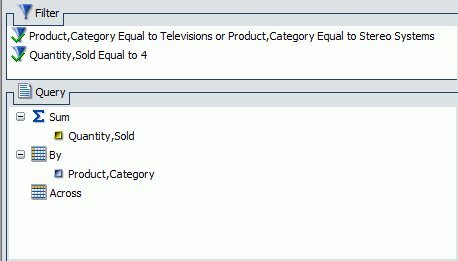
Reports. For all reports, the Query field containers in the Query Design pane include Sum, By, and Across.
 field
container to aggregate or display numeric measure fields. Its context
menu provides options to Sum (default), Print, Count, or List the
fields in the report.
field
container to aggregate or display numeric measure fields. Its context
menu provides options to Sum (default), Print, Count, or List the
fields in the report.The following image shows the Filter and Query (field container) areas of the Query Design pane as it appears in the Resources panel for reports.
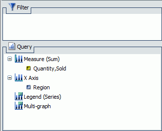
Charts. For most charts, the Query field containers in the Query Design pane include Measure (Sum), X Axis, Legend (Series), Multi-graph and Coordinated. More complex charts that require additional dimension fields have alternative field containers.
The following image shows the Filter and Query (field container) areas of the Query Design pane as it appears in the Resources panel for most charts in Live Preview and Query Design view.
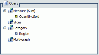
For pie charts, the Query field containers in the Query Design pane include Measure (Sum), Slices, Category, Multi-graph, and Coordinated.
The following image shows the Query (field container) area of the Query Design pane as it appears in the Resources panel for pie charts in Live Preview and Query Design view.
In this section: Reference: |
In the Query Design pane, you can right-click any field and select from a list of available options that are displayed in the menu that appears. The options that you can select vary, depending on the type of Query field container (Sum, By, Across) in which the field is located and the type of report that you are creating (report or chart).
Report. When you create a report, the Query field containers in the Query Design pane include Sum, By, and Across.
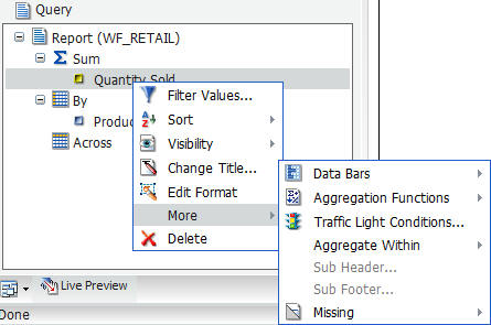
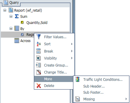
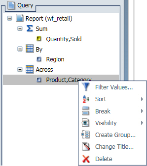
Chart. When you create a chart, the Query field containers in the Query Design pane include Measure (Sum), X Axis, Legend (Series), Multi-graph, and Coordinated (for documents only).
Note: When working with maps, the Location field container displays.
Note: Different options display in the shortcut menu depending on the type of data field that you select.
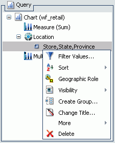
The shortcut menu for a Location field is shown in the following image.
Note: Different options display in the shortcut menu depending on the type of data field that you select.
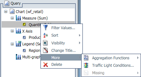
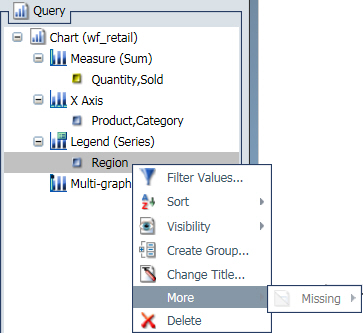
The shortcut menu for an X Axis or Legend (Series) field is shown in the following image.
Note: Depending on the type of data field used, different options appear in the shortcut menu.
The following table lists and describes all the right-click field options available in the Query Design pane for a selected field.
|
Option |
Description |
|---|---|
|
Filter Values |
Opens the Filter dialog box for creating WHERE statements, which enable you to select only the data that you want and to exclude all unwanted data. |
|
Sort |
Provides access to the Sort, Rank, and Limit menus. The Sort menu allows you to sort your data either in ascending or descending order. The Limit menu allows you to specify the number of unique values displayed for a sort group that has been added. The Rank menu allows you to insert a rank column immediately to the left if a Sort By field is selected and adds a rank column to the left of the Sort By field if a Measure field is selected. Ranking a Measure field results in two copies of the field, the original Measure field and the Sort By field that is created during ranking. |
|
Geographic Role |
Opens the Location Type dialog box, from which you can make a location selection. Note: This option is only available when working with maps. |
|
Data Bars |
Provides a menu for enabling the data bar representation functionality. Selecting On adds a data visualization column to the right of a selected numeric field. The column displays values in each row using horizontal bars that extend from left to right in varying lengths, depending on the corresponding data values. |
|
Aggregation Functions |
Provides a menu for selecting options to assign an aggregation type value to a selected numeric field in a report. |
|
Subtotal |
Provides a menu for enabling subtotal functionality. Clicking On inserts a line, descriptive text, and subtotal values in the report output for all numeric fields when the primary sort field changes. |
|
Page Break |
Provides a menu for enabling page break functionality. Clicking On starts a new page in the report output when the primary sort field changes. |
|
Reset Page Numbers |
Allows you to reset page numbers on a page break to start at 1. |
|
Traffic Light Conditions |
Opens the Traffic Light Condition dialog box, where you can add new conditional styling or modify existing conditional styling by applying traffic light (and other) colors to a selected field in the report output when the field meets specified criteria. |
|
Visibility |
Provides a menu for controlling the visibility of the selected field. Clicking Hide removes the selected field from the report output. Clicking Show (default) displays the selected field in the report output. |
|
Sub Header |
Opens the Sub Header & Sub Footer dialog box where you can edit and style your headers. |
|
Sub Footer |
Opens the Sub Header & Sub Footer dialog box where you can edit and style your footers. |
|
Missing |
Allows you to show or hide fields with no value. |
|
Create Group |
Allows you to create a group of elements based on the field data type that you select. Once you define a new group, a higher-level field is created that contains the selected elements. For more information, see How to Create a Dynamic Group. |
|
Change Title |
Opens the Edit Title dialog box, where you can change the title of the selected field by typing the new title in the Enter Title field. Note: When changing the title of a column heading, you can place a comma between words in the Enter Title field to create a multi-line header. |
|
Edit Format |
Opens the Field Format Options dialog box, where you can edit the field type and display options. |
|
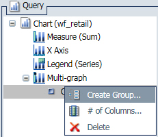
# of Columns |
Opens the Number of Columns dialog box, where you can indicate the number of columns in which you wish to display multiple graphs. |
|
Delete |
Deletes the selected field. Note: In the Query Design pane, you can select and delete multiple data fields at one time. Press the Ctrl key and click the data fields that you want to select. Then right-click, and click Delete. |
All of the right-click options that are available in the Query Design pane are also available in the Field tab. For more information, see Field Tab.
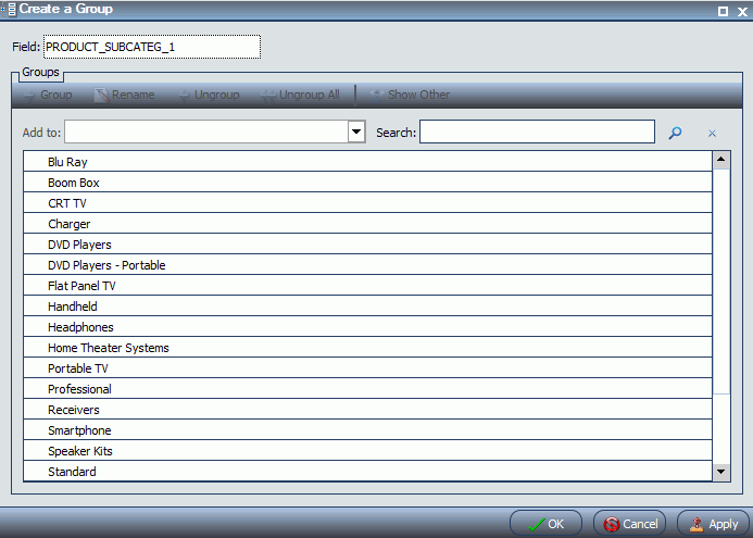
Dynamic grouping allows you to create groups of elements based on the field data type that you select. For example, in the WF_RETAIL database, there are a number of brands of televisions. Using the dynamic grouping functionality, you can create groups based on the popularity of a particular brand. The first group might include top sellers such as LG and Sony. The second group might contain the remaining brands (Panasonic, GPX, Supersonic, Tivax, and Audiovox). This would allow you to group top sellers into one group, and the remaining brands into another group.
Note: The Create Group option is only available for dimension fields of non-numeric format or attribute.
You can also specify multiple, unique groupings in the same session. For example, you might want to group the data to indicate groups or products, or specific regions.
Note: If you want to exclude a specific data element from your analysis, you can use the filter functionality.
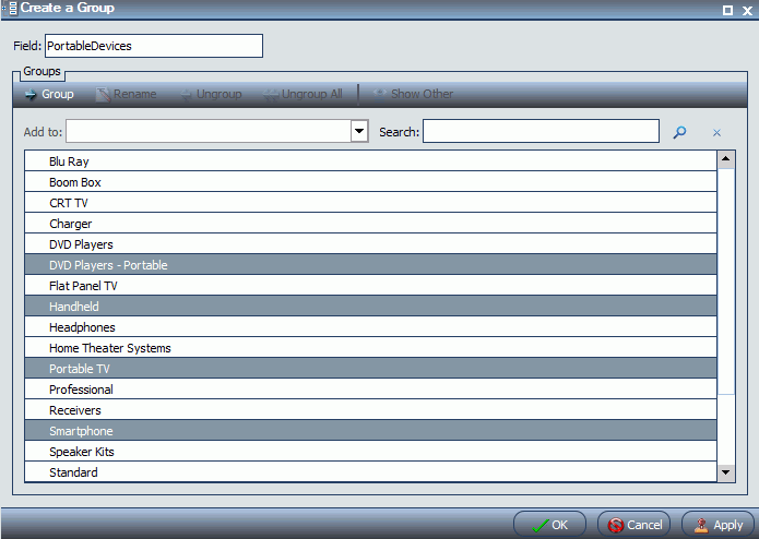
The grouping that you specify is applied and this new group then replaces the original field that you selected in the Query pane. The name that you specify when creating the group is reflected in the Query pane.
Note: You can edit the group once it has been created by right-clicking on the higher-level field and clicking Edit Group.
Note: You can use the dynamic grouping functionality on non-numeric dimension fields only.
Note: The Create Group option is also available in the Data pane shortcut menu.
The Create a Group dialog box displays, as shown in the following image.
Note: To ungroup values, click a group and then click Ungroup.
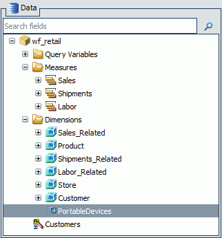
Your grouped data will display in the Data pane when your report or chart refreshes, as shown in the following image.
| WebFOCUS |


