By changing the CSS classes of the panels in the RDF templates, you can create your own custom layouts and add other features to your RDF page. These CSS classes include panel classes and column classes. A list of the panel classes that determine proportionate width can be found in Layout of Panels.
This example shows how to create a simple template with a modified panel configuration like the one shown in the following diagram.
The file refreshes in the Environments Tree panel and reflects the new name.
The HTML canvas opens.
This selects the entire panel and enables you to set properties for all content within the panel.
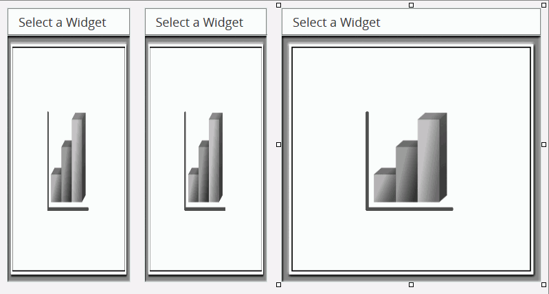
The box resizes to half of its original width and occupies 1/4 of the width of the container, as shown in the following image.
This resizes the panel to 1/4 of the width of the container and moves it adjacent to the first panel.
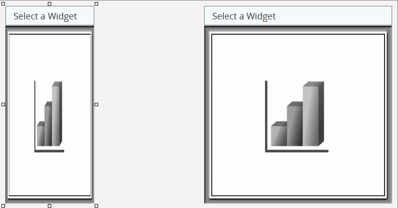
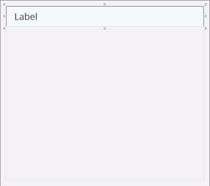
This moves the panel to the top-right of its container, as shown in the following image.
This adjusts the content panel to start at the left side of the container panel and take up the entire width of the container.
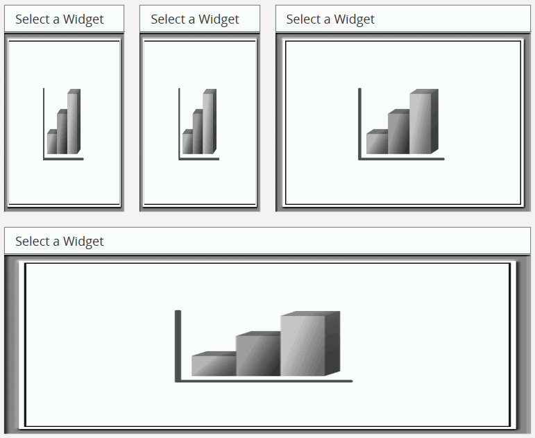
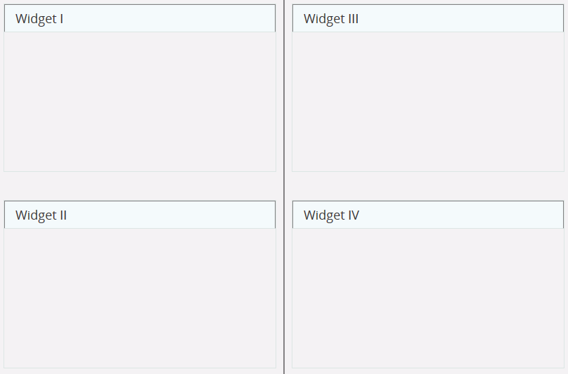
You now have a page with two quarter-width panels and one half-width panel at the top, and one full-width panel at the bottom, as shown in the following image.
You can use the same technique to set the panel sizes and reposition the panels. The RDF Add-on supports many different panel sizes.
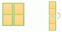
The following example shows you how to create a template with two independent columns, each with its own sets of panels. As the screen becomes smaller, column two folds beneath column one, as shown in the following diagram.
The file refreshes in the Environments Tree panel and reflects the new name.
The HTML canvas opens.
The pointer becomes a crosshair.
This creates a column that is half the container panel in width and 800 pixels tall, positioned along the top and left sides of the container, as shown in the following image.
The pointer becomes a crosshair.
This results in a column that is half the container panel in width and 800 pixels tall. It is positioned along the top and right sides of the container.
Next, draw content panels inside the column panels.
The pointer becomes a crosshair.
This creates a panel that is 340 pixels tall, located at the top of column1.
The pointer becomes a crosshair.
This creates a label that is the full width of content1-panel1 and 40 pixels tall, located along the top and left sides of the content panel, and with 15 pixels between the label text and the left side of the label, as shown in the following image.
The pointer becomes a crosshair.
The pointer becomes a crosshair.
The pointer becomes a crosshair.
This creates a panel that is 340 pixels tall, located at the top of column 2.
The pointer becomes a crosshair.
The pointer becomes a crosshair.
The pointer becomes a crosshair.
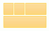
You have now created four equally large panels with labels.
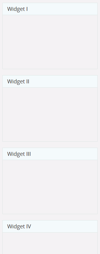
The original template without the column panels behaves differently. Without the two columns set up, Widget III would go directly below Widget I and Widget IV would go directly below Widget II.
The panel button options include the ability to add the following buttons to the top of your content panels:
To enable these panel buttons in your own content, add a few lines of syntax to the procedures that you are adding to the HTML page. To do so, find the procedure that you wish to add to your HTML page in the Environments Tree panel. Right-click the procedure file and click Open in Text Editor.
For a report, type the following two lines above the line listing the Master File:
-DEFAULT &FMT = ‘DEFAULT’;
-SET &WFFMT = IF &FMT EQ ‘DEFAULT’ OR ‘MAX’ THEN ‘HTML’ ELSE &FMT;
The syntax of the SET function will read as follows if the procedure being configured is an HTML5 Chart:
-SET &WFFMT = IF &FMT EQ ‘DEFAULT’ OR ‘MAX’ THEN ‘JSCHART’ ELSE &FMT;
Set the format to &WFFMT by changing
ON TABLE PCHOLD FORMAT HTML
to
ON TABLE PCHOLD FORMAT &WFFMT
for a report, or by changing
ON GRAPH PCHOLD FORMAT JSCHART
to
ON GRAPH PCHOLD FORMAT &WFFMT
for an HTML5 chart.
Below is the full syntax of a sample report to which a panel button could be added. Necessary lines are in bold:
-DEFAULT &FMT = 'DEFAULT';-SET &WFFMT = IF &FMT EQ 'DEFAULT' OR 'MAX' THEN 'HTML' ELSE &FMT;TABLE FILE WF_RETAIL_LITE
SUM
WF_RETAIL_LITE.WF_RETAIL_SALES.QUANTITY_SOLD
WF_RETAIL_LITE.WF_RETAIL_SALES.REVENUE_US
BY WF_RETAIL_LITE.WF_RETAIL_GEOGRAPHY_CUSTOMER.BUSINESS_SUB_REGION
BY WF_RETAIL_LITE.WF_RETAIL_PRODUCT.PRODUCT_CATEGORY
ON TABLE SET PAGE-NUM NOLEAD
ON TABLE SET ASNAMES ON
ON TABLE NOTOTALON TABLE PCHOLD FORMAT &WFFMTON TABLE SET HTMLEMBEDIMG ON
ON TABLE SET HTMLCSS ON
ON TABLE SET STYLE *
INCLUDE = IBFS:/EDA/EDASERVE/_EDAHOME/ETC/endeflt.sty,
$
INCLUDE = IBFS:/WFC/Repository/RDFTemplates/Common/sty/angular.sty,
$
TYPE=REPORT,
CALC-LOCATION=TOP,
$
TYPE=REPORT,
OBJECT=STATUS-AREA,
JUSTIFY=LEFT,
PAGE-LOCATION=BOTTOM,
$
ENDSTYLE
END For an HTML5 chart, you change the SET function to:
-SET &WFFMT = IF &FMT EQ ‘DEFAULT’ OR ‘MAX’ THEN ‘JSCHART’ ELSE &FMT;
and the ON TABLE PCHOLD function to:
ON GRAPH PCHOLD FORMAT &WFFMT
Once you add your content to the page, make sure the FMT variable has been added to your procedures using the syntax above, and connect that variable to the “format” control in the Parameters tab.
This example shows how to add optional panel buttons to an HTML page.
The file refreshes in the Environments Tree panel and reflects the new name.
The HTML canvas opens.
The Open File dialog box opens.
This will add a PDF button next to the standard Resize button at the top of the content panel.
A PDF version of the report opens in a new window.
This adds an Excel button next to the PDF and Resize buttons, when you run the page.
Note: The words internal default are automatically appended to the end of the Class identifier (CSS) property value. You may delete those words when working with the value. The system restores them after you save the file.
The content panel now has both a PDF and an Excel export button at the top.
Additionally, you can set the Resize button to refresh the page in addition to resizing the panel when it is clicked by adding rerun to the Class identifier (CSS) property value.
| WebFOCUS |