In this section: How to: |
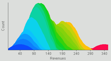
A histogram groups data values into classes and shows the frequency at which each class appears in the data set by displaying a series of columns whose width represents class intervals and whose areas are proportional to the corresponding frequencies. The shapes of histograms will vary depending on the choice of the size of the intervals. Histograms are designed for situations when the user is not interested in knowing the particular values, but in how those values are distributed across the data set.
The following image shows an example of a histogram.
WebFOCUS Visual Discovery enables you to see and understand locations and variations within the data by creating easy-to-read histograms with powerful features, such as:
 or the Vertical button
  .
.
Tip: In the pop-up menu, if Horizontal has a check mark next to it then the graph has a horizontal orientation. Click Horizontal to remove the check mark and change the orientation to vertical.
How to: Reference: |
Smoothing is a statistical technique in which data is averaged to remove extreme highs and lows. If little smoothing is applied, the data distribution reflects the exact data sample. Higher degrees of smoothing reduce the extreme highs and lows in the sample to show the idealized distribution of data.
The following image shows the Histogram tab in the Visual Discovery Properties dialog box.
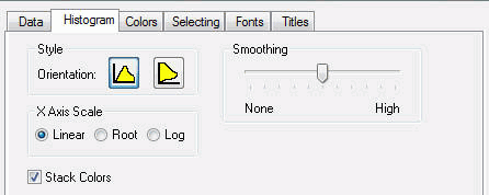
Orientation is horizontal or vertical. See How to Change the Orientation of a Histogram.
Is linear, root, or log. See How to Select the Histogram Scale.
A glyph may be colored to show two fields that have been colored by a third field. The colors are stacked on a glyph. See Assigning Color to the Data and the Graph.
A statistical technique in which data is averaged to remove extreme highs and lows. See Smoothing a Histogram.
The pop-up menu appears when you right-click a Visual Discovery control in the analytical dashboard. These options do not appear when you are developing in HTML Composer.
Is the orientation of the graph. If Horizontal is checked, the orientation of the graph is horizontal. If it is not checked, the orientation is vertical.
A glyph may be colored to show two fields that have been colored by a third field. The colors are stacked on a glyph. See Assigning Color to the Data and the Graph.
Changes the scale of the histogram to Linear, Root, or Log.
Reverses the previous action. You may repeatedly undo actions retained in the history file for your current session by selecting Undo over and over again. A description of the previous action appears on the pop-up menu. If you have performed no action, Undo is not available for selection and no action appears to the right of the word Undo.
Restores the previous undo action. If you have performed no action, Redo is not available for selection and no action appears to the right of the word Redo.
Selects all of the items in the graph. When you choose Select All, any previous selections are ignored. Selection state returns to the original setting.
When selected, all of the items become unselected. All items appear in the unselected color (gray, by default) or are hidden in the graph (if hide unselected is active).
Reverses the selection state of items. Selected items become unselected and unselected items become selected.
Excludes (temporarily removes) items from the graph.
Restores the items you excluded. If you accidentally excluded the unselected, this menu option restores those excluded items.
Enables you to save the graph to a GIF or JPEG file.
Enables you to copy the selected component and paste it to another file.
Takes you to the collection of tabs available for the respective visualization component. Common tabs include Data, Selecting, and Colors.
| WebFOCUS |