When a gauge includes multiple needles (multiple measures),
use the secondaryNeedlesAsMarkers property to draw secondary needles
as markers.
x
Syntax: How to Draw Secondary Gauge Needles as Markers
gaugeProperties: {
   secondaryNeedlesAsMarkers: boolean,
},
where:
- boolean
Valid values are:
- true,
which draws the secondary needles as markers.
- false, which draws multiple needles. The default value
is false.
Note: When secondaryNeedlesAsMarkers
is true, use the series:marker property to control the size
and format of the markers.
Example: Drawing Secondary Gauge Chart Needles as Markers
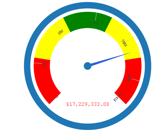
The following request against the GGDEMOG
data source draws the secondary needles as needles:
GRAPH FILE GGDEMOG
SUM HH MEDHHI98
MALEPOP98 FEMPOP98
P15TO1998 P20TO2998
P50TO6498
BY ST
WHERE ST EQ 'NY'
ON GRAPH PCHOLD FORMAT JSCHART
ON GRAPH SET LOOKGRAPH GAUGE1
ON GRAPH SET STYLE *
*GRAPH_JS
gaugeProperties: {
  groupLabel: {visible:false},
  secondaryNeedlesAsMarkers: false
}
*END
INCLUDE=ENIADefault_combine.sty,$
ENDSTYLE
END
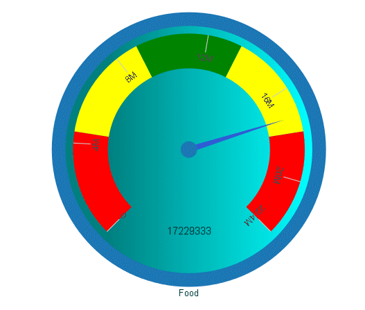
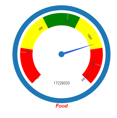
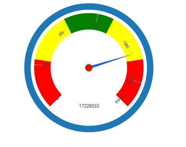
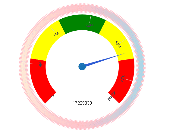
The output is:
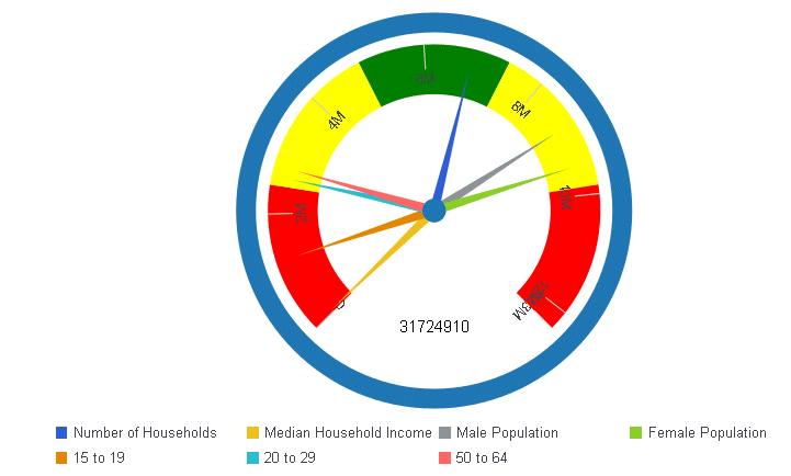
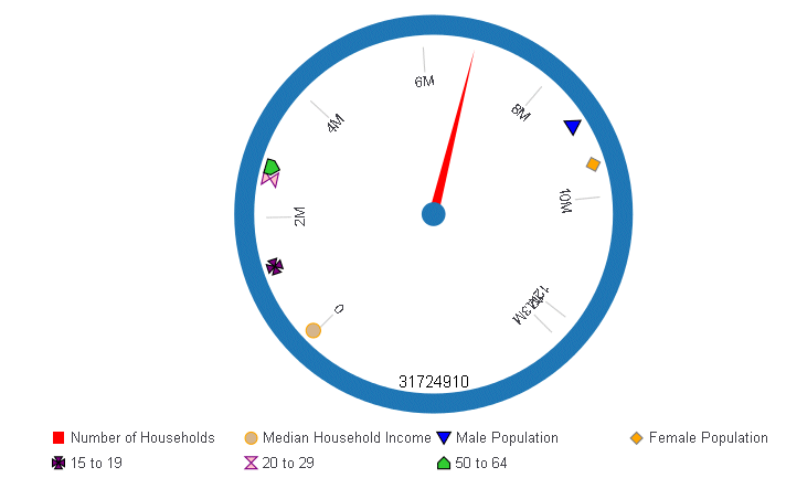
The
following version of the request, draws the secondary needles as
markers, and sets marker shapes, sizes, borders and colors for them.
To make the markers more visible, the axis width is set to zero.
Notice that series 0 is the primary needle, and is still drawn as a
needle:
GRAPH FILE GGDEMOG
SUM HH MEDHHI98
MALEPOP98 FEMPOP98
P15TO1998 P20TO2998
P50TO6498
BY ST
WHERE ST EQ 'NY'
ON GRAPH PCHOLD FORMAT JSCHART
ON GRAPH SET LOOKGRAPH GAUGE1
ON GRAPH SET STYLE *
*GRAPH_JS
gaugeProperties: {
  groupLabel: {visible:false},
  axisWidth: 0,
  secondaryNeedlesAsMarkers: true
},
series: [
{series: 0, color: 'red',},
{series: 1, color: 'tan',marker: {shape: 'circle', size: 12, border:
{width: 1, color: 'orange'}}},
{series: 2, color: 'blue',marker: {shape: 'triangle', size: 12, border:
{width: 1, color: 'black'}}},
{series: 3, color: 'orange',marker: {shape: 'diamond', size: 12, border:
{width: 1, color: 'grey'}}},
{series: 4, color: 'purple',marker: {shape: 'pirateCross', size: 12,
border: {width: 1, color: 'black'}}},
{series: 5, color: 'pink',marker: {shape: 'hourglass', size: 12,
border: {width: 1, color: 'purple'}}},
{series: 6, color: 'limegreen',marker: {shape: 'house', size: 12, border:
{width: 1, color: 'black'}}}
]
*END
INCLUDE=ENIADefault_combine.sty,$
ENDSTYLE
END
The output is: