axisname: {
minorGrid: {
  visible: boolean1,
  count: number,
  lineStyle: {
    width: wmnumber,
    color: 'cmstring',
    dash: 'dstring'
   },
    ticks: {
      length: lnumber,
      visible: boolean2,
      style: 'sstring',
      lineStyle: {
        width: wtumber,
        color: 'ctstring'}
    }
  }
}
where;
- axisname
Can be:
- xaxisOrdinal
- xaxisNumeric
- yaxis
- y2axis
- zaxisOrdinal
- boolean1
Controls the visibility of the minor grid lines. Valid values are:
- true, which draws the minor grid lines.
- false, which does not draw the minor grid lines. This is the default value.
- number
Is the number of minor grid lines to draw between each major grid line. The default value is undefined.
- wmnumber
Is a number that defines the width of minor grid lines in pixels. The default value is 1.
- 'cmstring'
Is a string that defines the color of minor grid lines using a color name or numeric specification string. The default value is 'black'.
For information about defining colors, see Colors and Gradients.
- 'dstring'
Is a string that defines the dash style. The default value is '' (which generates a solid line). Use a string of numbers that defines the width of a dash followed by the width of the gap between dashes (for example, dash: '1 1' draws a dotted line).
- lnumber
Is a number that defines the length of tick marks in pixels. The default value is 5.
- boolean2
Controls the visibility of tick marks. Valid values are
- true, which draws the tick marks.
- false, which does not draw the tick marks. This is the default value.
- 'sstring'
Is a string that defines the tick mark style. Valid values are:
- 'inner', which places the tick marks inside the minor grid lines. This is the default value.
- 'outer', which places the tick marks outside of the minor grid lines. This is the default value.
- 'span', which places half of each tick mark outside the minor grid line, and half of the tick mark inside the minor grid line.
- wtumber
Is a number that defines the width of the tick marks in pixels. The default value is 1.
- 'ctstring'
Is a string that defines the color of tick marks using a color name or numeric specification string. The default value is 'black'.
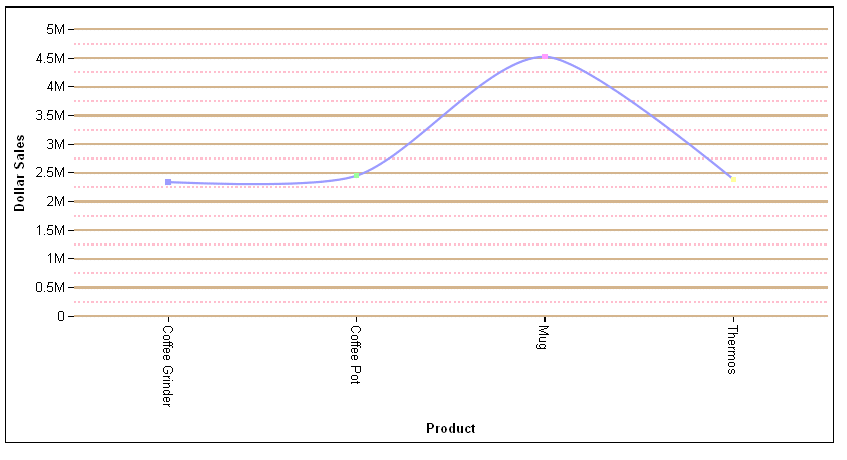
The following request against the GGSALES data source generates y-axis major grid lines that are solid tan lines and minor grid lines that are dashed pink lines:
GRAPH FILE GGSALES
SUM DOLLARS
BY PRODUCT
WHERE CATEGORY EQ 'Gifts'
ON GRAPH PCHOLD FORMAT JSCHART
ON GRAPH SET LOOKGRAPH VLINE
ON GRAPH SET STYLE *
*GRAPH_JS
blaProperties: {lineConnection: 'curved'},
yaxis: {
  majorGrid: {visible: true, lineStyle: {width: 2, color: 'tan'}},
  minorGrid: {visible: true, lineStyle: {width: 2, color: 'pink', dash: '2 2'}}
}
*END
ENDSTYLE
END
The output is:
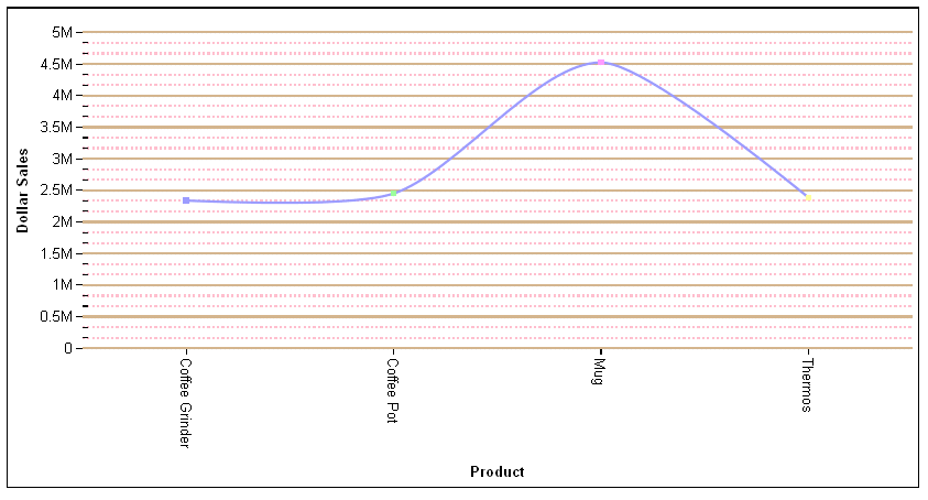
By default, two minor grid lines are being drawn between each major grid line. To change that number to one minor grid line between major grid lines, change the y-axis properties to the following:
yaxis: {
  majorGrid: {visible: true, lineStyle: {width: 2, color: 'tan'}},
  minorGrid: {visible: true, count:1, lineStyle: {width: 2, color: 'pink', dash: '2 2'}},
},
The output is: