|
Group By (X)
|
Changes groups by the horizontal sort field.
|
|
Add (Y)
|
Adds vertical sort field.
|
|
Export to
|
Exports to Excel, Word, and PowerPoint.
|
|
Top
|
Displays the top values. Options are Top
3, Top 5, Top 10, and Clear Top.
|
|
Chart/Rollup Tool
|
Opens the Chart/Rollup Tool which you can
use to select multiple group fields in the chart or rollup table
generated. The Chart/Rollup Tool contains a list of columns available
in the active report and Group By and Measure sort fields. Drag
the columns into the desired sort field.
|
|
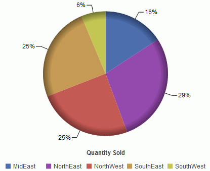
Pie
|
Views data as a pie chart.
|
|
Bar
|
Views data as a bar chart.
|
|
Line
|
Views data as a line chart.
|
|
Scatter
|
Views data as a scatter chart.
|
|
Advanced Chart
|
Opens the Chart/Rollup Tool.
|
|
Original Chart
|
Restores the active chart to the chart type
specified in the report procedure.
|
|
Sum
|
Applies the following options to the Measure
field: Sum, Avg, Min, Max, Count, and Distinct.
|