In this section: |
You can add a variety of components to an HTML page using the command groups in the Components tab.
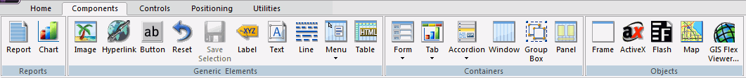
The Components tab contains the Reports, Generic Elements, Containers, and Objects groups, as shown in the following image.
How to: |
From the Reports group, you can add a Report or Chart to your HTML page. The Reports group is shown in the following image.

The commands in the Reports group are:
Inserts a report object. You can add reports to the HTML canvas that will display when you run the layout. You can either embed or reference reports. Double-clicking a blank report object opens the Report canvas where you can create, and style a report to be used in the HTML page.
You can also include parameters in a report whose values can be assigned with controls that are added with the HTML canvas.
Inserts a chart object. You can add charts to the HTML canvas that will display when you run the layout. You can either embed or reference charts. Double-clicking on a blank chart object will open the Chart canvas where you can create and style a chart to be used in the HTML canvas.
The pointer changes into a crosshair.
A report or chart object is created in the layout and assigned the name report(n) or chart(n), where n is a number. The object will appear in gray and white to indicate that the placeholder does not have a report or chart associated with it. Once a report or chart is associated with the object, the object displays the contents of the report or chart if live or simulated data is active (live data is the default) or a colored placeholder if preview is off in the HTML Page tab, located in the App Studio Options dialog box.
or
The Open dialog box opens.
The Report canvas opens for reports and the Chart canvas opens for charts.
The pointer changes into a crosshair. Drag the crosshair to create a report or chart object and adjust it to the size you want.
A report or chart object is created in the layout and assigned the name report(n) or chart(n), where n is a number. The object will appear in gray and white to indicate that the placeholder does not have a report or chart associated with it. Once a report or chart is associated with the object, the object displays the contents of the report or chart if live or simulated data is active (live data is the default) or a colored placeholder if preview is off in the HTML Page tab, located in the App Studio Options dialog box.
The Open dialog box opens.
The report or chart object appears in the Design view of the HTML canvas.
In this section: How to: |
You can add a variety of basic elements. The Generic Elements group is shown in the following image.
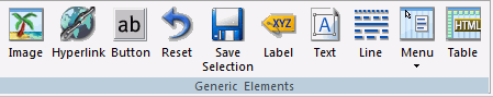
The commands in the Generic Elements group are:
Inserts an image. You can add an image to the layout. This is useful for including graphics, such as a company logo.
You can insert an image into your report layout and add a hyperlink. After you run your report and click the image, you can launch a URL or run a report the same way by clicking a hyperlink or push button.
Note: When inserting images, images must be referenced from a specific directory location.
Inserts a hyperlink.
Inserts a button. A push button enables you to execute a report or link to a URL or HTML file. This behavior is similar to a hyperlink.
Inserts a reset button. A reset button enables you to revert the entire page back to its initial settings.
Inserts a save selection button. This component is available only when you are using Managed Reporting.
Inserts a label. A label is simply a piece of text. The label component enables you to create and name a label, and link it to a control by assigning the label HTML for property the same value as the Unique Identifier property for the control.
Inserts a text box. You can add text to the layout. This is useful for including headings for your webpage, or adding directions or explanation for your report or chart.
Inserts a line. You can add a horizontal or vertical line to the layout. This is useful for distinguishing between sections of your launch or display page.
Inserts a menu. You can add a horizontal or vertical menu to the layout. This component can be used with Maintain code.
Inserts a table. You can add a horizontal or vertical line to the layout. This component can be used with Maintain code.
You can use the Font dialog box to style your text. The options are:
Determines the type of font used. For example, Ariel, Garamond, Times New Roman. The fonts available for you to use are determined by what fonts are installed on the current machine.
Determines whether the text is normal, bold, italic, or bold and italic.
Determines how large the text is.
Determines the color of the text.
Determines what effects, if any, are used for the text. You can select None, Underline, Strikethrough, Overline.
You may apply various formatting and style options to words and individual text characters within the text object.
Note: Any formatting and styling that you may have applied to individual text strings within the text object will remain unchanged. Changes made to the entire text object are only applied to part of the text string that has not been formatted.
Note: The Bold, Italic, Underline, Superscript, and Font Style options are available when formatting individual words or text characters. The Font Style and Alignment options are available when the entire text object is selected.
The format options are applied to the text selected.
To insert a bulleted list or numbered list into a text object:
The right-click shortcut menu opens.
Note:
To insert a nested list into the text object:
A list is started within the current list, allowing you to enter text on that list level.
Note: Pressing tab while your pointer is on the same line as a list item will move that item one level down, resulting in a nested list. The bullet or number type selected is the next list type in the right-click shortcut menu. For example, if you have a bulleted list that uses the disc bullet type, pressing tab to move an item down one level will cause that nested list to have the circle bullet type.
You can continue to nest lists within other lists by using the same steps shown above.
Note: You cannot skip a list level. For example, in order to insert a nested bulleted list or nested numbered list on a lower level, there must be a list one level up from it.
How to: |
You can add specific containers that group objects together on an HTML page. The Containers group is shown in the following image.
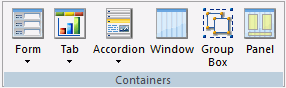
The commands in the Containers group are:
Inserts either a multi-layer or single-layer form.
Inserts a tab control. Tab controls enable you to create multiple pages in one HTML form and present a better display for viewing secondary information. You can select Top, Bottom, Left, or Right. This means you can choose to add a tab control that displays tabs at the top, bottom, left, or right on the control.
When a tab control object is added to the layout, each tab control consists of:
A tab item is the tab label. You may edit the name of the tab item, style the tab item, and add multiple tab items. Each tab item is associated with a tab body.
A tab body is the tab page where you associate your components, such as report and graph objects, images, and lines.
The Tab control can be displayed as a full screen or part of an HTML page.
Inserts an Accordion styled box.
Inserts a window.
Inserts a group box. A group box can be used to create a border around a group of objects, for example, forms or reports and charts.
Inserts a panel to group objects together. The panel is invisible at runtime.
A tab is added to the tab control object.
The tab items are resized to the size of the widest tab item and they are evenly spaced.
You may resize the tab control to fit the full screen of your layout, making the tab control the full background of your window at run time. When set to full screen mode, scroll bars will not be applied to the output window. Therefore, you may have to adjust the tab control (and any items on the tab) in the layout to ensure that they appear appropriately for display at run time.
Note: It is recommended to set the tab control to full screen mode at the beginning of the development process. If there are existing components on the layout that are not part of the tab control, these components will become inaccessible if the tab control is changed to full screen mode.
The pointer changes into a crosshair.
The tab control displays as a full screen in the layout.
Note: This setting can be applied only to one tab control in your application. If one tab control is set to full screen mode, the full screen mode item will be unavailable for any additional tab controls.
As popup dialog causes the form to display as a pop-up dialog box. When the dialog box is displayed, you must click Close to return to your HTML page.
As popup window causes the form to display as a pop-up window. When the window is displayed, you can resize and move the window around your screen.
In this section: |
You can add objects other than reports, charts, elements, or containers to customize your HTML page. The Objects group is shown in the following image.
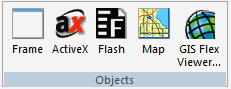
The commands in the Objects group are:
Inserts a frame. You can use a frame to embed additional web sources or run reports. You can also use a frame as the output location or target for a drill-down report. You can also use a frame to run a table of contents report, an OLAP report, a PDF report, an Excel® or a report.
Inserts an ActiveX control.
Inserts a Flash component. You can add SWF files that are Adobe® Flash Player compatible to accompany reports or graphs on an HTML page.
Note:
Inserts a map. You can add a Google™, Bing®, or ESRI map to your HTML page. Maps are services offering powerful, user-friendly mapping technology that can be customized to show points on a map with drill-down capabilities. You can customize the map properties and bind them to a report or chart.
Inserts a GIS Flex Viewer. The GIS Flex Viewer contains numerous controls, a report, and a map object.
This topic describes how to integrate maps with reports generated from the HTML canvas. Google, Bing, and ESRI Maps are services offering powerful, user-friendly mapping technology that can be customized to show points on a map with drill-down capabilities. You can customize the map properties and bind them to a WebFOCUS report.
Note: Google and Bing Maps are only available if you have an API license key.
In order to present points on a map generated by a WebFOCUS report, data needs to be in geocode. In other words, data needs to be enriched with geographical data. When binding WebFOCUS to a map, the source used to bind WebFOCUS reports needs to be defined by latitude and longitude coordinates and a marker value associated to a group of data in order for the map to launch properly.
To use Bing or Google Maps in HTML canvas, you must first obtain an API key and then apply that key to the WebFOCUS Administration Console.
To integrate WebFOCUS with Maps, set the Google or Bing configuration option in the WebFOCUS Administration Console.
Note: You must use a Version 7 API key for Bing Maps and a Version 3 or Version 2 API key for Google Maps.
http://hostname:port/ibi_apps/welcome.jsp
The WebFOCUS Administration Console appears. You may have to log on depending on how your configuration is set.
Note:
Google Maps API Version 3 does not require a key.
A Version 7 API key is required for Bing maps and a Version 2 API key is required for Google Maps.
Before binding maps to a WebFOCUS source, you must predefine marker fields in a source file. The source can be a URL, XML file, or external procedure.
Markers are presented at run time on the map by placing an image at specific geographical points. Clicking on the map marker can result in a drill down to a source file, and optionally, a tooltip can be presented when pausing on a map marker.
Markers are defined by the following:
Marker fields are displayed by an image, drill down, and/or tooltip in the map.
Note: The following procedures are applicable for using Google Maps, Bing Maps, and ESRI JavaScript API Maps.
In order to plot points on the map, you must define each point by its latitude and longitude coordinates and associate a marker, or group assignment, to each point. The Source file must be XML format and must contain fields called LATITUDE, LONGITUDE and MARKER. Additional fields can be included for tooltips or image icon information.
Note: The following example creates a source file for a map by:
Tip: The Century Sales and Locale data sources are available from the Master Files folder in the IBI Demonstration project of App Studio. You may copy these source files to the project directory of your choice.
The Open File dialog box appears.
The Join canvas opens.
The Open File dialog box appears.
App Studio automatically creates a Join between the data sources if they both have fields with the same formats. The Join canvas displays both data sources and the default Joins.
The Open File dialog box appears.
The Report canvas opens.
If fields in your source are not called Latitude, Longitude, or Marker, you can:
Each location (Latitude and Longitude) has been grouped to LINEPRICE for the report.
The map Latitude and Longitude coordinates have been set. This source file will be selected as the source file from the HTML canvas later on.
Marker and tooltip fields can be computed fields, or any field from your data source.
Note: If you are using a field from your data source as the Marker field, the field name must be renamed Marker.
A COMPUTE field is a calculated value in the source file that is used as the Marker field in the map. A COMPUTE field uses an expression that can be used to assign a value to a field.
Note: If the HTML page where your map resides is created in the Repository area and the marker images also reside in the Repository area, then a fully qualified path to the image files (starting with /WFC) is needed, if using a DEFINE/COMPUTE to determine the marker image. For example: IMAGE/A75='/WFC/repository/images/cust_'||IMAGE_COLOR||IMAGE_SIZE;
The following example creates marker fields and canvas tips fields by:
The Report canvas gmlayer.fex is still open. Create a COMPUTE field to assign an integer value determined by row-based values.
|
LINEPRICE |
Integer |
Marker |
|---|---|---|
|
0 - 999,999 |
2 |
redicon |
|
1,000,000 - 9,999,999 |
3 |
yellowicon |
|
10,000,000 - 49,000,000 |
1 |
greenicon |
|
50,000,000 or higher |
0 |
blueicon |
Enter the syntax to use LINEPRICE to group the data:
COMPUTE LINEPRICE_CLASS/I5 = IF LINEPRICE GE 50000000
  THEN 0 ELSE IF LINEPRICE GE 10000000
  THEN 1 ELSE IF LINEPRICE LE 1000000
  THEN 2 ELSE 3
Create a new COMPUTE field that sets the Marker field with a DECODE statement to convert the numerical grouping into icon names.
Note: A Marker field can also be any value field from your data source, but must be renamed Marker.
COMPUTE MARKER/A10 = DECODE LINEPRICE_CLASS( 0 'blueicon' 1 'greenicon' 2 'redicon' ELSE 'yellowicon') ;
Optionally, if you want to include a tooltip, create an additional COMPUTE field to assign fields as tooltips.
Note: A tooltip field can also be any value field from your data source.
COMPUTE REVENUE_RANGE/A10 = DECODE LINEPRICE_CLASS( 0 'OVER 50M' 1 '10M to 50M' 2 'UNDER 1M' ELSE '1M TO 10M') ;
The fields are added to the Computed fields folder in the Object Inspector and are automatically added to the report as LINEPRICE_CLASS, MARKER, and REVENUE_RANGE.
In addition to creating the Latitude or Longitude coordinates and associating markers, you must set the center view of the map to a bound geographical point at run time. Center values can be set dynamically or by a constant value.
Note: The following example creates a report that sets the starting point of your map by:
Tip: The Century Sales and Locale data sources are available from the Master Files folder in the IBI Demonstration project of App Studio. You may copy these source files to the project directory of your choice.
The Open File dialog box appears.
The Join canvas opens.
The Open File dialog box appears.
App Studio automatically creates a Join between the data sources if they both have fields with the same formats. The Join canvas displays both data sources and the default Joins.
The Open File dialog box appears.
The Expression Builder opens.
CITY EQ 'Nashville'
In this example, Nashville is set as the center value starting point for your report.
Once you have configured the map controls and created a WebFOCUS procedure to get a center value, you may add a map through the Insert menu of the HTML canvas.
Note: When ESRI map is selected for the map type, the ArcGIS Server option is added to the Property panel of the HTML page. A server must be specified or the map will not load without it.
The pointer changes into a crosshair.
The Settings panel opens, from which you can set the map and layers properties.
The map control also has a set of properties for the object.
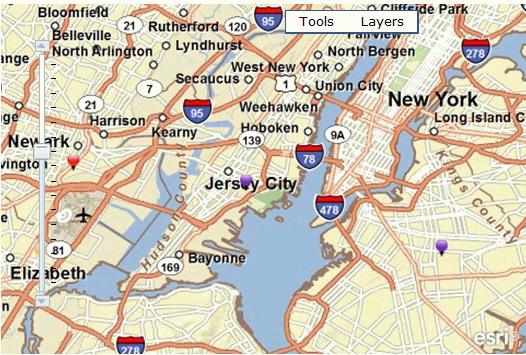
The map appears as an image in the HTML canvas.
Note: Once a map has successfully been inserted into the HTML page, the COORDINATES field becomes available for use by any other components further in the chain.
You may customize the map by using the Settings panel and the Properties panel.
The Settings Panel for a map object contains many options for controlling how a map behaves and what information it displays.
Sets the center view of the map to a bound geographical point at run time. The center location can be set dynamically or by a constant value.
Select a Source Type and a Source. This binds a Source file that contains coordinates to set the center view of the map.
An external file should only return one Latitude and Longitude value for the center point.
You can use the ASNAME command to rename an existing field to the required names.
Geographical position can be defined by Latitude or Longitude, or by an address.
The default is Latitude or Longitude.
Note: A Center Location, using address as the Location Type, is not supported when using an ESRI JavaScript map.
When using a Dynamic center value, select the source of your location data. Source Type options are URL, XML File, and External procedure.
If using an External procedure, the report output must be XML.
When using a Dynamic center value, enter the source file for the source type.
The Source field provides an ellipsis button when using XML File and External procedures. Select the source file from the Open File dialog box.
When using a constant value, enter the Address or Latitude and Longitude value.
If entering a Latitude or Longitude value, the value entered should be Latitude and then Longitude, separated with a comma (and/or space).
If entering a Latitude and Longitude value, it must be defined as a numeric value. For example, the following is latitude and longitude for New York, NY 10001:
40 45’ 58.73” N, 73 59” 1.48” W and converts to 40.7663277, -73.9920777.
An example of an Address value is: 2 Penn Plaza New York, NY 10001.
Layers bind sources to the map in order to define map markers. Markers are presented at run time in the map, as indicated with images at specified geographical points. Clicking the map marker results in a drill down to a Source file and optionally, a tooltip when pausing on a map marker.
Select a Source Type, Source and Marker. Each Layer row will yield a designated marker in the Marker Groups box. Optionally, a selected marker can be associated with an Image, Drill Down, and tooltip.
You can rename the layers by typing in the Layers box. This name should be a unique name that is used to identify a layer in the layer control and in JavaScript calls.
Note: A default name of Layer1, Layer2, and so on, is applied when you click the Add New button. You may double-click in the field and manually type a unique name.
Select the source of your layer. Source Type options are URL, XML File, and External procedure.
If using an External procedure, the report output must be XML.
Enter the source file for the source type.
Note: The Source field provides an ellipsis button which enables you to select the source file from the Open File dialog box.
When the source is selected, the Marker Groups box is populated with the values from the field MARKER in the WebFOCUS procedure.
When adding dynamic parameters to the HTML page, input controls retrieve data through procedures. Select this option to cache the run-time data for the selected input control. This setting is off by default. This setting overrides the Default caching option from the HTML Page tab, which is located in the App Studio Options dialog box.
Controls the initial visibility of the marker groups, from the layer control, when the map runs. The visible option is useful when you want to make selections on the map without other markers, from other layers, interfering. For example, when making selections and doing a drill down, only visible markers should be selected and passed along.
You can refresh the source for a layer when the map runs. You may refresh a layer on demand, or automatically at a timed interval. The default refresh time is set to 0 seconds, which indicates that the automatic refresh is disabled. The minimum automatic refresh time is 60 seconds.
Refresh is not applicable to markers in the Marker Groups.
The Marker Group box lists all unique markers defined in the source of the highlighted source row. When the source is selected, the Marker Groups box changes, listing all markers in the selected Layer. Optionally, a selected marker can be associated with an Image, Drill Down, and tooltip.
The possible values for markers are generated by previously defined fields in the Layer source.
Select the Image and/or tooltip to be associated for the selected marker.
Enter the source field, or constant value, for the source type.
When the Source Type is Image, the Source field provides an ellipsis button which enables you to select the image file from the Open File dialog box.
The inner ring radius is the distance between the center of the bullseye chart to the first ring, where 10 miles is the radius of distance.
The outer ring radius is the distance from the center of the bullseye chart, where 100 miles is the radius of distance.
The number of rings to draw for the bullseye chart, where three rings is the default number of rings.
When you set the number of rings, the inner radius, and the outer radius, any rings between the innermost and the outermost ring, are proportionally separated.
Sets the default map rendered at run time. Select from Map/Road, Satellite/Bird’s Eye, or Hybrid/Automatic. Each option is presented as part of the map in the output, allowing you to change views.
Note: Map, Satellite, and Hybrid are used for Google Maps while Road, Bird’s Eye, and Automatic are the equivalent for Bing Maps.
Controls the ability to drag the map in order to reposition the center point to a new location. This option is set by default.
Note: This option cannot be disabled for Bing or ESRI maps. Selecting No from the drop-down list will not disable dragging.
The Layers menu control provides options to show or hide markers in the layers of the map, and manually refresh the layer(s).
The New Polygon menu control provides options to select multiple markers on maps by creating shape selectors, such as a freehand polygon, rectangle, or bullseye chart.
You can select multiple markers on maps at run time by creating polygon shapes. Polygon features enable you to add both tooltips and actions to all polygons when you pause on them in the map.
The Run menu control runs the drill downs for the selected markers.
Enables copying of a polygon.
Enables deleting of a polygon.
Enables moving of a polygon.
Enables resizing of a polygon.
tooltips appear when you pause on a shape selector in the map.
All tooltip options are turned on by default.
Shows the Area tooltip.
Shows the Dimensions tooltip.
Dimensions appears as Radius (for a circle polygon shape) in the tooltip.
Shows the Markers Count tooltip.
Sets the icon or image associated with a marker when selected. Click the Selected Marker Image ellipsis button to open the Open File dialog box and select a marker image. If you do not specify a selected marker image, the default selected marker image (a red bulb) is used.
Options for the location distance are miles (mi) or kilometers (km), where miles is the default unit selection.
Enables smooth, continuous zooming for select browsers.
Enables you to double-click to zoom in and out of the map.
Note: This option cannot be disabled for Bing maps. Selecting No from the drop-down list will not disable zooming when double-clicking.
Sets the default zoom level of the map at run time. The levels available are 0 through 18. If the zoom level is set to 8 or higher, the initial map will have only one point visible. The default value is 10.
You may also change the zoom level in the output with the scrolling and arrow buttons on the map.
Enables you to use the scroll wheel of your mouse to zoom in and out of the map.
Note: This option cannot be disabled for Bing maps. Selecting No from the drop-down list will not disable zooming using the scroll wheel.
Customize the map by selecting the map and layer options.
Source Type options are URL, XML File, and External procedure. If you are using an External procedure, the report output must be XML.
For example, select Dynamic, Latitude/Longitude from the Location Type drop-down list, and External procedure from the Source Type drop-down list. Click the Source ellipsis button to open the Open File dialog box and double-click setcentervalue.fex as the external XML file.
An example of an Address value is: 2 Penn Plaza New York, NY 10001.
If entering a Latitude and Longitude value, it must be defined as a numeric value. For example, the following is latitude and longitude for New York, NY 10001: 40 45’ 58.73” N, 73 59” 1.48” W and converts to 40.7663277, -73.9920777.
For example, click the Source ellipsis button to open the Open File dialog box and double-click purplepin.png as the marker image file.
For example, click the Add new button to create a layer. Click the Request drop-down to select a request used to populate this layer. A request is created in the Tasks & Animations panel.
When the source is selected, the Marker Groups box is populated with the values from the Field MARKERS in the WebFOCUS procedure.
Each marker group can have its own image and tooltip.
For example, select greenicon from the Marker Groups box. Double-click greenpin.png from the Image Source section. The marker image is automatically saved. Repeat this process to apply individual images to each of the marker groups.
Tip: To select multiple marker groups at one time:
For example, apply the tooltip to all of the marker groups by selecting Field as the Source Type and REVENUE_RANGE as the Source.
You may use map controls to navigate around the map, zoom in or out, drag the map to a new position, select different map types, and see marker groups. For example, click the minus icon on the map to zoom out and see all of the colored marker groups.
Note: The Zoom In and Zoom Out slider control appears on the map since the Size: Height property is greater than 280px.
For more information about using map controls, see the documentation from the website of each respective map.
You can integrate WebFOCUS reports with maps by:
Latitude and longitude values can be passed as a parameter from a map to update a WebFOCUS procedure. Latitude and longitude are sent as a pair of values, and the HTML canvas uses a specific parameter, &COORDINATES, to parse the value pairs correctly.
By adding a drill down to a map, you can filter a WebFOCUS report by the latitude and longitude coordinates of the selected marker(s). The parameter to pass the longitude and latitude values must be called &COORDINATES. This HTML canvas parameter will parse the Latitude and Longitude as paired data sets.
The following example updates a WebFOCUS report based on a map location by:
The Procedure View panel opens and the Open File dialog box opens.
Tip: The Century Sales and Locale data sources are available from the Master Files folder in the IBI Demonstration project of App Studio. You may copy these source files to the project directory of your choice.
The Open File dialog box appears.
The Join canvas opens.
The Open File dialog box appears.
App Studio automatically creates a Join between the data sources if they both have fields with the same formats. The Join canvas displays both data sources and the default Joins.
The Open File dialog box appears.
The Report canvas opens.
The Variable Editor opens.
The Expression Builder opens.
You are returned to the HTML canvas where the New Parameters dialog box appears.
You will not need a control for the &COORDINATES parameter because the parameters will be passed by the map.
The Revenue by Category report appears in the HTML canvas.
Click the markers on the map to update the report based on the location selected.
This section describes how to use maps with the custom functionality provided by Information Builders. You can select multiple markers on maps at run time and drill down to WebFOCUS procedures filtered by the marker locations selected.
Note: For Google and Bing maps, the functions in this section can be accessed by right-clicking on a map during run time. To access the same functions for ESRI JavaScript API maps, you must click on the canvass button at the top of the map during run time.
There are several ways of selecting markers, such as:
Note: Selected markers are indicated by the Selected Marker Image that you supply on the map Properties panel.
Manual selection is the act of clicking on one or more individual markers in succession.
Note: The Shift key does not clear the selected markers.
When the green and blue markers are selected, they become purple markers.
Shape selection is the act of clicking in a specific location on the map and then drawing an area with the mouse on the map to form a shape. This shape enables you to select all markers within the drawn area. The map provides various selector shapes to choose from.
Tip: The shape selection options are available from the right-click shortcut menu on Google and Bing maps and through the canvass menu for ESRI JavaScript API maps. You may also customize these options from the map Properties panel.
The canvass menu appears.
You may create a new polygon shape, change the polygon settings, show or hide markers from a layer, and refresh a layer.
Note: The method by which selections are made depends on the selector shape used.
The shape selector is created with the selected markers, and a tooltip indicating the details of the shape selector.
Note: Selecting Clear Selection clears all of the selected markers from the map.
Note: Selecting Remove Polygons removes all the shape selectors from the map.
The selector shape is repositioned over the new location.
Combination selection is the act of using both the manual selection method and the shape selection method separately, or in coordination with one another, to make marker selections. Multiple selections can be made by using any of the above procedures prior to drilling down to WebFOCUS procedures.
All layer marker groups are visible in a map by default. You may edit the visibility option to hide the markers in a map at run time.
The menu appears.
Note: The layer name is the unique name for the layer created in the Map Properties dialog box.
The selected markers are not visible on the map.
Tip: To show all marker groups from all layers on the map, select Show All from the Layers menu.
Note: Only layers have a visibility option on the Settings panel. You may hide individual markers from a layer in the map output, as described in the first step of this procedure.
When you run the map, all of the layer markers are not visible.
You may refresh the map output on demand or by setting up an automatic refresh at a timed interval.
The menu appears.
Note: The layer name is the unique name for the layer created in the Map Properties dialog box.
Note: The default refresh time is set to 0 seconds, which indicates that the automatic refresh is disabled. The minimum automatic refresh time is 60 seconds.
Refresh is not applicable to markers in the Marker Groups.
The source for the layer refreshes on the map at the set timed interval.
The available shape selections from the New Polygon menu are Freehand, N-sided Polygon, Rectangle, Bullseye Fixed, and Bullseye Freehand.
Note: Polygons created when using ESRI maps are unable to be moved, copied, or resized.
A freehand polygon shows the selector shape as a series of lines that you mark at specific points on the map.
A cross is indicated on the map.
Note: You can also use the Freehand Close option to close the polygon. The Freehand Close option is found in the New Polygon menu. This option is unavailable unless you are using the Freehand option. The Freehand Close options is best used on an iPad device.
An N-sided polygon shows the selector shape as a continuous line you draw around the markers to be selected. N-sided indicates that you can select the number of sides for the polygon.
Note: The default polygon is a circle.
A cross is indicated on the map.
To change the number of sides for the polygon:
Note: The default polygon is a 12-sided polygon. You may change the number of sides for a polygon by using the Polygon Settings menu on the map.
Optionally, you may select to Show tooltips for the polygons on the map.
The polygon shape has the number of sides that you indicated from the Polygon Settings.
A cross is indicated on the map.
You may create a fixed or freehand bullseye chart in the map output. A bullseye chart is used to show radius distance from a location using three rings of increasing size. The bullseye options are available from the New Polygon shortcut menu on the map.
Note: You may customize the ring and radius options of the bullseye chart from the Map Properties dialog box.
A fixed bullseye chart applies a predetermined size at the selected location.
A cross is indicated on the map.
The bullseye chart is inserted in the selected location with a randomly generated color.
A freehand bullseye chart enables you to create the size and location of the initial bullseye chart.
A cross is indicated on the map.
The bullseye chart is inserted in the selected location with a randomly generated color.
A white box appears in the center of the bullseye and on the outer ring.
Optionally, you may select Freehand Resize to manually resize the bullseye chart.
The polygon shapes will remain on the map when the markers are cleared.
The polygon shapes are removed from the map but the markers remain selected.
Whenever maps are run against a secured server (SSL configuration), the user is prompted with a message for display of secured and unsecured content on the HTML page. This message originates from map provider and is shown because they establish a link to an unsecured server to present the map.
When actions are enabled from the map Properties panel, you may Copy, Delete, Move, and Resize the polygon shape selectors on the map.
All action options are selected by default.
When chaining maps with other controls in the HTML canvas, you are able to pass fields that are not displayed by the map. These fields can be passed from one control to the map and then from the map to another control, where those undisplayed fields will then be used.
The following example shows how a map can be chained with other controls and how it can pass fields through the map for use later in the chain. For this example, the centurystores Master File was used.
This example contains an HTML page that has two listboxes and one map control.
The Parameters tab view shows that these controls are chained together.
Listbox1 is populated with a list of store names from the centurystores Master File. When one of the stores on the list is selected, the store location is shown on the map.
When the store marker image is selected on the map, the store address is displayed in listbox2.
Listbox1 passes the necessary fields to mapcontrol1 so that it can display the store location on the map. In this case, it passes the STORENAME field.
The layer procedures include BY STORENAME to filter the layer to show only the markers for the selected store in listbox1. The layer procedures also include a BY STOREID reference, which the map does not display, but is used in listbox2 to retrieve the correct store address for the selected map marker.
Mapcontrol1 does not use this field. However, when the store marker is selected on the map, the STOREID field is passed from mapcontrol1 to listbox2.
STOREID is passed to listbox2 where it is used to filter out the store address from the selected marker.
Maps can pass fields that they do not display. They can then pass those unused fields to another control, down the chain, which can use the passed fields.
The toggleLayer(‘mapId’, ‘layerName’) function toggles the visibility of the specified layer.
function button1_onclick(ctrl) {
toggleLayer('mapId', 'layerName');
}
where:
Alphanumeric
Is the unique identifier of the map control. For example, mapcontrol1.
Alphanumeric
Is the unique identifier of a layer within the map. For example, Layer1.
The toggleLayer(‘mapId’, ‘layerName’, ‘markerName’) function toggles the visibility of the specified marker.
function button2_onclick(ctrl) {
toggleLayer('mapId', 'layerName', 'markerName');
}
where:
Alphanumeric
Is the unique identifier of the map control. For example, mapcontrol1.
Alphanumeric
Is the unique identifier of a layer within the map. For example, Layer1.
Alphanumeric
Is the unique identifier of a marker within the map. For example, redpin.
The refreshLayer(‘mapId’, ‘layerName’) function refreshes the specified layer.
The panToAddress(‘address’, ‘mapId’, ‘zoom’) function pans to a designated address.
function button4_onclick(ctrl) {
panToAddress('address', 'mapId', 'zoom');
}
where:
Alphanumeric
Is the address you want to pan to. For example, 2 Penn Plaza New York NY 10001.
Alphanumeric
Is the unique identifier of the map control. For example, mapcontrol1.
Integer
Is how much you wish to zoom. For example, 7.
The panToPoint(‘lat’, ‘long’, ‘mapId’, ‘zoom’) function pans to a designated point based on latitude and longitude coordinates the user enters.
function button5_onclick(ctrl) {
panToPoint('lat', 'long', 'mapId', 'zoom');
}
where:
Integer
Is the latitude coordinate of the point you want to pan to. For example, 40.7663277.
Integer
Is the longitude coordinate of the point you want to pan to. For example, -73.9920777.
Alphanumeric
Is the unique identifier of the map control. For example, mapcontrol1.
Integer
Is how much you wish to zoom . For example, 7.
The showAllMarkers(‘mapId’) function displays all map markers, even if previously hidden.
The drawBullseye('mapId', 'lat', 'long', 'selectmarkers', 'units', 'rings', '(list-of-sizes)', '(list-of-colors)') function draws a bullseye at a point on the map. This function has optional parameters to select whether to display markers, the units of measure used for the bullseye, the number of rings, the size of the rings, and the color of the rings.
function button5_onclick(ctrl) {
drawBullseye('mapId', 'lat', 'long', 'selectmarkers', 'units', 'rings', '(list-of-sizes)', '(list-of-colors)');
}
where:
Alphanumeric
Is the unique identifier of the map control. For example, mapcontrol1.
Integer
Is the latitude coordinate of the point you want to pan to. For example, 40.7663277.
Integer
Is the longitude coordinate of the point you want to pan to. For example, -73.9920777.
Boolean
Is an operator that, when set to true, selects all markers within the Bullseye.
Alphanumeric
The unit of measure for the Bullseye rings For example, mi for miles.
Integer
The number of rings the bullseye uses. For example, 3.
Integer
A comma separated list of sizes for the bullseye rings. For example, 1, 3, 5.
Alphanumeric
A comma separated list of colors for the bullseye rings. The colors can be RGB values or hexadecimal values. For example, Blue or #FFFF.
The ESRI Flex Viewer creates a component that adds numerous controls, a report, and a map object when used.
The ESRI Flex Viewer component can be accessed from the Insert menu, by selecting Components and clicking ESRI Components. You can then drag the crosshair to the desired size for the ESRI Flex Viewer controls and report. The ESRI Flex Viewer component will contain a number of controls, a report, and a map object. It is recommended that the ESRI Flex Viewer component be drawn big enough to accommodate all of these items.
You will then choose the esriinfo XML file to use with the ESRI Flex Viewer component.
Note: The following line must be present in your esriinfo XML file for you to pass parameters from the controls to the map object and from the map object to the report.
<callback identify="parmcollect" map="IBI_GetLayoutPainterParameters" report="IBI_GetLayoutPainterParameters"/>
The New Parameter dialog box will open and you will be able to change the options for the parameters contained within the ESRI Flex Viewer component.
The ESRI Flex Viewer component will then be inserted into the HTML page.
Note: Controls and reports within the ESRI Flex Viewer can be chained. Maps within the ESRI Flex Viewer component cannot be chained.
| WebFOCUS |