|
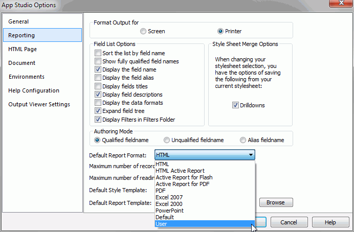
Sort the list
by field name
|
Sorts any list of field
names alphabetically.
|
|
Show fully qualified
field names
|
Displays any list of field
names as qualified field names, which includes data source and table
names, alphabetically.
|
|
Display the field name
|
Displays the full field
name in the Fields tab, as specified in the file description.
|
|
Display the field alias
|
Displays the alternate field
name in the Fields tab, as specified in the file description.
|
|
Display field
titles
|
Displays the column title
in the Fields tab, as specified in the file description.
|
|
Display field descriptions
|
Displays descriptive information
about the field in the Fields tab, as specified in the file description.
|
|
Display the data formats
|
Displays the field length
and format type in the Fields tab, as specified in the file description.
|
|
Expand field
tree
|
Displays fields in expanded
mode when using a Field tree. If this option is not selected, segments
appear collapsed wherever a Field tree appears.
Note: This option can also be accessed
from the Field tree context menu.
|
|
Display Filters
in Filters Folder
|
Displays Filters in a separate
Filters folder of the Field tree. If this option is not selected,
Filters appear with the rest of the fields in the segment.
Note: This option can
also be accessed from the Field tree context menu.
|
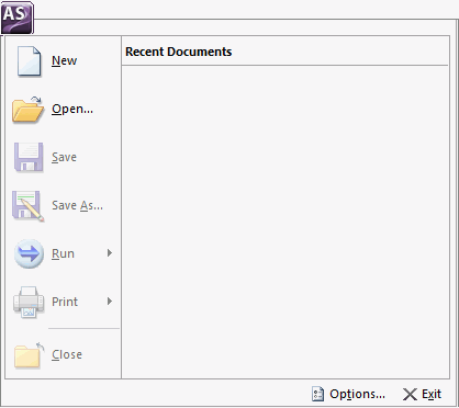
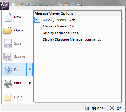
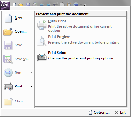
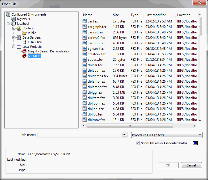
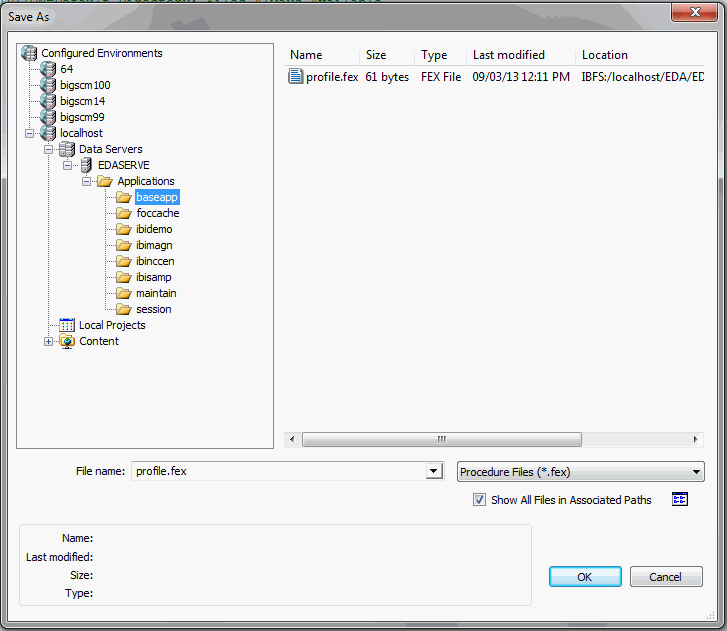
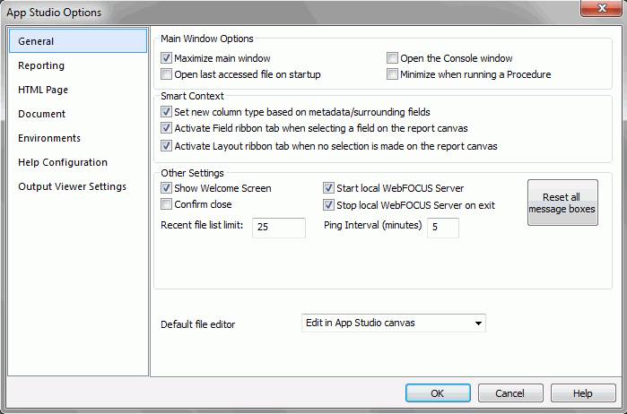
 , opens the Application
menu of file-related commands. You can create a new document, open
an existing document, save an active document, and print an active
document. The Options button opens the App Studio Options dialog
box, where you can set user preferences. The Application menu also
lists recently opened documents. The Application button is always available.
It is located in the upper-left corner of the App Studio interface.
, opens the Application
menu of file-related commands. You can create a new document, open
an existing document, save an active document, and print an active
document. The Options button opens the App Studio Options dialog
box, where you can set user preferences. The Application menu also
lists recently opened documents. The Application button is always available.
It is located in the upper-left corner of the App Studio interface.