In this section: |
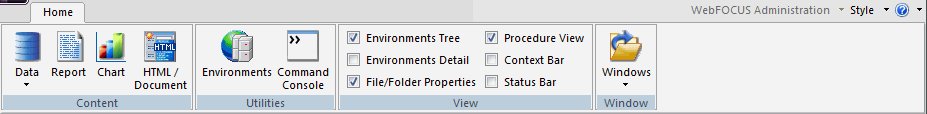
The App Studio ribbon replaces traditional toolbars with a single command bar that organizes commands and controls into a series of static and contextual tabs. From the ribbon, you can also access the WebFOCUS Administration menu, the Style menu, and the Help menu.
The default ribbon is shown in the following image.
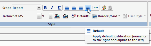
Each tab on the ribbon, whether static or contextual, contains commands and controls that are organized into groups according to their function or relationship. All tabs are named and all groups are labeled. Icons are used to represent the commands or controls in each group. Typically, all icons are labeled by default. There are a few styling icons in the Style group that are not labeled. Rest your pointer over an icon to view the tooltip that identifies it. An example of this is shown in the following image.
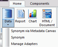
In addition to single-click commands, some commands on the ribbon contain a submenu of options that opens when you click the arrow associated with the command. These arrows can appear below or next to a label. An example of this is the Data command, which opens a submenu of options, as shown in the following image.
Note: There is no default ribbon size. As your monitor or application window size changes, the commands and controls on the ribbon resize themselves to fit the available space. Large monitors or application windows will display larger icons and entire groups. Smaller monitors or application windows may display groups as a single, labeled icon that opens a submenu.
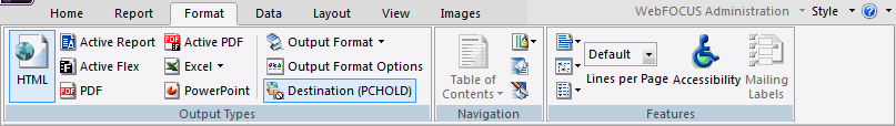
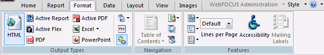
In the following example, the Output Types group, Navigation group, and Features group display the icons at their full size.

In the following example, the Output Types group, Navigation group, and Features group contain a combination of full-size icons and smaller-size icons.
In the following example, the Features group and Navigation group contain small icons, some without their labels, while the Output Types has collapsed down to a single icon with a submenu.
As described earlier, the App Studio ribbon is composed of static and contextual tabs. When you launch App Studio for the first time, the Home tab opens. The Home tab is the only static tab in App Studio. All other tabs on the ribbon are contextual, and open or close as you develop applications.
The following tabs open on the ribbon:
Note: The Field and Appearance tabs open when you select a field in the report. The Modeling tab is available only when you license RStat.
Note: The Report tab is only available when you click the Data Profiling or Statistics commands on the Metadata tab.
In the Environments Tree panel, select a WebFOCUS environment, and then click the WebFOCUS Administration menu, as shown in the following image.
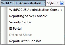
From this menu, you can access administration options to manage your environment. These options include the following:
You can customize the appearance of the App Studio interface from the Style menu. From this menu, you can select a theme with which to customize the App Studio interface. The themes available to you are determined by the themes that you have installed for Microsoft® Office. The Style menu is always available. It is located in the upper-right corner of the App Studio interface, as shown in the following image.
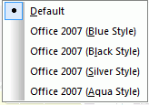
Note: When you close App Studio, the theme that you have selected is saved and used the next time you launch the product.
You can access the App Studio Help content, App Studio licensing information, and other product options, from the Help menu. The Help button is always available. It is located in the upper-right corner of the App Studio interface.
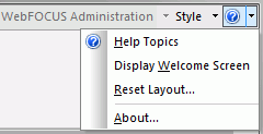
From the Help menu, you can do the following:
Tip: You can also press F1 on your keyboard to access the online Help system.
| WebFOCUS |