Key Dashboard Controls:
x
You can customize toolbars and place them anywhere on
the screen. If you build new toolbars, they are saved when you exit
WebFOCUS Visual Discovery AE and automatically displayed when you
open WebFOCUS Visual Discovery AE. For more information about toolbars,
click Help, Topics,
and click Toolbars.
x
To select data, left click and sweep your mouse over
what you see on charts. The selection is then seen as colored, with
the unselected data as grey. Most of the charts have brushups which
will state the % selected. The selected and unselected data will always
total to all included (aka non-excluded) data.
x
When you click on a toolbar button, an action is executed.
To see a description of the toolbar, hover the cursor over the button.
The Key functions on the Selection Toolbar are:
|
Toolbar Button
|
Description
|
|---|
|

|
Exclude Unselected. Removes unselected
elements from the data view. These items are logically removed
and will not show in any of the charts until they are restored.
|
|

|
Exclude Selected. Removes selected
elements from the data view.
|
|

|
Restore Excluded. Restores and redisplays
all excluded elements. Prior selection state is not changed.
|
|

|
Select All. Use this function to
select all data that is not excluded.
|
|

|
Toggle Selection. Use this function
to switch between selected and unselected data.
|
|

|
Undo. This function allows you to
remove a single action (by selecting this function once) or several
actions (by repeatedly selecting this function).
Note: This
function may be slow or inoperative with large data sets, depending
on computer memory.
|
|

|
Redo. This function allows you to
re-institute a single action (by selecting the function once) or
several actions (by repeatedly selecting this function).
Note: This
function may be slow or inoperative with large data sets, depending
on computer memory.
|
x
Selection mode controls determine how the mouse interacts
with the data when you sweep over or click on a chart. The key functions
on the Selection Mode Toolbar are:
|
Toolbar Button
|
Description
|
|---|
|

|
Rectangular Selector.
Default
Setting. To use the rectangular selector, place the cursor in
the area to be captured and drag the mouse while holding down the
left mouse button. A rectangular selection box appears around the
data that you have selected.
|
|

|
Circular Selector. To use the circular
selector, place the cursor in the area to be captured and drag the
mouse while holding down the left mouse button. A circular selection
area appears around the data that you have selected.
|
|

|
Lasso Selector. Use this tool to
select data by creating freehand selection borders around the data.
|
|

|
Replace Selection Mode.
Default
Setting. The data that you select using this tool replaces previously-selected data.
|
|

|
Add Selection Mode. Use this function
to add data to an existing selection.
|
|

|
Subtract Selection Mode. Use this
function to remove data from an existing selection.
|
|

|
Intersect Selection Mode. Use this
function to select the “intersection” of two fields. This is essentially
an “and” function.
|
Now that the data you selected is displayed in a page, you can
analyze the information to find answers to your business questions.
xVisual Discovery: 4 Data States
One of the strengths of WebFOCUS Visual Discovery AE
is the ability to select what you see on charts in projects. We
call that a selection. A selection on one chart in a project is
propagated to all the other charts across all the other pages in
a project. This happens in simple one table projects, as well as
across charts attached to multiple linked tables in a more complex
project. As selections are made, underlying data can be in one of 4
states: Included and Selected (all in), All Included but some Unselected,
Excluded, Filtered:
-
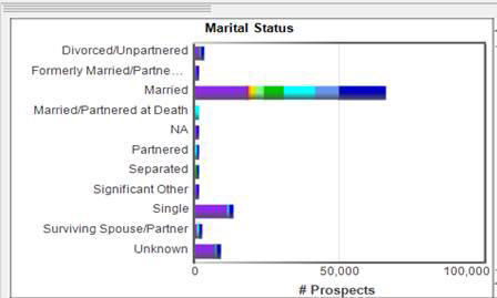
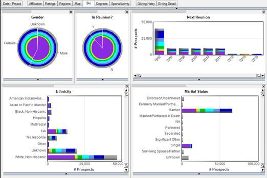
All Included and Selected (all in). Data that is
selected will appear colored in the dashboard. For example, the
bar chart below shows the Marital Status for a population. It indicates
that every individual in the population is selected because all of
the bars are colored.
-
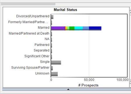
All Included but some Unselected (for example, not all Selected). Data that
is included but Un-selected will appear gray in the graphical charts
in the dashboard. Using the same example, we see that now only those
individuals who have a marital status of Married are selected. The
population with other Marital Status’ is still included but is unselected
and, hence grey.
-
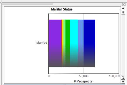
Excluded (removed from the base population). Excluded
data will not be displayed in the dashboard. Using the same bar
chart we now see that only the population that is Married is selected
and all other Marital Status types have been excluded as we only
see the Married bar.
-
Filtered (removed from the base population by a text filter, or a logon filter in WebFOCUS Visual Discovery AE Server). This
is logically similar to excluding data, except that chart and toolbar
controls for restore excluded will not restore filtered data. The
only way to restore the filtered data is by resetting the filter.
Text Filters are normally used only on the first page of a project
(which it opens on), and are used in cases where it is clear that
certain populations are not going to be used in subsequent comparisons
(for example, to remove inactive customers from an analysis of recent transactions).
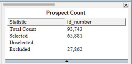
The counts chart is a great way to get a quick view of what's
selected, and what's not. The first line (total count) counts all
rows in the table whether included, excluded, selected, or unselected.
Note: The counts chart can also show unique counts, sums,
averages, etc. The second line shows what is selected, the third
line what is included but not selected, and the fourth line shows
what is excluded (both by filtering and excluding.
xUsing a Project to Perform Visual Discovery
-
How to select data on a chart. Left-click
and drag mouse over portion of a chart. All charts on all pages
update instantly based on the selection. The selected data will
be colored and all unselected data will turn grey. WebFOCUS Visual
Discovery AE shows stats on the percent of the selected to the whole available
(i.e., non-excluded) population. You can then add in unselected
data, intersect with other selected data, or subtract other selected
data. Then, reduce the available population by excluding the unselected
data. Excluded data is now logically removed, and no longer shows
as unselected. Note that all graphical charts are set to show both selected
and unselected available data. Text charts (datasheet and summary
sheet are set in default mode to only show selected data).
-
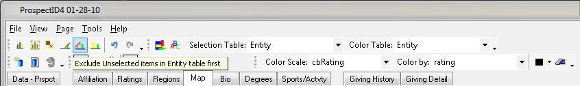
How to exclude data:
-
From the Selection Table First. Use
the top toolbar to exclude entities and then refresh the charts
to show all attributes associated with the selected entities. For
more information, see the following image.
-
From the Local Table First. Right-click on the chart
to exclude data from the chart first and then update to show only
entities who have some of the selected attributes. For more information,
see the following image.
-
How to Filter Data. Text filters allow you to immediately
drop the dashboard down to a subset of data.
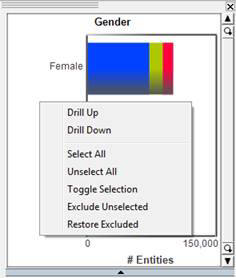
xTypes of Selection (Selection Modes)
- Replace Selection Mode . This is the default setting. The
data that you select using this tool replaces previously-selected
data.
- Left-click and drag mouse over portion of a chart, then release,
as shown in the following image.
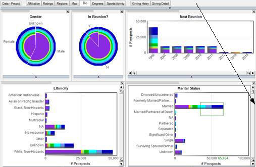
All charts on all
pages update instantly based on the selection.
- The selected data will be colored and all unselected data will
turn grey.

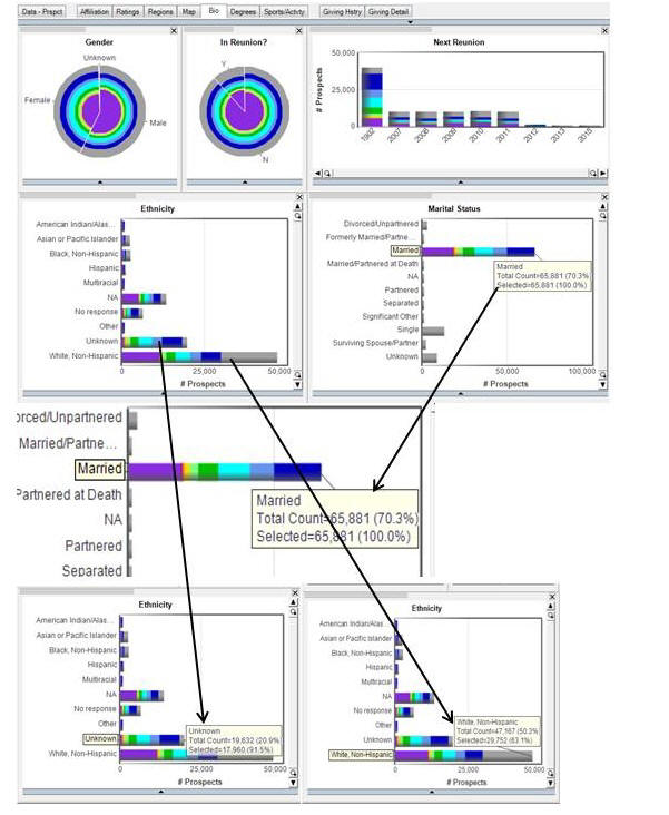
In the page above,
only those individuals who are Married are now the colored portions
of the bars in the Ethnicity, Gender, In Reunion, and Next Reunion
charts.
What does it mean to have selected and unselected
data? When you have both selected and unselected data you are able
to see the percentage of the selected data to the whole available
(= non-excluded) population. In the example, below we see that 70.3%
of the available population are Married, you can also see that 91.5%
of the Unknown Ethnicity are Married, which is a much higher % than
the larger White, Non-Hispanic group. Then you can add in unselected
data, intersect with other selected data, or subtract other selected
data.
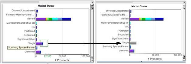
- Add Selection Mode . Use this function to add data
to an existing selection. Using the Martial Status example, if you
want to add another Marital Status to the selection you have already
made, in the Add Selection Mode select another bar on the Martial
Status chart.
When you add more
data, the other charts in the project will adjust to reflect the selection
that has been made. In this case, all charts include the Married
and Singlepopulation.
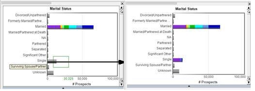
- Subtract Selection Mode . Use this function to remove data
from an existing selection. Select any bar on a chart that has already
been selected and it will subtract that selection from your entire
selection population.
Notice in the Subtract
Select Mode, when selecting the Single bar in the Marital Status
chart, the Single bar goes grey as that population is now unselected.
- Intersect Selection Mode . Use this function to select the “intersection”
of two fields. This is essentially an “and” function. For example,
you might want to select the population that is Married and Unknown
ethnicity and Male gender.
x
-
From the Selection Table First. Excluding
from the top toolbar or Globally.

Use the top tool bar
to exclude entities and then refresh the charts to show all attributes
associated with the selected entities. For example, suppose you
have a data set that includes geographical information, such as
the State a population of individuals lives in. They may have a
primary address in Illinois and a secondary or seasonal address
in another state. Now let’s assume you want to exclude all those
individuals that do not have an address in the state of Illinois.
When you exclude from the Selection table, all those individuals
that have an address outside of Illinois will be excluded. However,
you will still show a population in your bar chart that includes
other states. The reason for this is that all those individuals
who have a Primary address in Illinois may have a secondary or seasonal
address in another state and the bars for those other states remained
and were not excluded. For more information, see the image below.
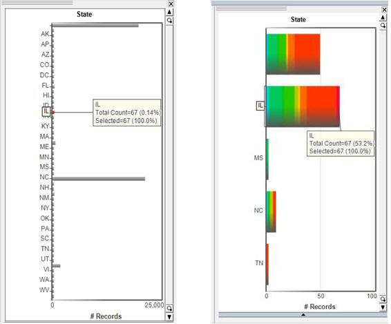
In this case there
are 67 individuals living in Illinois. By excluding the unselected from
the Primary or Core table by using the “Exclude Unselected” chart
in the tool bar, all those individuals outside of the 67 that live
in Illinois have been excluded. However, some of those remaining
individuals have seasonal or secondary addresses in other states
and those records were returned because they still pertain to the
67 individuals that live in Illinois. What is excluded first are
individuals, and then all addresses are updated for those individuals.
-
From Local Table First. Excluding from the chart or locally.
Using the same geographic example as above, if you right click on
the chart and then left click on “Exclude Unselected,” you will
first exclude all address records not in Illinois, and then all
of the people who don't have an address in Illinois.
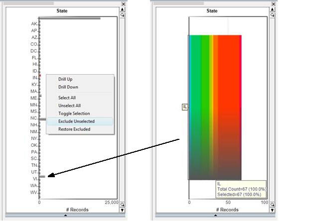
In this case because
the exclusion was executed locally, all those addresses that existed
outside of Illinois were excluded. This is because the exclusion
occurred FIRST in the table that included the addresses, not the
table that included the individuals.
x
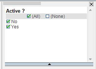
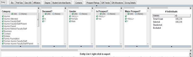
Filters are a mechanism for specifying a subset of the
data from a data source that is available in an analysis session.
An easy way to look at filters is as a starting point before your
analysis. Suppose you have a data set of individuals and decide
from the outset that you want to exclude all the males from the
data set before starting your analysis. If your project has a text
filter set to Gender you can remove all the males from your project by
deselecting Male in the text filter box. See the following image.
Notice that with both males and females selected there are 188,238
individuals represented in the data set.
Note that when the Males are deselected from the text filter,
the counts of individuals in the data set changes from 188,238 to
111,358 and the counts also show that 76,880 individuals (males)
have been excluded from the data set. For more information, see
the following image.
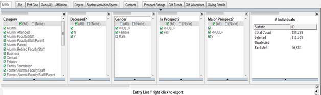
It is important to note that the only way to bring back the data
that has been excluded due to a text filter is to reselect the filter
and return the data to its original state. In this case, to bring
back all of the males, you must reselect the Male box in the text
filter.