In this section: |
A scatter plot, also called a scatter gram or scatter diagram, is used to investigate the possible association between two variables that both relate to the same event by distributing a series of points or nodes, each representing a value in the data set, across a grid. Scatter plots are used to demonstrate cause-and-effect, and evaluate the nature and degree of associations between two attributes.
Scatter plots share many of the characteristics of basic line graphs, and data can be plotted using variable scales on both axes. You can use the scatter plot to analyze correlations, clusters of points, patterns, and the influence of one variable upon another. That is, plotting two groups of numbers as one series of XY coordinates. Scatter plots can also be used to examine how the value of Y changes as a function of X, including changes over time if the x-axis is a time sequence.
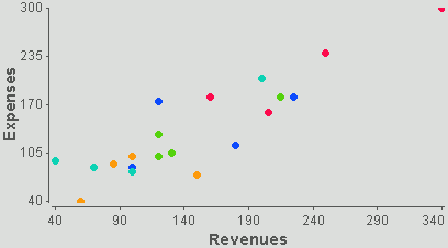
The following image shows an example of a scatter plot.
With WebFOCUS Visual Discovery, you can easily visualize correlations between two items. Additionally, scatter plots can be enhanced by:
The scatter plot accepts continuous variables. It does not accept string variables. Unselected items are drawn as open circles and selected values are drawn as filled circles of either the default highlight color or the color used to code the data.
How to: Reference: |
You can add a trend line to a data series in a scatter plot. Trend lines are commonly used to study problems of prediction (regression analysis) and to smooth fluctuations in data to show the pattern or trend more clearly. The trend option can show or hide trend lines for both the data and the selected subset.
The detail options on the trend menu are used for drawing non-trend type lines through the scatter plot data. Each of the options draws a line connecting dots in the direction of the x-axis. The difference in the options lies in how the line is drawn when dots with the same x-value and different y-values are encountered.
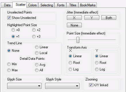
The following image shows the Scatter tab in the Visual Discovery Properties dialog box.
Shows unselected data in gray. If the Show Unselected check box is not selected, unselected data is omitted from the display.
To add unselected data, either select the Show Unselected check box in the Properties dialog box, or use the right mouse button menu in the view and click Select All.
Adjusts the size of the selected nodes, thereby enabling them to stand out from the unselected nodes.
Turns off the trend line option.
Creates a trend line using the linear equation, y=mx+b.
Creates a trend line that curves to fit the data points.
For complete details, see Inserting a Trend Line in a Scatter Plot.
Draws a trend line through the minimum values in the data set.
Draws a trend line through the maximum values in the data set.
Draws a trend line through the average of the points.
Draws a trend line through every item in the data set.
Specifies the name of the data field that controls the size of points. It is best to size by a numeric field.
Specifies the name of the data field that controls the shape that is drawn for a point. It is best to style by a categorical field (string or integer). A fixed set of shapes are automatically assigned to data. These include a filled or open circle, filled or open square, filled or open diamond, and filled or open triangle.
When points in your data set have exactly the same coordinates, overplotting can cause them to appear as a single plotted point, thus obscuring the display. You can jitter points to put more space between them.
Jitters the x-axis points.
Jitters the y-axis points.
Jitters both the x-axis and y-axis points.
Turns off the jitter option.
Adjusts the size of glyphs. To make the glyphs larger, move the slider to the right. To make the glyphs smaller, move the slider to the left.
Plots all data on the axis with their exact values. You can choose to have exact values plotted for data on the x-axis, y-axis, or both axes.
This is the default data presentation.
Displays data along the axis as the square root of its current value. For example, if the current value of a piece of data is 9 and you select Root, the data displays at 3. This is useful when looking at highly skewed distributions, because it evenly reduces the positions of the items, making them appear closer together.
You can choose the Root option for data plotted on the x-axis, y-axis, or both axes.
Displays data along the axis as the logarithm of its current value. For example, if the current value of a piece of data is 100 and you select Log, the data displays at 2 (the log of 100 to the base 10 is 2). When you have a large range of an item (like one item in a million), Log is useful because it maintains the relative position of the item while reducing the extremes.
You can use the Log option for data plotted on the x-axis, y-axis, or both axes.
Links the x-axis and y-axis when zooming.
The pop-up menu appears when you right-click a Visual Discovery control in the analytical dashboard. These options do not appear when you are developing in HTML Composer.
Shows unselected data in gray. If the Show Unselected check box is not selected, unselected data is omitted from the display.
To add unselected data, either select the Show Unselected check box in the Properties dialog box, or use the right mouse button menu in the view and click Select All.
Adjusts the size of selected nodes.
Adds a trend line. For more information, see Inserting a Trend Line in a Scatter Plot.
Changes the scale to linear. This is the default.
Displays data along the axis as the square root of its current value. For example, if the current value of a piece of data is 9 and you select Root, the data displays at 3. This is useful when looking at highly skewed distributions, because it evenly reduces the positions of the items, making them appear closer together. You can choose the Root option for data plotted on the x-axis, y-axis, or both axes.
Displays data along the axis as the logarithm of its current value. For example, if the current value of a piece of data is 100 and you select Log, the data displays at 2 (the log of 100 to the base 10 is 2). When you have a large range of an item (like one item in a million), Log is useful because it maintains the relative position of the item while reducing the extremes.
You can use the Log option for data plotted on the x-axis, y-axis, or both axes.
When points in your data set have exactly the same coordinates, overplotting can cause them to appear as a single plotted point, thus obscuring the display. You can jitter points to put more space between them.
Turns the jitter option off.
Increases or decreases the size of the selected glyphs.
Reverses the previous action. You may repeatedly undo actions retained in the history file for your current session by selecting Undo over and over again. A description of the previous action appears on the pop-up menu. If you have performed no action, Undo is not available for selection and no action appears to the right of the word Undo.
Restores the previous undo action. If you have performed no action, Redo is not available for selection and no action appears to the right of the word Redo.
Selects all of the items in the graph. When you choose Select All, any previous selections are ignored. Selection state returns to the original setting.
When selected, all of the items become unselected. All items appear in the unselected color (gray, by default) or are hidden in the graph (if hide unselected is active).
Reverses the selection state of items. Selected items become unselected and unselected items become selected.
Excludes (temporarily removes) items from the graph.
Restores the items you excluded. If you accidentally excluded the unselected, this menu option restores those excluded items.
Saves the graph to a GIF or JPEG file.
Copies the selected component and pastes it to another file.
Takes you to the collection of tabs available for the respective visualization component. Common tabs include Data, Selecting, and Colors.
| WebFOCUS |