Developer Studio provides
intuitive GUI tools that enable you to concentrate on interface design,
business logic, and data manipulation. Using Developer Studio, you
can build powerful webpage interfaces that allow users to create
and view reports.
x
The following are new features in Developer Studio.
x
Web Component Authentication Enhancement
As of Developer Studio Release 8.0 Version 07, the Kerberos authentication
option has been added to the drop-down list in the Web Component Authentication
area of the WebFOCUS Environment Properties dialog box.
For more information on configuring WebFOCUS Environments in
Developer Studio, see the Developer Studio Application Development
Getting Started manual.
For more information about the WebFOCUS configuration of Kerberos,
see the WebFOCUS Security and Administration manual.
x
Source Control Enhancements
Developer Studio Release 8.0 Version 02 and higher supports
Microsoft Team Foundation Server as a source control provider. Information
Builders has tested and certified Microsoft Team Foundation Server
2012.
x
Microsoft Team Foundation Server Requirements
In order to use Microsoft Team Foundation Server as a source
control provider with Developer Studio, you must have the Microsoft
Visual Studio® Team Foundation Server 2012 MSSCCI Provider 32-bit
plug-in installed. The plug-in is available through the Microsoft website.
You can run the MSSCCI software using the following environments:
- Windows 7, Windows XP Service Pack 2, Windows Server 2008
R2, or Windows Server 2003 Service Pack 1.
- Microsoft Visual Studio Team Foundation Server 2005, 2008, 2010,
or 2012.
Microsoft Visual Studio Team Explorer can also be installed on
the same machine as Developer Studio so that you can simultaneously
compare files from both.
x
Procedure: How to Set Microsoft Team Foundation Server as the Source Control Provider
-
While in Developer Studio, click Window,
and select Options.
The Developer Studio Options dialog box opens.
-
Select the Source Control tab.
-
Select the Team Foundation Server MSSCCI Provider check
box from the list of available Source Controls.
Once the Team Foundation Server MSSCCI Provider option
is selected, Microsoft Team Foundation Server is used as your source
control provider.
Note: The Team Foundation Server
MSSCCI Provider check box is selected by default if the Microsoft
Team Foundation Server is the only source control you have installed.
x
When an application is run, it will open in the Developer
Studio Viewer, as shown in the image below.
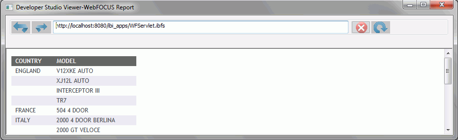
The Developer Studio Viewer functions similar to a web browser.
It has forward, back, stop, and reload buttons. It also has an address
bar for entering application names and locations.
Using the Output Viewer Options tab from the Developer Studio
Options dialog box, you can choose to run applications in Internet
Explorer. You can also choose to run applications in a new window
or refresh in a currently open window.
x
Output Viewer Settings Tab
You can customize whether applications are run in Internet
Explorer or the Developer Studio Viewer. You can also specify whether
applications are run in a new window or refreshed in a currently
open window. The Output Viewer Settings tab contains the following
options:
Output Viewer Settings
|
Option
|
Description
|
|---|
|
Use Internet Explorer
|
When selected, your application
will run in an Internet Explorer window instead of the Developer
Studio Viewer.
|
|
Navigation Options
|
|
Run in new window
|
When selected, runs the
application in a new window. Only one Navigation Option can be selected
at a time.
|
|
Run in
same window
|
When selected, refreshes
an already open window to display the application. If no window
is open, a new one will open when the application is run. Only one
Navigation Option can be selected at a time.
|
x
Sort Columns in Master File Dialog Box
Master File dialog boxes accessed from the Developer Studio Data
Servers area and Managed Reporting are enhanced to allow sorting
of the files by clicking on the column header. The dialog box has
also been enhanced to allow resizing.
x
Display Application Name in Master File Dialog Boxes
Master File dialog boxes accessed
from Developer Studio and BI Portal tools are enhanced to display
the Reporting Server application directory name in addition to Description
and Title. This enhancement allows developers to identify the location
where the Master File resides and allows the Master File list to
be sorted by the available columns.
Master Files are retrieved based on the
application path set on the Reporting Server global, group, or user
profile, or on the application path that may be set at a folder
or file level for the WebFOCUS Client Repository. If a Master File
with the same name is available in more than one application, the
search path will retrieve and display the first instance found.
x
An option has been added to the Developer Studio main
toolbar to allow users to stop running requests. Users can stop
running requests from multiple WebFOCUS Environments that are configured
in Developer Studio. A dialog box displays the environments where
a user has made a connection when pressing the Cancel running
objects button. The last environment used to run a job
is selected by default.
Users can select to stop running jobs from additional environments,
as well. Information in the dialog box will display with the status
of the stop request. When multiple jobs are submitted for processing,
they are queued on the Reporting Server and only active jobs for
the user will be stopped.
x
Controlling Screening Conditions Against Cross-Referenced Segment Instances in a Left Outer Join
You can select the SHORTPATH command in the Set tool
to control screening conditions against cross-referenced segment
instances in a left outer join.
x
Procedure: How to Control Screening Conditions Against Cross-Referenced Segment
Instances in a Left Outer Join
-
From the
Procedure Viewer in Developer Studio, click and hold a component
connector (yellow diamond), then select Set on
the Component Connector toolbox.
The Set tool opens.
-
Select SHORTPATH from
the Available Settings list and click Add.
or
Double-click SHORTPATH.
SHORTPATH
is added to the Used Settings list.
-
Select a
value from the Current Value list to set the SHORTPATH command.
You may select from the following options:
The
following image is an example of the SHORTPATH command in the Set tool.
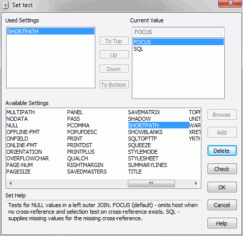
-
Click OK to
save the SET SHORTPATH command and close the Set tool.
The corresponding syntax is:
SET SHORTPATH = {FOCUS|SQL}
x
Update Assist Enhancements
The following are enhancements
to Update Assist:
- The .mnt
files that are created by Update Assist can be reopened and edited in
Update Assist if no changes have been made in the Maintain Development Environment
(MDE).
- Live display for selecting navigation
and style.
- Forms in the segname.mnt file are easier
to navigate.
- Easier navigation, using New and Save,
for database functionality.
xHTML Composer Enhancements
HTML Composer enables you to graphically create an HTML page
that incorporates forms, reports, graphs, and web objects.
x
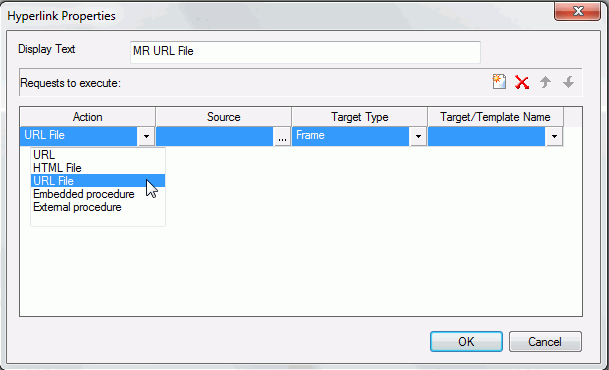
The URL File action, found in the Hyperlink Properties
dialog box, will create a hyperlink that invokes a Managed Reporting
.url file. You can select the .url file to link to from the Source
section. This action is only available when creating an HTML page hyperlink
in the Repository area.
x
Function: IbComposer_getAllAmpersValues
The IbComposer_getAllAmpersValues is used to get the
current selected values from all the controls on your page layout.
It then takes those values and assembles them as a string that can
be added to the end of a URL call. An example of this would be having
a REGION control and multiselecting MidEast, NorthEast, and NorthWest.
It will assemble these selections as shown below:
®ION=%27MidEast%27%20OR%20%27NorthEast%27%20OR%20%27NorthWest%27
This function can be used in conjunction with the Business Intelligence
Portal, where the generated string is appended to all Business Intelligence
Portal calls that run reports or charts. This allows the parameter
values to affect all portal components, even if new ones are added
or existing ones are removed at run time.
x
Syntax: How to Get all Parameter Values
IbComposer_getAllAmpersValues([verifySelection]);
where:
- verifySelection
Boolean
Is an optional parameter. When true and when
the Selection required property for the control is set to Yes,
this returns an empty string for the parameter controls that do
not have a selection made.
Note: All controls have
the Selection required property. This property is set to Yes by
default. If a control has no valid selection made at run time, a
red box appears around it and the following status bar message displays:
Please make required selections
Example: Retrieving a List of All Parameters Selected in a Report
function button1_onclick(ctrl)
{
var val = IbComposer_getAllAmpersValues();
alert(val);
OnExecute(ctrl);
}
x
Master File Parameter Support
If you reference or import an existing report that uses
a Master File that contains a parameter, the New Parameters dialog
box opens with that parameter in the list, as well as any parameters
from the report procedure.
x
Default Theme Option and Additional Themes
You can use the Default Theme option to set the default
theme of the HTML page. The Default Theme option is found in the
HTML Page tab of the Developer Studio Options dialog box. Additional
themes have been added.
-
Default Theme
-
You can set the default theme for a new HTML
page. The Information Builders theme is chosen by default.
The
following is the list of themes that you can use.
- Information Builders
- Black
- Blue
- Green
- Orange
- Purple
- Red
- Silver
- Teal
- Plain
- Yellow red
- Beige blue
- Dramatic blue
- Neutral gray
- Light blue
- Light green
- Light purple
x
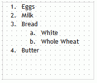
Inserting a Bulleted or Numbered List
You can insert a bulleted or numbered list into a text object.
x
Procedure: How to Insert a Bulleted List or Numbered List Into a Text Element
To
insert a bulleted list or numbered list into a text element:
-
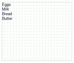
Insert a text element into the layout and type text on different lines,
as shown in the following image.
-
Highlight
and right-click the text.
The right-click context menu opens.
-
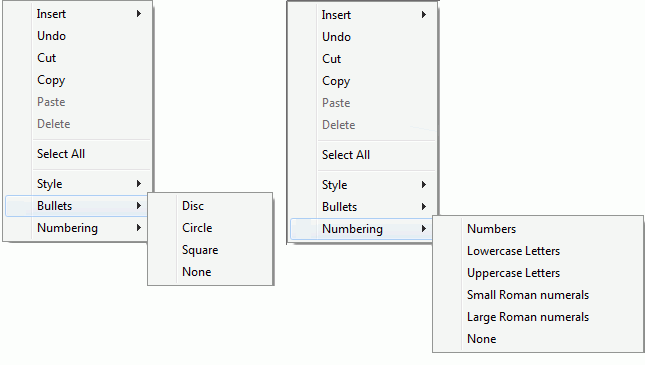
Select Bullets and
then either Disc, Circle,
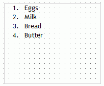
or Square if you want a bulleted list. Select Numbering and
then either Numbers, Lowercase
Letters, Uppercase Letters, Small
Roman numerals, or Large Roman numerals if
you want a numbered list. Both options are shown in the following
image.
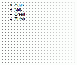
For example, the following
image shows each item of text on a different line with a bullet
next to it.
Note:
- Alternatively, you
can select a bullet type before typing text to begin the list. Pressing
Enter will begin the next item in the list on a separate line.
- To change the bullet or number list type of an existing list,
place your cursor on the list level you want to change and reselect
a bullet or number list type. Selecting None will
remove the bullets or numbers for that level and move any nested
lists up one level. In order to switch between bullets and numbers,
you must first remove the current list option by selecting None and then
applying the list option you want.
x
Procedure: How to Insert Nested Lists Into a Text Element
To
insert a nested list into the text element:
-
Insert a
text element into the layout and create a list, as shown in the
following image.
-
Place your cursor after a list item.
-
Right-click
and select Nested List and then select a
bulleted or numbered list option.
A list is started within the current list, allowing you
to enter text on that list level, as shown in the following image.
Note: Pressing
the Tab key while your cursor is on the same line as a list item
will move that item one level down, resulting in a nested list.
The bullet or number type selected is the next list type in the
right-click context menu. For example, if you have a bulleted list
that uses the disc bullet type, pressing the Tab key to move an
item down one level will cause that nested list to have the circle
bullet type.
You can continue to nest lists within other lists
by using the same steps shown above.
Note: You cannot
skip a list level. For example, in order to insert a nested bulleted
list or nested numbered list on a lower level, there must be a list
one level up from it.
x
When chaining maps with other controls in HTML Composer,
you are able to pass fields that are not displayed by the map. You
can pass these fields from one control to the map, and then from
the map to another control where those undisplayed fields can then
be used.
Example: Map Chaining
The
following example shows how a map can be chained with other controls
and how it can pass fields through the map for use later in the
chain. For this example, the centurystores Master File was used.
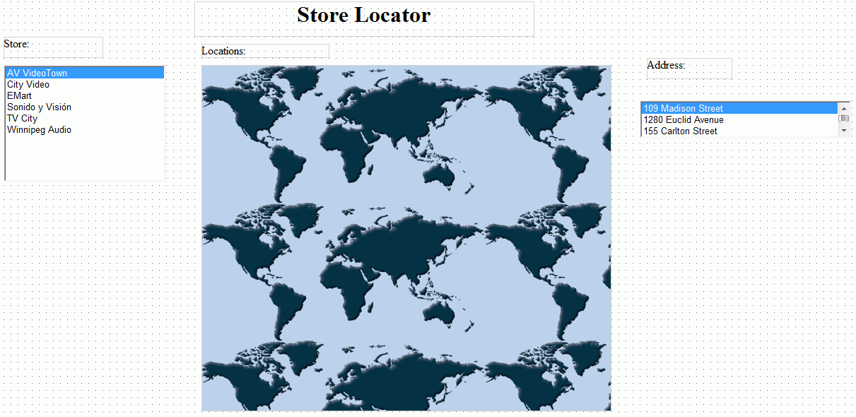
This
example contains an HTML page that has two list boxes and one map
control. The Design tab view of this page is shown in the following
image.
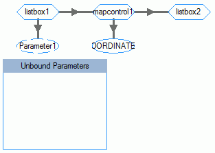
The
Parameters tab view shows that these controls are chained together,
as shown in the following image.
Listbox1
is populated with a list of store names from the centurystores Master
File. When one of the stores on the list is selected, the store
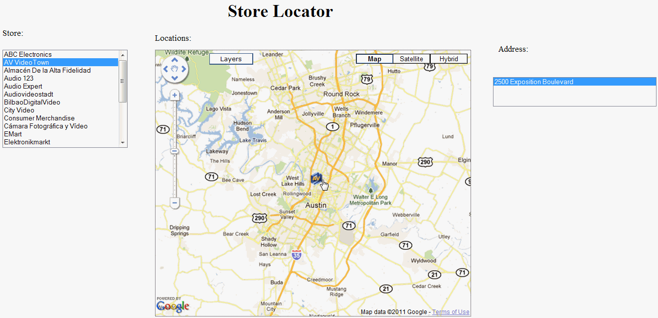
location is shown on the map, as shown in the following image.
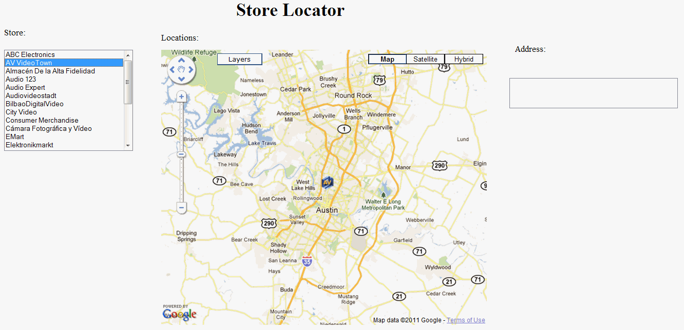
When
the store marker image is selected on the map, the store address
is displayed in listbox2, as shown in the following image.
Listbox1
passes the necessary fields to mapcontrol1 so that it can display
the store location on the map. In this case, it passes the STORENAME
field.
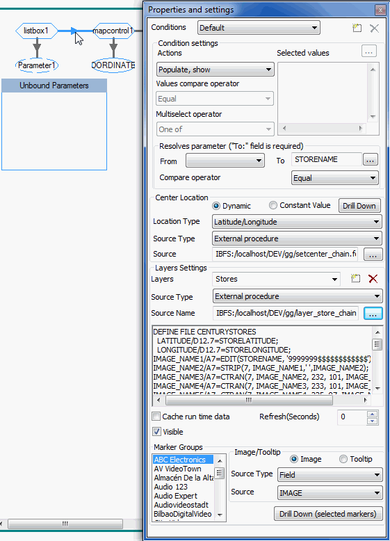
The
layer procedures include BY STORENAME to filter the layer to show
only the markers for the selected store in listbox1. The layer procedures
also include a BY STOREID reference, which the map does not display,
but is used in listbox2 to retrieve the correct store address for
the selected map marker.
Mapcontrol1 does not use this field.
However, when the store marker is selected on the map, the STOREID
field is passed from mapcontrol1 to listbox2, as shown in the following
image.
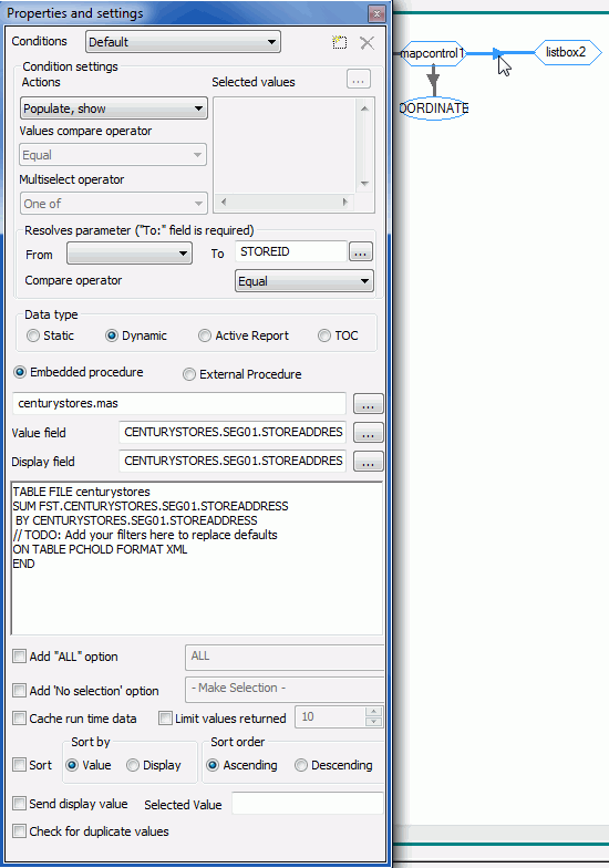
STOREID
is passed to listbox2 where it is used to filter out the store address
from the selected marker.
Maps can pass fields that they do
not display. They can then pass those unused fields to another control,
down the chain, which can use the passed fields.
x
Mapping support has be expanded to include Bing® Maps.
All the functionality of Google Maps™ integration is supported with
Bing Maps. For detailed information, see Chapter 9, Using
Maps in HTML Composer in the Designing a User Interface
for a Web Application With HTML Composer manual.
x
Using JavaScript Code With Maps
The following JavaScript functions have been included
in the Using Maps in HTML Composer chapter in the Designing
a User Interface for a Web Application With HTML Composer manual.
-
toggleLayer('mapId', 'layerName')
-
toggleMarker('mapId', 'layerName', 'markerName')
-
refreshLayer('mapId', 'layerName')
-
panToAddress('address', 'mapId', 'zoom')
-
parent.panToPoint('lat', 'long', 'mapId', 'zoom')
-
showAllMarkers('mapId')
x
Date Formats for Calendar Options
You can display the format of a date differently by
selecting one of the available formats from the Date
format in data source drop-down list in the calendar
controls Property and settings dialog box. Several new formats have
been added to this release. For a list of available date formats,
see Date Formats in Chapter 2, Creating and Using
Parameters in HTML Composer in the Designing a User
Interface for a Web Application With HTML Composer manual.
x
The InfoWindow Action has been added to the Target Type
drop-down list of the Hyperlink properties. The InfoWindow Target
Type will execute the action in the WebFOCUS generated InfoWindow.
For more information, see the Using HTML Composer chapter
in the Designing a User Interface for a Web Application With HTML
Composer manual.
x
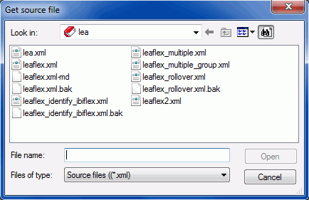
ESRI Flex Viewer Integration
The ESRI® Flex Viewer creates a component that adds
numerous controls, a report, and a map object when used. An ESRI
Flex Viewer component can be seen in the following image.
You can access the ESRI Flex Viewer component from the Insert
menu by selecting Components and clicking ESRI Components.
You can then click and drag the crosshair symbol to the desired size
for the ESRI Flex Viewer controls and report. The ESRI Flex Viewer
component will contain a number of controls, a report, and a map
object. It is recommended that the ESRI Flex Viewer component be
drawn big enough to accommodate all of these items.
You will then choose the esriinfo XML file from the Get source
file dialog box to use with the ESRI Flex Viewer component, as shown
in the following image.
x
Mapping support has be expanded to include ESRI maps.
For detailed information, see Chapter 9, Using Maps in HTML
Composer in the Designing a User Interface for a Web
Application With HTML Composer manual.
x
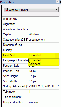
Initial State of a RIA Window
You can choose whether a RIA window component starts
expanded or collapsed by using the Initial State property, located
in the Properties window. The two options are Expanded and Collapsed.
- Expanded sets the
window to be expanded at run time and is set by default.
- Collapsed sets the window to be collapsed at run time.
The following image shows the Initial State property on the Properties
window.
x
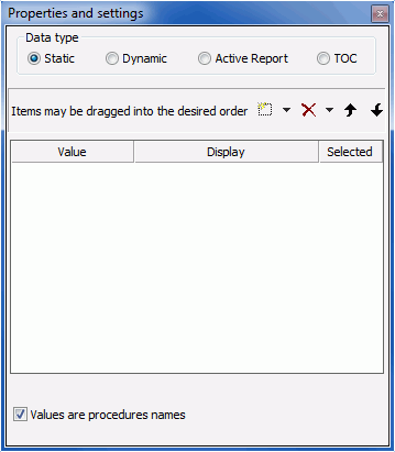
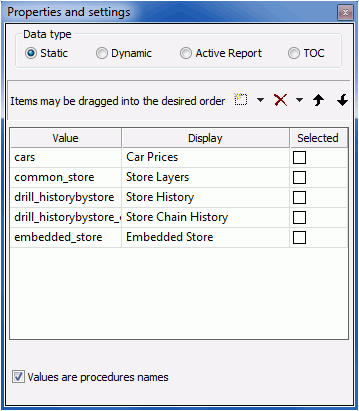
Populate Control With Procedure Names
You can select the Values are procedures names option
from the Properties and settings dialog box when Static is selected
as the Data type.
This enables a control to be populated with procedure names,
so that when a value is selected, that procedure executes. The Value
column is the procedure name itself and cannot be edited. The Display
column is editable.
x
Procedure: How to Use Procedure Names as Values
-
Create an
HTML page that contains a list box, a push button, and a report,
as shown in the following image.
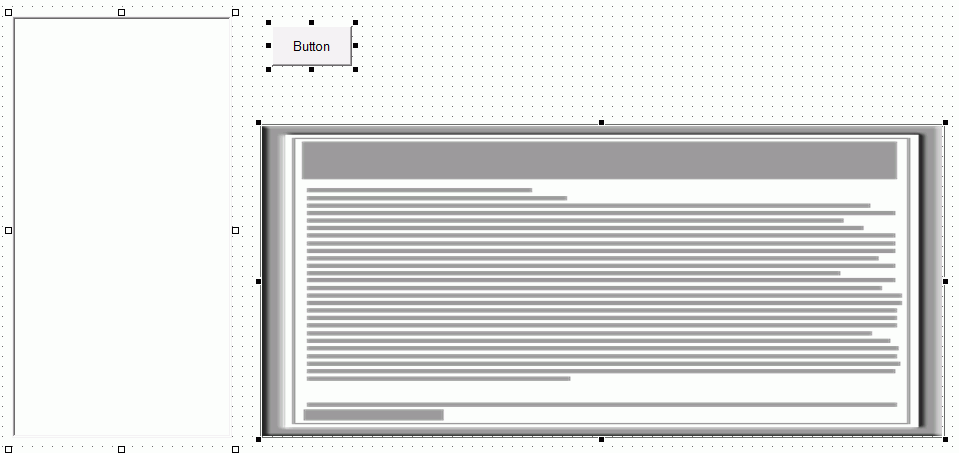
Note: In
this procedure, a list box is used. However, the following controls
are also able to use the Values are procedures names option: double
list, drop-down, radio button, and check box.
-
Select the
list box to bring up the Properties and settings dialog box.
Note: If the Properties and settings dialog box
does not open, select View and click Properties
and settings.
-
Select Static as
the Data type.
-
At the bottom
of the Properties and settings dialog box, select Values
are procedures names, as shown in the following image.
-
Click the New button
and select procedures from your directory, as shown in the following
image.
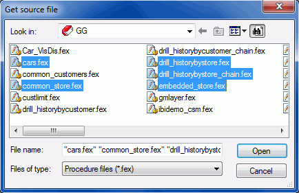
Note: You
can add multiple procedure names to the Properties and settings
dialog box by multiselecting procedures while in the Get source
file dialog box.
-
Once the
procedures have been added to the Properties and settings dialog
box, edit the display names of the procedure values by double-clicking
the display contents if they are not highlighted already.
The following image shows the procedure values with new
display names.
-
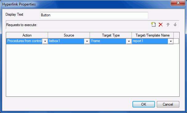
Right-click
the button you created and click Create Hyperlink.
The Hyperlink Properties dialog box opens.
-
Create a
hyperlink that opens a selected procedure from a control in the report
frame created earlier.
-
For the Action, select Procedures from control from
the drop-down list.
This option coincides with the Values are procedures names
option found in the Properties and settings dialog box. This option
will point to an entire procedure for the hyperlink, rather than
a simple value. This option is only available when a control on
the HTML page is using the Values are procedures names option.
-
Select listbox1 as the Source.
The source can be different if you use a different control.
For example, combobox1, customselect1, radio1, or checkbox1.
-
Select Frame as the Target Type.
You could also select New Window as
the target if you wanted the procedure to open in a new window.
-
Select report1 as the Target/Template Name.
The created hyperlink is shown in the following image.
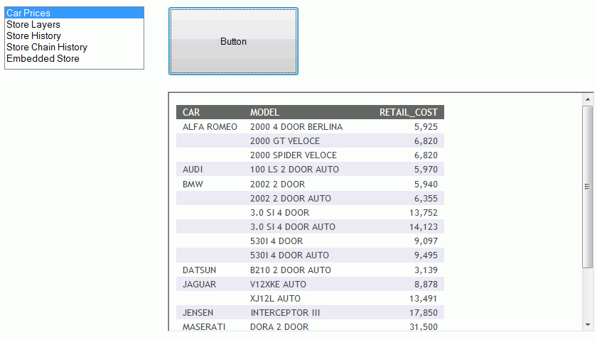
-
Run the
page.
-
Select the
procedure from the list box and click the button.
The report is run, as shown in the following image.
x
HTML Composer and Visual Discovery Integration Features
The following features are available for HTML Composer
users that license Visual Discovery.
x
Values are VisDis Color By
The Values are VisDis Color By option has been added
to the Parameters Properties and settings dialog box, as shown in
the following image.
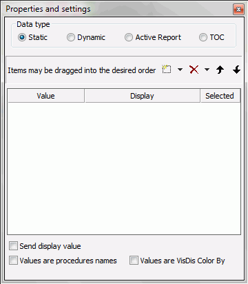
Values are VisDis Color By is an option available only through
the Properties and settings dialog box of a list box, drop-down
list, or double list box. You must first create a canvas using HTML
Composer, add a Visual Discovery control, and then add a list box, double
list box, or drop-down list that contains the field names from the
data pool of the Visual Discovery control.
When you run the HTML page, you are able to select a field name
from the list to change the colors of the Visual Discovery control.
x
You can preselect values of a Visual Discovery control
that display at run time, by adding the onInitialUpdate() function
to the Client JavaScript tab of HTML Composer. When you run the
HTML page, the values you preselected will display.
x
Passing a Parameter Between a Visual Discovery Control and
a Report
You can pass a parameter between a Visual Discovery
control and a report so that when data is selected from the Visual
Discovery control, the same data is displayed in the report on the
same page.
x
Passing a Parameter Between a Report and a Visual Discovery
Control
You can pass a parameter between a report and a Visual
Discovery control so that when data is selected in the report, the
same data is displayed on a new page that contains the Visual Discovery
control.
x
Chaining Into a Visual Discovery Control
You can chain into a Visual Discovery control using
a parameterized procedure and a list box, double list box, or drop-down
list. This allows you to select values from a list and the data
correlating to that data will be displayed in the Visual Discovery control.
x
Excluding and Restoring Data
You can exclude and restore selected data in Visual
Discovery controls by using the Visual Discovery Exclude and Visual
Discovery Restore hyperlink actions. These actions are only available
when a Visual Discovery control is present on an HTML page.
xDocument Composer Enhancements
Document Composer
enables you to design reports and to coordinate and distribute layouts made
up of multiple reports and graphs in a single document. You can
position reports and graphs anywhere on a single page or combine
a series of layouts within a single document.
x
Applying Pre-Process Code and Post-Process Code to a Document
You can create pre-process code that applies to all
objects added to a document. For example, if your document requires
the joining of two tables, you can create pre-process code that
joins those two tables. This join can then be used by any object
in the document and any items following the pre-process code.
In addition, you can create post-process code that runs after
the document is run. This can be used in conjunction with pre-process
code. For example, using pre-process code, you could create a join.
You could then use the post-process code to clear that join.
Note: Pre-process code and post-process code are not meant
to display output.
x
Procedure: How to Create Pre-Process Code for a Document
While
in a document:
-
From the Insert menu, click Pre-process
code.
The procedure viewer window opens.
Here, you can
create the pre-process code that the document will use. A join is being
used in this example.
-
Click the component connector and select Join.
-
Join the videotrk and movies Master Files.
-
Save and close the Join.
-
Close the procedure viewer.
-
In your document, create a report frame.
-
Double-click the report frame to open the procedure viewer.
Note:
-
Normally, double-clicking a report
frame prompts you to select a Master File for creating a report.
However, when pre-process code or post-process code is present,
the procedure viewer opens instead.
-
The pre-process code is displayed, with the last block being
a comment that states do not move, remove, or modify. Pre-process
code above. This comment separates pre-process code from component
code. Adding component blocks before this comment, or editing what
is already there, modifies the pre-process code. Adding blocks after
this comment affects the component code.
-
Click the component connector after the pre-process code
and select Report.
Report Painter opens.
The pre-process code joined
the videotrk and movies Master Files, allowing you to use data from
both in your report.
x
Procedure: How to Create Post-Process Code for a Document
While
in a document:
-
From the Insert menu, click Post-process
code.
The procedure viewer window opens.
Here, you can
create the post-process code that the document will use. A join
clear is being used in this example.
Note: Any pre-process
code you created is shown in the procedure viewer. Do not modify
or delete pre-process code when creating or modifying post-process
code.
-
Click the component connector after all other procedure
components and select Join.
-
Clear all joins.
-
Save and close the Join.
-
Close the procedure viewer.
After the document is run, the post-process code will clear
all joins. When combined with pre-processing code, you could create
the joins before the document is run and clear the joins after.
x
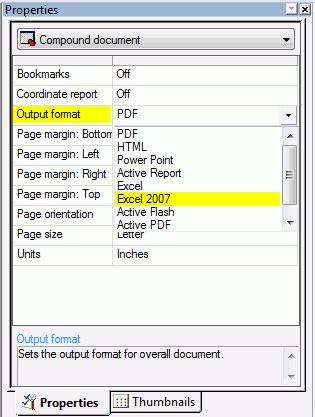
The Excel 2007 output format is available from the Output
format property in the Properties window, as shown in the following
image.
x
Apply Filter On Load Option
The Apply filter on load check option is only available
for active output formats. It is available from the Properties and
Settings dialog box.
When selected, this option causes the default value to be applied
to the reports and charts when the page is loaded. This option is
not active while the Add “ALL” option is selected. You cannot select
this option while the Add “ALL” option is selected.
x
Inserting Pages Before and After the Current Page Layout
You can insert new or existing pages before or after
the current page layout.
x
Procedure: How to Insert an Existing Page Layout Before or After the Current
Page Layout
-
Open or create a document.
-
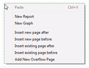
Right-click on a page layout.
The right-click context menu opens, as shown in the following
image.
-
Select either Insert existing page after or Insert
existing page before.
The Get source file dialog box opens.
-
Navigate to a previously saved page layout, select it,
and click Open.
The previously created page layout is inserted either before
or after right-clicking the page layout.
x
Procedure: How to Insert a New Page Layout Before or After the Current Page
Layout
-
Open or create a document.
-
Right-click on a page layout.
The right-click context menu opens, as shown in the following
image.
-
Select either Insert new page after or Insert
new page before.
The new page layout is inserted either before or after
right-clicking the page layout.
x
Inserting Bulleted and Numbered Lists
You can insert bulleted and numbered lists into a text
object. You can also nest those lists within themselves.
x
Procedure: How to Insert a Bulleted List or Numbered List Into a Text Element
-
Insert a text element into the layout
and type text on different lines, as shown in the following image.
-
Highlight and right-click the text.
The right-click context menu opens.
-
Select Bullets and then choose Disc, Circle,
or Square if you want a bulleted list. Select Numbering and
then choose Numbers, Lowercase
Letters, Uppercase Letters, Small
Roman numerals, or Large Roman numerals if
you want a numbered list. Both options are shown in the following
image.
For example, the following
image shows each item of text on a different line with a bullet
next to it.
Note:
- Alternatively, you can select a bullet type before typing text
to begin the list. Pressing Enter will begin the next item in the
list on a separate line.
- To change the bullet or number list type of an existing list,
place your cursor on the list level you want to change and reselect
a bullet or number list type. Selecting None will
remove the bullets or numbers for that level and move any nested
lists up one level. In order to switch between bullets and numbers,
you must first remove the current list option by selecting None and then
applying the list option you want.
x
Procedure: How to Insert Nested Lists Into a Text Element
To
insert a nested list into the text element:
-
Insert a text element into the layout and create
a list, as shown in the following image.
-
Place your cursor after a list item.
-
Right-click and select Nested List and
then select a bulleted or numbered list option.
A list is started within the current list, allowing you
to enter text on that list level, as shown in the following image.
Note: Pressing
the Tab key while your cursor is on the same line as a list item
will move that item one level down, resulting in a nested list.
The bullet or number type selected is the next list type in the
right-click context menu. For example, if you have a bulleted list
that uses the disc bullet type, pressing the Tab key to move an
item down one level will cause that nested list to have the circle
bullet type.
You can continue to nest lists within other lists
by using the same steps shown above.
Note: You cannot
skip a list level. For example, in order to insert a nested bulleted
list or nested numbered list on a lower level, there must be a list
one level up from it.
x
You can layer objects in a page layout by using the
object right-click menu.
x
You can layer objects that are added to the page layout
by using the object right-click menu, as shown in the following
image.
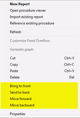
The options are:
-
Bring to front. Moves an object to the front so
that it is stacked on top of every other object it overlaps with.
-
Send to back. Moves an object to the back so that
it is stacked below every other object it overlaps with.
-
Move forward. Moves an object forward one position
in the stacking z-order.
-
Move backward. Moves an object backwards one position
in the stacking z-order.
When using any of these commands, the stacking order of the object
will change. This is reflected in the z-index property in the Properties
window, The z-index is the stacking order of a specific object.
x
Procedure: How to Insert a Dashboard Bar Into the Layout
A Dashboard
Bar is an additional page layout where you can insert controls,
reports, and charts that display above the dashboard tabs. The Dashboard Bar
is only available for active report, active PDF, and active flash
formatted documents. Dashboard Bar can be a maximum of one page.
To insert a Dashboard Bar:
-
From the Compound document Property list, select
either Active Report, Active PDF,
or Active Flash.
-
From the Insert menu, click Add Dashboard Bar.
The Dashboard Bar is inserted into the document.
You
can now insert controls, reports, and charts that display above
the dashboard tabs.
Note: Though the Dashboard Bar
can be a full page, it is not recommended that you insert large
reports and charts as this would make the Dashboard Bar appear the
same size or larger than the dashboard.
x
Apply Filter on Load Property
The Apply filter on load property is available from
the Properties and Settings window. This option causes the default
value to be applied to all reports and charts when the page is loaded.
-
Apply filter on load
-
When selected, this option causes the default value to be
applied to the reports and charts when the page is loaded. This
option is not active while Add “ALL” option is selected. You cannot
select this option while Add “ALL” option is selected.
x
The Page Color property is available from the Property
window. This option lets you set the page color.
-
Page color
-
Sets the background color of the page. Opens the Color Picker
dialog box where you can choose from preset colors or set your own
custom color.
Note: This option is only available in
active report and active flash output formats. The option will be
hidden in the Properties window until you select either active report
or active flash from the Output format property.
x
Page Size E Property Option
The E page size is available from the Page Size Property
window option.
-
Page size
-
Determines the size of the page. The options are:
- Letter
- Tabloid
- Ledger
- Legal
- Power Point Slide
- Statement
- Executive
- A3
- A4
- A5
- B4
- B5
- CUSTOM1
- D
- E
- Folio
- Quarto
- 10 x 14
- 11 x 17
- U.S. Standard Fanfold
- German Standard Fanfold
- German Legal Fanfold
- Envelope #9
- Envelope #10
- Envelope #11
- Envelope #12
- Envelope #14
- Note
- Envelope DL
- Envelope C5
- Envelope C3
- Envelope C4
- Envelope C65
- Envelope C6
- Envelope B4
- Envelope B5
- Envelope B6
- Envelope Monarch
Note: When using a Dashboard
Bar, it is advised you use Page size options D or E. If you use
other Page size options, text in the Dashboard Bar may overlap.
x
Switching the Chart Engine
You can switch between the default JavaScipt charts and Fusion™
charts. To do this, select compound document from the Properties
tab and then select active report from the
Output format property list. The Chart Engine property is now available.
Select one of the options from the Chart Engine property drop-down
list, as shown in the following image.
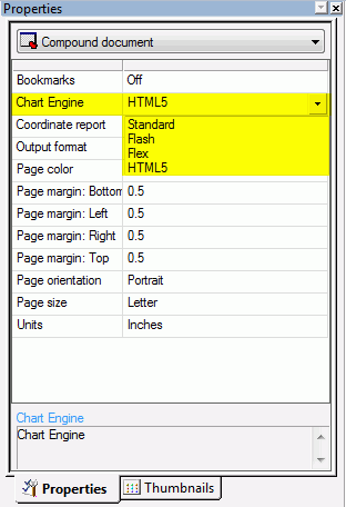
The Chart Engine options are described below:
-
Standard. This option changes the engine to use
JavaScript charts.
-
Flash. This option changes the engine to use Fusion charts.
-
Flex. This option changes the engine to use Flex charts.
-
HTML5. This is the default chart option. This option
changes the engine to use High charts.
x
Page Numbering Options in the Page Master
The following image shows the page numbering options,
available from a page numbering object in the Page Master.
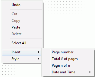
The following page numbering options are available from the Insert
context menu:
-
Page Number
-
Adds the <Page #> object, representing the current
page number of the document.
-
Total # of pages
-
Adds the <Total pages> object, representing the total
number of pages in the document.
-
Pages n of n
-
Adds the <Page # of ##> object, representing the current
page number of the total number of pages in the document.
-
Date and Time
-
Adds the date or time in any of the selected formats:
mm/dd/yy
mm/dd/yyyy
Month
(First three letters) Day, Year
Month (Full Name) Day, Year
Day
Month, Year
Quarter Year
HH.MM.SS
Note: THE
HH.MM.SS format is a time format. The time is updated dynamically
to display the current time at run time.
x
Report Painter provides you with many powerful reporting
features that enable you to create and style complex reports. You
can graphically paint the report on the Report Painter window, a
graphical representation of the report page.
x
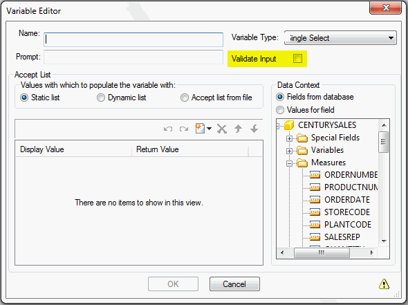
The Validate Input check box is found in the Variable
Editor dialog box. When checked, at run time, this validates whether
your data entry is consistent with the definition of a parameter.
x
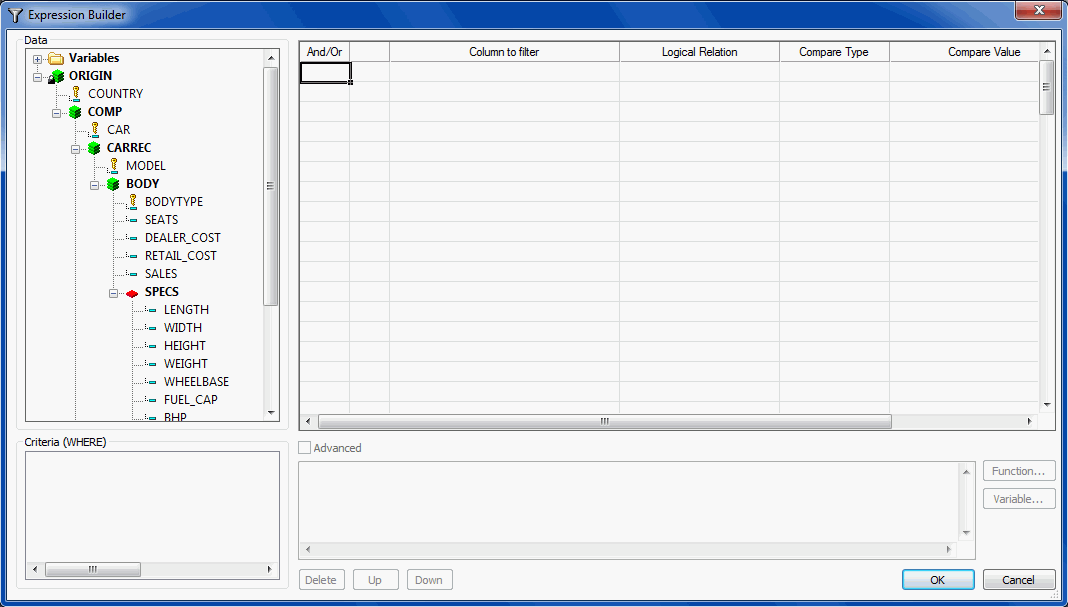
The Expression Builder in WebFOCUS 8 has been enhanced.
The Criteria and Advanced sections were added, as shown in the image
below. The ability to create multiple WHERE, IF, or WHERE TOTAL
expressions without having to exit and reenter the Expression Builder
has also been added. The previous version of the Expression Builder
is now called the Basic Expression Builder. The Expression Builder
enables you to create WHERE, IF, or WHERE TOTAL expressions quickly
by selecting fields, relations, operators, and values from lists.
You can base selection criteria on a specified value, a variable
value, or a field value.
x
Quick Prompt for Amper Variables
Additional options have been added to the Compare Type
drop-down list, located in the Expression Builder. These Compare
Types are parameter options that automatically generate the required
syntax so that the Variable Editor does not need to be invoked.
These compare types are:
- Parameter (Dynamic) allows a user to multiselect values
using a button.
- Parameter (Static) presents a value list from which to select.
- Parameter (Simple) prompts the user to enter a value.
x
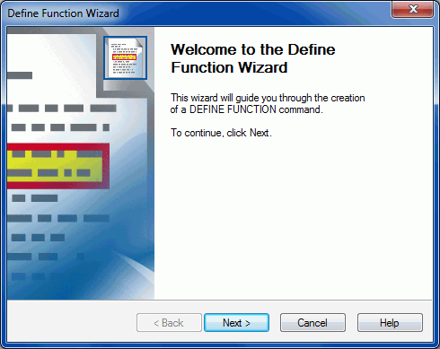
You are able to create your own functions by using the
Define Function Wizard. The Define Function Wizard assists in the
creation of a user function. The created functions can later be
retrieved through the Function Arguments dialog box using the Retrieve
User Functions button. By clicking Retrieve User Functions, your
created functions will be available for use.
x
Promote a Report to a Compound Document
Reports in Report Painter may be promoted to a Compound
Document, similar to InfoAssist. This is done by clicking the Build
a Compound Document button  .
The original report is left unaffected and a copy of the report
is put in Document Composer.
.
The original report is left unaffected and a copy of the report
is put in Document Composer.
x
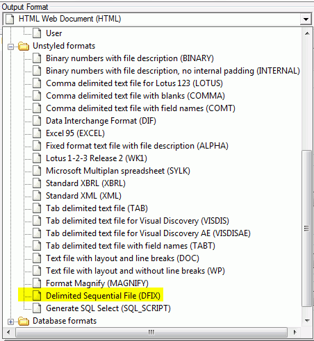
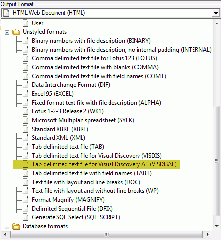
The VISDISAE output format has been added to the unstyled
formats and can be selected from the Output Format drop-down list
in the Report Options dialog box, as shown in the following image.
For more information on the VISDISAE output format, see the Using
WebFOCUS Visual Discovery to Develop Analytic Dashboards manual.
x
The DFIX output format has been added to the unstyled
formats and can be selected from the Output Format drop-down list
in the Report Options dialog box, as shown in the following image.
You can use the DFIX output format to specify a delimited data file
and the delimiters of that file. For example, you could set the
delimiter to be a slash (/) so that data in the files is separated
by a slash.